The Page With No Code

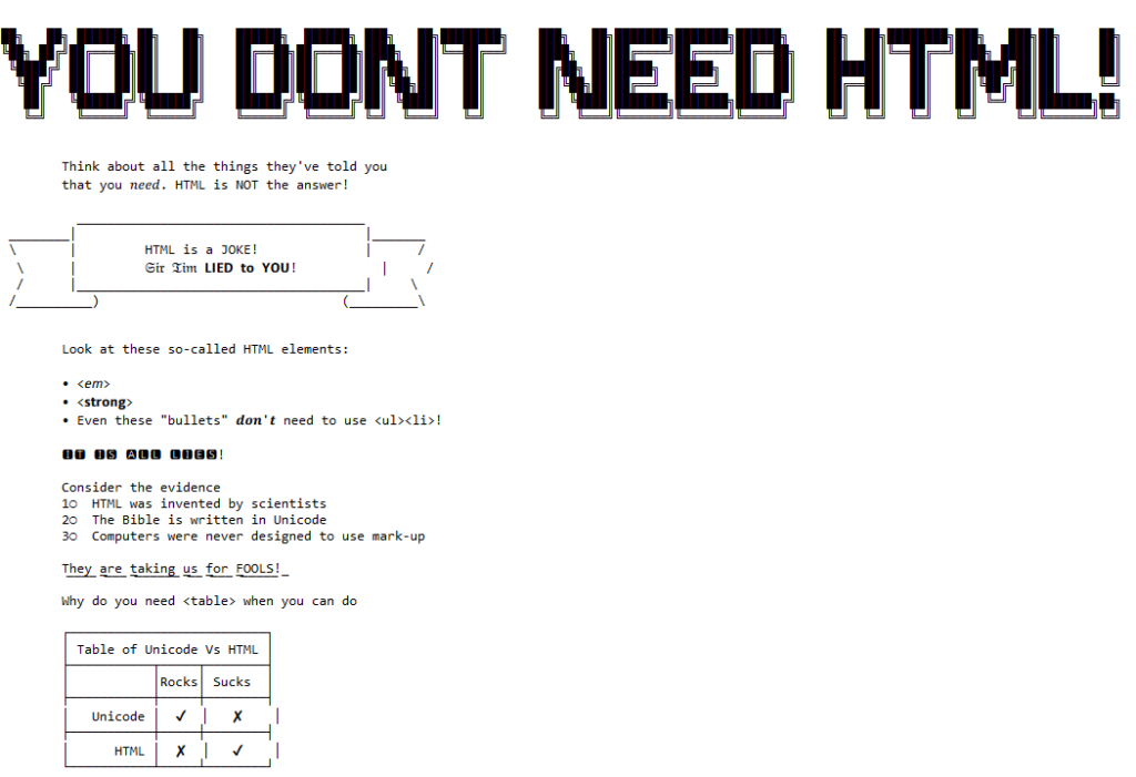
It all started when I saw no-ht.ml, Terence Eden‘s hilarious response to Salma Alam-Naylor‘s excellent HTML is all you need to make a website. The latter is an argument against both the silly amount of JavaScript with which websites routinely burden their users, but also even against depending on CSS. As a fan of CSS Naked Day and a firm believer in using JS only for progressive enhancement, I’m obviously in favour.

Screenshot showing Terence Eden's no-ht.ml website, which uses plain text ASCII/Unicode art to argue that you don't need HTML.
Obviously no-ht.ml is to be taken as tongue-in-cheek, but as you’re about to see: it caught my interest and got me thinking: how could I go even further.

Terence’s site works by delivering a document with a claimed MIME type of text/html, but which contains only the (invalid) “HTML” code <!doctype UNICODE><meta charset="UTF-8"><plaintext> (to work around browsers’ wish to treat the page as HTML). This is followed by a block of UTF-8 plain text making use of spacing and emoji to illustrate and decorate the content. It’s frankly very silly, and I love it.1

I think it’s possible to go one step further, though, and create a web page with no code whatsoever. That is, one that you can read as if it were a regular web page, but where using View Source or e.g. downloading the page with curl will show you… nothing.

I present: The Page With No Code! (It’ll probably only work if you’re using Firefox, for reasons that will become apparent later.)

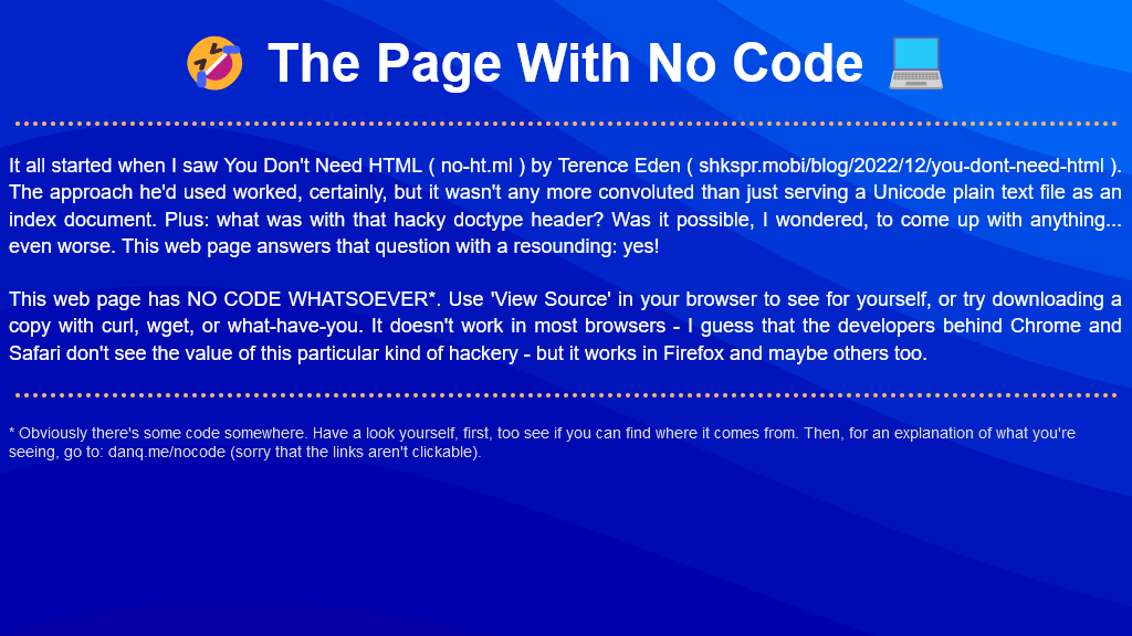
Screenshot showing my webpage, "The Page With No Code". Using white text (and some emojis) on a blue gradient background, it describes the same thought process as I describe in this blog post, and invites the reader to "View Source" and see that the page genuinely does appear to have no code.
I’d encourage you to visit The Page With No Code, use View Source to confirm for yourself that it truly has no code, and see if you can work out for yourself how it manages this feat… before coming back here for an explanation. Again: probably Firefox-only.

Once you’ve had a look for yourself and had a chance to form an opinion, here’s an explanation of the black magic that makes this atrocity possible:

  1. The page is blank. It’s delivered with Content-Type: text/html. Your browser interprets a completely-blank page as faulty and corrects it to a functionally-blank minimal HTML page: <html><head></head><body></body></html>.
  2. <body> and <html> elements can be styled with CSS; this includes the ability to add content: ::before and ::after each element. If only we could load a stylesheet then content injection is possible.
  3. We use the fourth way to inject CSS – a Link: HTTP header – to deliver a CSS payload (this, unfortunately, only works in Firefox). To further obfuscate what’s happening and remove the need for a round-trip, this is encoded as a data: URI.
Screenshot showing HTTP headers returned from a request to the No Code Webpage. A Link: header is highlighted, it contains a data: URL with a base64-encoded CSS stylesheet.
The stylesheet – and all the page content – is right there in the Link: header if you just care to decode it! Observe that while 5.84kB of data are transferred, the browser rightly states that the page is zero bytes in size.

This is one of the most disgusting things I’ve ever coded, and that’s saying a lot. I’m so proud of myself. You can view the code I used to generate this awful thing on Github.

My server-side implementation of this broke in 2023 after I upgraded Nginx; my new version doesn’t support the super-long Link: header needed to make this hack work, so I’ve updated the page to use the Link: to reference the CSS file rather than embed it via a data URI. It’s not as cool, but it at least means you can still see the page. Thanks to Thomas Bradshaw for pointing out the problem.

Footnotes

1 My first reaction was “why not just deliver something with Content-Type: text/plain; charset=utf-8 and dispense with the invalid code, but perhaps that’s just me overthinking the non-existent problem.

Y100K

Reassuring to see that @Firefox’s datetime-local implementation is year 100,000 compliant. 😂 #Y100K

Firefox Daylight Makes Me Sad

I love Firefox, as I’ve doubtless said before. In 2005 it reached the point at which (with the right combination of add-ons) it could replace Opera as my default browser. Going mobile, I used it on my N900 (still an underrated device) back in 2010, and later I’d use it on my Android devices. I love the power, productivity, performance, and privacy Firefox helps to give me.

Enter the latest iteration of the Android version, Firefox Daylight, which came out last week.

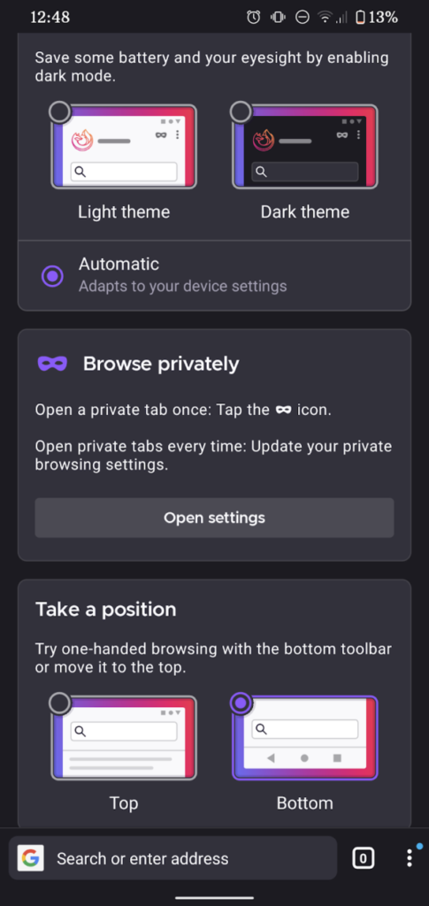
Start page shown after first upgrading to Firefox Daylight including options for URL bar location.
When you first run Firefox Daylight, you’re asked where you want the address bar, among other things.

First, the good: this latest version of Firefox for Android is fast. Blazingly fast. The privacy controls are clearer and easier to access. Having picture-in-picture mode on mobile is a nice touch, as is the new generation of tracking prevention features.

But Firefox Daylight still makes me frown. And it’s a trio of smaller things that really niggle:

1. Top or bottom toolbar… but top is a second-class citizen.

In theory, I like the idea of having the address bar and its friends at the bottom of the screen where it’s more-accessible to your thumb. I’ve even tried it, independently. in years past. But it’s too much of a mental leap for me nowadays, plus it doesn’t cleanly fit into the “scroll down and the address bar disappears” user experience that’s become commonplace.

Making bottom toolbar the default was perhaps a little radical, then, but at least Mozilla provided an option to put it back at the top. But… it’s not quite right:

Firefox Daylight's navigation controls can involve you moving from the bottom to the top of the screen in succession. Ick.
Sure, I’ll move my thumb the entire height of the screen every time I want to open a new tab.

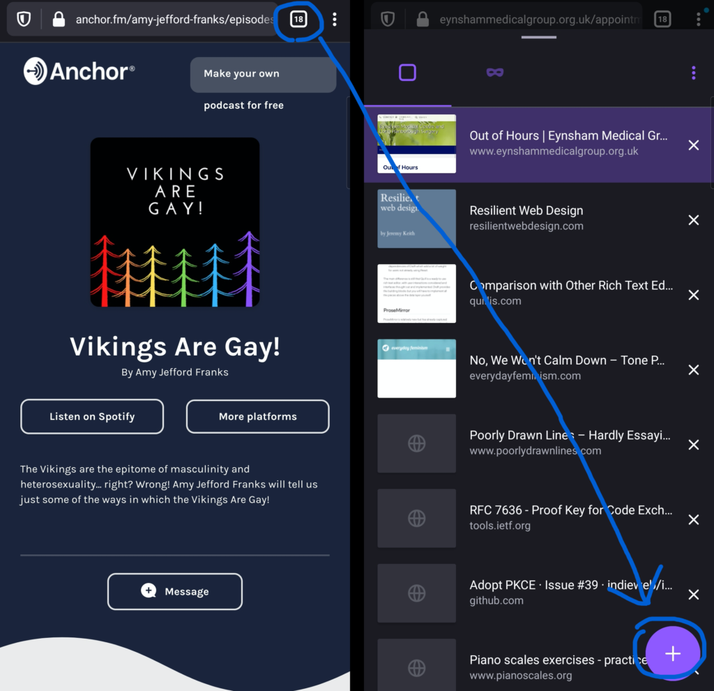
Even with the toolbar moved back to the top, some controls associated with it stay at the bottom. Want to open a new tab? You have to press the “tabs” button at the top of the screen, then the “plus” button at the bottom of the screen, then – probably – the address bar back at the top of the screen again! You’ve just covered two complete lengths of the screen to do something that used to require none. Not a satisfactory experience.

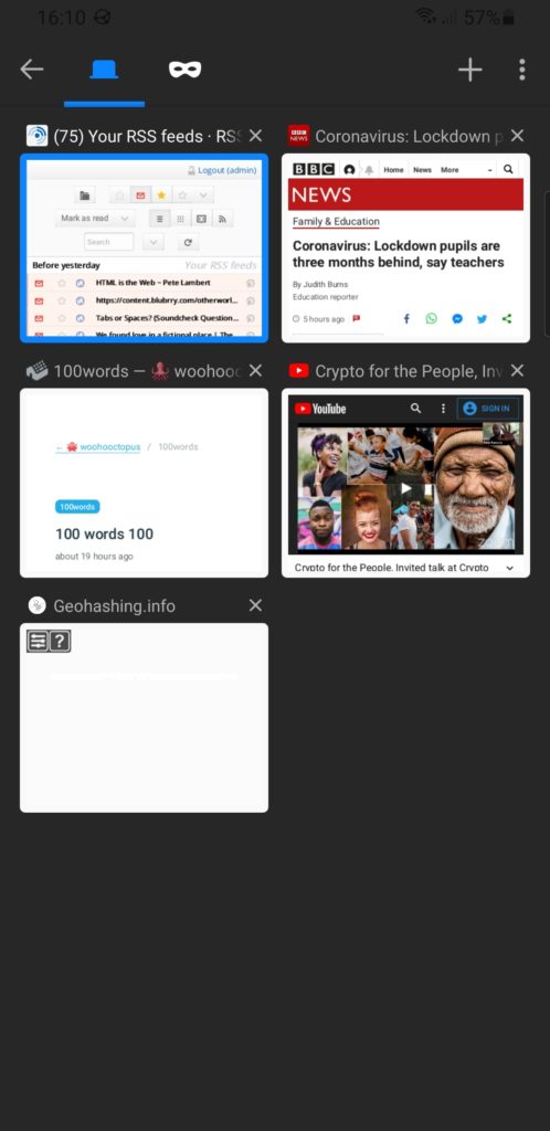
Fennec F-Droid (showing Firefox for Android's old interface) has the "add tab" button right at the top, on the toolbar. It also uses a "tiled" layout for the tabs with the oldest first, rather than a list view with the oldest last.
The old interface put the oft-used “add tab” button in the toolbar in the same place as the “tabs” button you just pressed. Much better.

2. Tab previews were more space-efficient before

You’ve probably already spotted the other change to the “current tabs” view. Previously, open tabs were shown as mini previews with their titles above. Now they’re shown as tiny (sometimes absent) icon-sized previews with their titles alongside. This allows the domain name to be shown, which is nice, but not nice enough to justify reducing the instant visual recognition the previous interface provided.

It’s not even like you can fit more tabs onto a screen. The capacity is basically the same. You’re just making smaller hit targets with less recognisable graphics. Plus: previously the most-recent tabs were at the bottom (close to where your thumb is, which was the justification for making the address bar default to the bottom); now they’re at the top, further adding to the distance travelled.

3. Plugin support is terrible

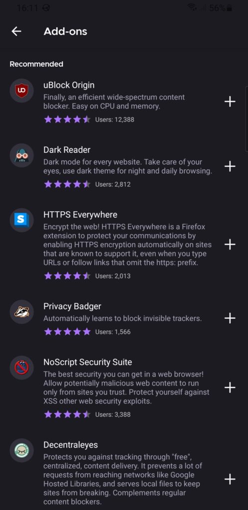
I know first hand that implementing backwards-compatibility is hard, but breaking most plugins and then providing a list of nine or so popular/recommended ones that still works isn’t a great experience.

Firefox Daylight's recommended add-ons list
No uMatrix. No Violentmonkey (or any equivalent). No Ghostery, even! Feels like surfing the Web with one hand tied behind my back.

Feels a bit like this was released before it was ready.

For the time being, I’m using Fennec F-Droid as my primary mobile browser. It picks up exactly where Firefox for Android left off, and it doesn’t break my workflow. I hope to switch back to regular Firefox for Android someday, but Daylight needs “finishing” first.

× × × ×

Microsoft exec riles Firefox faithful by telling Mozilla to embrace Chrome – CNET

This is a repost promoting content originally published elsewhere. See more things Dan's reposted.

Microsoft staffer pokes finger into Twitter beehive by saying Firefox should join Chrome, not fight it (CNET)

Debate: Does Mozilla have more influence as a Chrome rival or ally?

“Thought: It’s time for @mozilla to get down from their philosophical ivory tower. The web is dominated by Chromium, if they really *cared* about the web they would be contributing instead of building a parallel universe that’s used by less than 5%?” He made it clear the viewpoint was his personal opinion, not Microsoft’s position.

Mozilla is indeed in a sticky situation, trying to improve the web when it comes to things like openness, privacy and new standards. That mission is harder with declining influence, though, and Firefox now accounts for 5 percent of web usage, according to analytics firm StatCounter. But without independent efforts like Firefox, and to an extent Apple’s Safari, the web will stop being an independent software foundation and become whatever Google says it is.

And plenty of people don’t like that one bit. Indeed, Mozilla defenders see the nonprofit’s mission as even more important with Chrome’s dominance.

“I couldn’t disagree with you more. It precisely *because* Chromium has such a large marketshare that is vital for Mozilla (or anyone else) to battle for diversity,” tweeted web developer Jeremy Keith in a response. “‘Building a parallel universe’? That *is* the contribution.”

Browsers

This is a repost promoting content originally published elsewhere. See more things Dan's reposted.

by Jeremy Keith

I’ve been using Firefox as my main browser for a while now, and I can heartily recommend it. You should try it (and maybe talk to your relatives about it at Christmas). At this point, which browser you use no longer feels like it’s just about personal choice—it feels part of something bigger; it’s about the shape of the web we want.

Very much this. I’ve been using Firefox as my primary browser since I began (gradually) switching from Opera in 2005, but it’s never been more important than it is now that people know about and use Firefox. The rest of his post, which summarises the news I was talking about the other week and everything people have said since, is well-worth reading too.

We need a new movement: a movement of developers, influencers, and tech enthusiasts who loudly, proudly, use Firefox as their primary web browser. We use it on our desktops. We use it on our laptops. We use it on our phones. All of us test sites in it. Some of us write plugins for it. The bravest of us write code for it. But none of us, not one, takes it for granted.

Goodbye, EdgeHTML

This is a repost promoting content originally published elsewhere. See more things Dan's reposted.

Microsoft is officially giving up on an independent shared platform for the internet. By adopting Chromium, Microsoft hands over control of even more of online life to Google.

This may sound melodramatic, but it’s not. The “browser engines” — Chromium from Google and Gecko Quantum from Mozilla — are “inside baseball” pieces of software that actually determine a great deal of what each of us can do online. They determine core capabilities such as which content we as consumers can see, how secure we are when we watch content, and how much control we have over what websites and services can do to us. Microsoft’s decision gives Google more ability to single-handedly decide what possibilities are available to each one of us.

From a business point of view Microsoft’s decision may well make sense. Google is so close to almost complete control of the infrastructure of our online lives that it may not be profitable to continue to fight this. The interests of Microsoft’s shareholders may well be served by giving up on the freedom and choice that the internet once offered us. Google is a fierce competitor with highly talented employees and a monopolistic hold on unique assets. Google’s dominance across search, advertising, smartphones, and data capture creates a vastly tilted playing field that works against the rest of us.

From a social, civic and individual empowerment perspective ceding control of fundamental online infrastructure to a single company is terrible. This is why Mozilla exists. We compete with Google not because it’s a good business opportunity. We compete with Google because the health of the internet and online life depend on competition and choice. They depend on consumers being able to decide we want something better and to take action.

Will Microsoft’s decision make it harder for Firefox to prosper? It could. Making Google more powerful is risky on many fronts. And a big part of the answer depends on what the web developers and businesses who create services and websites do. If one product like Chromium has enough market share, then it becomes easier for web developers and businesses to decide not to worry if their services and sites work with anything other than Chromium. That’s what happened when Microsoft had a monopoly on browsers in the early 2000s before Firefox was released. And it could happen again.

If you care about what’s happening with online life today, take another look at Firefox. It’s radically better than it was 18 months ago — Firefox once again holds its own when it comes to speed and performance. Try Firefox as your default browser for a week and then decide. Making Firefox stronger won’t solve all the problems of online life — browsers are only one part of the equation. But if you find Firefox is a good product for you, then your use makes Firefox stronger. Your use helps web developers and businesses think beyond Chrome. And this helps Firefox and Mozilla make overall life on the internet better — more choice, more security options, more competition.

Scathing but well-deserved dig at Microsoft by Mozilla, following on from the Edge-switch-to-Chromium I’ve been going on about. Chris is right: more people should try Firefox (it’s been my general-purpose browser on desktop and mobile ever since Opera threw in the towel and joined the Chromium hivemind in 2013, and on-and-off plenty before then) – not just because it’s a great browser (and it is!) but also now because it’s important for the diversity and health of the Web.

(Reprinted in full under a creative commons license.)

Your RSS is grass: Mozilla euthanizes feed reader, Atom code in Firefox browser, claims it’s old and unloved

This is a repost promoting content originally published elsewhere. See more things Dan's reposted.

When Firefox 64 arrives in December, support for RSS, the once celebrated content syndication scheme, and its sibling, Atom, will be missing.

“After considering the maintenance, performance and security costs of the feed preview and subscription features in Firefox, we’ve concluded that it is no longer sustainable to keep feed support in the core of the product,” said Gijs Kruitbosch, a software engineer who works on Firefox at Mozilla, in a blog post on Thursday.

Not a great sign, but understandable. Live Bookmarks was never strong enough to be a full-featured RSS reader, and I don’t know about you but I haven’t really made use of bookmarks for a good few years, let alone “live” bookmarks, but the media are likely to see this (as El Reg does, in the article) as another nail in the coffin of one of the best syndication mechanisms the Web ever came up with.

Note #8034

Investigating a possible new bug in @firefox 57: after installing the service worker, going to an uncached page on a site like adactio.com (@adactio), danq.me, or 3r.org.uk results in a “NetworkError” and the offline page, even though the connection is fine…

Favourite Firefox Four Feature FAIL!

I’ve been playing about with the beta of Firefox 4 for a little while now, and I wanted to tell you about a feature that I thought was absolutely amazing, until it turned out that it was a bug and they “fixed” it. This feature is made possible by a handful of other new tools that are coming into Firefox in this new version:

  1. App tabs. You’re now able to turn tabs into small tabs which sit at the left-hand side.
  2. Tab groups. You can “group” your tabs and display only a subset of them at once.

I run with a lot of tabs open most of the time. Not so many as Ruth, but a good number. These can be divided into three major categories: those related to my work with SmartData, those related to my work with Three Rings, and those related to my freelance work and my personal websurfing. Since an early beta of Firefox 4, I discovered that I could do this:

  1. Group all of my SmartData/Three Rings/personal tabs into tab groups, accordingly.
  2. This includes the webmail tab for each of them, which is kept as an App Tab – so my SmartData webmail is an app tab which is in the SmartData tab group, for example.
  3. Then – and here’s the awesome bit – a can switch between my tab groups just be clicking on the relevant app tab!

Time to do some SmartData work? I just click the SmartData webmail app tab and there’s my e-mail, and the rest of the non-app tabs transform magically into my work-related tabs: development versions of the sites I’m working on, relevant APIs, and so on. Time to clock off for lunch? I click on the personal webmail tab, look at my e-mail, and magically all of the other tabs are my personal ones – my RSS feeds, the forum threads I’m following, and so on. Doing some Three Rings work in the evening? I can click the Three Rings webmail tab and check my mail, and simultaneously the browser presents me with the Three Rings related tabs I was working on last, too. It was fabulous.

Firefox 4 app tabs

The other day, Firefox 4 beta 7 was released, and this functionality didn’t work any more. Now app tabs aren’t associated with particular tab groups any longer: they’re associated with all tab groups. This means:

  • I can’t use the app tabs to switch tab group, because they don’t belong to tab groups any more, and
  • I can’t fix this by making them into regular tabs, because then they won’t all be shown.

I’m painfully familiar about what happens when people treat a bug as a feature. Some years ago, a University Nightline were using a bug in Three Rings  as a feature, and were outraged when we “fixed” it. Eventually, we had to provide a workaround so that they could continue to use the buggy behaviour that they’d come to depend upon.

So please, Mozilla – help me out here and at least make an about:config option that I can switch on to make app tabs belong to specific tab groups again (but still be always visible). It was such an awesome feature, and it saddens me that you made it by mistake.

×

My Firefox Window

It didn’t occur to me until somebody looked over my shoulder and commented on it, today, that I actually have an at-least slightly unusual layout for my Firefox window. I thought I’d share with you all the thinking behind the particular collection of add-ons and tweaks that go into my day-to-day web browsing:

I’m a big fan of maximising the amount of screen real estate available for browsing, minimising the chrome that surrounds it. That’s why I use the LittleFox theme. It’s not the prettiest theme around, but it’s tiny, simplistic, and works with every version of Firefox I’ve ever thrown it at. It saves space by reducing the size of icons and excess space around tabs and buttons, and it does a great job of it.

To save even more precious vertical space (and because I’m generally running at high screen resolutions, and can spare the horizontal screen space), I combine my menu bar, toolbar, address bar and search boxes into a single toolbar. You can do this by right-clicking on the menu bar and clicking “Customize…” I drop the refresh, stop, and home buttons. I never pressed refresh nor stop anyway, always using the shortcut keys (F5 or CTRL-R, and ESC, respectively), and I my homepage is about:blank. On computers running at lower screen resolutions I’ve previously used the Searchbar Autosizer add-on to tuck-away the search box when I’m not using it, but nowadays I rarely bother.

I frequently find myself with dozens of tabs open, and I loathe it when tabbed applications force me to “scroll” left and right through my tabs (I’d rather my tabs just got narrower and narrower, until only the favicon remains), so I use about:config to change the browser.tabs.tabMinWidth setting to 0, which, after you’ve restarted your browser, changes this behaviour.

In addition to the add-ons that can be seen in my status bar – ColorZilla (in the bottom-left, so not visible in the screenshot above), Adblock Plus, FireGPG, Firebug (and a few extensions), Google Reader Watcher, Greasemonkey, HTML Validator, NoScript (with noscript.firstRunRedirection set to false, to stop it’s nagging), and ShowIP, I use one further add-on to tidy up my “bookmarks toolbar”.

The Status Buttons add-on gives you the capability to drag-drop any other user interface component into the right-hand side of the status bar: I use this to move the entire contents of the Bookmarks Toolbar down into the status bar, tucked out of the way. I remove the titles from most of the bookmarks (I can identify these, my most-frequently-used sites, by their favicons), adding them only where there’d otherwise be ambiguity as to the purpose of the icon.

All of these tweaks give me a huge browsing space that works the way that I want it to. I’m a heavy user of keyboard shortcuts – I pretty much only use the mouse to click hyperlinks and the buttons in the status bar – so this kind of layout suits me very well. One of the great things about Firefox is it’s flexibility: that you can make these kinds of tweaks so easily. And hopefully if you’re a similar kind of power user you’ll take some of these tips and be able to make use of them, too.

×

The Latest Stupidity From The Internet Explorer Team

Have you seen the latest stupidity that the Windows Internet Explorer team have come up with? Ten Grand Is Buried Here.

The idea is that they encourage you to give up whatever browser you’re using (assuming it’s not Internet Explorer 8), calling it names (like “old Firefox” if you’re using Firefox, “boring Safari” if you’re using Safari, “tarnished Chrome” if you’re using Chrome, and… “that browser” if you’re using Opera) and upgrade to Internet Explorer 8, and they’ll be giving out clues on their Twitter feed about some secret website that’ll only work in IE8 at which you can register and win $10,000AUS (yes, this is an Australian competition).

After looking at the site in Firefox, Safari, Chrome, and Opera, I thought I’d give it a go in Internet Explorer 8. But it didn’t work – it mis-detected my installation of IE8 as being IE7 (no, I didn’t have Compatability Mode on).

In the end, though, I just used User Agent Switcher to make my copy of Firefox pretend to be Internet Explorer 8. Then it worked. So basically, all that I’ve learned is that Firefox does a better job of everything that Internet Explorer does, including viewing websites designed to only work in Internet Explorer. Good work, Microsoft. Have a slow clap.

Firefox 3 “Download Day”

Download Day 2008

Downloaded your copy of Mozilla Firefox 3 yet to help them make the world record? I’ve been using Firefox 3 since the early betas and I’ve got no qualms about recommending it wholeheartedly. The awsomebar is simply that: awesome, the speed and memory usage have become far better than the previous version, and the care and attention that have gone into the little things – like the fact that it now asks you if you want to save passwords after you’ve seen if they were correct, not before – really do make this the best web browser I’ve ever used.

Go download it already.