There’s a lot of talk lately about scam texts pretending to be from Royal Mail (or other parcel carriers), tricking victims into paying a fee to receive a parcel. Hearing of recent experiences with this sort of scam inspired me to dissect the approach the scammers use… and to come up with ways in which the scams could be more-effective.
Let’s take a look at a scam:
Anatomy of a Parcel Fee Scam
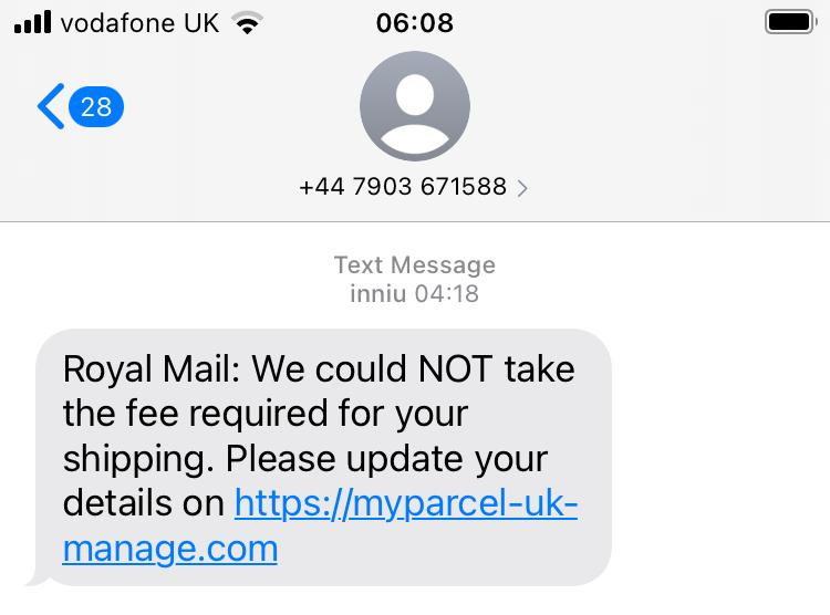
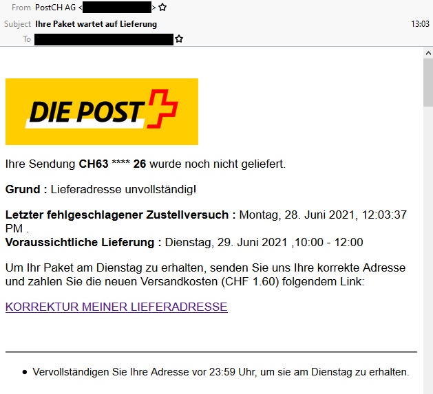
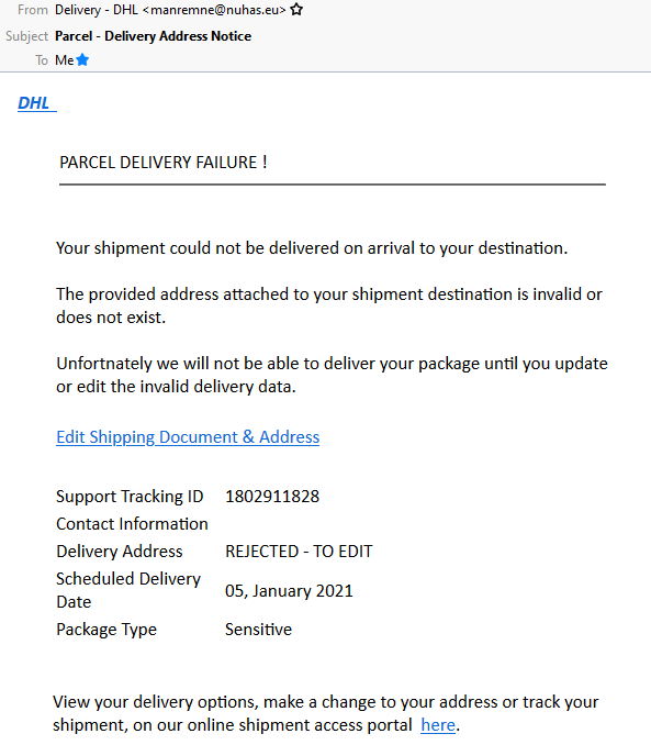
A parcel fee scam begins with a phishing email or, increasingly, text message, telling the victim that they need to pay a fee in order to receive a parcel and directing them to a website to make payment.
If the victim clicks the link, they’ll likely see a fake website belonging to the company who allegedly have the victim’s parcel. They’ll be asked for personal and payment information, after which they’ll be told that their parcel is scheduled for redelivery. They’ll often be redirected back to the real website as a “convincer”. The redirects often go through a third-party redirect site so that your browser’s “Referer:” header doesn’t give away the scam to the legitimate company (if it did, they could e.g. detect it and show you a “you just got scammed by somebody pretending to be us” warning!).
Many scammers also set a cookie so they’ll recognise you if you come back: if you return to the scam site with this cookie in-place, they’ll redirect you instantly to the genuine company’s site. This means that if you later try to follow the link in the text message you’ll see e.g. the real Royal Mail website, which makes it harder for you to subsequently identify that you’ve been scammed. (Some use other fingerprinting methods to detect that you’ve been victimised already, such as your IP address.)
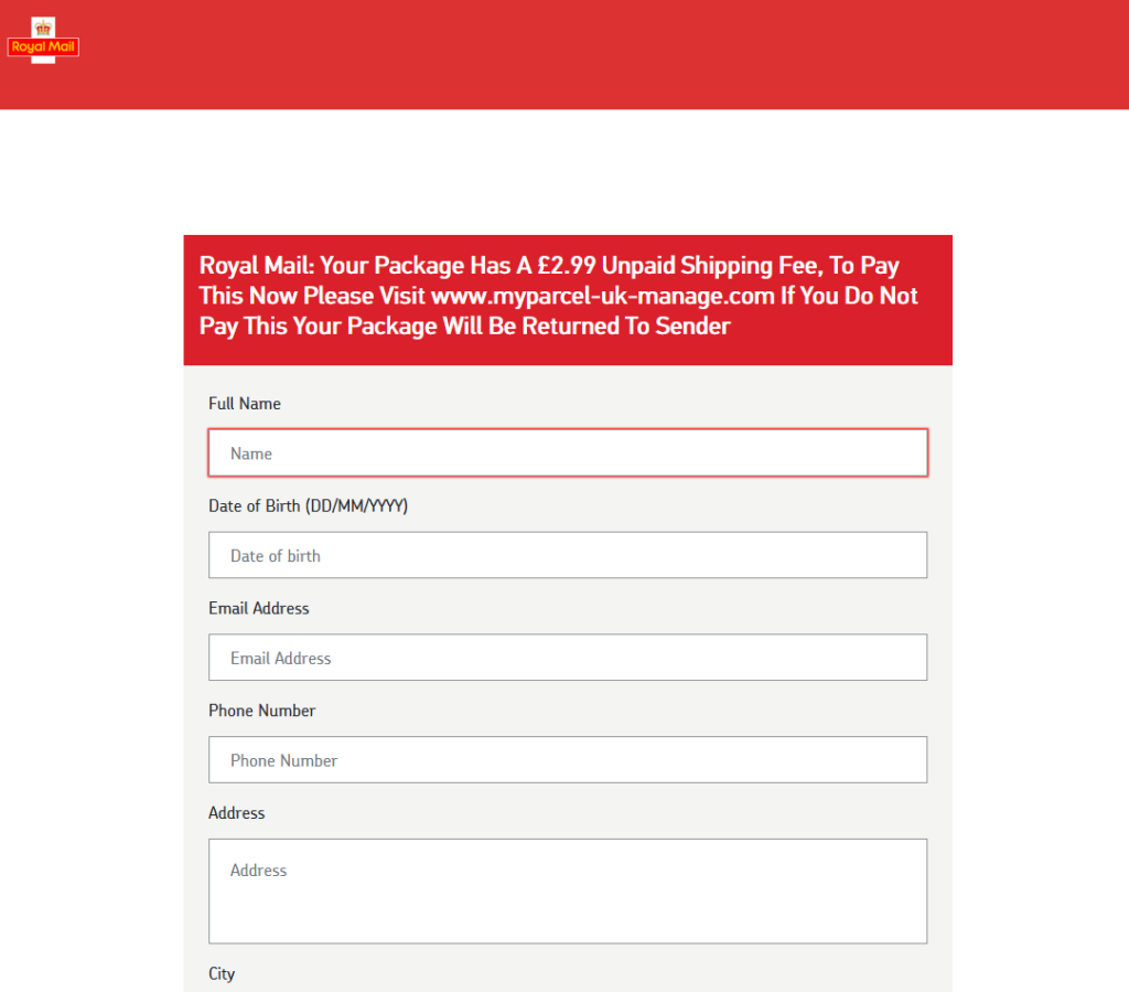
Typically, no payment is actually taken. Often, the card number and address aren’t even validated, and virtually any input is accepted. That’s because this kind of scam isn’t about tricking you into giving the scammers money. It’s about harvesting personal information for use in a second phase.
Once the scammers have your personal information they’ll either use your card details to make purchases of hard-to-trace, easy-to-resell goods like gift cards or, increasingly, use all of the information you’ve provided in order to perform an even more-insidious trick. Knowing your personal, contact and bank details, they can convincingly call you and pretend to be your bank! Some sophisticated fraudsters will even highlight the parcel fee scam you just fell victim to in order to gain your trust and persuade you that they’re genuinely your bank, which is a very powerful convincer.

Why does the scam work?
A scam like the one described above works because each individual part of it is individually convincing, but the parts are delivered separately.
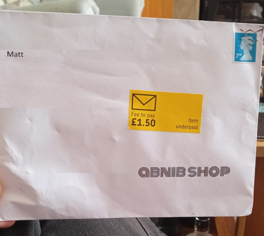
Being asked to pay a fee to receive a parcel is a pretty common experience, and getting texts from carriers is too. A lot of people are getting a lot more stuff mail-ordered than they used to, right now, and that – along with the Brexit-related import duties that one in ten people have had to pay – means that it seems perfectly reasonable to get a message telling you that you need to pay a fee to get your parcel.
Similarly, I’m sure we’ve all been called by our bank to discuss a suspicious transaction. (When this happens to me, I’ve always said that I’ll call them back on the number on my card or my bank statements rather than assume that they are who they claim to be. When I first started doing this, 20 years ago, this sometimes frustrated bank policies, but nowadays they’re more accepting.) Most people though will willingly believe the legitimacy of a person who calls them up, addresses them by name and claims to be from their bank.
Separating the scam into two separate parts, each of which is individually unsuspicious, makes it more effective at tricking the victim than simpler phishing scams.

Anybody could fall for this. It’s not about being smart and savvy; lots of perfectly smart people become victims of this kind of fraud. Certainly, there are things you can do (like learning to tell a legitimate domain name from a probably-fake one and only ever talking to your bank if you were the one who initiated the call), but we’re all vulnerable sometimes. If you were expecting a delivery, and it’s really important, and you’re tired, and you’re distracted, and then a text message comes along pressuring you to pay the fee right now… anybody could make a mistake.
The scammers aren’t really trying
But do you know what: these scammers aren’t even trying that hard. There’s so much that they could be doing so much “better”. I’m going to tell you, off the top of my head, four things that they could do to amplify their effect.
Wait a minute: am I helping criminals by writing this? No, I don’t think so. I believe that these are things that they’ve thought of already. Right now, it’s just not worthwhile for them to pull out all the stops… they can make plenty of money conning people using their current methods: they don’t need to invest the time and energy into doing their shitty job better.
But if there’s one thing we’ve learned it’s that digital security is an arms race. If people stop falling for these scams, the criminals will up their game. And they don’t need me to tell them how.

I’m a big fan of trying to make better attacks. Even just looking at site-spoofing scams I’ve been doing this for a couple of decades. Because if we can collectively get ahead of security threats, we’re better able to defend against them.
So no: this isn’t about informing criminals – it’s about understanding what they might do next.
How could the scammers be more effective?
I’d like to highlight four ways that this scam could be made more-effective. Again, this isn’t about helping the criminals: it’s about thinking about and planning for what tomorrow’s attacks might look like.
1. SMS Spoofing
Most of these text messages appear to come from random mobile numbers, which can be an red flag. But it’s distressingly easy to send a text message “from” any other number or even from a short string of text. Imagine how much more-convincing one of these messages would be if it appeared to come from e.g. “Royal Mail” instead?
A further step would be to spoof the message to appear to come from the automated redelivery line of the target courier. Many parcel delivery services have automated lines you can call, provide the code from the card dropped through your door, and arrange redelivery: making the message appear to come from such a number means that any victim who calls it will hear a genuine message from the real company, although they won’t be able to use it because they don’t have a real redelivery card. Plus: any efforts to search for the number online (as is done automatically by scam-detection apps) will likely be confused by the appearance of the legitimate data.
SMS spoofing is getting harder as the underlying industry that supports bulk senders tries to clean up its image, but it’s still easy enough to be a real (yet underexploited) threat.
2. Attention to detail
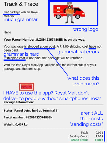
Scammers routinely show a lack of attention to detail that can help give the game away to an attentive target. Spelling and grammar mistakes are commonplace, and compared to legitimate messages the scams generally have suspicious features like providing few options for arranging redelivery or asking for unusual personal information.
They’re getting a lot better at this already: text messages and emails this year are far more-convincing, from an attention-to-detail perspective, than they were three years ago. And because improvements to the scam can be made iteratively, it’s probably already close to the “sweet spot” at the intersection of effort required versus efficacy. But the bad guys’ attention to detail will only grow and in future they’ll develop richer, more-believable designs and content based on whatever success metrics they collect.
3. Tracking tokens
On which note: it amazes me that these SMS scams don’t yet seem to include any identifier unique to the victim. Spam
email does this all the time, but a typical parcel scam text directs you to a simple web address like https://royalmail.co.uk.scamsite.com/. A smarter scam could
send you to e.g. https://royalmail.co.uk.scamsite.com/YRC0D35 and/or tell you that your parcel tracking number was e.g. YRC0D35.
Not only would this be more-convincing for anybody who’s familiar with the kind of messages that are legitimately left by couriers, it would also facilitate the gathering of a great deal of additional metrics which scammers could use to improve their operation. For example:
- How many, and which, potential victims clicked the link? Knowing this helps plan future scams, or for follow-up attacks.
- Pre-filling personal data, even just a phone number, acts as an additional convincer, or else needn’t be asked at all.
- Multivariate testing can determine which approaches work best: show half the victims one form and half the victims another and use the results as research for future evolution.
These are exactly the same techniques that legitimate marketers (and email spammers) use to track engagement with emails and advertisements. It stands to reason that any sufficiently-large digital fraud operation could benefit from them too.
4. Partial submission analysis
I’ve reverse-engineered quite a few parcel scams to work out what they’re recording, and the summary is: not nearly as much as they could be. A typical parcel scam site will ask for your personal details and payment information, and when you submit it will send that information to the attacker. But they could do so much more…
I’ve spoken to potential victims, for example, who got part way through filling the form before it felt suspicious enough that they stopped. Coupled with tracking tokens, even this partial data would have value to a determined fraudster. Suppose the victim only gets as far as typing their name and address… the scammer now has enough information to convincingly call them up, pretending to be the courier, ask for them by name and address, and con them out of their card details over the phone. Every single piece of metadata has value; even just having the victim’s name is a powerful convincer for a future text message campaign.
Summary
There’s so much more that parcel fee SMS scammers could be doing to increase the effectiveness of their campaigns, such as the techniques described above. It’s not rocket science, and they’ll definitely have considered them (they won’t learn anything new from this post!)… but if we can start thinking about them it’ll help us prepare to educate people about how to protect themselves tomorrow, as well as today.