Window Tax

Duration

Podcast Version

This post is also available as a podcast. Listen here, download for later, or subscribe wherever you consume podcasts.

…in England and Wales

From 1696 until 1851 a “window tax” was imposed in England and Wales1. Sort-of a precursor to property taxes like council tax today, it used an estimate of the value of a property as an indicator of the wealth of its occupants: counting the number of windows provided the mechanism for assessment.

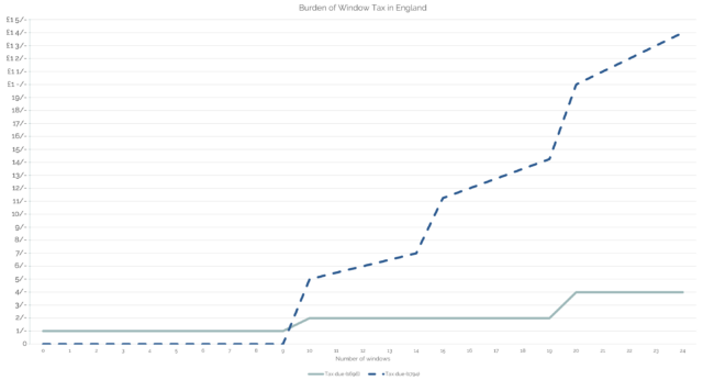
Graph showing the burden of window tax in 1696 and 1794. In the former year a flat rate of 1 shiling was charged, doubling for a property when it reached 10 and 20 windows respectively. In the latter year charging began at 10 windows and the price per-window jumped up at 15 at 20 windows. Both approaches result in a "stepped" increase.
The hardest thing about retrospectively graphing the cost of window tax is thinking in “old money”2.
Window tax replaced an earlier hearth tax, following the ascension to the English throne of Mary II and William III of Orange. Hearth tax had come from a similar philosophy: that you can approximate the wealth of a household by some aspect of their home, in this case the number of stoves and fireplaces they had.

(A particular problem with window tax as enacted is that its “stepping”, which was designed to weigh particularly heavily on the rich with their large houses, was that it similarly weighed heavily on large multi-tenant buildings, whose landlord would pass on those disproportionate costs to their tenants!)

1703 woodcut showing King William III and Queen Mary II.
It’d be temping to blame William and Mary for the window tax, but the reality is more-complex and reflects late renaissance British attitudes to the limits of state authority.

Why a window tax? There’s two ways to answer that:

  • A window tax – and a hearth tax, for that matter – can be assessed without the necessity of the taxpayer to disclose their income. Income tax, nowadays the most-significant form of taxation in the UK, was long considered to be too much of an invasion upon personal privacy3.
  • But compared to a hearth tax, it can be validated from outside the property. Counting people in a property in an era before solid recordkeeping is hard. Counting hearths is easier… so long as you can get inside the property. Counting windows is easier still and can be done completely from the outside!
Dan points to a bricked-up first storey window on a stone building used by a funeral services company.
If you’re in Britain, finding older buildings with windows bricked-up to save on tax is pretty easy. I took a break from writing this post, walked for three minutes, and found one.4

…in the Netherlands

I recently got back from a trip to Amsterdam to meet my new work team and get to know them better.

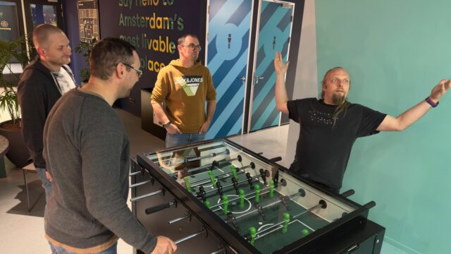
Dan, by a game of table football, throws his arms into the air as if in self-celebration.
There were a few work-related/adjacent activities. But also a table football tournament, among other bits of fun.

One of the things I learned while on this trip was that the Netherlands, too, had a window tax for a time. But there’s an interesting difference.

The Dutch window tax was introduced during the French occupation, under Napoleon, in 1810 – already much later than its equivalent in England – and continued even after he was ousted and well into the late 19th century. And that leads to a really interesting social side-effect.

Dan, with four other men, sit in the back of a covered boat on a canal.
My brief interest in 19th century Dutch tax policy was piqued during my team’s boat tour.

Glass manufacturing technique evolved rapidly during the 19th century. At the start of the century, when England’s window tax law was in full swing, glass panes were typically made using the crown glass process: a bauble of glass would be spun until centrifugal force stretched it out into a wide disk, getting thinner towards its edge.

The very edge pieces of crown glass were cut into triangles for use in leaded glass, with any useless offcuts recycled; the next-innermost pieces were the thinnest and clearest, and fetched the highest price for use as windows. By the time you reached the centre you had a thick, often-swirly piece of glass that couldn’t be sold for a high price: you still sometimes find this kind among the leaded glass in particularly old pub windows5.

Multi-pane window with distinctive crown glass "circles".
They’re getting rarer, but I’ve lived in houses with small original panes of crown glass like these!

As the 19th century wore on, cylinder glass became the norm. This is produced by making an iron cylinder as a mould, blowing glass into it, and then carefully un-rolling the cylinder while the glass is still viscous to form a reasonably-even and flat sheet. Compared to spun glass, this approach makes it possible to make larger window panes. Also: it scales more-easily to industrialisation, reducing the cost of glass.

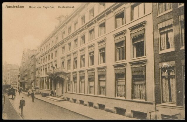
The Dutch window tax survived into the era of large plate glass, and this lead to an interesting phenomenon: rather than have lots of windows, which would be expensive, late-19th century buildings were constructed with windows that were as large as possible to maximise the ratio of the amount of light they let in to the amount of tax for which they were liable6.

Hotel des Pays-Bas, Nieuwe Doelenstraat 11 (1910 photo), showing large windows.
Look at the size of those windows! If you’re limited in how many you can have, but you’ve got the technology, you’re going to make them as large as you possibly can!

That’s an architectural trend you can still see in Amsterdam (and elsewhere in Holland) today. Even where buildings are renovated or newly-constructed, they tend – or are required by preservation orders – to mirror the buildings they neighbour, which influences architectural decisions.

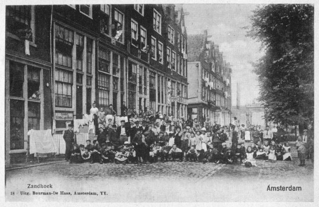
Pre-WWI Neighbourhood gathering in Amsterdam, with enormous windows (especially on the ground floor) visible.
Notice how each building has only between one and three windows on the ground floor, letting as much light in while minimising the tax burden.

It’s really interesting to see the different architectural choices produced in two different cities as a side-effect of fundamentally the same economic choice, resulting from slightly different starting conditions in each (a half-century gap and a land shortage in one). While Britain got fewer windows, the Netherlands got bigger windows, and you can still see the effects today.

…and social status

But there’s another interesting this about this relatively-recent window tax, and that’s about how people broadcast their social status.

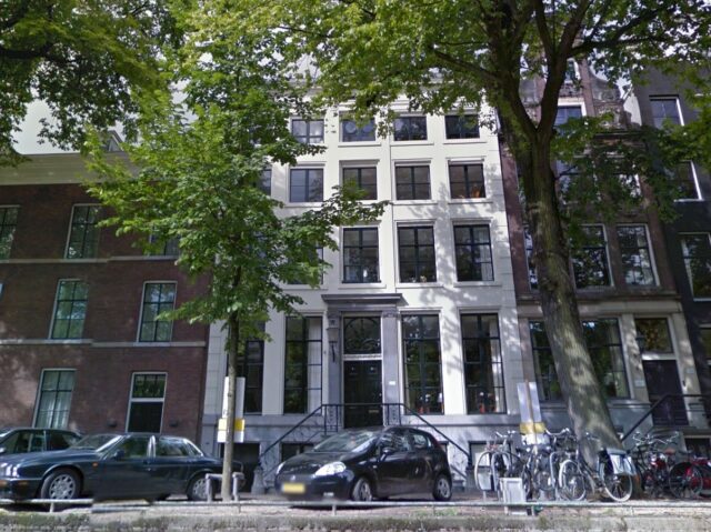
Modern photo, taken from the canal, showing a tall white building in Amsterdam with large windows on the ground floor and also basement level, and an ornamental window above the front door. Photo from Google Street View.
This Google Street Canal (?) View photo shows a house on Keizersgracht, one of the richest parts of Amsterdam. Note the superfluous decorative window above the front door and the basement-level windows for the servants’ quarters.

In some of the traditionally-wealthiest parts of Amsterdam, you’ll find houses with more windows than you’d expect. In the photo above, notice:

  • How the window density of the central white building is about twice that of the similar-width building on the left,
  • That a mostly-decorative window has been installed above the front door, adorned with a decorative leaded glass pattern, and
  • At the bottom of the building, below the front door (up the stairs), that a full set of windows has been provided even for the below-ground servants quarters!

When it was first constructed, this building may have been considered especially ostentatious. Its original owners deliberately requested that it be built in a way that would attract a higher tax bill than would generally have been considered necessary in the city, at the time. The house stood out as a status symbol, like shiny jewellery, fashionable clothes, or a classy car might today.

Cheerful white elderly man listening to music through headphones that are clearly too large for him.
I originally wanted to insert a picture here that represented how one might show status through fashion today. But then I remembered I don’t know anything about fashion7. But somehow my stock image search suggested this photo, and I love it so much I’m using it anyway. You’re welcome.
How did we go wrong? A century and a bit ago the super-wealthy used to demonstrate their status by showing off how much tax they can pay. Nowadays, they generally seem more-preoccupied with getting away with paying as little as possible, or none8.

Can we bring back 19th-century Dutch social status telegraphing, please?9

Footnotes

1 Following the Treaty of Union the window tax was also applied in Scotland, but Scotland’s a whole other legal beast that I’m going to quietly ignore for now because it doesn’t really have any bearing on this story.

2 The second-hardest thing about retrospectively graphing the cost of window tax is finding a reliable source for the rates. I used an archived copy of a guru site about Wolverhampton history.

3 Even relatively-recently, the argument that income tax might be repealed as incompatible with British values shows up in political debate. Towards the end of the 19th century, Prime Ministers Disraeli and Gladstone could be relied upon to agree with one another on almost nothing, but both men spoke at length about their desire to abolish income tax, even setting out plans to phase it out… before having to cancel those plans when some financial emergency showed up. Turns out it’s hard to get rid of.

4 There are, of course, other potential reasons for bricked-up windows – even aesthetic ones – but a bit of a giveaway is if the bricking-up reduces the number of original windows to 6, 9, 14 or 19, which are thesholds at which the savings gained by bricking-up are the greatest.

5 You’ve probably heard about how glass remains partially-liquid forever and how this explains why old windows are often thicker at the bottom. You’ve probably also already had it explained to you that this is complete bullshit. I only mention it here to preempt any discussion in the comments.

6 This is even more-pronounced in cities like Amsterdam where a width/frontage tax forced buildings to be as tall and narrow and as close to their neighbours as possible, further limiting opportunities for access to natural light.

7 Yet I’m willing to learn a surprising amount about Dutch tax law of the 19th century. Go figure.

8 Obligatory Pet Shop Boys video link. Can that be a thing please?

9 But definitely not 17th-century Dutch social status telegraphing, please. That shit was bonkers.

× × × × × × × × × ×

Bash+Batch In One File

Today I wanted to write a script that I could execute from both *nix (using Bash or a similar shell) and on Windows (from a command prompt, i.e. a batch file). I found Max Norin’s solution which works, but has a few limitations, e.g. when run it outputs either the word “off” when run in *nix or the word “goto” when run on Windows. There’s got to be a sneaky solution, right?

Here’s my improved version:

 1
 2
 3
 4
 5
 6
 7
 8
 9
10
11
12
@goto(){
  # Linux code here
  uname -o
}

@goto $@
exit

:(){
@echo off
rem Windows script here
echo %OS%

Mine exploits the fact that batch files can prefix commands with @ to suppress outputting them as they execute. So @goto can be a valid function name in bash/zsh etc. but is interpreted as a literal goto command in a Windows Command Prompt. This allows me to move the echo off command – which only has meaning to Windows – into the Windows section of the script and suppress it with @.

The file above can be saved as e.g. myfile.cmd and will execute in a Windows Command Prompt (or in MS-DOS) or your favourite *nix OS. Works in MacOS/BSD too, although obviously any more-sophisticated script is going to have to start working around the differences between GNU and non-GNU versions of core utilities, which is always a bit of a pain! Won’t work in sh because you can’t define functions like that.

But the short of it is you can run this on a stock *nix OS and get:

$ ./myfile.cmd
GNU/Linux

And you can run it on Windows and get:

> .\myfile.cmd
Windows_NT

You can’t put a shebang at the top because Windows hates it, but there might be a solution using PowerShell scripts (which use hashes for comments: that’s worth thinking about!). In any case: if the interpreter strictly matters you’ll probably want to shell to it on line 3 with e.g. bash -c.

Why would you want such a thing? I’m not sure. But there is is, if you do.

Post-It Minesweeper

Remember Minesweeper? It’s probably been forever since you played, so go have a game online now. And there went your afternoon.

A game of Microsoft Minesweeper in progress.
This is actually a pretty tough move.

My geek-crush Ben Foxall posted on Twitter on Monday morning to share that he’d had a moment of fun nostalgia when he’d come into the office to discover that somebody in his team had covered his monitor with two layers of Post-It notes. The bottom layer contained numbers – and bombs! – to represent the result of a Minesweeper board, and the upper layer ‘covered’ them so that individual Post-Its could be removed to reveal what lay beneath. Awesome.

Ben Foxall discovers Post-It Minesweeper
Unlike most computerised implementations of Minesweeper, the first move isn’t guaranteed to be safe. Tread carefully…

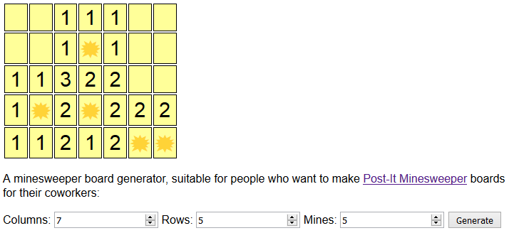
Not to be outdone, I hunted around my office and found some mini-Post-Its. Being smaller meant that I could fit more of them onto a monitor and thus make a more-sophisticated (and more-challenging!) play space. But how to generate the board? Sure: I could do it by hand, but that doesn’t seem very elegant at all – plus, humans make really bad random number generators! I didn’t need quantum-tunnelling-seeded Minesweeper (yes, that’s a thing) levels of entropy, sure, but it’d still be nice to outsource the heavy lifting to a computer, right?

Screenshot of my Post-It Minesweeper board generator.
Yes, I’m quite aware of the irony of using a computer to generate a paper-based version of a computer game, why do you ask?

So naturally, I wrote a program to do it for me. Want to see? It’s at danq.me/minesweeper. Just line up some Post-Its on a co-worker’s monitor to work out how many you can fit across it in each dimension (I found that I could get 6 × 4 standard-sized Post-Its but 7 × 5 or even 8 × 5 mini-sized Post-Its very comfortably onto one of the typical widescreen monitors in my office), decide how many mines you want, and click Generate. Don’t like the board you get? Click it again!

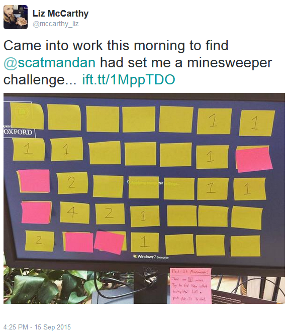
Liz McCarthy tweets about her experience of being given a Post-It Minesweeper game to play.
I set up the first game on my colleague Liz’s computer, before she came in this morning.

And because I was looking for a fresh excuse to play with Periscope, I broadcast the first game I set up live to the Internet. In the end, 66 people ended up watching some or all of a paper-based game of Minesweeper played by my colleague Liz, including moments of cheering her on and, in one weird moment, despair at the revelation that she was married. The internet’s strange, yo.

Anyway: in case you missed the Periscope broadcast, I’ve put it on YouTube. Sorry about the portrait-orientation filming: I think it’s awful, too, but it’s a Periscope thing and I haven’t installed the new update that fixes it yet.

Now go set up a game of Post-It Minesweeper for a friend or co-worker.

× ×

The Good, The Bad, And The Ugly Of System Tray Icons

What the fuck is that icon for? Despite the best efforts of icon designer to (apparently) make clear and comprehensible icons, and by computer users to learn and understand them, I still remain perplexed from time to time by the plethora of icons in my system tray (sorry, I mean Taskbar Notification Area). Let’s take a tour:

This is a good start. It’s a clear, obvious icon that just screams out what it is and what it does. It’s blatantly the volume control. If it’s got more lines, the speakers are louder. No lines, and it’s muted. It’s also a lot clearer than the standard volume icon that came with earlier versions of Windows, which tried too much to look like a speaker, and not like a representation of a speaker. There’s a reason that speed camera signs in the UK look like old-fashioned cameras: it’s about the representation (can you imagine an iconic form that actually represented a speed camera – how stupid would that look?).

And now it all goes rapidly downhill. What the fuck does this icon mean? It’s a monitor with a growth in the top-left corner which I’m lead to believe is supposed to be an Ethernet cable. Seriously, Microsoft? You almost had this one right in earlier versions of Windows, when you had the “two computers with a line between them” metaphor, which is a more clear representation of network than this is. And when it’s connecting? A pair of spinning balls! What the fuck does that mean? It means “something’s happening” without giving any clue as to whether my pen drive is mounting or my toast is nearly done.

Oh, it’s a flag. I guess this must be the icon I click on to, I don’t know, help aircraft land on my computer. While I applaud Microsoft’s efforts to make everyday users know about the maintenance tasks they ought to be doing on their computer (like backups), this icon doesn’t scream out “DO SOMETHING OR YOU MIGHT LOSE ALL YOUR DATA!” to me. Then again, my work puts me in contact with people who ignore even their I.T. departments telling them about the importance of backups, so this might be a losing battle anyway. That’s probably why Windows is waving the white flag.

As a side note, am I the only one who’s noticed that the Windows 7 taskbar and the new standard notification icons, above, are starting to bear a remarkable similarity to MacOS (at least, left in their default configuration), with it’s Dock and Notifcation Area. Unfortunately, Microsoft didn’t take the time to tell every software manufacturer that white is the new colourful, so only Windows’ own icons appear in shiny white: everything else looks just like it used to. Like these:

This is the icon for my wireless network device. Usually I don’t bother with these, but this this particular app is the first of it’s kind that I’ve actually found to be better than Windows’ own (excellent) Wireless Zero Configuration tool. Unfortunately, it’s icon leaves a little to be desired. Thanks to mobile phones, everybody and their grandmother now understands the universal icon for “signal strength” is a series of bars ascending like steps. Except for NetGear, apparently, who believe that the best icon would be a radioactive laptop whose screen changes colour from green through yellow to red to represent signal strength. I hope none of their customers are colourblind.

I like my keyboards (and mice) big and feature rich: I’ve got big hands and I have no problem memorising what functions and macros I’ve mapped to a dozen or so hotkeys. That’s why, as well as having the best mouse in the world, I have a related keyboard with about a million buttons. This icon, which depicts a keyboard and mouse, links to the applet that configures those hotkeys, and provides notifications about my mouse’s battery level.

It’s not the clearest icon in the world – how about a little more contrast between the mouse and keyboard there? – but it’s perfectly functional.

Obvious Bluetooth icon is obvious. Kthxbye.

Although I do wonder why the Bluesoleil driver stack – which I tend to use rather than the Microsoft one or the one provided by my chipset manufacturer, because of it’s fantastic support for just-about-everything from Wiimotes to OBEX/OPP – uses an icon with a very-slightly-different Blue, which only irritates you if you, like me, frequently have multiple Bluetooth dongles installed with different stacks attached to each. I guess that’s just me.

You can almost see where Microsoft is trying to go with the safely remove hardware icon, but it just doesn’t seem right. It only shows a USB plug, yet (for some unknown reason) provides features to unmount, for example, my internal SATA hard drives. And the little green “tick” icon suggests that this icon back-ends onto an application which is “doing fine” and doesn’t need my attention. So, as always, I happily yank out my pen drive without unmounting it, and it always turns out fine because I’m not the kind of idiot that does so while I’m copying files to and from it.

Ah, Sandboxie, how I love you. This icon’s actually pretty good, and I couldn’t think of a better one for an application that “runs other applications in a sandbox” – see, it’s a stylised sandbox! My only objection is that the best icon that the designer could come up with for when the application is working in the background is what looks like a sandbox with five cat turds in it. Seriously. Seriously; let me show you:

If that’s supposed to show me that my sandbox is in use then, well, yes, I guess it does. It could also be to indicate that my sandbox needs cleaning – a routine operation with the application – in which case, yes, it also works. Maybe it’s a better icon than I thought. Or maybe it’s just telling me to shoot the cat.

ZoneAlarm. I used to like the ZoneAlarm icon, back when it was two little bar charts – one red, one green – that indicated the amount of traffic coming and going from my computer. Now it still does that, but when there’s minimal traffic it shows this “Z” icon instead. This icon’s also okay, but it irritates me that the icon changes so drastically. If I’m looking for an icon, I want it to look somewhat vaguely sort-of the same as when I left it, not completely different.

What? An amorphous blob? I guess this much be the button to click if I run out of jelly cubes. Nope, it’s the icon for WebDrive, a wonderful little abstraction layer that allows S3, SCP, FTP, FTPS etc to be mounted transparently as local drives: in short, it makes it so that any application can manage files stored on just about any remote system can be edited as if they were local, which is a sickeningly lazy way to manage a network. It makes me feel dirty, and I love it.

On the other hand, the icon sucks. What does it mean? It looks like a piece of nondescript corporate artwork. Their other products don’t fare much better – they make an FTP server whose icon is the same as the WebDrive icon, but in red and blue instead of blue and orange.

One of these days somebody will release a program that allows me to easily change the system tray icons of other programs, and I will love it dearly. So long as it has a good icon.

You fail, Skype. When I think of you, I think of your lovely blue icon with the “S” in the middle. What you’ve got here is the same icon but in green and without the “S”. So… not the same icon at all. The worst of it is, I can see what they’re trying to achieve. It’s green because my status is “online”, but couldn’t you have used your regular icon and given it a thick green border, or made the cancerous growths on the top and the bottom turn green, instead? That way, I could still tell at-a-glance that you were Skype and not some mucus that had gotten stuck to the corner of my screen.

Okay, it’s a fox. Thankfully this icon is distinct, at least, unless you’re running some variety of furry-fandom-focussed-feed-fetcher, and doesn’t take long to identify as being the stunning AnyDVD, the flagship product of SlySoft, who use the fox head icon as their corporate image, too. I’ll let this one off, but surely an icon that somehow featured an optical disc in it might have been a little better?


This is a perfectly good icon. It’s for Giganews Accelerator, an abstraction layer that adds SSL, compression, and rate-limiting controls to any newsreader software. Most of you won’t care even a little about what any of that means, so here’s the scoop: the icon uses the style of their company logo, it’s small, legible, and distinct, and it’s shaped like a “down” arrow, which is pretty sensible for an application that streamlines downloading.

In other news, Giganews are a fantastic usenet provider and you should really give them a look.

Another perfectly good icon, this time for XMing. The artifacts around the edges are probably the result of the icon being designed to appear only on grey backgrounds, which is a little sloppy, but better that than for this mostly-black icon to disappear completely on black backgrounds. Again, many of you will have never heard of or care what this program is, but trust me: this is a perfectly good icon.

A computer… wearing a hat. You know, this one almost makes sense, if you think about it hard enough or if you’ve had a couple of drinks first. It’s the icon for Pageant, a part of the PuTTY suite, and it… no, wait: wearing a hat isn’t a good icon, is it? A good icon for this application, which stores the keys you use for connecting to other computers, might be more like a keyring, if it weren’t for the fact that every application in the world already used a keyring, sometimes completely inappropriately, like in the case of some versions of the Windows Genuine Advantage nagware. I initially thought that the hat metaphor was a good one, because it was about the different roles you’re in (or “hats” that you put on your computer), but that’s not a good metaphor because it’s possible to store any number of keys in Pageant, but very few people wear more than one hat. At least, not if they don’t want to get laughed at.

A speech bubble, sort-of, and the distinctive green spot of an instant messaging program. Not bad, although if I were running multiple instant messengers there’d be no way for me to know that this minimalist icon belonged to Pidgin. Of course, the theory with Pidgin is that you don’t need to run any other instant messengers (in my case, Pidgin keeps me simultaneously on four Google Talk accounts, MSN, ICQ, Yahoo!, IRC, Facebook Chat, and others), so you can see why they thought that would be okay. They’re wrong, of course, because I’m having to run Skype as well, but the theory was sound.

Like I said, it’s not a bad icon, but Pidgin has such a distinctive logo (a pigeon!) that you’d think they’d have tried to work that in, somewhere. On the other hand, I can’t complain too much because the program allows me to choose my own icons anyway. And also, it’s awesome.

Another pretty-good icon, this time for Synergy+, which helps me pretend that I’m hacking into The Matrix by running several computers (all running different operating systems) and a crazy number of monitors (of all shapes and sizes) simultaneously. Right now I’m surrounded by five screens and let me tell you, having 7.5MP of screen real estate in front of you (while most of your friends with just one high-def widescreen monitor have about 2MP) makes for a fabulous way of organising yourself. Instead of putting windows behind one another, just fling them over onto one of your other monitors, and glance across when you need them! Computer slowing down a little? Move some of your processing off onto your other computers, and get all your speed right back again. It’s like supercomputing on your desktop.

Anyway – the icon’s okay, because it’s the “ring” icon of Synergy with a “lightning bolt” that appears when connection has been established. It’d be better if it had more granularity (if the network connections between my computers failed, but at least one was still connected, the icon would still show a lightning bolt: how about a full lightning bolt if all the connections are working, and half a bolt if only some are?), but it’s still quite workable.

Another good icon. It’s AutoHotkey, and it’s, well, the AutoHotkey icon. I suppose it could have been a letter H “key” from a keyboard, but then again, half the things I use AutoHotkey for feel more like macro programming and less like shortcut keys. The key (hah!) thing is that I can identify it at a glance, and it’s perfectly good at that.

This is the icon for Quartz, SmartData‘s (really very good) in-house timesheet/task tracking solution. To plug the application a little more; it sits in your system tray and you click on it to change tasks (for example, right now I’m on my lunch break, but when I get back from lunch I’ll select the project I’m working on this afternoon. It collates all of the data that you and your staff have been working on and presents reports and statistics about how efficient you’re being (by comparison to the actual costs of your staff time, quoted costs for work, and so on), blah blah blah. It’s pretty cool. The icon… that’s debatable. In fact, Alex (lead developer on Quartz) and I have debated it many, many times.

It’s a clock. Well, yeah, that’s a pretty good starting point for a time tracking application, and it’s reasonably distinct. It changes the colour of the face when you’re on breaks, so you don’t forget to tell it when you’re back. And that’s about it. Basic and functional.

But there are two improvements I’d like to see. Firstly, the problem with a clock is it’s a little too generic. I’m actually surprised that more applications don’t have a clock icon (other than the long-dead Windows Clock). Secondly, it’d be awesome if I could tell even more at-a-glance, by associating colours, perhaps, to different projects, and having a little coloured “button” in the corner of the icon, like we saw earlier with Pidgin, that indicated which task I was currently on. I suppose I could just mouse-over the icon, but I’ve got 7.5MP of desktop, here, and it’s a long way from wherever-I-am to the Quartz icon.

On the other hand, I suppose I could just poke Alex until this feature makes it into the application. That’s what I usually do.

It’s a lightning bolt! Honestly, this could be the icon for anything: some anti-virus software, an instant messenger, a BitTorrent client: really, anything at all. As it happens, it’s the icon for Daemon Tools, disc virtualisation software. Again: seriously, couldn’t you have put a picture of a compact disc somewhere into the icon? Perhaps you could have even had a number in the corner, showing how many disc images were mounted right now, or changed the colour based on whether or not the virtual drive was being accessed? Maybe you could have done anything that it’s a dull and uninspiring lightning bolt icon. Such great software, let down by a shitty icon.

A fabulous icon. It’s for a VNC Server, and it’s even got the letters “VNC” in it. It’s a little plain, but perfectly functional, and it even changes colour when a connection has been established.

And finally: the Language Bar icon. I turn off all of the superfluous bits, leaving just the icon, and I only keep that because it changes colour (to a colour chosen by me, which is nice) when I change keyboard layout. I periodically switch between QWERTY and Dvorak keyboard layouts, depending on what I’m writing, and sometimes I use different layouts in different applications on the same monitor: it’s on these occasions that I’m thankful that I’m able to glance down and see easily what keyboard I’m typing on. It kinda ruins the sleek white icons that Microsoft are providing these days that the first thing I do with them is add a colourful (pink, no less) version of the same, but as we’ve already discovered; these white icons aren’t making the impact they were supposed to anyway, it seems.

(if you’d never heard of Dvorak before right now, I highly recommend you read the Dvorak Zine, especially if you write a lot and you aren’t a programmer)

So that’s my notification area: a mixture of good, bad, and ugly. Icon design and selection is often a lower consideration for developers than other parts of user interface design, and it’s easy to fuck up – especially because you can never be sure what environments your icon will ultimately inhabit, or what they’ll end up next to – and I’m not claiming that I could do any better… well; except in those cases above where I’ve specifically said that I could and how I’d do it, but these are the absolute worst cases.

Windows XP Box

This is scary. This guy’s managed to build a mini-ITX Windows XP box… inside a Windows XP box (by which I mean one of those boxes in which they ship copies of Windows XP). It’s a full working computer (well, it runs Windows, but you know what I mean) inside the box that originally contained the copy of Windows which is installed upon it.

Click here to see pictures and a how-to guide, in case you want to do it yourself.