Welcome to my 88×31 button creator, this is a pretty rough and ready implementation so it could be buggy, please let me know if you find any issues.
This supports gif despite the basic canvas tag limitation courtesy of gif.js – none of
this would be possible without that project.
…
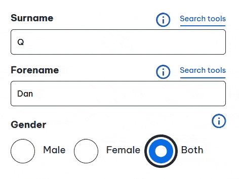
Dan (whose website is freakin’ awesome, by the way) has done an amazing job with this new 88×31 generator. Look at this (trashy, but I don’t care) button I threw together in literally
seconds, with it:
Have a play, and remind yourself that the Web is brilliant.
Modern CSS is freakin’ amazing. Widespread support for nesting, variables, :has, and :not has unlocked so much potential. But I don’t yet see it used widely
enough.
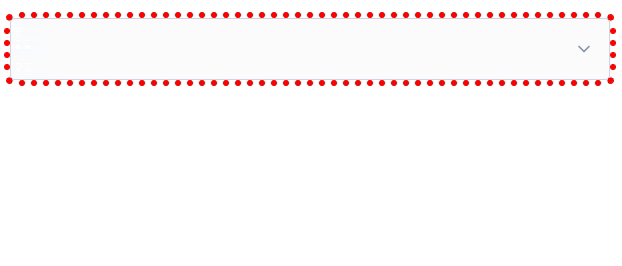
Suppose I have a form where I’m expecting, but not requiring, a user to choose an option from each of several drop-downs. I want to make it more visually-obvious
which drop-downs haven’t yet had an option selected. Something like this:
It’s a slightly gnarly selector, but thanks to nesting you could choose to break it into multiple blocks if you preferred.
What that’s saying is:
a <select>
that contains an <option>
where that <option> does not have a value="..."
and that <option> is currently selected
gains a dotted red outline around it
Or in short: if the default option is selected, highlight it so the user knows they haven’t chosen a value yet. Sweet!
Obviously you could expand this to have different effects for every value, if you wanted.
I can’t understate how valuable it is that we can do this in CSS, nowadays. Compared to doing it in JavaScript… CSS gives better performance and reliability and is much easier to
implement in a progressively-enhanced manner.
Here’s another example, this time using a fun “dress-up Dan” feature I from a redesign of my blog theme that I’m hoping to launch in the New Year:
If you’ve ever wanted to know what I’d look like if I were an elderly Tom Scott, my new design will answer that question!
Every single bit of interactivity shown in the video above… from the “waving” Dan to the popup menu to the emoji-styled checkboxes to the changes to t-shirt and hair
colours… is implemented in CSS.
The underlying HTML is all semantic, e.g. the drop-down menu is a <details>/<summary> pair (with thanks to Eevee for
the inspiration); its contents are checkbox and radiobutton <input>es; the images are SVGs that use CSS variables (another killer feature these years!) to specify
colours (among other things), and virtually everything else… is CSS.
Consider this:
:root{
/* Default values for Dan's t-shirt, hair, and beard colours used throughout the site: */--dan-tshirt:#c3d4d7;
--dan-hair:#3b6f8f;
--dan-beard:#896a51;
/* ...more variables... */
}
/* When the page contains a "checked" checkbox, update some variables: */
:root:has(#dan-tshirt-color-white:checked){--dan-tshirt:#c3d4d7;}
:root:has(#dan-tshirt-color-purple:checked){--dan-tshirt:#7429a8;}
/* ... */
:root:has(#dan-hair-color-natural:checked){--dan-hair:#896a51;}
:root:has(#dan-hair-color-blue:checked){--dan-hair:#3b6f8f;}
/* When "dye beard" is checked, copy the hair colour: */
:root:has(#dan-dye-beard-toggle:checked){--dan-beard:var(--dan-hair);}
The ability to set :root CSS variables, based on the status of user-controlled elements like checkboxes within the document, unlocks amazing options for interactivity. It
also works in smaller scopes like HTML Web Components, of course, for encapsulated functionality.
If you’re still using JavaScript for things like this, perhaps it’s time you looked at how much CSS has grown up this last decade or so. CSS gives you performance benefits, less
fragility, and makes it easier for you to meet your accessibility and usability goals.
You can still enrich what you create with JavaScript if you like (I’ve got a few lines of JS that save those checkbox states to localStorage so they persist
through page loads, for example).
But a CSS-based approach moves more of your functionality from the “nice to have” to “core” column. And that’s something we can all get behind, right?
Way back in the day, websites sometimes had banners or buttons (often 88×31 pixels, for complicated historical reasons) to indicate what screen
resolution would be the optimal way to view the site. Just occasionally, you still see these today.
Folks who were ahead of the curve on what we’d now call “responsive design” would sometimes proudly show off that you could use any resolution, in the same way as they’d
proudly state that you could use any browser1!
I saw a “best viewed at any size” 88×31 button recently, and it got me thinking: could we have a dynamic button that always
shows the user’s current resolution as the “best” resolution. So it’s like a “best viewed at any size” button… except even more because it says “whatever
resolution you’re at… that’s perfect; nice one!”
Anyway, I’ve made a website: best-resolution.danq.dev. If you want a “Looks best at [whatever my visitor’s screen
resolution is]” button, you can get one there.
1 I was usually in the camp that felt that you ought to be able to access my site with any
browser, at any resolution and colour depth, and get an acceptable and satisfactory experience. I guess I still am.
2 If you’re reading this via RSS or have JavaScript disabled then you’ll probably see an
“any size” button, but if you view it on the original page with JavaScript enabled then you should see your current browser inner width and height shown on the button.
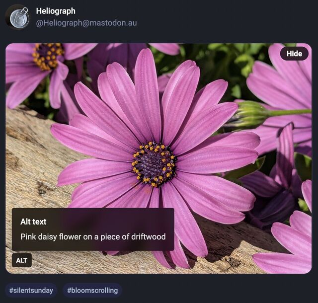
Mastodon shows an “Alt” button in the bottom right of images that have associated alt text. This button, when clicked, shows the alt text the author has written for the image.
…
After using this button a few times, I realised how much I appreciated reading the alt text for an image. Reading the alt text helped me better understand an image. In some cases, I
saw posts where the alt text contained context about an image I otherwise would not have had (i.e. the specific name of the game from which a screenshot was taken).
…
Like James, I’ve also long enjoy Mastodon’s tools to help explore alt-text more-easily, but until I saw this blog post of his I’d never have considered porting such functionality to my
own sites.
He’s come up with an implementation, described in his post, that works pretty well. I find myself wondering if a <details>/<summary> UI metaphor
might be more appropriate than a visually-hidden checkbox. Where CSS is disabled or fails, James’ approach displays a checkbox, the word “ALT”, and the entire alt text, which is
visually confusing and will result in double-reading by screen readers.
A <details>/<summary> approach would be closer to
semantically-valid (though perhaps I’m at risk of making them a golden hammer?), and would degrade more gracefully
into situations in which CSS wasn’t available.
Still, a wonderful example of what can be done and something I might look at replicating during my next bout of blog redesigning!
A few years ago I implemented a pure HTML + CSS solution for lightbox images, which I’ve been using on my blog ever since. It works by
pre-rendering an invisible <dialog> for each lightboxable image on the page, linking to the anchor of those dialogs, and exploiting the :target selector
to decide when to make the dialogs visible. No Javascript is required, which means low brittleness and high performance!
It works, but it’s got room for improvement.
One thing I don’t like about it is that it that it breaks completely if the CSS fails for any reason. Depending upon CSS is safer than depending upon JS (which breaks all
the time), but it’s still not great: if CSS is disabled in your browser or just “goes wrong” somehow then you’ll see a hyperlink… that doesn’t seem to go anywhere (it’s an
anchor to a hidden element).
A further thing I don’t like about it is it’s semantically unsound. Linking to a dialog with the expectation that the CSS parser will then make that dialog visible isn’t really
representative of what the content of the page means. Maybe we can do better.
🚀 Wired: <details>-based HTML+CSS lightboxes?
Here’s a thought I had, inspired by Patrick Chia’s <details> overlay trick and by
the categories menu in Eevee’s blog: what if we used a <details> HTML element for a lightbox? The thumbnail image would go in the
<summary> and the full image (with loading="lazy" so it doesn’t download until the details are expanded) beneath, which means it “just works” with or
without CSS… and then some CSS enhances it to make it appear like a modal overlay and allow clicking-anywhere to close it again.
Let me show you what I mean. Click on one of the thumbnails below:
Each appears to pop up in a modal overlay, but in reality they’re just unfolding a <details> panel, and some CSS is making the contents display as if if were
an overlay, complete click-to-close, scroll-blocking, and a blur filter over the background content. Without CSS, it functions as a traditional <details> block.
Accessibility is probably improved over my previous approach, too (though if you know better, please tell me!).
The code’s pretty tidy, too. Here’s the HTML:
<detailsclass="details-lightbox"aria-label="larger image">
<summary>
<imgsrc="thumb.webp"alt="Alt text for the thumbnail image.">
</summary>
<div>
<imgsrc="full.webp"alt="Larger image: alt text for the full image."loading="lazy">
</div>
</details>
The CSS is more-involved, but not excessive (and can probably be optimised a little further):
Native CSS nesting is super nice for this kind of thing. Being able to use :has on the body to detect whether there exists an open lightbox and prevent
scrolling, if so, is another CSS feature I’m appreciating today.
I’m not going to roll this out anywhere rightaway, but I’ll keep it in my back pocket for the next time I feel a blog redesign coming on. It feels tidier and more-universal than my
current approach, and I don’t think it’s an enormous sacrifice to lose the ability to hotlink directly to an open image in a post.
The video below is presented in portrait orientation, because your screen is taller than it is wide.
The video below is presented in landscape orientation, because your screen is wider than it is tall.
The video below is presented in square orientation (the Secret Bonus Square Video!), because your screen has approximately the same width as as its height. Cool!
This is possible (with a single <video> element, and without any Javascript!) thanks to some cool HTML features you might not be aware of, which I’ll briefly explain
in the video. Or scroll down for the full details.
<videocontrols><sourcesrc="squareish.mp4"media="(min-aspect-ratio: 0.95) and (max-aspect-ratio: 1.05)"/><sourcesrc="portrait.mp4"media="(orientation: portrait)"/><sourcesrc="landscape.mp4"/></video>
This code creates a video with three sources: squareish.mp4 which is shown to people on “squareish” viewports, failing that portrait.mp4 which is shown to
people whose viewports are taller than wide, and failing that landscape.mp4 which is shown to anybody else.
That’s broadly-speaking how the video above is rendered. No JavaScript needed.
Browsers only handle media queries on videos when they initially load, so you can’t just tip your phone over or resize the window: you’ll need to reload the page, too. But it works!
Give it a go: take a look at the video in both portrait and landscape modes and let me know what you think1.
Adding adaptive bitrate streaming with HLS
Here’s another cool technology that you might not have realised you could “just use”: adaptive bitrate streaming with HLS!
You’ve used adaptive bitrate streaming before, though you might not have noticed it. It’s what YouTube, Netflix, etc. are doing when your network connection degrades and you quickly get
dropped-down, mid-video, to a lower-resolution version2.
Turns out you can do it on your own static hosting, no problem at all. I used this guide (which has a great
description of the parameters used) to help me:
This command splits the H.264 video landscape.mp4 into three different resolutions: the original “v1” (1920×1080, in my case, with 96kbit audio), “v2” (1280×720, with
96kbit audio), and “v3” (640×360, with 48kbit audio), each with a resolution-appropriate maximum bitrate, and forced keyframes every 48th frame. Then it breaks each of those into HLS
segments (.ts files) and references them from a .m3u8 playlist.
The output from this includes:
Master playlist landscape.m3u8, which references the other playlists with reference to their resolution and bandwidth, so that browsers can make smart choices,
Playlists landscape_0.m3u8 (“v1”), landscape_1.m3u8 (“v2”), etc., each of which references the “parts” of that video,
Directories landscape_0/, landscape_1/ etc., each of which contain
data00.ts, data01.ts, etc.: the actual “chunks” that contain the video segments, which can be downloaded independently by the browser as-needed
Bringing it all together
We can bring all of that together, then, to produce a variable-aspect, adaptive bitrate, HLS-streamed video player… in pure HTML and suitable for static hosting:
<videocontrols><sourcesrc="squareish.m3u8"type="application/x-mpegURL"media="(min-aspect-ratio: 0.95) and (max-aspect-ratio: 1.05)"/><sourcesrc="portrait.m3u8"type="application/x-mpegURL"media="(orientation: portrait)"/><sourcesrc="landscape.m3u8"type="application/x-mpegURL"/></video>
You could, I suppose, add alternate types, poster images, and all kinds of other fancy stuff, but this’ll do for now.
One solution is to also provide the standard .mp4 files as an alternate <source>, and that’s fine I guess, but you lose the benefit of HLS (and
you have to store yet more files). But there’s a workaround:
Polyfill full functionality for all browsers
If you’re willing to use a JavaScript polyfill, you can make the code above work on virtually any device. I gave this a go, here, by:
Adding some JavaScript code that detects affected `<video>` elements and applying the fix if necessary:
// Find all <video>s which have HLS sources:for( hlsVideo of document.querySelectorAll('video:has(source[type="application/x-mpegurl"]), video:has(source[type="vnd.apple.mpegurl"])') ) {
// If the browser has native support, do nothing:if( hlsVideo.canPlayType('application/x-mpegurl') || hlsVideo.canPlayType('application/vnd.apple.mpegurl') ) continue;
// If hls.js can't help fix that, do nothing:if ( ! Hls.isSupported() ) continue;
// Find the best source based on which is the first one to match any applicable CSS media queriesconst bestSource =Array.from(hlsVideo.querySelectorAll('source')).find(source=>window.matchMedia(source.media).matches)
// Use hls.js to attach the best source:const hls =new Hls();
hls.loadSource(bestSource.src);
hls.attachMedia(hlsVideo);
}
It makes me feel a little dirty to make a <video>depend on JavaScript, but if that’s the route you want to go down while we wait for HLS support to become
more widespread (rather than adding different-typed sources) then that’s fine, I guess.
This was a fun dive into some technologies I’ve not had the chance to try before. A fringe benefit of being a generalist full-stack developer is that when you’re “between jobs”
you get to play with all the cool things when you’re brushing up your skills before your next big challenge!
(Incidentally: if you think you might be looking to employ somebody like me, my CV is over there!)
Footnotes
1 There definitely isn’t a super-secret “square” video on this page, though. No
siree. (Shh.)
2 You can tell when you get dropped to a lower-resolution version of a video because
suddenly everybody looks like they’re a refugee from Legoland.
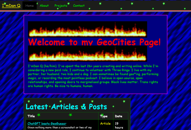
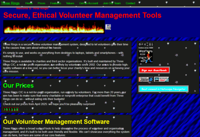
Sure, it’s gaudy, but it’s got a few things going for it, too.
Let’s put aside for the moment that you can already send my website back into “90s mode” and dive into this take on how I could
present myself in a particularly old-school way. There’s a few things I particularly love:
It’s actually quite lightweight: ignore all the animated GIFs (which are small anyway) and you’ll see that, compared to my current homepage, there are very few
images. I’ve been thinking about going in a direction of less images on the homepage anyway, so it’s interesting to see how it comes together in this unusual context.
The page sections are solidly distinct: they’re a mishmash of different widths, some of which exhibit a horrendous lack of responsivity, but it’s pretty clear where
the “recent articles” ends and the “other recent stuff” begins.
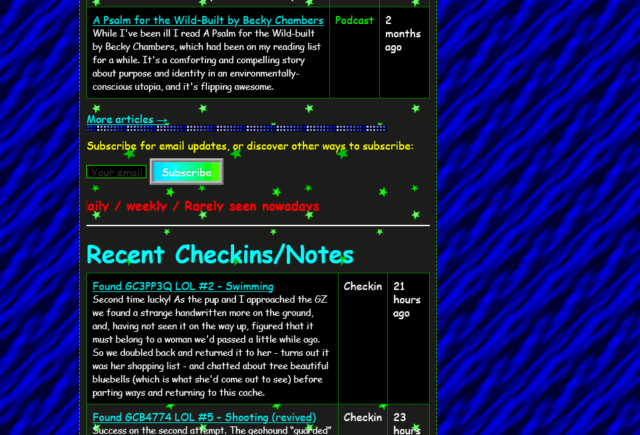
The post kinds are very visible: putting the “kind” of a post in its own column makes it really clear whether you’re looking at an article, note, checkin, etc., much
more-so than my current blocks do.
Maybe there’s something we can learn from old-style web design? No, I’m serious. Stop laughing.
90s web design was very-much characterised by:
performance – nobody’s going to wait for your digital photos to download on narrowband connections, so you hide them behind descriptive links or tiny thumbnails, and
pushing the boundaries – the pre-CSS era of the Web had limited tools, but creators worked hard to experiment with the creativity that was possible within those
limits.
Those actually… aren’t bad values to have today. Sure, we’ve probably learned that animated backgrounds, tables for layout, and mystery meat navigation were horrible for
usability and accessibility, but that doesn’t mean that there isn’t still innovation to be done. What comes next for the usable Web, I wonder?
As soon as you run a second or third website through the tool, its mechanisms for action become somewhat clear and sites start to look “samey”, which is the opposite of what
made 90s Geocities great.
The only thing I can fault it on is that it assumes that I’d favour Netscape Navigator: in fact, I was a die-hard Opera-head for most of the
nineties and much of the early naughties, finally switching my daily driver to Firefox in 2005.
I certainly used plenty of Netscape and IE at various points, though, but I wasn’t a fan of the divisions resulting from the browser wars. Back in the day, I always backed
the ideals of the “Viewable With Any Browser” movement.
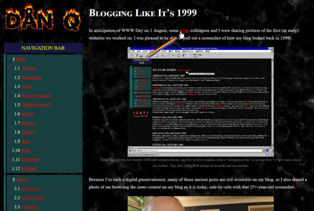
My love of the yesterweb forced me to teach myself just-enough Blender to make an animation for a stupid thing: an 88×31 button representing “me” (and, I suppose, my blog, whenever I
next end up redesigning its theme).
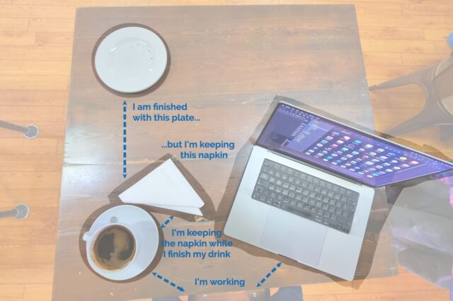
Possible future presentation concept: using a cafe/dining metaphor to help explain the proximity principle in user interface design (possibly with a “live waitstaffing” demo?).
Last month I implemented an alternative mode to view this website “like it’s 1999”, complete with with cursor trails, 88×31 buttons, tables for
layout1,
tiled backgrounds, and even a (fake) hit counter.
One thing I’d have liked to do for 1999 Mode but didn’t get around to would have been to make the images look like it was the 90s, too.
Back then, many Web users only had graphics hardware capable of displaying 256 distinct colours. Across different platforms and operating systems, they weren’t even necessarily
the same 256 colours2!
But the early Web agreed on a 216-colour palette that all those 8-bit systems could at least approximate pretty well.
I had an idea that I could make my images look “216-colour”-ish by using CSS to apply an SVG filter, but didn’t implement it.
But Spencer, a long-running source of excellent blog comments, stepped up and wrote an SVG
filter for me! I’ve tweaked 1999 Mode already to use it… and I’ve just got to say it’s excellent: huge thanks, Spencer!
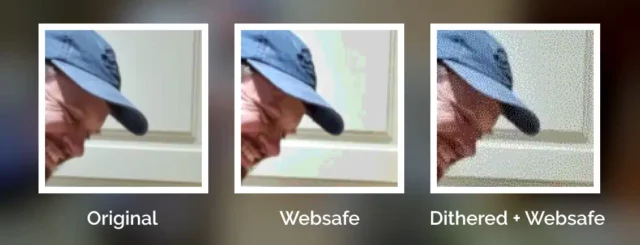
The filter coerces colours to their nearest colour in the “Web safe” palette, resulting in things like this:
The flat surfaces are particularly impacted in this photo (as manipulated by the CSS SVG filter described above). Subtle hues and the gradients coalesce into slabs of colour, giving
them an unnatural and blocky appearance.
Plenty of pictures genuinely looked like that on the Web of the 1990s, especially if you happened to be using a computer only capable of 8-bit colour to view a page built by
somebody who hadn’t realised that not everybody would experience 24-bit colour like they did3.
Dithering
But not all images in the “Web safe” palette looked like this, because savvy web developers knew to dither their images when converting them to a limited palette.
Let’s have another go:
This image uses exactly the same 216-bit colour palette as the previous one, but looks a lot more “natural” thanks to the Floyd–Steinberg dithering algorithm.
Dithering introduces random noise to media4
in order to reduce the likelihood that a “block” will all be rounded to the same value. Instead; in our picture, a block of what would otherwise be the same colour ends up being rounded
to maybe half a dozen different colours, clustered together such that the ratio in a given part of the picture is, on average, a better approximation of the correct
colour.
The result is analogous to how halftone printing – the aesthetic of old comics and newspapers, with different-sized dots made from
few colours of ink – produces the illusion of a continuous gradient of colour so long as you look at it from far-enough away.
Zooming in makes it easy to see the noisy “speckling” effect in the dithered version, but from a distance it’s almost invisible.
The other year I read a spectacular article by Surma that explained in a very-approachable way
how and why different dithering algorithms produce the results they do. If you’ve any interest whatsoever in a deep dive or just want to know what blue noise is and why you
should care, I’d highly recommend it.
You used to see digital dithering everywhere, but nowadays it’s so rare that it leaps out as a revolutionary aesthetic when, for example, it gets used in
a video game.
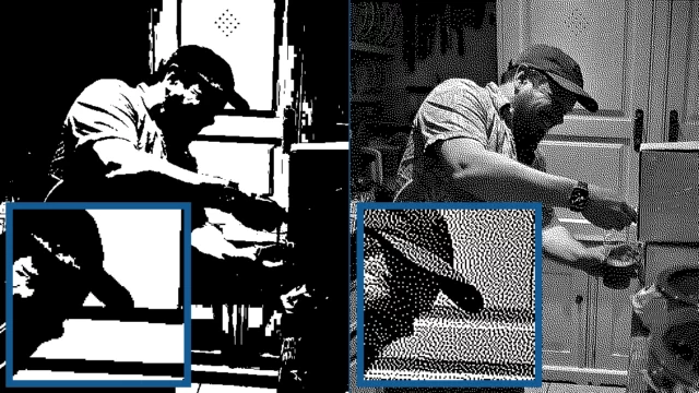
Dithering can be so effective that it can even make an image “work” all the way down to 1-bit (i.e. true monochrome/black-and-white) colour. Here I’ve used Jarvis, Judice & Ninke’s dithering algorithm, which is highly-effective for picking out subtle colour differences in what would
otherwise be extreme dark and light patches, at the expense of being more computationally-expensive (to initially create) than other dithering strategies.
All of which is to say that: I really appreciate Spencer’s work to make my “1999 Mode” impose a 216-colour palette on images. But while it’s closer to the truth, it still doesn’t
quite reflect what my website would’ve looked like in the 1990s because I made extensive use of dithering when I saved my images in Web safe palettes5.
Why did I take the time to dither my images, back in the day? Because doing the hard work once, as a creator of graphical Web pages, saves time and computation (and can look
better!), compared to making every single Web visitor’s browser do it every single time.
Which, now I think about it, is a lesson that’s still true today (I’m talking to you, developers who send a tonne of JavaScript and ask my browser to generate the HTML for you
rather than just sending me the HTML in the first place!).
Footnotes
1 Actually, my “1999 mode” doesn’t use tables for layout; it pretty much only applies a
CSS overlay, but it’s deliberately designed to look a lot like my blog did in 1999, which did use tables for layout. For those too young to remember: back before CSS
gave us the ability to lay out content in diverse ways, it was commonplace to use a table – often with the borders and cell-padding reduced to zero – to achieve things that today
would be simple, like putting a menu down the edge of a page or an image alongside some text content. Using tables for non-tabular data causes problems, though: not only is
it hard to make a usable responsive website with them, it also reduces the control you have over the order of the content, which upsets some kinds of accessibility
technologies. Oh, and it’s semantically-invalid, of course, to describe something as a table if it’s not.
2Perhaps as few as 22 colours were defined the same across all
widespread colour-capable Web systems. At first that sounds bad. Then you remember that 4-bit (16 colour) palettes used to look look perfectly fine in 90s videogames. But then you
realise that the specific 22 “very safe” colours are pretty shit and useless for rendering anything that isn’t composed of black, white, bright red, and maybe one of a few
greeny-yellows. Ugh. For your amusement, here’s a copy of the image rendered using only the “very safe” 22
colours.
3 Spencer’s SVG filter does pretty-much the same thing as a computer might if asked to
render a 24-bit colour image using only 8-bit colour. Simply “rounding” each pixel’s colour to the nearest available colour is a fast operation, even on older hardware and with larger
images.
4 Note that I didn’t say “images”: dithering is also used to produce the same “more
natural” feel for audio, too, when reducing its bitrate (i.e. reducing the number of finite states into which the waveform can be quantised for digitisation), for example.
5 I’m aware that my footnotes are capable of nerdsniping Spencer, so by writing this
there’s a risk that he’ll, y’know, find a way to express a dithering algorithm as an SVG filter too. Which I suspect isn’t possible, but who knows! 😅
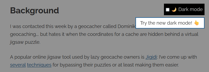
I’m testing a handful of highly-experimental new features on my personal website using multivariate (“A/B”) testing.
“Dark Mode” is just one of the new features I’m testing out.
If you visit within the next day or so you’re likely to be randomly-selected to try out one of them. (If you’re not selected, you can manually enable one of the
experiments.)
I’d love to hear your feedback on these Very Serious New Features! Let me know which one(s) you see and whether you think they should become permanent fixtures on my site.
Yesterday, I wrote the stupidest bit of CSS of my entire career.
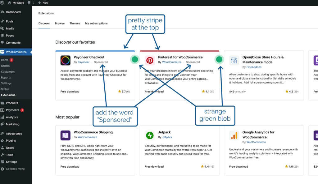
Two new visual elements and one textual one will make it clear where a product’s placement in the marketplace is sponsored.
Owners of online shops powered by WooCommerce can optionally “connect” their stores back to Woo.com. This enables them to manage their subscriptions to
any extensions they use to enhance their store1. They can also browse a
marketplace of additional extensions they might like to consider, which is somewhat-tailored to them based on e.g. their geographical location2
In the future, we’ll be adding sponsored products to the marketplace listing, but we want to be transparent about it so yesterday I was working on some code that would determine from
the appropriate API whether an extension was sponsored and then style it differently to make this clear. I took
a look at the proposal from the designer attached to the project, which called for
the word “Sponsored” to appear alongside the name of the extension’s developer,
a stripe at the top in the brand colour of the extension, and
a strange green blob alongside it
That third thing seemed like an odd choice, but I figured that probably I just didn’t have the design or marketing expertise to understand it, and I diligently wrote some appropriate code.3
I even attached to my PR a video demonstrating how my code reviewers could test it without spoofing actual sponsored
extensions.
After some minor tweaks, my change was approved. The designer even swung by and gave it a thumbs-up. All I needed to do was wait for the automated end-to-end tests to complete, and I’d
be able to add it to WooCommerce ready to be included in the next-but-one release. Nice.
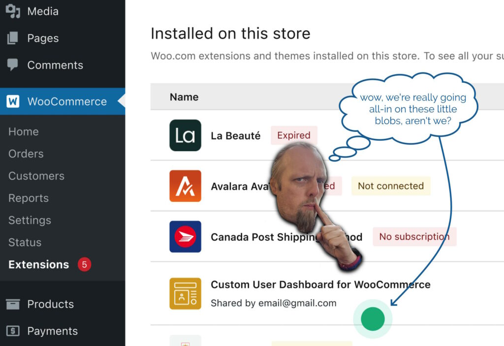
In the meantime, I got started on my next bit of work. This one also included some design work by the same designer, and wouldn’t you know it… this one also had a little green
blob on it?
I’m almost embarrassed to admit that my first thought was that this must be part of some wider design strategy to put little green blobs everywhere.
Then it hit me. The blobs weren’t part of the design at all, but the designer’s way of saying “look at this bit, it’s important!”. Whoops!
So I got to rush over to my (already-approved, somehow!) changeset and rip out
the offending CSS: the stupidest bit of CSS of my entire career.
Not bad code per se, but reasonable code resulting from a damn-stupid misinterpretation of a designer’s wishes. Brilliant.
3 A fun side-effect of working on open-source software is that my silly mistake gets
immortalised somewhere where you can go and see it any time you like!


