 RSS
RSS Spotify
 Pocket Casts
 Apple Podcasts
 YouTube
Hi, HackerNews! Please be kind/friendly! I’d love to hear your experiences of these (IMHO horrible) keyboard features, whether good or bad. Drop me a comment or join in on the thread over there.
In my living room1 is an ageing Windows media centre PC, which is connected to the TV and principally used for Jellyfin, Netflix, Nebula, Steam, and the like. For convenient sofa use, I’ve equipped it with a wireless keyboard/trackpad combo.
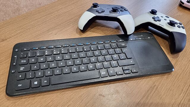
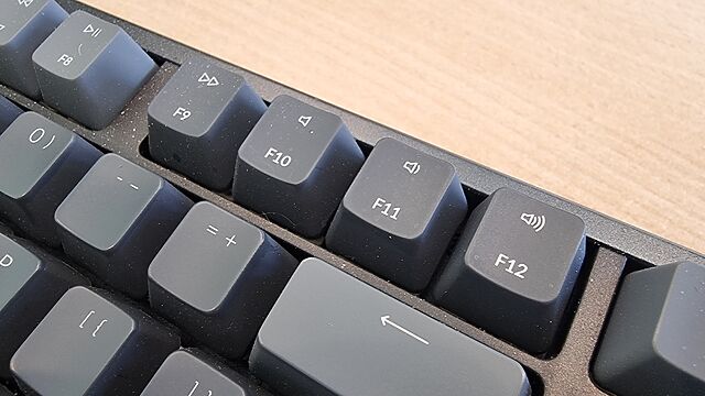
Unfortunately, the manufacturers of this keyboard decided that it needed a dozen extra functions, and repurposed the F-keys F1 through F12 for these purposes.
It was nice that they gave dedicated keys to volume control/toggling muting – we use those all the time. And there are three other dedicated keys in the top right which we never use… so there was clearly capacity for a little extra. And they still they felt the need to do… this:

I don’t want any of these “special function keys. Occasionally, I suppose, I might need one2, but mostly I’d just like F1 through F12 to remain the multi-purpose, context-dependent keys that they have been since they first appeared in 1965.
And so, because I don’t want to hold Fn every time I want to press an F-key for its intended purpose, I used the arcane shortcut Fn+Caps to “lock” the keyboard into “standard” mode, where multipurpose F-keys remain multipurpose F-keys unless I hold down the special magic button that transforms them into rarely-used single-purpose special function keys.
But here’s where the problem occurs. If the batteries get changed, or if the keyboard gets turned-off for an extended period, or sometimes – seemingly – just randomly… that function-lock gets switched off.
And I’ll grab the keyboard and, to quickly quit Steam Big Picture or a Jellyfin Client or something, I’ll press Alt+F4. Which will send the “sleep” command. And because this computer’s a bit older, it’ll hibernate.
Instead of closing one application, which is what I intended, I now have to wait upwards of a minute for the old box to finish copying all of its RAM into a file, and shutting down, and then booting up again (in response to my repeated and frustrated hammering of the space bar), and then loading everything back into RAM… just to put me back where I started3.
What’s most-frustrating is at F4 is the only key with such a time-consuming and annoying function. If I accidentally paused some music or opened the system settings or did whatever-the-hell the icon on the F6 key is supposed to mean, that wouldn’t be so bad. But man; the three or four times a year that this catches me out are just aggravating enough to piss me off without being quite bad enough for me to do something about it4.
It doesn’t have to be this way.
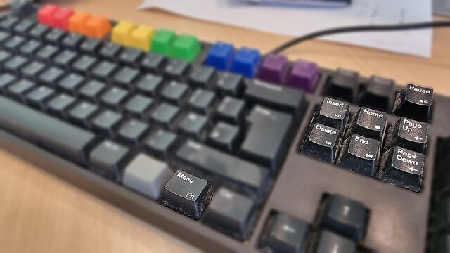
My WASD Code gets it right by resigning the effects of all double-duty keys to minor conveniences only, and making them the secondary functions of the keys to which they’re attached. I use these volume control buttons and they’re fine6.
My Keychron K10 gets it right by having the double-duty keys mirror those of the Mac it attaches to7: again, all minor, low-impact functions that are easily and quickly un-done. Also, when you lock it to traditional F-key mode it stays that way, even if it’s disconnected and left unpowered for an extended period.
These keyboards – which are my daily drivers – show that an Fn key can be done right.
Here’s what “doing Fn right” looks like, to me –
- Where keys do double-duty, it’s a low-impact and quickly reversible operation, so there’s little cognitive load or delay in correcting any mistakes.
- The default state is the traditional key function, or if that’s not the case, switching mode is easy (doesn’t involve looking up an underdocumented shortcut or installing a proprietary driver).
- When you switch the default state, it stays switched and doesn’t swap back to factory defaults just because of a loss of power or other arbitrary and unrelated trigger.
Sadly, a great number of keyboards get their Fn key implementations wrong. And I hate them for it.
Footnotes
1 By which, right now, I mean the living room of the Chicory House, on account of my actual house being busy having its underfloor foundations torn up.
2 In particular, this keyboard lacks dedicated page up/page down keys, and I don’t mind pressing Fn+F11 or Fn+F12 for that. And maybe once or twice I’ve used Fn+F2 for pause/play. But other than that, they’re completely pointless.
3 Yes, I’m fully aware that I could just disable all sleep/hibernation functions at an OS or even BIOS level. But at the time I remember that, all I want to do is get back to watching the latest episode of Star City or something.
4 I mean, except for write this blog post, I suppose. But for that I blame Terence Eden, who put the idea in my head with a recent poll.
5 And why yes, I do have Pride keycaps in place of my function keys, why do you ask?
6 The volume control knob of the mechanical it replaced, a Das Keyboard 3, was better, but you can’t have everything.
7 The Keychron itself is super versatile and OS-independent: it’s easily toggled between layouts and even comes with spare keycaps to make it “look like” your preferred operating system, assuming that unlike me you don’t routinely use around three different ones in a typical session.
8 Don’t get me started on Apple’s other UX decisions like “natural scrolling” which makes no sense whatsoever on a mouse… but – unlike every other operating system I’ve checked – won’t let you configure a different scrolling orientation on a mouse than for a trackpad: both have to be kept aligned in MacOS. Argh!.