Skip to content

Dan Q

    • Articles
    • Everything
    • Notes
    • Reposts (shares)
    • Checkins (geo*)
    • Videos
    • Reviews
    • Comics
    • Tags
    • Stats
    • Subscribe
    • Blogroll
  • About
    • Semi-standard "slash pages" you might like to explore:
    • /about
    • /blank
    • /blogroll
    • /colophon
    • /contact
    • /cv
    • /license
    • /postcards
    • /privacy
    • /salary
    • /shh
    • /slashes
    • /stats
    • /subscribe
    • /where
    • Hide posts of type:
    • Choose how Dan's dressed:
    • Hair
    • T-Shirt
  • Contact
  • Podcast

Tag: infographics

  • Not just a global issue but a local one too. A local one... almost everywhere.
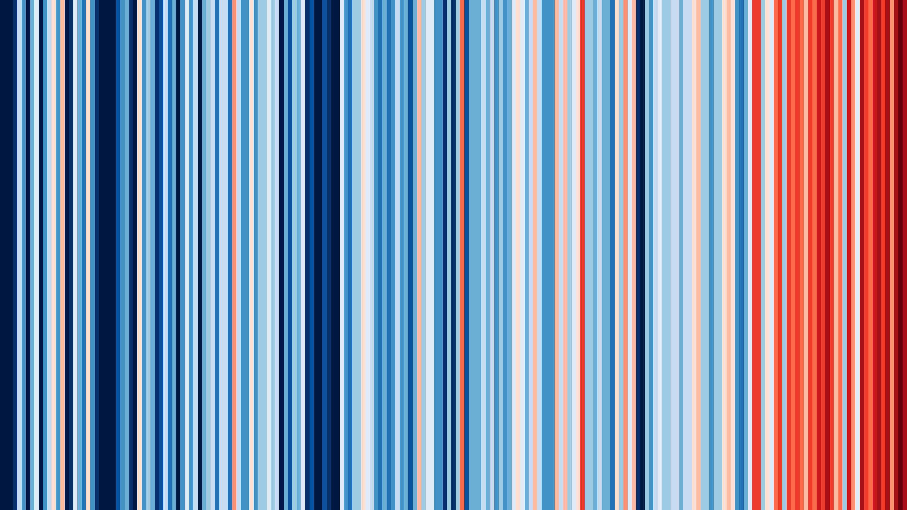
    Full image of Series of coloured bars trending from blue to red, representing relative temperature change in Oxford, UK, for the last 111 years, showing a clear average increase of a couple of โ„ƒ.
    Alt

    Series of coloured bars trending from blue to red, representing relative temperature change in Oxford, UK, for the last 111 years, showing a clear average increase of a couple of โ„ƒ.

    #ShowYourStripes

    • Note
    • posted 23 June, 2025
  • Wide diagram consisting of 2,062 vertical lines in a variety of different colours, each representing a different blog post.

    The Continuum

    Inspired by Geneveive Raine's "The Continuum", I turned all of my blog post's featured images into a stripy picture.

    Read more (237 words)

    • Article
    • posted 10 February, 2025
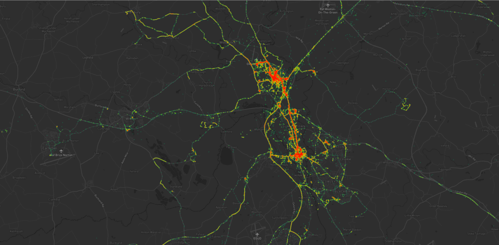
  • Heatmap showing Dan's movements around Kidlington, including a lot of time in the village and in Oxford City Centre, as well as hotspots at the hospital, parks, swimming pools, and places that Dan used to volunteer. Individual expeditions can also be identified.

    Heatmapping my Movements

    Leveraging a decade of past GPS data, Dan draws heatmaps of his movements around Oxfordshire.

    Read more - about 6 minutes (1395 words)

    • Article
    • 4 comments
    • posted 22 August, 2021
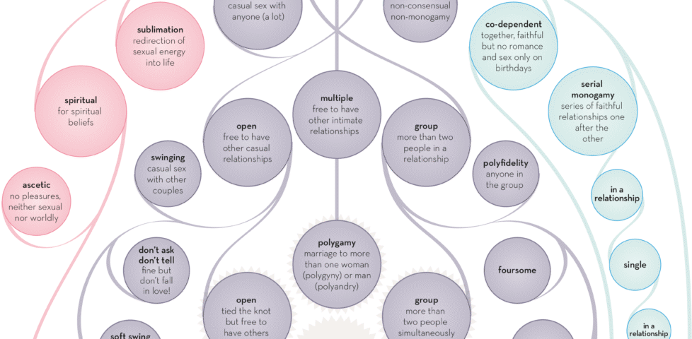
  • Image representing post: The Varieties of Intimate Relationship

    The Varieties of Intimate Relationship

    The Information Is Beautiful folks have made an infographic showing how different kinds of relationships relate to one another. It's a relationship-relationship diagram!

    Read more (81 words)

    • Repost
    • posted 24 February, 2021
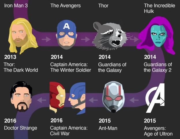
  • The Marvel Cinematic Universe in Chronological Order (almost)

    Avengers Endgame: The Marvel Cinematic Universe explained

    The BBC have adapted a Marvel infographic to show the order you SHOULD watch their films in.

    Read more (59 words)

    • Repost
    • 1 comment
    • posted 21 April, 2019
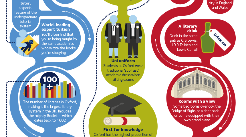
  • The Oxford Experience infographic

    The "Oxford University Experience" infographic [x-post /r/oxforduni]

    Read more - about 0 minutes (0 words)

    • Repost
    • posted 18 May, 2015

Get in Touch

I'd love to hear from you! Why not...

  • email me on blog@danq.me?
    (my spam filter is aggressive, so use a good subject line, i.e. not just "hello"; encrypt your email if you like)
  • say hi on Mastodon, where I'm @dan@danq.me?
  • send a letter or postcard to
    Dan Q, Unit 159610, PO Box 7169, Poole, BH15 9EL, UK
  • reach out some other way?
  • ยฉ Dan Q 1998-2026
  • Creative CommonsAttributionNon-Commercial except where stated (how to use)
  • powered by BloqClassicPressHTML5CSS3
  • privacy
  • Read articles, checkins, notes, reposts, and more...
  • @dan@danq.me
  • contact
  • subscribe
  • Dan Q
  • Creative Commons Attribution Non-Commercial license
  • ClassicPress
  • CSS is awesome
  • Created by a human, not by AI
  • LGBTQ+ pride flag (2018 progress variant)
  • Polyamory flag
  • Say no to Web3
  • Mastodon (it's like email... no, come back!)
  • Tested on Firefox
  • Best viewed on the Internet
  • PHP
  • Ruby
  • Debian
  • Caddy (webserver)
  • Find me on Melonland
  • Check out my GitHub
  • Three Rings - by volunteers, for volunteers, since 2002
  • I'm a fucking webmaster
  • Looks best at: any resolution!