Did I just rank my LPG provider 10/10, or 1/10? I genuinely don’t know.
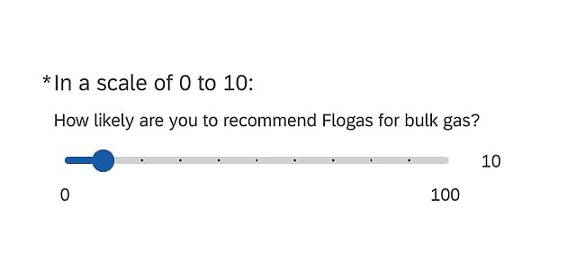
Did I just rank my LPG provider 10/10, or 1/10? I genuinely don’t know.
What’s the equivalent phrase to “hair of the dog”, but for caffeine?
I’ve always been pretty sensitive to it, and while I’m less-so now, it was still definitely a mistake to eat several portions of tiramisu right before bedtime.
So now I’m going to need more caffeine, this morning, to compensate for the lack of sleep.
What do we call that?
It’s that time of year again when I comparison-shop for car insurance, and every time I come across a new set of reasons to hate the developers at Confused.com. How do you confuse me? Let me count the ways.
I was planning to enumerate my concerns to them directly, via their contact form, but when I went to do so I spotted this bit of genius, which clinched it and made me write a blog post instead:
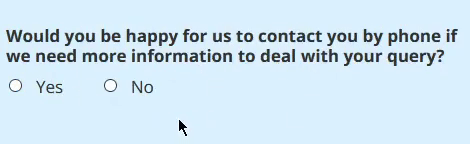
Turns out that there’s a bit of the old sloppy-paste going on there:
<input type="radio" value="Yes" id="ContactByPhoneYes" name="contactByPhone" />
<label for="ContactByPhoneYes" class="label">Yes</label>
<input type="radio" value="No" id="ContactByPhoneNo" name="contactByPhone" />
<label for="ContactByPhoneYes" class="label">No</label>
I guess nobody had the “consent talk” with Confused.com?
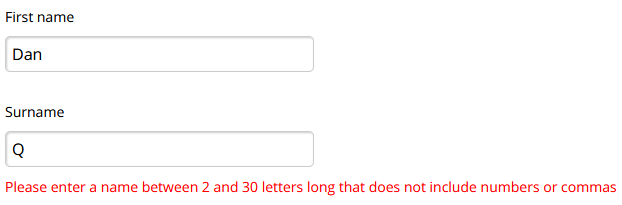
Honestly, I’m used to my unusual name causing trouble by now and I know how to work around it in the way that breaks the fewest systems (I can even usually get airline tickets without too much difficulty nowadays). But these kinds of (arbitrary) restrictions must frustrate folks like Janice Keihanaikukauakahihulihe’ekahaunaele.
I guess their developers didn’t realise that this blog post was parody?
This one, though, pisses me off:
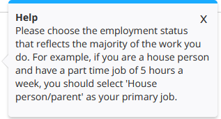
This is a perfect example of why your forms should ask for what you actually want to know, not for what you think people want to tell you. Just ask!
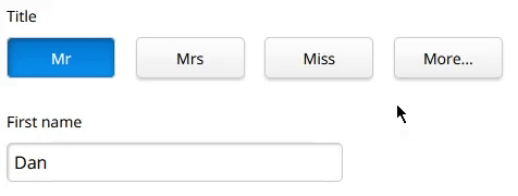
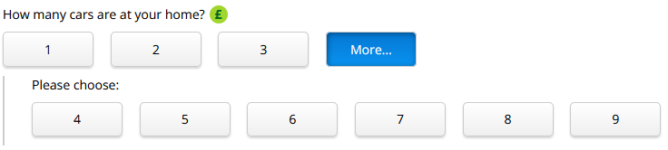
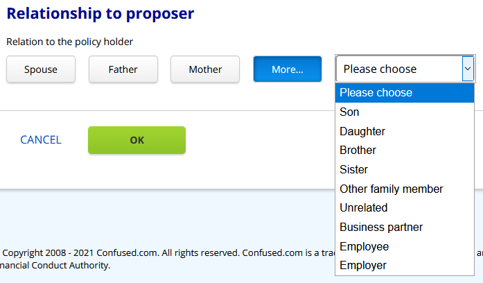
It’s not a big thing, but if you come up with a user interface paradigm like “clicking More… shows more buttons”, you ought to stick to it.
Again, I’m not sure exactly what all of this data is used for, nor why there’s a need to differentiate between married couples and civil partnerships, but let’s just assume this is all necessary and legitimate and just ask ourselves: why are we using drop-downs now for “More…”? We were using buttons just a second ago!
There’s so much to unpack in the “occupation” part of the form that I’m not even sure where to begin. Let’s just pick out a few things:
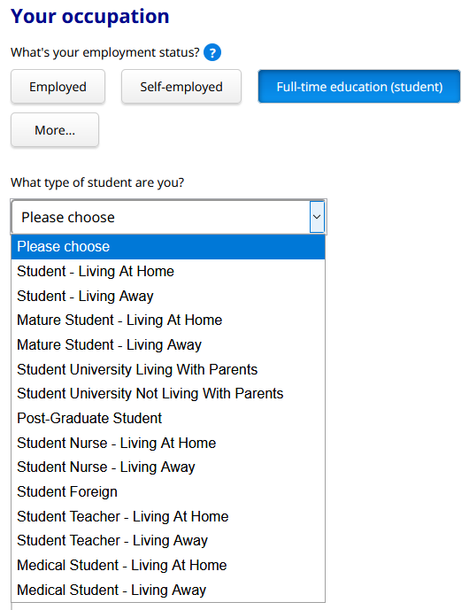
The student thing is just the beginning, though. You can declare up to two jobs, but if the first one is “house person/parent” you can’t have a second one. If you’re self-employed, that has to be your first job even though the guidance says that the one you spend most time on must be the first one (this kind of thing infuriated me when I used to spend 60% of my work time employed, 20% self-employed, and 20% studying).
I’m not saying it’s easy to make a form like this. I know from experience that it’s not. I am saying that Confused.com make it look a lot harder than it is.
At a glance, this sounds like a “poly world problem”, but hear me out:
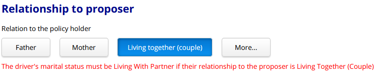
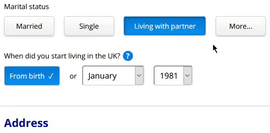
I put Ruth‘s martial status as married, because she’s married to JTA. But then when it asked how she was related to me, it wouldn’t accept “Living together (couple)”.
Even if you don’t think it’s odd that they hide “living with partner” button as an option to describe a married person’s relationship to somebody other than their spouse… you’ve still got to agree that it’s a little bit odd that they don’t hide the “spouse” button. In other words, this user interface is more-okay with you having multiple spouses than it is with you having a spouse and an unmarried partner!
And of course this isn’t just about polyamorous folks: there are perfectly “normal” reasons that a person might end up confused by this interface, too. For example a separated (but not yet divorced) couple, one of whom has a new partner (it’s not even inconceivable that such a pair might share custody of a car). Also interesting is the fact that the form doesn’t care about the gender of your spouse (it doesn’t ask for “husband” or “wife”) but does care about the gender of your parent, child, or sibling. What gives?
Given that their entire marketing plan for most of the last two decades has been that they reduce customer confusion, Confused.com’s user interface leaves a lot to be desired. As I’ve mentioned before – and speaking as a web developer that’s been in the game for longer than their company has – it’s not necessarily easy to get this kind of thing right. But you can improve a form like this, a little at a time. And every little win counts for something: a more-satisfied returning customer, perhaps, or a new word-of-mouth recommendation.
Or you can just let it languish and continue to have the kind of form that people mock on the public Internet.
It’ll be a year until I expect to comparison-shop for car insurance again: let’s see how they get on, shall we?
I didn’t expect to receive any response to this post: most organisations don’t when I call-out the problems with their websites (not least because I’m more than a little bit sarcastic about it!). I never heard back from the Digital Climate Strike folks, for example, when I pointed out that their website was a great example of exactly the kind of problem they were protesting. But Confused.com passed on my thoughts to Product Manager Gareth who took a look at them and gave me a £20 Amazon gift card by way of thanks. Nice one, Confused.com!
Originally from a tweet.
In case anyone needs a good laugh today here’s me falling off a stool in McDonald’s that a friend found on the CCTV
Since I’ve been working from home, things with my “day job” at SmartData have ticked along pretty much the same as they ever did before. But once in a while, something goes wrong. Like this.
I checked my instant messenger, and saw a bit of text from my boss, Simon:
also, have you implemenmted a "message of the day" type feature as users login?msg from [our contact with a client I've been working with][another requested feature][and a bug report]
That’s simple enough, then: our contact wants us to fix that bug and add two features: the second one (not listed), and a Message of the Day tool. Easy.
I implemented the MotD, first, because it’s trivial. It’s nice to implement the fast features first, because it gives the client something to play with, test, and get value from while they’re waiting for the rest of their project. Plus, a “Message of the Day” feature was a nice warm-up activity this morning while my brain picked up steam in order to tackle some of the bigger tasks of the day.
Later, I spoke to my boss via the instant messenger. The conversation went a little like this:
Dan: If you speak to [client name], let her know I've redeployed.
Dan: New version has [another feature] and the MotD tool.

Simon: MotD tool? For [name of completely unrelated project]
You see, the problem was that without a context of time (I’d ignored the timestamps on the messages), I wasn’t to know that the message “also, have you implemenmted a “message of the day” type feature as users login?” referred to the previous conversation we’d been having. And didn’t apply to this project at all.
I just hope that my client likes the unsolicited “free” feature I’ve given them, because – well – they’ve got it, now.
Is an unsolicited feature a bug? I’m just not sure.