As part of the preparing to leave the Bodleian I’ve been revisiting a lot of the documentation I’ve written over the last eight years. It occurred to me that I’ve never written publicly about how the Bodleian’s digital signage/interactives actually work; there are possible lessons to learn.
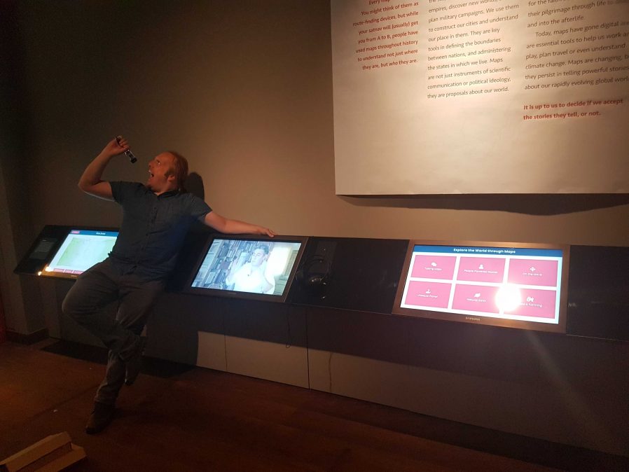
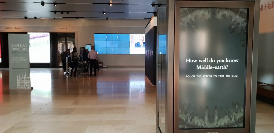
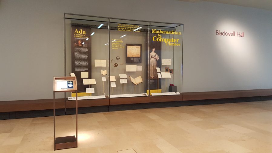
The Bodleian‘s digital signage is perhaps more-diverse, both in terms of technology and audience, than that of most organisations. We’ve got signs in areas that are exclusively reader-facing to help students and academics find what they’re looking for, signs in publicly accessible rooms that advertise and educate, and signs in gallery spaces upon which we try to present engaging and often-interactive content to support exhibitions.
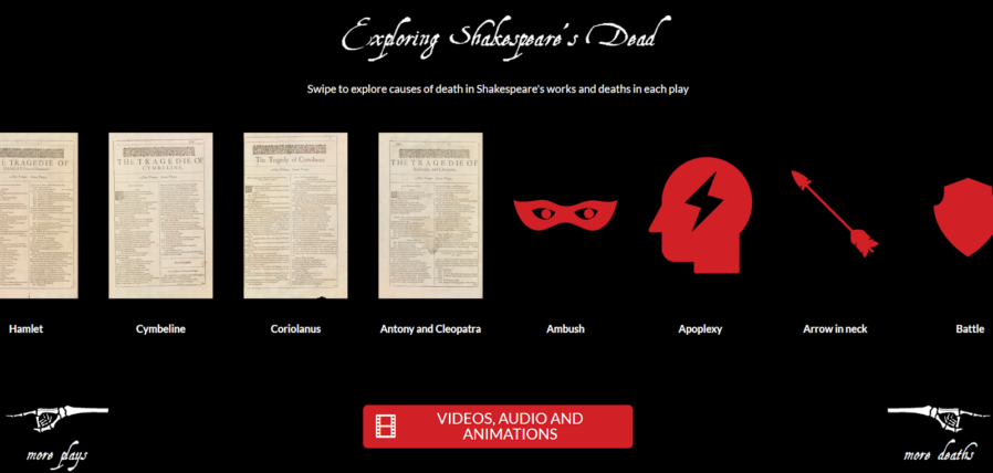
Throughout those three spheres, we’ve routinely delivered a diversity of content (let’s just ignore the countdown clock, for now…). Traditional directional signage, advertisements, games, digital exhibitions, interpretation, feedback surveys…
In the vast majority of cases – and this is where the Bodleian’s been unusual (though certainly not unique) among cultural sector institutions – we’ve created those in-house rather than outsourcing them.
To do this economically – the volume of work on interactive signage is inconsistent throughout the year – we needed to align the skills required with skills used elsewhere in the organisation. To do this, we use the web as our medium! Collectively, the Bodleian’s Digital Communications team already had at least some experience in programming, web design, graphic design, research, user testing, copyediting etc.: the essential toolkit for web application development.
By shifting our digital signage platform to lean heavily on web technologies, we were able to leverage talented people we already had to produce things that we might otherwise have had to outsource. This, in turn, meant that more exhibitions and displays get digital enhancement, on a shorter turnaround.
It also means that there’s a tighter integration between exhibition content and content for web and social media: it’s easier for us to re-use content across multiple platforms. Sometimes we’ve even made our digital interactives, or adapted version of them, available directly online, allowing our exhibitions to reach people that can’t get to our physical spaces at all.
On to the technology! We’re using a real mixture of tech: when it’s donated or reclaimed from previous projects (and when the bidding and acquisition processes are, well… as you’d expect at the University of Oxford), you learn not to say no to freebies. Our fleet includes:
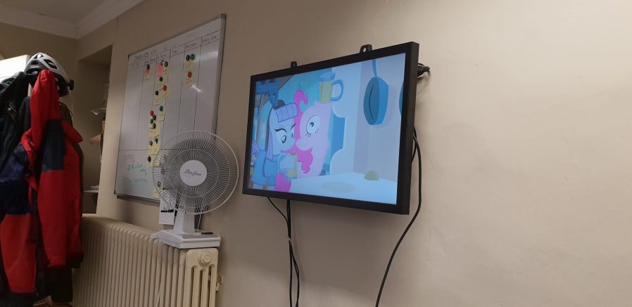
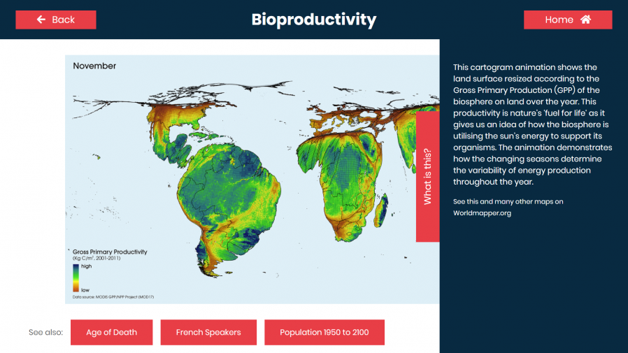
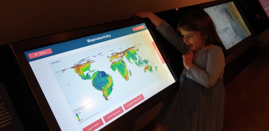
- Samsung Android tablets with freestanding kiosk frames. We run the excellent-value Kiosk Browser Lockdown app on these, which loads on boot and prevents access to anything but a specified website.
- Onelan NTBs connected to a mixture of touch and non-touch screens, wall-mounted or in kiosk frames. We use Onelan’s standard digital signage features as well as – for interactive content – their built-in touch-capable web browser.
- Dell PCs of the standard variety supplied by University IT services, connected to wall-mounted touch screens, running Google Chrome in Kiosk Mode. More on this below.
When you’re developing content for a very small number of browsers and a limited set of screen sizes, you quickly learn to throw a lot of “best practice” web development out of the window. You’ll never come across a text browser or screen reader, so alt-text doesn’t matter. You’ll never have to rescale responsively, so you might as well absolutely-position almost everything. The devices are all your own, so you never need to ask permission to store cookies. And because you control the platform, you can get away with making configuration tweaks to e.g. allow autoplaying videos with audio. Coming from a conventional web developer background to producing digital signage content makes feels incredibly lazy.
This is the “techy bit”. Skip it?
Using Chrome to run digital signage requires, in the Bodleian’s case, a couple of configuration tweaks and the right command-line switches. We use:
-
chrome://flags/#overscroll-history-navigation– disabling this prevents users from triggering “back”/”forward” by swiping with two fingers -
chrome://flags/#pull-to-refresh– disabling this prevents the user from triggering a “refresh” by scrolling up beyond the top of the page (this only happens on some kinds of devices) -
chrome://flags/#system-keyboard-lock– we don’t use attached keyboards, but if you do, you might want to set this flag so you can use thekeyboard.lock()API to intercept e.g. ALT+F4 so users can’t escape the application - running on startup with e.g.
chrome --kiosk --noerrdialogs --allow-file-access-from-files --disable-touch-drag-drop --incognito https://example.com/some/url- Kisok mode makes the browser run fullscreen and prevents e.g. opening additional tabs, giving an instant “app-like” experience. As we don’t have keyboards attached to our digital signage, this also prevents visitors from closing Chrome.
- Turning off error dialogs reduces the risk that an error will result in an unslightly message to the user.
- Enabling “file access from files” allows content hosted at file:// addresses to access content at other file:// addresses, which makes it possible to write “offline” sites (sometimes useful where we’re serving large videos or on previous occasions when WiFi has been shaky) that can still take advantage of features like the Fetch API.
- Unless you need drag-and-drop, it’s simpler to disable it; this prevents a user long-press-and-dragging an image around the screen.
- Incognito mode ensures that the browser doesn’t remember what site was showing last time it ran; our computers often end up switched off at the wall at the end of the day, and without this the browser will offer to load the site it had open last time, when it runs.
- We usually host our interactives directly on the web, at “secret” addresses, and this is generally preferable to us as we can more-easily make on-the-fly adjustments to content (plus it makes it easier to hook up analytic tools).
Meanwhile, in the application’s CSS code, we set * { user-select: none; } to prevent the user from highlighting
text by selecting it with their finger. We also make heavy use of absolutely-sized/positioned, overflow: hidden blocks to ensure that scrollbars never appear, and
CSS animations to make content feel dynamic and to draw attention to particular elements.
Altogether, this approach gives the Bodleian the capability to produce engaging interactive content at low cost and using the existing skills of their digital and exhibitions teams. It’s not an approach that would work for every cultural institution: in particular, some of the Bodleian’s sister institutions already outsource the technical parts of their web work, and so don’t have the expertise in-house to share with a web-powered digital signage solution.
But for those museums that can fit into this model – or can adapt to do so in future – using the web to produce interactive digital content and digital signage is a highly cost-effective way to engage with visitors, even (or especially!) when dealing with short-lived and/or rotating displays.
It’s also been among my favourite parts of my job at the Bod these last 8½ years, and I’m sure I’ll miss it!