An additional thing I wanted to implement – again, for the next version of my blog’s theme – was an “alt text viewer”. Mastodon has one, and it’s excellent2.
Mastodon’s viewer requires JavaScript, but I was inspired when I saw James come up with a
CSS-based version that used a re-styled checkbox.
But I wanted to do one better. Displaying alt text, too, seems like an example of what would semantically be best-represented by a
<details>/<summary> pair.
Clicking on the image shows a larger version in a lightbox; clicking on the ‘alt’ button shows the alt text… all in semantic HTML and vanilla CSS.3
My first attempt tried to put the alt-text widget inside the <summary> of the original image, but that’s an accessibility no-no, so instead I
wrap both<details> blocks (the lightbox, and the alt-text revealer) inside a container and then reposition the latter over the former.
The rest is all the same kinds of tricks I demonstrated previously, to ensure that you can click in-and-out of both in an intuitive way and that keyboard navigation works as you’d
expect.
I can’t use it on my blog yet (because if I do, it’ll probably break horribly when I add the functionality to my entire theme, later!), but I’ve put together a demonstration page that showcases the technique, plus a GitHub repo with all of the code (which is all public domain/unlicensed). Go have a
play and tell me what you think!
Footnotes
1 As a secondary goal, using <details>/<summary>
means that it’ll behave better when CSS is disabled or unavailable, which’ll make it easier to celebrate Naked CSS Day!
2 Why would I, a sighted person, need an alt text viewer, you ask? All kinds of reasons.
Good alt text is for everybody, and can help by providing context, e.g. “explaining” the joke or identifying the probably-well-known-but-I-didn’t-recognise-them subject of a
photo. Here’s some more reasons.
3 If you love owls and you love accessibility, this is the kind of example you should give
a hoot about.
A special level of accessibility failure on Egencia‘s mailing list subscription management page: the labels for choosing
which individual mailing lists to subscribe to are properly-configured, but the “unsubscribe all” one isn’t. Click the words “unsubscribe all” and… nothing happens.
But it gets better: try keyboard-navigating through the form, and it’s hard not to unsubscribe from everything, even if you didn’t want to! As soon as the
“unsubscribe all” checkbox gets focus, you get instantly unsubscribed: no interaction necessary.
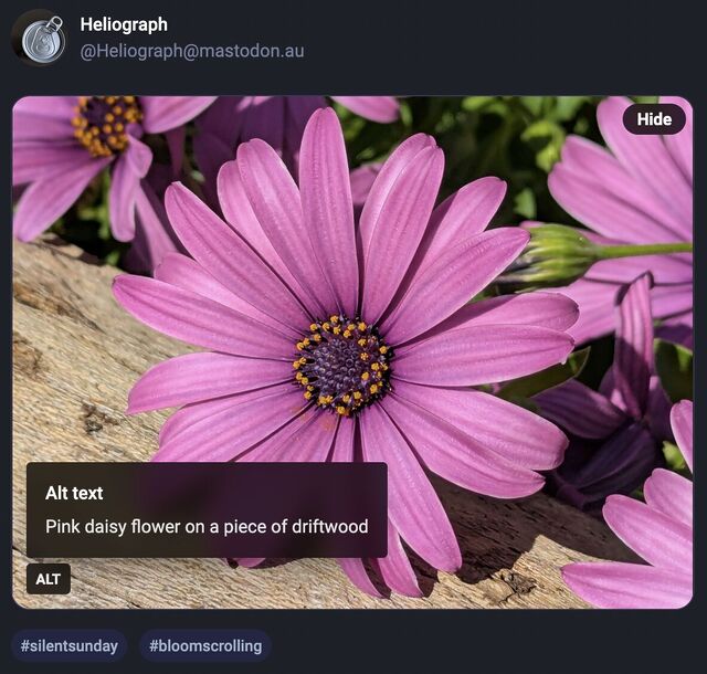
Mastodon shows an “Alt” button in the bottom right of images that have associated alt text. This button, when clicked, shows the alt text the author has written for the image.
…
After using this button a few times, I realised how much I appreciated reading the alt text for an image. Reading the alt text helped me better understand an image. In some cases, I
saw posts where the alt text contained context about an image I otherwise would not have had (i.e. the specific name of the game from which a screenshot was taken).
…
Like James, I’ve also long enjoy Mastodon’s tools to help explore alt-text more-easily, but until I saw this blog post of his I’d never have considered porting such functionality to my
own sites.
He’s come up with an implementation, described in his post, that works pretty well. I find myself wondering if a <details>/<summary> UI metaphor
might be more appropriate than a visually-hidden checkbox. Where CSS is disabled or fails, James’ approach displays a checkbox, the word “ALT”, and the entire alt text, which is
visually confusing and will result in double-reading by screen readers.
A <details>/<summary> approach would be closer to
semantically-valid (though perhaps I’m at risk of making them a golden hammer?), and would degrade more gracefully
into situations in which CSS wasn’t available.
Still, a wonderful example of what can be done and something I might look at replicating during my next bout of blog redesigning!
A few years ago I implemented a pure HTML + CSS solution for lightbox images, which I’ve been using on my blog ever since. It works by
pre-rendering an invisible <dialog> for each lightboxable image on the page, linking to the anchor of those dialogs, and exploiting the :target selector
to decide when to make the dialogs visible. No Javascript is required, which means low brittleness and high performance!
It works, but it’s got room for improvement.
One thing I don’t like about it is that it that it breaks completely if the CSS fails for any reason. Depending upon CSS is safer than depending upon JS (which breaks all
the time), but it’s still not great: if CSS is disabled in your browser or just “goes wrong” somehow then you’ll see a hyperlink… that doesn’t seem to go anywhere (it’s an
anchor to a hidden element).
A further thing I don’t like about it is it’s semantically unsound. Linking to a dialog with the expectation that the CSS parser will then make that dialog visible isn’t really
representative of what the content of the page means. Maybe we can do better.
🚀 Wired: <details>-based HTML+CSS lightboxes?
Here’s a thought I had, inspired by Patrick Chia’s <details> overlay trick and by
the categories menu in Eevee’s blog: what if we used a <details> HTML element for a lightbox? The thumbnail image would go in the
<summary> and the full image (with loading="lazy" so it doesn’t download until the details are expanded) beneath, which means it “just works” with or
without CSS… and then some CSS enhances it to make it appear like a modal overlay and allow clicking-anywhere to close it again.
Let me show you what I mean. Click on one of the thumbnails below:
Each appears to pop up in a modal overlay, but in reality they’re just unfolding a <details> panel, and some CSS is making the contents display as if if were
an overlay, complete click-to-close, scroll-blocking, and a blur filter over the background content. Without CSS, it functions as a traditional <details> block.
Accessibility is probably improved over my previous approach, too (though if you know better, please tell me!).
The code’s pretty tidy, too. Here’s the HTML:
<detailsclass="details-lightbox"aria-label="larger image">
<summary>
<imgsrc="thumb.webp"alt="Alt text for the thumbnail image.">
</summary>
<div>
<imgsrc="full.webp"alt="Larger image: alt text for the full image."loading="lazy">
</div>
</details>
The CSS is more-involved, but not excessive (and can probably be optimised a little further):
Native CSS nesting is super nice for this kind of thing. Being able to use :has on the body to detect whether there exists an open lightbox and prevent
scrolling, if so, is another CSS feature I’m appreciating today.
I’m not going to roll this out anywhere rightaway, but I’ll keep it in my back pocket for the next time I feel a blog redesign coming on. It feels tidier and more-universal than my
current approach, and I don’t think it’s an enormous sacrifice to lose the ability to hotlink directly to an open image in a post.
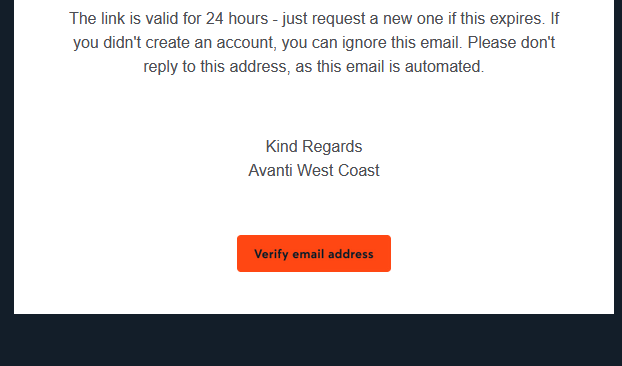
Clearly that certificate only applies to their website, though, and not to e.g. their emails. When you sign up an account with them, you need to verify your email address. They send you
a (HTML-only) email with a link to click. Here’s what that link looks like to a sighted person:
So far, so good. But here’s the HTML code they’re using to create that button. Maybe you’ll spot
the problem:
Despite specifying the font to use three times, they don’t actually have any alt text. So for somebody who can’t see that image, the link is
completely unusable1.
This made me angry enough that I gave up on my transaction and bought my train tickets from LNER instead.
Accessibility matters. And that includes emails. Do better, Avanti.
Footnotes
1 Incidentally, this also makes the email unusable for privacy-conscious people who, like
me, don’t routinely load remote images in emails. But that’s a secondary concern, really.
I noticed that automated emails from Steam weren’t doing alt-text very well. Some image links had no or inadequate alt-text. (Note that Steam don’t support opting for plain text rather
than HTML emails.)
I’m fortunate enough to depend upon alt-text never-to-rarely. But I prefer not to load remote images, so I still benefit from alt-text.
I filled out a support request to Steam layout out the specific examples I’d found of where they weren’t doing very well, and stressing why it’s (morally, legally, etc.) important to do
better.
And you know what: they quietly fixed it. When I received an email today telling me that something on my wishlist is on sale, it had reasonably-good alt-text throughout. Neat.
5. If you use AI, you are the one who is accountable for whatever you produce with it. You have to be certain that whatever you produced was correct. You cannot ask the system
itself to do this. You must either already be expert at the task you are doing so you can recognise good output yourself, or you must check through other, different means the
validity of any output.
…
9. Generative AI produces above average human output, but typically not top human output. If you overuse generative AI you may produce more mediocre output than you are capable of.
…
I was also tempted to include in 9 as a middle sentence “Note that if you are in an elite context, like attending a university, above average for humanity widely could be below
average for your context.”
Point 5 is a reminder that, as I’ve long said, you can’t trust an AI to do anything that you can’t do for yourself. I
sometimes use a GenAI-based programming assistant, and I can tell you this – it’s really good for:
Fancy autocomplete: I start typing a function name, it guesses which variables I’m going to be passing into the function or that I’m going to want to loop through the
output or that I’m going to want to return-early f the result it false. And it’s usually right. This is smart, and it saves me keypresses and reduces the embarrassment of mis-spelling
a variable name1.
Quick reference guide: There was a time when I had all of my PHP DateTimeInterface::format character codes memorised. Now I’d have to look them up. Or I can write a comment (which I should anyway, for the next human) that says something like //
@returns String a date in the form: Mon 7th January 2023 and when I get to my date(...) statement the AI will already have worked out that the format is 'D
jS F Y' for me. I’ll recognise a valid format when I see it, and I’ll be testing it anyway.
Boilerplate: Sometimes I have to work in languages that are… unnecessarily verbose. Rather than writing a stack of setters and getters, or laying out a repetitive
tree of HTML elements, or writing a series of data manipulations that are all subtly-different from one another in ways that are obvious once they’ve been explained to you… I can just
outsource that and then check it2.
Common refactoring practices: “Rewrite this Javascript function so it doesn’t use jQuery any more” is a great example of the kind of request you can throw at an LLM.
It’s already ingested, I guess, everything it could find on StackOverflow and Reddit and wherever else people go to bemoan being stuck with jQuery in their legacy codebase. It’s not
perfect – just like when it’s boilerplating – and will make stupid mistakes3
but when you’re talking about a big function it can provide a great starting point so long as you keep the original code alongside, too, to ensure it’s not removing any
functionality!
Other things… not so much. The other day I experimentally tried to have a GenAI help me to boilerplate some unit tests and it really failed at it. It determined pretty quickly,
as I had, that to test a particular piece of functionality need to mock a function provided by a standard library, but despite nearly a dozen attempts to do so, with copious prompting
assistance, it couldn’t come up with a working solution.
Overall, as a result of that experiment, I was less-effective as a developer while working on that unit test than I would have been had I not tried to get AI assistance: once I
dived deep into the documentation (and eventually the source code) of the underlying library I was able to come up with a mocking solution that worked, and I can see why the AI failed:
it’s quite-possibly never come across anything quite like this particular problem in its training set.
Solving it required a level of creativity and a depth of research that it was simply incapable of, and I’d clearly made a mistake in trying to outsource the problem to it. I was able to
work around it because I can solve that problem.
But I know people who’ve used GenAI to program things that they wouldn’t be able to do for themselves, and that scares me. If you don’t understand the code your tool has
written, how can you know that it does what you intended? Most developers have a blind spot for testing and will happy-path test their code without noticing if they’ve
introduced, say, a security vulnerability owing to their handling of unescaped input or similar… and that’s a problem that gets much, much worse when a “developer” doesn’t even
look at the code they deploy.
Security, accessibility, maintainability and performance – among others, I’ve no doubt – are all hard problems that are not made easier when you use an AI to write code that
you don’t understand.
Footnotes
1 I’ve 100% had an occasion when I’ve called something $theUserID in one
place and then $theUserId in another and not noticed the case difference until I’m debugging and swearing at the computer
2 I’ve described the experience of using an LLM in this way as being a little like having
a very-knowledgeable but very-inexperienced junior developer sat next to me to whom I can pass off the boring tasks, so long as I make sure to check their work because they’re so
eager-to-please that they’ll choose to assume they know more than they do if they think it’ll briefly impress you.
3 e.g. switching a selector from $(...) to
document.querySelector but then failing to switch the trailing .addClass(...) to .classList.add(...)– you know: like an underexperienced but
eager-to-please dev!
Note that there are differences in how they are described in some cases:
“grinning face” is also “beaming face”
“beaming face” is also a “smiling face”
“open mouth” is described by JAWS/Narrator but not by NVDA/VoiceOver
“big eyes” are described by NVDA/VoiceOver but not by JAWS/Narrator
“cold sweat” is “sweat” and also “sweat drop”
…
The differences don’t matter to me (but I am just one and not the intended consumer), as I usually experience just the symbol. Reading the text descriptions is useful though as
quite often I have no idea what the symbols are meant to represent. It is also true that emoji’s take on different meanings in different contexts and to different people. For
example I thought 🤙 meant “no worries” but its description is “call me hand”, what do I know 🤷
What Steve observes is representative of a the two sides of emoji’s biggest problem, which are
that when people use them for their figurative meaning, there’s a chance that they have a different interpretation than others (this is, of course, a risk with any communication,
although the effect is perhaps more-pronounced when abbreviating1),
and
when people use them for the literal image they show, it can appear differently: consider the inevitable confusion that arises from the fact that Twitter earlier this year
changed the “gun” emoji, which everybody changed to look like a water pistol
to the extent that the Emoji Consortium changed its official description, which is likely to be used by screen readers, to “water pistol”, back to looking like a firearm. 🤦
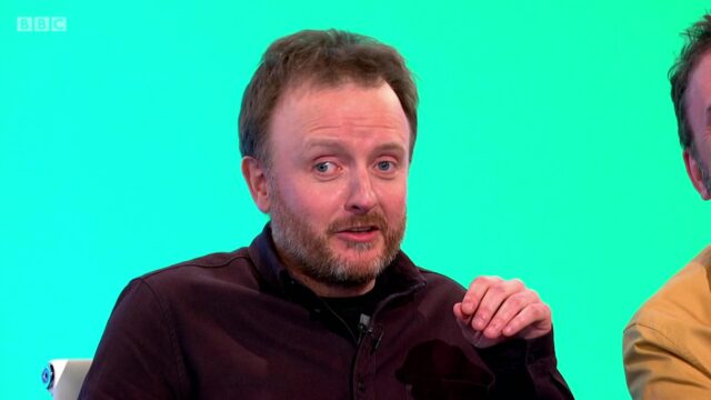
But the thing Steve’s post really left me thinking about was a moment from Season 13, Episode 1 of Would I Lie To
You? (still available on iPlayer!), during which blind comedian Chris McCausland described how the screen reader on his phone processes emoji:
My phone talks, so it reads everything out. And just to give you an insight, even the emojis… if you use an emoji it tells you what the emoji is… and the smiley face – the main
smiley face – specifically for blind people… that one is called “smiling face with normal eyes”. I don’t know if I’m expected to use the smiling face with sunglasses?
I don’t know if it’s true that Chris’s phone actually describes the generic smileys as having “normal eyes”, but it certainly makes for a fantastic gag.
Footnotes
1 I remember an occasion where a generational divide resulted in a hilarious difference of
interpretation of a common acronym, for example. My friend Ash, like most people of their generation, understood “LOL” to mean “laughing out loud”, i.e. an expression of humour. Their
dad still used it in the previous sense of “lots of love”. And so there was a moment of shock and confusion when Ash’s dad,
fondly recalling their recently-deceased mother, sent Ash a text message saying something like: “Thought of your mum today. I miss her. LOL.”.
When was the last time you tested your website in a text-only browser like Lynx (or ELinks, or one of several others)? Perhaps you should.
I’m a big fan of CSS Naked Day. I love the idea of JS Naked Day, although I missed it earlier this month (I was busy abroad, plus my aggressive caching,
including in service workers, makes it hard to reliably make sweeping changes for short periods). I’m a big fan of the idea that, for the vast majority of websites, if it isn’t at least
usable without any CSS or JavaScript, it should probably be considered broken.
This year, I thought I’d celebrate the events by testing DanQ.me in the most-limited browser I had to-hand: Lynx. Lynx has zero CSS or JavaScript support, along with limited-to-no support for heading levels, tables, images, etc. That may seem extreme, but it’s a reasonable
analogue for the level of functionality you might routinely expect to see in the toughest environments in which your site is accessed: slow 2G connections from old mobile hardware,
people on the other side of highly-restrictive firewalls or overenthusiastic privacy and security software, and of course users of accessibility technologies.
Here’s what broke (and some other observations):
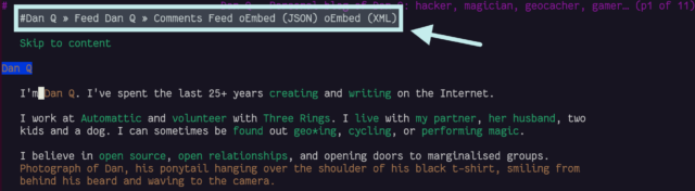
<link rel="alternate">s at the top
I see the thinking that Lynx (and in an even more-extreme fashion, ELinks) have with showing “alternate versions” of a page at the top, but it’s not terribly helpful: most of mine are
designed to help robots, not humans!
Four alternates is pretty common for a WordPress site: post feed, comments feed, and two formats of oEmbed.
I wonder if switching from <link rel="alternate"> elements to Link: HTTP headers would
indicate to Lynx that it shouldn’t be putting these URLs in humans’ faces, while still making them accessible to all the
services that expect to find them? Doing so would require some changes to my caching logic, but might result in a cleaner, more human-readable HTML file as a side-effect. Possibly something worth investigating.
Fortunately, I ensure that my <link rel="alternate">s have a title attribute, which is respected by Lynx and ELinks and makes these scroll-past links
slightly less-confusing.
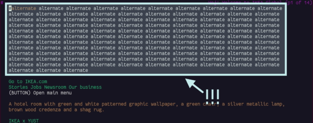
Not all sites title their alternate links. IKEA.com requires you to scroll through 113 anonymous links for their alternate language versions, because Lynx doesn’t understand the
hreflang attribute.
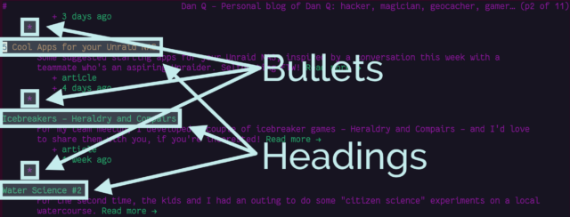
Post list indentation
Posts on the homepage are structured a little like this:
Strictly-speaking, that’s not valid. Heading elements are only permitted within flow elements. I chose to implement it that way because it seemed to be the most semantically-correct way
to describe the literal “list of posts”. But probably my use of <h2> is not the best solution. Let’s see how Lynx handles it:
Lynx “outdents” headings so they stand out, and “indents” lists so they look like lists. This causes a quirky clash where a heading is inside a list.
It’s not intolerable, but it’s a little ugly.
CSS lightboxes add a step to images
I use a zero-JavaScript approach to image lightboxes: you can see it by clicking
on any of the images in this post! It works by creating a (closed) <dialog> at the bottom of the page, for each image. Each <dialog> has a unique
id, and the inline image links to that anchor.
Originally, I used a CSS :target selector to detect when the link had been clicked and show the
<dialog>. I’ve since changed this to a :has(:target) and directed the link to an element within the dialog, because it works better on browsers
without CSS support.
It’s not perfect: in Lynx navigating on an inline image scrolls down to a list of images at the bottom of the page and selects the current one: hitting the link again now
offers to download the image. I wonder if I might be better to use a JavaScript-powered lightbox after all!
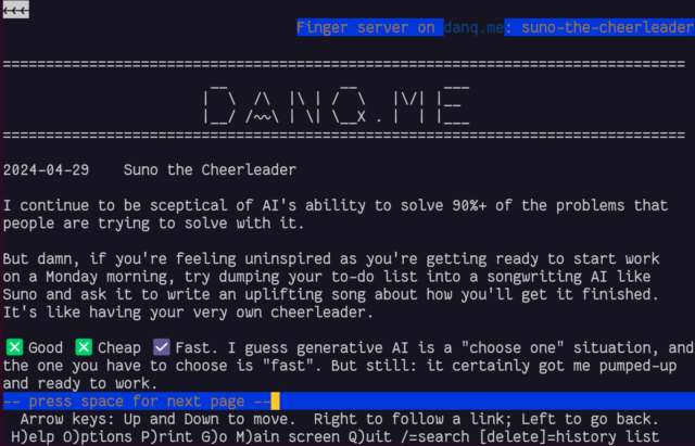
gopher: and finger: links work perfectly!
I was pleased to discover that gopher: and finger: links to alternate copies of a post… worked perfectly! That shouldn’t be a surprise – Lynx natively supports
these protocols.
In a fun quirk and unusually for a standard of its age, the Finger specification did not state the character encoding that ought to
be used. I guess the authors just assumed everybody reading it would use ASCII. But both my
WordPress-to-Finger bridge and Lynx instead assume that UTF-8 is acceptable (being a superset of
ASCII, that seems fair!) which means that emoji work (as shown in the screenshot above). That’s
nuts, isn’t it?
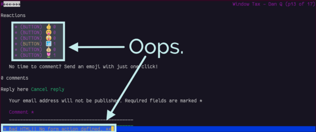
You can’t react to anything
Back in November I added the ability to “react” to a post by clicking an emoji, rather than
typing out a full comment. Because I was feeling lazy, the feature was (and remains) experimental, and I didn’t consider it essential functionality, I implemented it mostly in
JavaScript. Without JavaScript, all you can do is see what others have clicked.
The available emoji vary from post to post; I sometimes like to throw a weird/fun one in there, knowing that it’ll invariably be Ruth that
clicks it first.
In a browser with no JavaScript but with functional CSS, the buttons correctly appear disabled.
But with neither technology available, as in Lynx, they look like they should work, but just… don’t. Oops.
Lynx is correct; this is sloppy code. Without CSS support, it even shows the instruction that implies the buttons will work, but they don’t.
If I decide to keep the reaction buttons long-term, I’ll probably reimplement them so that they function using plain-old HTML
and HTTP, using a <form>, and refactor my JavaScript to properly progressively-enhance the buttons for
those that support it. For now, this’ll do.
Comment form honeypot
The comment form on my blog posts works… but there’s a quirk:
At the end of the comments form, an additional <textarea> appears!
That’s an annoyance. It turns out it’s a honeypot added by Akismet: a fake comments field, normally hidden, that tries to trick spam bots into filling
it (and thus giving themselves away): sort-of a “reverse CAPTCHA” where the
robots do something extra, unintentionally, to prove their inhumanity. Lynx doesn’t understand the code that Akismet uses to hide the form, and so it’s visible to humans, which
is suboptimal both because it’s confusing but also because a human who puts details into it is more-likely to be branded a spambot!
I might look into suppressing Akismet adding its honeypot field in the first place, or else consider one of the alternative anti-spam plugins for WordPress. I’ve heard good things about
Antispam Bee; I ought to try it at some point.
Overall, it’s pretty good
On the whole, DanQ.me works reasonably well in browsers without any JavaScript or CSS capability, with only a few optional
features failing to function fully. There’s always room for improvement, of course, and I’ve got a few things now to add to my “one day” to-do list for my little digital garden.
Obviously, this isn’t really about supporting people using text-mode browsers, who probably represent an incredible minority. It’s about making a real commitment to the
semantic web, to accessibility, and to progressive enhancement! That making your site resilient, performant, and accessible also helps make it function in even the
most-uncommon of browsers is just a bonus.
You can click an image and see a full-window popup dialog box containing a larger version of the image.
The larger version of the image isn’t loaded until it’s needed.
You can close the larger version with a close button. You can also use your browser’s back button.
You can click again to download the larger version/use your browser to zoom in further.
You can share/bookmark etc. the URL of a zoomed-in image and the recipient will see the same image (and return to the
image, in the right blog post, if they press the close button).
No HTTP round trip is required when opening/closing a lightbox: it’s functionally-instantaneous.2
No JavaScript is used at all.
Visitors can click on images to see a larger version, with a “close” button. No JavaScript needed.
Here’s how it works –
The Markup
<figureid="img3336"aria-describedby="caption-img3336"><ahref="#lightbox-img3336"role="button"><imgsrc="small-image.jpg"alt="Alt text is important."width="640"height="480"></a><figcaptionid="caption-img3336">
Here's the caption.
</figcaption></figure>
... (rest of blog post) ...
<dialogid="lightbox-img3336"class="lightbox"><ahref="large-image.jpg"><imgsrc="large-image.jpg"loading="lazy"alt="Alt text is important."></a><aclass="close"href="#img3336"title="Close image"role="button">×</a></dialog>
The HTML is pretty simple (and I automatically generate it, of course).
For each lightboxed image in a post, a <dialog> for that image is appended to the post. That dialog contains a larger copy of the image (set to
loading="lazy" so the browser have to download it until it’s needed), and a “close” button.
The image in the post contains an anchor link to the dialog; the close button in the dialog links back to the image in the post.3 I wrap the lightbox image itself in a link to the full version of the
image, which makes it easier for users to zoom in further using their browser’s own tools, if they like.
Even without CSS, this works (albeit with “scrolling” up and down to the larger image). But the clever bit’s yet to
come:
The Style
body:has(dialog:target) {
/* Prevent page scrolling when lightbox open (for browsers that support :has()) */position:fixed;
}
a[href^='#lightbox-'] {
/* Show 'zoom in' cursor over lightboxed images. */cursor: zoom-in;
}
.lightbox {
/* Lightboxes are hidden by-default, but occupy the full screen and top z-index layer when shown. */all:unset;
display:none;
position:fixed;
top:0;
left:0;
width:100%;
height:100%;
z-index:2;
background:#333;
}
.lightbox:target {
/* If the target of the URL points to the lightbox, it becomes visible. */display: flex;
}
.lightboximg {
/* Images fill the lightbox. */object-fit:contain;
height:100%;
width:100%;
}
/* ... extra CSS for styling the close button etc. ... */
Here’s where the magic happens.
Lightboxes are hidden by default (display: none), but configured to fill the window when shown.
They’re shown by the selector .lightbox:target, which is triggered by the id of the <dialog> being referenced by the anchor part of
the URL in your address bar!
Summary
It’s neither the most-elegant nor cleanest solution to the problem, but for me it hits a sweet spot between developer experience and user experience. I’m always disappointed when
somebody’s “lightbox” requires some heavyweight third-party JavaScript (often loaded from a CDN), because that seems to be the
epitome of the “take what the Web gives you for free, throw it away, and reimplement it badly in JavaScript” antipattern.
There’s things I’ve considered adding to my lightbox. Progressively-enhanced JavaScript that adds extra value and/or uses the Popover API where available, perhaps? View Transitions to animate the image “blowing up” to the larger size, while the full-size image loads in the
background? Optimistic preloading when hovering over the image4? “Previous/next” image links when lightboxing a gallery? There’s lots of potential to expand it
without breaking the core concept here.
I’d also like to take a deeper dive into the accessibility implications of this approach: I think it’s pretty good, but accessibility is a big topic and there’s always more to
learn.
In the meantime, why not try out my lightbox by clicking on this picture of my dog (photographed here staring longingly at the bacon sandwich picture above, perhaps).
I hope the idea’s of use to somebody else looking to achieve this kind of thing, too.
Footnotes
1 Where JavaScript is absolutely necessary, I (a) host it on the same domain, for
performance and privacy-respecting reasons, and (b) try to provide a functional alternative that doesn’t require JavaScript, ideally seamlessly.
2 In practice, the lightbox images get lazy-loaded, so there can be a short round
trip to fetch the image the first time. But after that, it’s instantaneous.
3 The pair – post image and lightbox image – work basically the same way as footnotes,
like this one.
4 I already do this with links in general using the excellent instant.page.
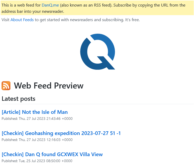
I’ve made a handful of tweaks to my RSS feed which I feel improves upon
WordPress’s default implementation, at least in my use-case.1 In case any of these improvements help
you, too, here’s a list of them:
Post Kinds in Titles
Since 2020, I’ve decorated post titles by prefixing them with the “kind” of post they are (courtesy of the Post Kinds
plugin). I’ve already written about how I do it, if you’re
interested.
Identifying post kinds is particularly useful for people who subscribe by
email (the emails are generated off the RSS feed either daily or weekly: subscriber’s choice), who might want to see
articles and videos but not care about for example checkins and reposts.
RSS Only posts
A minority of my posts are – initially, at least – publicised only via my RSS feed (and places that are directly fed
by it, like email subscribers). I use a tag to identify posts to be hidden in this way. I’ve
written about my implementation before, but I’ve since made a couple of additional improvements:
Suppressing the tag from tag clouds, to make it harder to accidentally discover these posts by tag-surfing,
Tweaking the title of such posts when they appear in feeds (using the same technique as above), so that readers know when they’re seeing “exclusive” content, and
Setting a X-Robots-Tag: noindex, nofollow HTTP header when viewing such tag or a post, to discourage
search engines (code for this not shown below because it’s so very specific to my theme that it’s probably no use to anybody else!).
// 1. Suppress the "rss club" tag from tag clouds/the full tag listfunctionrss_club_suppress_tags_from_display( string $tag_list, string $before, string $sep, string $after, int $post_id ): string {
foreach(['rss-club'] as$tag_to_suppress){
$regex=sprintf( '/<li>[^<]*?<a [^>]*?href="[^"]*?\/%s\/"[^>]*?>.*?<\/a>[^<]*?<\/li>/', $tag_to_suppress );
$tag_list=preg_replace( $regex, '', $tag_list );
}
return$tag_list;
}
add_filter( 'the_tags', 'rss_club_suppress_tags_from_display', 10, 5 );
// 2. In feeds, tweak title if it's an RSS exclusivefunctionrss_club_add_rss_only_to_rss_post_title( $title ){
$post_tag_slugs=array_map(function($tag){ return$tag->slug; }, wp_get_post_tags( get_the_ID() ));
if ( !in_array( 'rss-club', $post_tag_slugs ) ) return$title; // if we don't have an rss-club tag, drop out herereturn trim( "{$title} [RSS Exclusive!]" );
return$title;
}
add_filter( 'the_title_rss', 'rss_club_add_rss_only_to_rss_post_title', 6 );
Adding a stylesheet
Adding a stylesheet to your feeds can make them much friendlier to beginner users (which helps drive adoption) without making them much less-convenient for people who know how
to use feeds already. Darek Kay and Terence Eden both wrote great articles about this just
earlier this year, but I think my implementation goes a step further.
In addition to adding some “Q” branding, I made tweaks to make it work seamlessly with both my RSS and Atom feeds by using
two<xsl:for-each> blocks and exploiting the fact that the two standards don’t overlap in their root namespaces. Here’s my full XSLT; you need to
override your feed template as Terence describes to use it, but mine can be applied to both RSS and Atom.2
I’ve still got more I’d like to do with this, for example to take advantage of the thumbnail images I attach to posts. On which note…
Thumbnail images
When I first started offering email subscription options I used Mailchimp’s RSS-to-email service, which was… okay,
but not great, and I didn’t like the privacy implications that came along with it. Mailchimp support adding thumbnails to your email template from your feed, but WordPress themes don’t
by-default provide the appropriate metadata to allow them to do that. So I installed Jordy Meow‘s RSS Featured Image plugin which did it for me.
<item><title>[Checkin] Geohashing expedition 2023-07-27 51 -1</title><link>https://danq.me/2023/07/27/geohashing-expedition-2023-07-27-51-1/</link>
...
<media:contenturl="https://bcdn.danq.me/_q23u/2023/07/20230727_141710-1024x576.jpg"medium="image"/><media:description>Dan, wearing a grey Three Rings hoodie, carrying French Bulldog Demmy, standing on a path with trees in the background.</media:description></item>
Media attachments for RSS feeds are perhaps most-popular for podcasts, but they’re also great for post thumbnail images.
During my little redesign earlier this year I decided to go two steps further: (1) ditching the
plugin and implementing the functionality directly into my theme (it’s really not very much code!), and (2) adding not only a <media:content medium="image" url="..."
/> element but also a <media:description> providing the default alt-text for that image. I don’t know if any feed readers (correctly) handle this
accessibility-improving feature, but my stylesheet above will, some day!
So there we have it: a little digital gardening, and four improvements to WordPress’s default feeds.
RSS may not be as hip as it once was, but little improvements can help new users find their way into this (enlightened?) way
to consume the Web.
If you’re using RSS to follow my blog, great! If it’s not for you, perhaps pick your favourite alternative way to get updates, from options including email, Telegram, the Fediverse (e.g. Mastodon), and more…
1 The changes apply to the Atom
feed too, for anybody of such an inclination. Just assume that if I say RSS I’m including Atom, okay?
2 The experience of writing this transformation/stylesheet also gave me yet another opportunity to remember how much I hate
working with XSLTs. This time around, in addition to the normal namespace issues and headscratching
syntax, I had to deal with the fact that I initially tried to use a feature from XSLT version 2.0 (a
22-year-old version) only to discover that all major web browsers still only support version 1.0 (specified last millenium)!
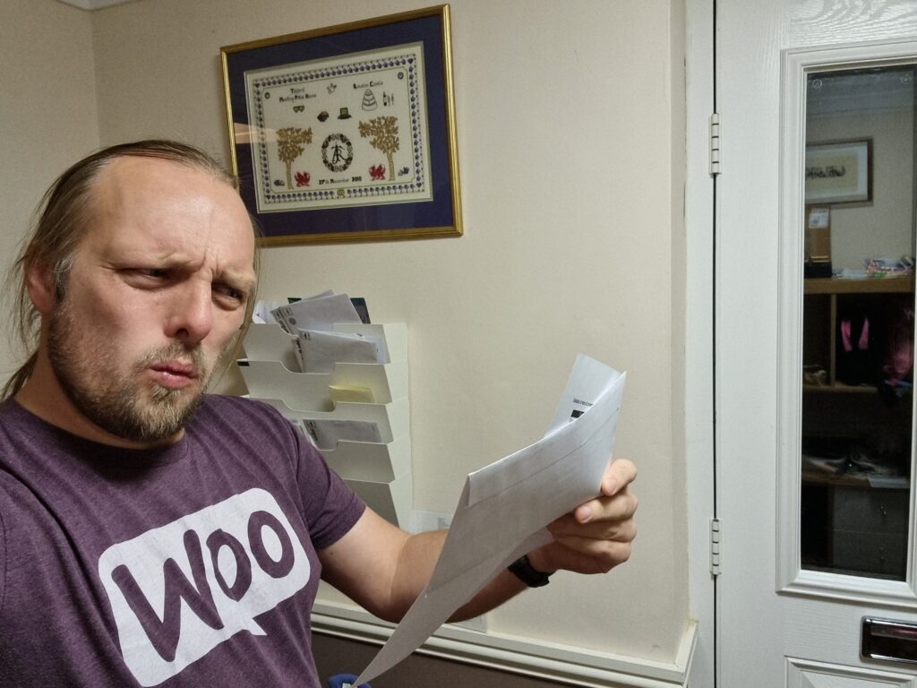
A few weeks ago, my credit card provider wrote to me to tell me that they were switching me back from paperless to postal billing because I’d “not been receiving their emails”.
This came as a surprise to me because I have been receiving their emails. Why would they think that I hadn’t?
This is a re-enactment but I promise the facial expression is pretty much right.
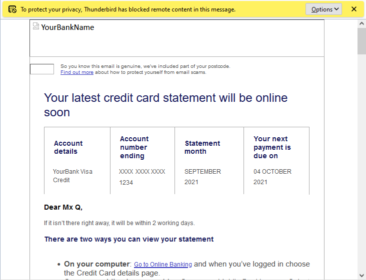
Turns out they have a tracking pixel in their email to track that it’s been opened, as well as potentially additional data such as when it was opened (or re-opened), what email client
or clients the recipient uses, what IP address or addresses they read their mail from, and so on.
“To protect your privacy from fucking creepy banks misusing features of HTML emails, Thunderbird has blocked remote content
in this message.” only tells half the story.
Do you have numbers on how many people opened a particular newsletter? Do you have numbers on how many people clicked a particular link?
You can call it data, or stats, or analytics, but make no mistake, that’s tracking.
Follow-on question: do you honestly think that everyone who opens a newsletter or clicks on a link in a newsletter has given their informed constent to be tracked by you?
Needless to say, I had words with my credit card provider. Paperless billing is useful to almost everybody but it’s incredibly useful for blind and partially-sighted users (who are also
the ones least-likely to have images loading in the first place, for obvious reasons) because your computer can read your communication to you which is much more-convenient
than a letter. Imagine how annoyed you’d be if your bank wrote you a letter (which you couldn’t read but had to get somebody else to read to you) to tell you that because you don’t
look at the images in their emails they’re not going to send them to you any more?
Even if you can somehow justify using tracking technologies (which don’t work reliably) to make general, statistical decisions (“fewer people open our emails when the subject
contains the word ‘overdraft’!”), you can’t make individual decisions based on them. That’s just wrong.
Using <input type="text" inputmode="numeric" pattern="[0-9]*"> allows for a degree of separation between how the user enters data (“input mode”), what the browser
expects the user input to contain (type equals number), and potentially how it tries to validate it.
…
I’ve sung the praises of the GDS research team before, and it’s for things like this that I respect them the most: they’re
knowing for taking a deep-dive user-centric approach to understanding usability issues, and they deliver valuable actionable answers off the back of it.
If you’ve got Web forms that ask people for numbers, this is how you should be doing it. If you’re doing so specifically for 2FA purposes, see that post I shared last month on a similar topic.
Don’t understand why Web accessibility is important? Need a quick and easily-digestible guide to the top things you should be looking into in order to make your web applications
screenreader ready? Try this fun, video-game-themed 5 minute video from Microsoft.
There’s a lot more to accessibility than is covered here, and it’s perhaps a little over-focussed on screenreaders, but it’s still a pretty awesome introduction.
Google’s built-in testing tool Lighthouse judges the accessibility of our websites with a score between 0 and 100. It’s laudable to try to get a high grading, but a score of 100
doesn’t mean that the site is perfectly accessible. To prove that I carried out a little experiment.
…
Manuel Matuzovic wrote a web page that’s pretty-much inaccessible to everybody: it doesn’t work with keyboard navigation, touchscreens, or mice. It doesn’t work with screen
readers. Even if you fix the other problems, its contrast is bad enough that almost nobody could read it. It fails ungracefully if CSS or JavaScript is unavailable. Even the source code is illegible. This took a special kind of evil.
But it scores 100% for accessibility on Lighthouse! I earned my firework show for this site last year but I know better than to let that lull
me into complacency: accessibility isn’t something a machine can test for you, only something that (at best) it can give you guidance on.