This checkin to geohash 2019-08-01 51 -1 reflects a geohashing expedition. See more of Dan's hash logs.
Location
Edge of field near Charlbury railway station, Oxfordshire. Looks to be accessible via a narrow road connecting the B4437 to what looks like a sewage treatment plant.
Participants
Plans
Dan Q plans to cycle out to the hashpoint this morning/early afternoon, aiming to arrive around 13:00.
Expedition
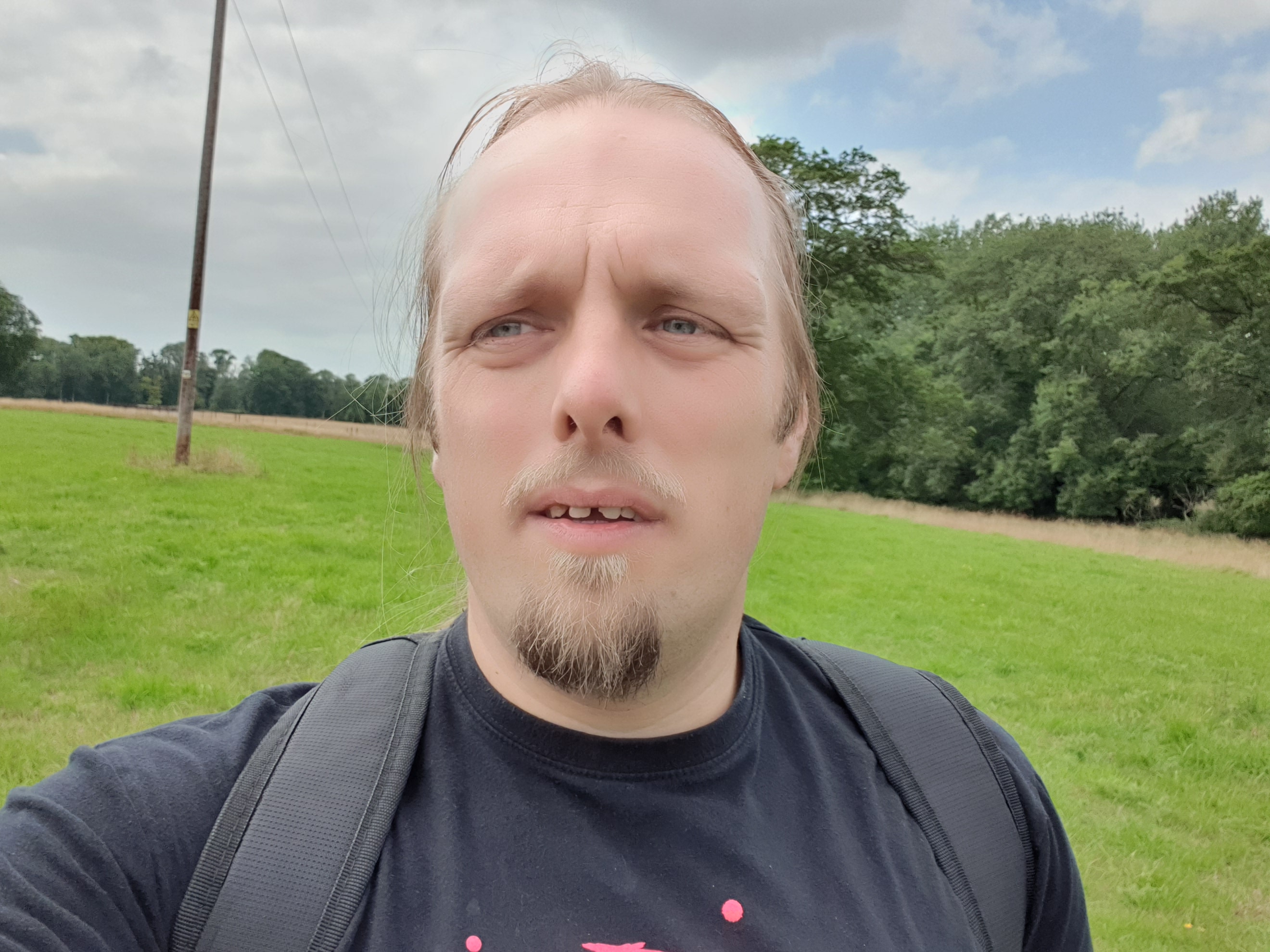
A morning meeting with an estate agent wrapped-up sooner than I expected, and I found myself with enough free time to tackle a cycle out to (and back from) this hashpoint with enough
time to spare to do a little freelance work and study in the afternoon. The sun beamed gloriously except during a few windy moments (as you can hear hear in the accompanying video) and
a couple of points where it briefly threatened to rain before changing its mind.
I picked a route that minimised the time I would spend on major roads: I left Kidlington via the towpath alongside the Oxford Canal, taking the woodland path to Begbroke alongside the
“fairy doors”, and then the cyclepath alongside the A44 into Woodstock. There, I’d planned to cut through the grounds of Blenheim Palace, but for a brief moment I worried that this might not be possible: some kind of event is taking place
at the Palace this week, and it seemed possible that parts of the grounds would be inaccessible. Fortunately I was allowed through and was able to continue my adventure without
venturing on the main roads, but I still wonder if my route was truly legit: when I came out of the other side of the grounds I noticed a sign indicating that the route I’d taken was
not supposed to be a public right of way to the Palace I’d just come from!
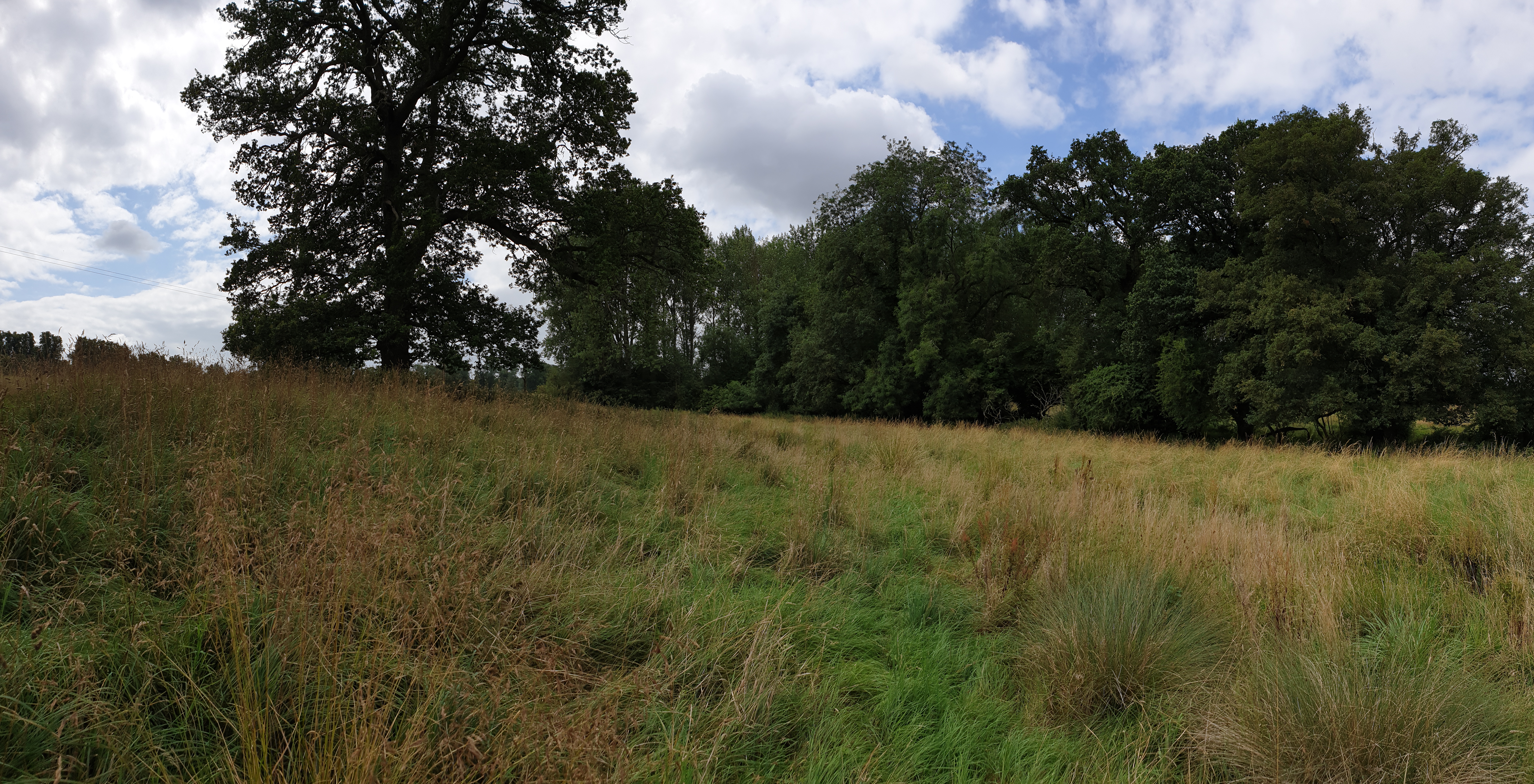
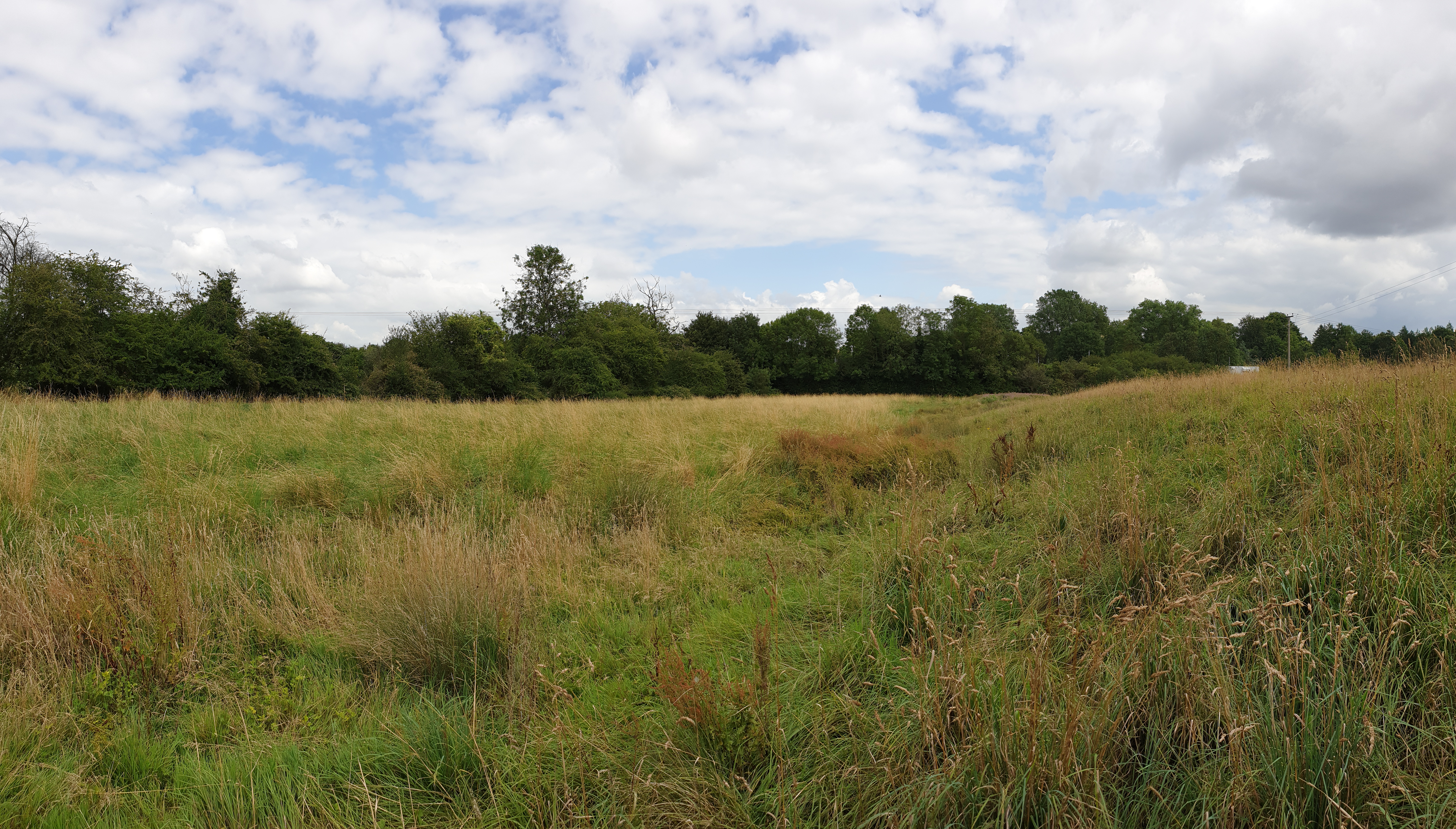
Pushing on through Stonesfield and Fawler I made my way to Charlbury, dismounted twice to pick my way through the village’s confusing one-way system, found the station, and made my way
down the lane behind it. There’s a lovely little nursery there called The Railway Children, which is pretty cute for a nursery alongside a station. The lane seemed to exist only for the
purpose of serving the sewage treatment works at the end of it, but nobody batted an eye at my cycling down it, and I was able to park my bike up half-way and walk the remaining
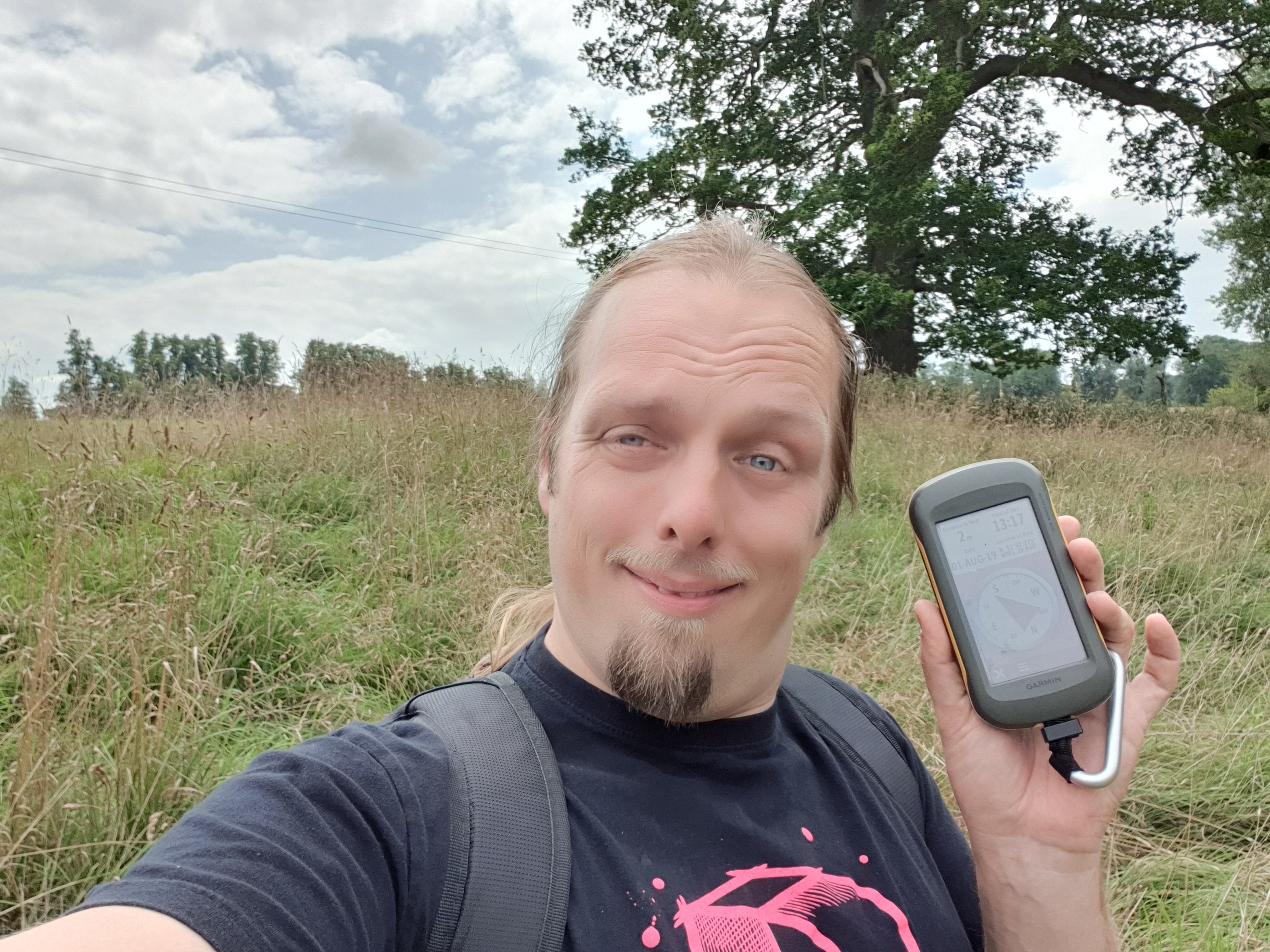
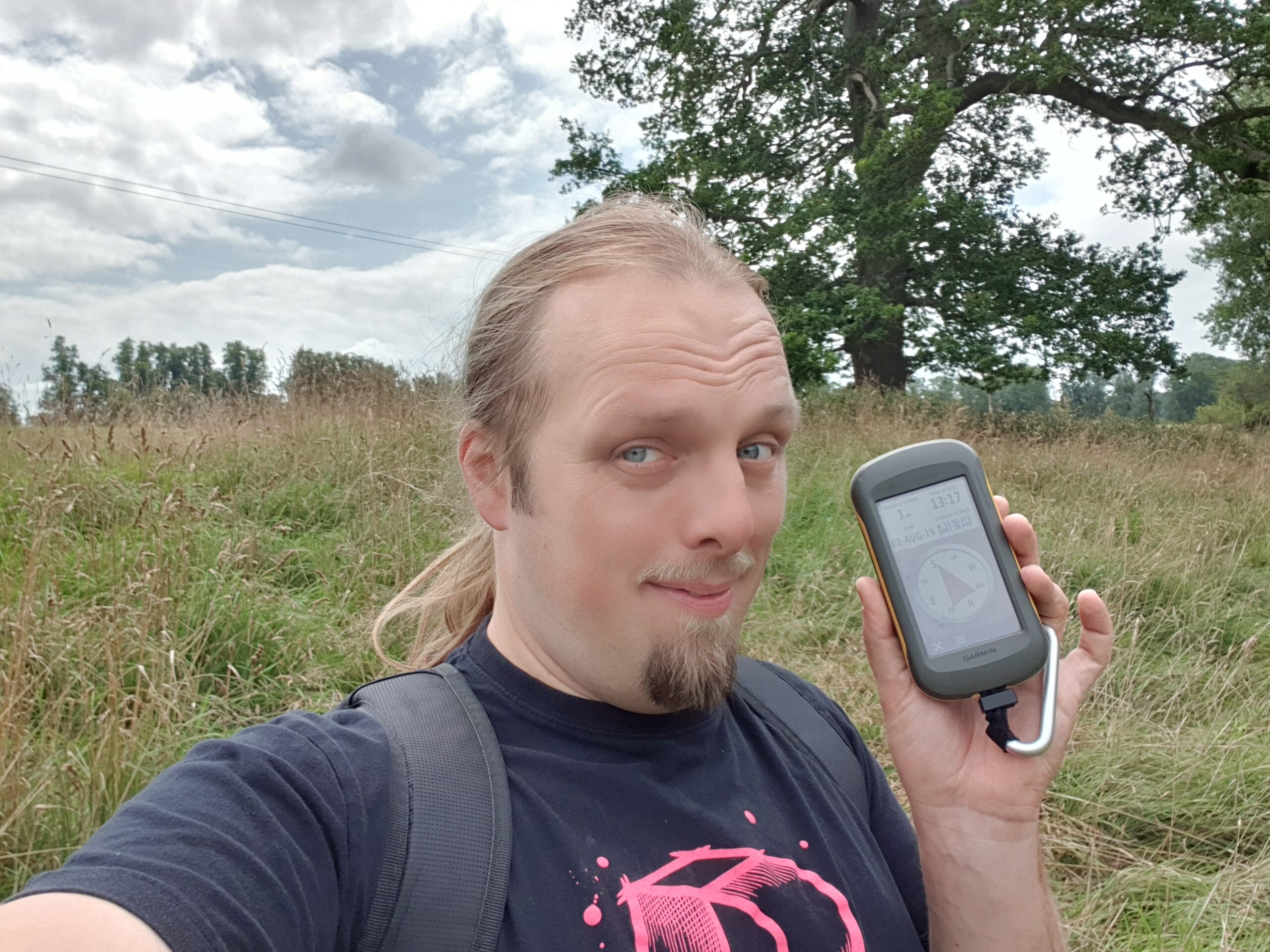
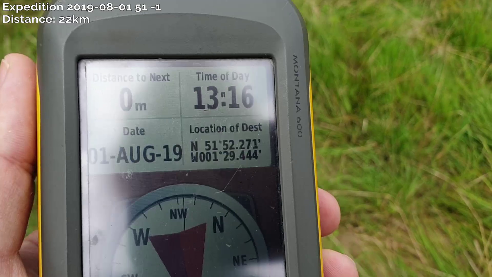
distance up through the grassy field to the hashpoint, arriving at about 13:30. It’s a beautiful area, but there’s not much more to say about it than that.
On the return journey I called in at geocaches GC1JMQY (log) and GC873ZQ (log), but failed to find GC87403 (log), principally because I was running out of spare time and had to cut my search short. I cycled home,
logging a total journey of around 43 kilometres (around 27 miles).
Tracklog
My GPSr keeps a tracklog:
Video
I vlogged the entire experience.
Music: Pitx Remix by Martin Cee (softmartin) Copyright 2019, used under a Creative Commons Attribution (3.0)
license.
You can also watch it at:
Photos