My house is under water.
Well, fuck.
James van der Beek died this week of bowel cancer; he was only a couple of years older than I am. I guess I’m at that point of my life where unexpectedly-early celebrity deaths might start being “around my age”.

I’m neither young nor angsty enough to enjoy a re-watch of Dawson’s Creek, but I especially loved him in Don’t Trust the B—- in Apartment 23 so maybe I’ll re-watch that.
This is a repost promoting content originally published elsewhere. See more things Dan's reposted.
- What fragments you?
- What defragments you?
- How are you balancing both?
My dear friend Boro raises this curious provocation, which I really enjoyed musing upon this evening. His choice of words are excellent.
Fragmentation is about context-switching. About disfocus. About the scattering of ideas. We think of defragmentation – the “re-ordering” of data – as a necessary good: bringing management and logic to how our information is arranged. But it’s Boro’s third question that reminds us that that’s not necessarily true.1 2
Anyway: Boro’s post is a reminder that a human brain is not a magnetic drum, and fragmentation is not necessarily something to fear. What’s an extra millisecond or two of psychological “seek time” as you aim to remember the date of your friend’s birthday… if the mental journey takes you past memories of parties long-ago? How bad, really, is a few moments of seeking the right word if, on the way, you discover the perfect metaphor for that blog post?3
What Boro accidentally touches on, for me, is the concept of premature optimisation. We talk about this being bad in software engineering circles, but it’s also bad for us psychologically. Taking shortcuts weakens our ability to think things through “the hard way”. Earlier today, I had a thought about… something inconsequential about heart rates… and chose to use mental arithmetic, over the course of several minutes, to estimate an answer to my query. My phone – with its built-in calculator app – sat in my pocket the whole time. I chose the less-efficient route, and I felt better for it. Efficiency is not always the goal.
Or, as folks in my circles are saying a lot lately: inconvenience is counterculture. I quite like that.
Anyway: thanks, Boro, for the thought.
1 Brief side-note #1: if you’re wondering why you haven’t had to “defrag your hard drive” for the last decade or so: the biggest reason is that SSDs don’t suffer fragmentation in the same kind of way (and, indeed, trying to defragment them probably reduces their lifespan!). Fragmentation on physical media is a problem only because the magnetic heads need to jump back and forth between “parts” of a file or stream of data, which introduces wear and slows down seeking. But on solid state media, where data is referenced directly by memory address, fragmentation is no impediment.
2 Brief side-note #2, with the understanding that the side notes are now getting to be longer than the actual content: one of my favourite features of late-stage HDD defragmentation utilities was that they were smart about what they defragmented where. Not only could they group individual files “together”, they could also group frequently-used-together files close to one another (minimising head movement) and could even cluster frequently-accessed files like operating system data very close to the edge of physical media, where the angular rotation of the heads would be smallest (because the track length was greatest). Mind-boggling how these things, like e.g. screen savers as a mechanism to prevent CRT burn-in, become completely obsolete but still live on in popular consciousness.
3 Y’know, the one about defragmentation.
This is a repost promoting content originally published elsewhere. See more things Dan's reposted.
It’s the year 2101. Corporations have taken over the world. The only way to be free is to join a pirate crew and start plundering the galaxy. The only means of survival is to play basketball.
Now it’s your turn to go out there and make a name for yourself. Create your crew and start wandering the galaxy in search of worthy basketball opponents.
The game is under heavy development and breaking changes are often introduced. If you can’t continue an old game because the save file is invalid, you probably need to start a new one or open an issue to check if the save file can be migrated.
…
Just try it out!
Connect via SSH to try the game.
ssh rebels.frittura.org -p 3788Save files are deleted after 2 days of inactivity.
…
I feel like I’m reading a lot about SSH lately and how it can be used for exotic and unusual tasks. Tarpitting‘s fun, of course, but really what inspires me is all these dinky projects like ssh tiny.christmas that subvert the usual authentication-then-terminal flow that you expect when you connect to an SSH server.
These kinds of projects feel more like connecting to a BBS. And that’s pretty retro (and cool!).
Anyway: Rebels in the Sky is a networked multiplayer terminal-based game about exploring the galaxy with a team of basketball-loving space pirates. I met the main developer on a forum and they seem cool; I’m interested to see where this quirky little project ends up going!
(The pixel art planets, based on Deep-Fold’s work, are amazing too. Honestly impressed to see animations like these transmitted over a shell!)
This is a repost promoting content originally published elsewhere. See more things Dan's reposted.
In the style of Wild Bread, Curious Cones is a catalogue of traffic cones in unusual places, and that is all.
How wonderful and weird our World Wide Web is, that such a thing can exist. And it’s got an 88×31, too (now sported on my blogroll)!
With thanks to Piece of the Pie’s “Site of the Week” for helping me discover it!
Mostly as a note to myself, but here’s what to do if you’re running linuxserver/syncthing via Docker on Unraid and it keeps saying:
ERR Database error when getting previous version (error="getkv: database disk image is malformed (11)" log.pkg=syncthing)
The problem is that Syncthing’s index has been corrupted. I was able to fix it by getting a shell into the relevant Docker container and moving the index: Syncthing detected it as absent and re-created it, re-indexing everything. Here’s what I did:
docker exec -it syncthing bash


                mv /config/index-v2 /config/index-v2-BROKEN
Everything fixed itself immediately and the Docker logs showed the reindex underway.
My partner and her husband (my metamour) have a tradition that every 5th wedding anniversary they get the “next size up” of champagne bottle.
This meant that on yesterday, when we celebrated their 15th, we needed to get through a Methuselah: a massive 6 litre bottle equivalent to nine standard bottles of champagne (rightmost in the attached picture).
It’s times like these you’re glad of friends you can call on to help you drink such a monster!
This checkin to GC8X84J Crawley to Minster Loop - #1 Acrux reflects a geocaching.com log entry. See more of Dan's cache logs.
One last cache on this afternoon’s walk before I had to take the geopup off for a doggy bath! We tried a couple of obvious hosts near the GZ before expanding our search and quickly finding its hidey-hole. TFTC!
This checkin to GC7YHDV One with the tree reflects a geocaching.com log entry. See more of Dan's cache logs.
QEF in the third host I tried. SL. TFTC!
This checkin to GC8X88R Crawley to Minster Loop - #12 Zosma reflects a geocaching.com log entry. See more of Dan's cache logs.
Walking backwards and forwards past the GZ eventually enabled the geopup and I to spot this very-visible but high-up cache. Soon it was retrieved, the log signed, and returned. Logbook is very full; I had to just initial it.
This checkin to GC8X888 Crawley to Minster Loop - #11 Wasat reflects a geocaching.com log entry. See more of Dan's cache logs.
The dog’s walk needed extending to make sure she’s well worn-out and not too-excited for some guests we’re having over this evening, so she and I came and parked on Dry Lane (ironically-named, it seems, as the road was flooded) and walked down to try to find this cache. Unfortunately we weren’t able to find it, this time, but we’ll try again next time we’re in the vicinity.
It’s February, which means that (here in the UK) it’s LGBT+ History Month.1 And it feels like this year, it’s more important than ever to remember our country’s queer history.
In 2015, the UK was ranked first place in ILGA Europe‘s annual “Rainbow Map” study of LGBT rights in 50 countries of Europe. By 2025, the UK had fallen to 22nd place. That’s the fastest drop of any country in the list, tied with Hungary2 and Georgia3.
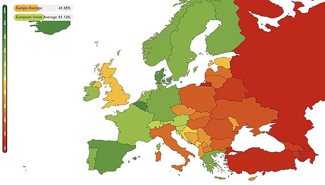
Knowing your history is important. I’ve talked before about my personal experience of growing up under Section 28, and I don’t think that the UK’s backsliding is, by any means, harmless4. In case the reasons for the UK’s drop in the rankings aren’t obvious, it’s pretty much entirely to do with the UK’s increasingly restrictive gender identity laws (thanks, Supreme Court)5.
This stuff affects everybody. When you build a community that is a safe space for queer people, and trans people,6 everybody benefits7. So even if you’re somehow not compelled by the argument that we should treat everybody fairly and with compassion, you should at least accept that it helps you, too, when we do.
In many ways, queer rights in the UK have been a success story in recent decades. Within my lifetime, we’ve seen the harmonisation of the age of consent (2001), civil partnerships (2004), the Gender Recognition Act (2004), the Equality Act (2010), same-sex marriage (2013; I was genuinely surprised this bill passed!) and the mass-pardoning of people previously convicted under discriminatory sex act laws (2017). These are enormous and important steps and it’s little wonder that the UK topped ILGA Europe’s scoreboard for a while there.
But as recent developments have shown: we can’t rest on our laurels. There’s more to do. History shows us what’s possible; it’s up to us to decide whether we keep moving forward or let it unravel.
So this LGBT+ History Month, don’t just remember the past: pay attention to the present, and push back where it’s slipping.
1 We celebrate it in February; I’ve never truly understood why. The Independent claims the month was chosen to coincide with the 2003 abolition of Section 28 in England and Wales, but that wouldn’t happen until later in the year; it doesn’t really coincide with the Employment Equality (Sexual Orientation) Regulations 2003 (made June, commencing December) either. So if anybody knows the real reason the UK marks LGBT+ History month in February, I’ve love to hear it.
2 Hungary banned same-sex couples from adopting five years ago and banned Pride parades last year, in an incredible backslide for an EU country.
3 Georgia’s backslide is superficially similar to Hungary’s except that one can’t help but feel the influence of partial occupier Russia – a frequent bottom-scorer in ILGA’s list – in that.
4 By the way: I just looked back at my own blog posts tagged ‘sexuality’, and man, that shit is on fire! Some fun things there if you’re new to my blog and just catching-up, if I may toot my own horn a little! (Is “toots own horn” a protected identity? ‘Cos I do it a lot.)
5 It’s also aggravated by established but regressive problems like the fact that the UK still doesn’t outlaw “conversion therapy”, gender identity is not a recognised justification for seeking asylum, and protections for intersex people are basically nonexistent.
6 And, it turns out, furries, who’ve ‘gone from “ew cringe” to “they’re the lichens of a healthy social ecosystem”‘.
7 Everybody benefits… except, perhaps, nazis.
This is a repost promoting content originally published elsewhere. See more things Dan's reposted.
…
The Internet, the interconnection of most of the computers in the world, has existed since the late sixties. But no protocol existed to actually exploit that network, to explore and search for information. At the time, you needed to know exactly what you wanted and where to find it. That’s why the USA tried to develop a protocol called “Gopher.”
At the same time, the “World Wide Web,” composed of the HTTP protocol and the HTML format, was invented by a British citizen and a Belgian citizen who were working in a European research facility located in Switzerland. But the building was on the border with France, and there’s much historical evidence pointing to the Web and its first server having been invented in France.
It’s hard to be more European than the Web! It looks like the Official European Joke! (And, yes, I consider Brits Europeans. They will join us back, we miss them, I promise.)
…
Google, Microsoft, Facebook may disappear tomorrow. It is even very probable that they will not exist in fourty or fifty years. It would even be a good thing. But could you imagine the world without the Web? Without HTML? Without Linux?
Those European endeavours are now a fundamental infrastructure of all humanity. Those technologies are definitely part of our long-term history.
…
There are so many ways in which the UK has had to choose – and continues to have to choose – which side of the Atlantic it belongs on: the North American side, or the European side. Legally, politically, financially, culturally… And every time we swing away from Europe, it saddens me.
This wonderful article by Lionel Dricot encapsulates one of many reasons why. European tech culture, compared to that in the USA, leans more open-source, more open-standards, more collaborative. That’s the culture I want more of.
Worth a read.
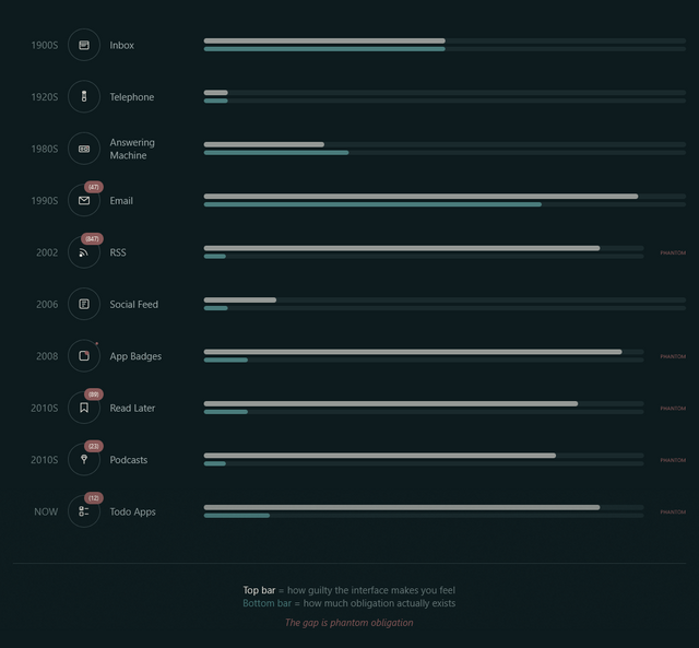
A week or so ago, Terry Godier – who’s been thinking a lot about UX assumptions lately – argued that the design of most feed readers produces an effect called “phantom obligation”.
He observes that the design of feed readers – which still lean on the design of the earliest feed readers, which adopted the design of email software to minimise the learning curve – makes us feel obligated to stay on top of all our incoming content with its “unread counts”.
Email’s unread count means something specific: these are messages from real people who wrote to you and are, in some cases, actively waiting for your response. The number isn’t neutral information. It’s a measure of social debt.
But when we applied that same visual language to RSS (the unread counts, the bold text for new items, the sense of a backlog accumulating) we imported the anxiety without the cause.
…
RSS isn’t people writing to you. It’s people writing, period. You opted to be notified of their existence. The interface implied debt where none existed. The obligation became phantom.
For a while now I’ve been encouraging people to see their feed reader as something distinct from email, and Terry’s expertly summarised exactly why. When people think of RSS as being like email, they’re encouraged to idolise “inbox zero” for both. But that’s not the right metaphor for RSS at all.
I use FreshRSS as my feed reader, and I love it. But here’s the thing: I use the same application for two different kinds of feeds. I call them slow content and fast content.2
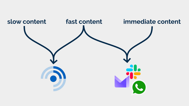
Blogs, news, podcasts, webcomics, vlogs, etc. I want to know that there is unread content, but I don’t need to know how much.
In some cases, I configure my reader to throw away stuff that’s gotten old and stale; in other cases, I want it to retain it indefinitely so that I can dip in when I want to. There are some categories in which I’ll achieve “inbox zero” most days3… but many more categories where the purpose of my feed reader is to gather and retain a library of things I’m likely to be interested in, so that I can enjoy them at my leisure.
I also use my RSS reader to subscribe to a few mailing lists (where an RSS feed isn’t available for some reason). These – like blogs – are often “people writing, period” content and shouldn’t have been sent by email in the first place!4
Some of the things I subscribe to, though, I do want to know about. Not necessarily immediately, but “same day” for sure! This includes things like when it’s a friend’s birthday (via the Abnib Birthdays feed) or when there’s an important update to some software I selfhost.
This is… things I want to know about promptly, but that I don’t want to be interrupted for! I appreciate that this kind of subscription isn’t an ideal use for a feed reader… but I use my feed reader with an appropriate frequency that it’s the best way for me to put these notifications in front of my eyeballs.
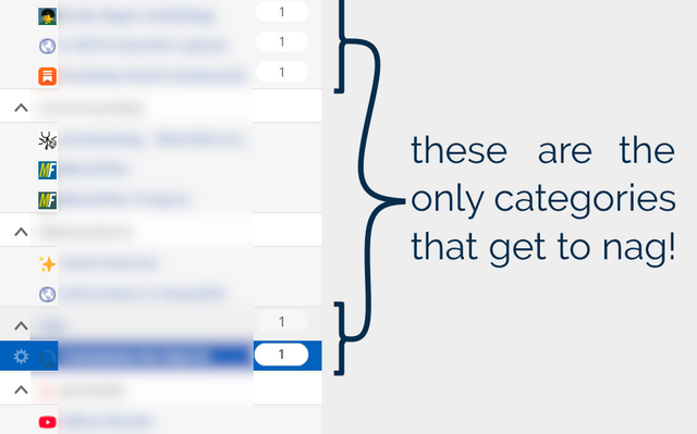
I agree with Terry that unread counts and notification badges are generally a UX antipattern in feed readers… but I’d like to keep them for some purposes. So that’s exactly what I do.
FreshRSS already provides categories. But what I do is simply… not show unread counts except for designated feeds and categories. To do that, I use the CustomCSS extension for FreshRSS (which nowadays comes as-standard!), giving it the following code (note that I want to retain unread count badges only for feed #1 and categories #6 and #8 and their feeds):
.aside.aside_feed {
  /* Hide all 'unread counts' */
  .category, .feed {
    .title:not([data-unread="0"])::after,
    .item-title:not([data-unread="0"])::after {
      display: none;
    }
  }

  /* Re-show unread counts only within:
   * - certain numbered feeds (#f_*) and
   * - categories (#c_*)
   */
  #f_1, #c_6, #c_8 {
    &, .feed {
    .title:not([data-unread="0"])::after,
    .item-title:not([data-unread="0"])::after {
      display: block;
    }
  }
}
That’s how I, personally, make my feed reader feel less like an inbox and more like a… I don’t know… a little like a library, a little like a newsstand, a little like a calendar… and a lot like a tool that serves me, instead of another oppressive “unread” count.
Maybe it’ll help you too.
1 Or whenever you like. It’s ‘slow content’. I’m not the boss of you.
2 A third category, immediate content, is stuff where I might need to take action as soon as I see it, usually because there’s another human involved – things like this come to me by email, Slack, WhatsApp, or similar. It doesn’t belong in a feed reader.
3 It’s still slow content even if I inbox-zero it most days… because I don’t inbox-zero it every day! I don’t feel bad ignoring or skipping it if I’m, for example, not feeling the politics news right now (and can you blame me?). This is fundamentally different than ignoring an incoming phone call or a knock at the door (although you’re absolutely within your rights to do that too, if you don’t have the spoons for it).
4 I’m yet to see a mailing list that wouldn’t be better as either a blog (for few-to-many communication) or a forum (for many-to-many communication), frankly. But some people are very wedded to their email accounts as “the way” to communicate!
I’ve had my itch.io account for about six years; I think I first created it to buy a copy of We Are But Worms: A One Word RPG. I’ve since made several purchases, donations, reviews, and comments, but never really used my account as a “creator”.
I changed that today when I realised that there was nothing to stop me re-publishing games like DNDle and Axe Feather 2021 via my itch.io profile as well as on their current homes (and on GitHub, I suppose). For some folks, itch.io’s discovery features might be the best way for them to discover worthwhile content weird stuff like this.
I might republish some other “things” I’ve made on itch.io too. It’s not like there haven’t been lots of them over the years!