As I mentioned last year, for several years I’ve collected pretty complete historic location data from GPSr devices I carry with me everywhere, which I collate in a personal μlogger server.
Going back further, I’ve got somewhat-spotty data going back a decade, thanks mostly to the fact that I didn’t get around to opting-out of Google’s location tracking until only a few years ago (this data is now also housed in μlogger). More-recently, I now also get tracklogs from my smartwatch, so I’m managing to collate more personal location data than ever before.
Inspired perhaps at least a little by Aaron Parecki, I thought I’d try to do something cool with it.
Heatmapping my movements
The last year

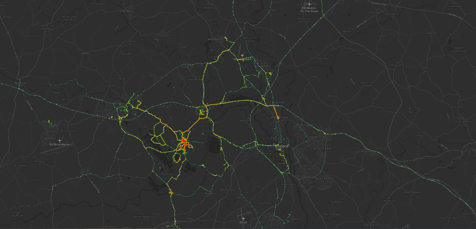
What you’re looking at is a heatmap showing my location over the last year or so since I moved to The Green. Between the pandemic and switching a few months prior to a job that I do almost-entirely at home there’s not a lot of travel showing, but there’s some. Points of interest include:
- The blob around my house, plus some of the most common routes I take to e.g. walk or cycle the children to school.
- A handful of my favourite local walking and cycling routes, some of which stand out very well: e.g. the “loop” just below the big blob represents a walk around the lake at Dix Pit; the blob on its right is the Devils Quoits, a stone circle and henge that I thought were sufficiently interesting that I made a virtual geocache out of them.
- The most common highways I spend time on: two roads into Witney, the road into and around Eynsham, and routes to places in Woodstock and North Oxford where the kids have often had classes/activities.
- I’ve unsurprisingly spent very little time in Oxford City Centre, but when I have it’s most often been at the Westgate Shopping Centre, on the roof of which is one of the kids’ favourite restaurants (and which we’ve been able to go to again as Covid restrictions have lifted, not least thanks to their outdoor seating!).
One to eight years ago
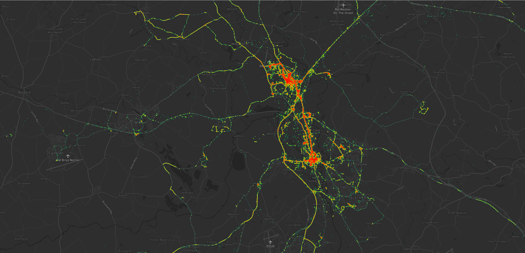
Let’s go back to the 7 years prior, when I lived in Kidlington. This paints a different picture:

This heatmap highlights some of the ways in which my life was quite different. For example:
- Most of my time was spent in my village, but it was a lot larger than the hamlet I live in now and this shows in the size of my local “blob”. It’s also possible to pick out common destinations like the kids’ nursery and (later) school, the parks, and the routes to e.g. ballet classes, music classes, and other kid-focussed hotspots.
- I worked at the Bodleian from early 2011 until late in 2019, and so I spent a lot of time in Oxford City Centre and cycling up and down the roads connecting my home to my workplace: Banbury Road glows the brightest, but I spent some time on Woodstock Road too.
- For some of this period I still volunteered with Samaritans in Oxford, and their branch – among other volunteering hotspots – show up among my movements. Even without zooming in it’s also possible to make out individual venues I visited: pubs, a cinema, woodland and riverside walks, swimming pools etc.
- Less-happily, it’s also obvious from the map that I spent a significant amount of time at the John Radcliffe Hospital, an unpleasant reminder of some challenging times from that chapter of our lives.
- The data’s visibly “spottier” here, mostly because I built the heatmap only out of the spatial data over the time period, and not over the full tracklogs (i.e. the map it doesn’t concern itself with the movement between two sampled points, even where that movement is very-guessable), and some of the data comes from less-frequently-sampled sources like Google.
Eight to ten years ago
Let’s go back further:

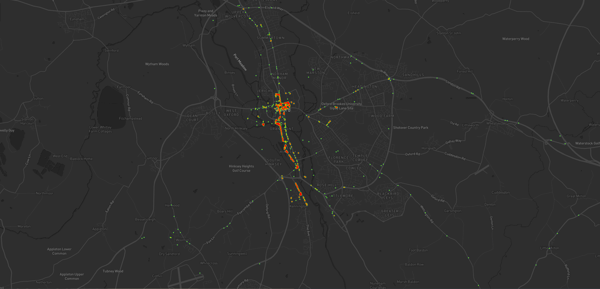
Before 2011, and before we bought our first house, I spent a couple of years living in Kennington, to the South of Oxford. Looking at this heatmap, you’ll see:
- I travelled a lot less. At the time, I didn’t have easy access to a car and – not having started my counselling qualification yet – I didn’t even rent one to drive around very often. You can see my commute up the cyclepath through Hinksey into the City Centre, and you can even make out the outline of Oxford’s Covered Market (where I’d often take my lunch) and a building in Osney Mead where I’d often deliver training courses.
- Sometimes I’d commute along Abingdon Road, for a change; it’s a thinner line.
- My volunteering at Samaritans stands out more-clearly, as do specific venues inside Oxford: bars, theatres, and cinemas – it’s the kind of heatmap that screams “this person doesn’t have kids; they can do whatever they like!”
Every map tells a story
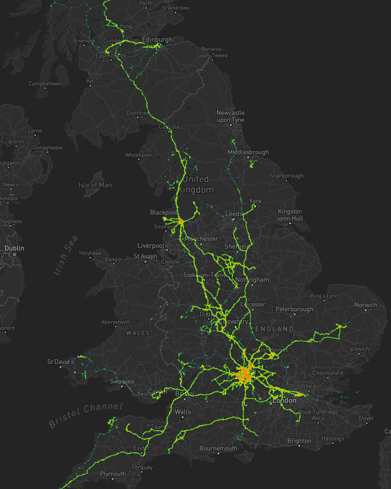
I really love maps, and I love the fact that these heatmaps are capable of painting a picture of me and what my life was like in each of these three distinct chapters of my life over the last decade. I also really love that I’m able to collect and use all of the personal data that makes this possible, because it’s also proven useful in answering questions like “How many times did I visit Preston in 2012?”, “Where was this photo taken?”, or “What was the name of that place we had lunch when we got lost during our holiday in Devon?”.
There’s so much value in personal geodata (that’s why unscrupulous companies will try so hard to steal it from you!), but sometimes all you want to do is use it to draw pretty heatmaps. And that’s cool, too.
How these maps were generated
I have a μlogger instance with the relevant positional data in. I’ve automated my process, but the essence of it if you’d like to try it yourself is as follows:
First, write some SQL to extract all of the position data you need. I round off the latitude and longitude to 5 decimal places to help “cluster” dots for frequency-summing, and I raise the frequency to the power of 3 to help make a clear gradient in my heatmap by making hotspots exponentially-brighter the more popular they are:
SELECT ROUND(latitude, 5) lat, ROUND(longitude, 5) lng, POWER(COUNT(*), 3) `count`
FROM positions
WHERE `time` BETWEEN '2020-06-22' AND '2021-08-22'
GROUP BY ROUND(latitude, 5), ROUND(longitude, 5)
This data needs converting to JSON. I was using Ruby’s mysql2 gem to
fetch the data, so I only needed a .to_json call to do the conversion – like this:
db = Mysql2::Client.new(host: ENV['DB_HOST'], username: ENV['DB_USERNAME'], password: ENV['DB_PASSWORD'], database: ENV['DB_DATABASE'])
db.query(sql).to_a.to_json
Approximately following this guide and leveraging my Mapbox
subscription for the base map, I then just needed to include leaflet.js, heatmap.js, and leaflet-heatmap.js before writing some JavaScript code
like this:
body.innerHTML = '<div id="map"></div>';
let map = L.map('map').setView([51.76, -1.40], 10);
// add the base layer to the map
L.tileLayer('https://api.mapbox.com/styles/v1/{id}/tiles/{z}/{x}/{y}?access_token={accessToken}', {
  maxZoom: 18,
  id: 'itsdanq/ckslkmiid8q7j17ocziio7t46', // this is the style I defined for my map, using Mapbox
  tileSize: 512,
  zoomOffset: -1,
  accessToken: '...' // put your access token here if you need one!
}).addTo(map);
// fetch the heatmap JSON and render the heatmap
fetch('heat.json').then(r=>r.json()).then(json=>{
  let heatmapLayer = new HeatmapOverlay({
    "radius": parseFloat(document.querySelector('#radius').value),
    "scaleRadius": true,
    "useLocalExtrema": true,
  });
  heatmapLayer.setData({ data: json });
  heatmapLayer.addTo(map);
});
That’s basically all there is to it!
