I recently discovered a minor security vulnerability in mobile webcomic reading app Comic Chameleon, and I thought that it was interesting (and tame) enough to share as a learning example of (a) how to find security vulnerabilities in an app like this, and (b) more importantly, how to write an app like this without this kind of security vulnerability.
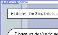
The nature of the vulnerability is that, for webcomics pushed directly into the platform by their authors, it’s possible to read comics (long) before they’re published. By way of proof, here’s a copy of the top-right 200 × 120 pixels of episode 54 of the (excellent) Forward Comic, which Imgur will confirm was uploaded on 2 July 2018: over three months ahead of its planned publication date.
How to hack a web-backed app
Just to be clear, I didn’t set out to hack this app, but once I stumbled upon the vulnerability I wanted to make sure that I was able to collect enough information that I’d be able to explain to its author what was wrong and how to fix it. You’d be amazed how many systems I find security holes in almost-completely by accident. In fact, I’d just noticed that the application supported some webcomics that I follow but for which I hadn’t been able to find RSS feeds (and so I was selfdogfooding my own tool, RSSey, to “produce” RSS feeds for my reader by screen-scraping: not the most-elegant solution). But if this app could produce a list of issues of the comic, it must have some way of doing what I was trying to do, and I wanted to know what it was.
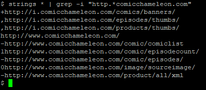
The app, I figured, must “phone home” to some website – probably the app’s official website itself – to get the list of comics that it supports and details of where to get their feeds from, so I grabbed a copy of the app and started investigating. Because I figured I was probably looking for a URL, the first thing I did was to download the raw APK file (your favourite search engine can tell you how to do this), decompressed it (APK files are just ZIP files, really) and ran strings on it to search for likely-looking URLs:
I tried visiting a few of the addresses but many of them seemed to be API endpoints that were expecting additional parameters. Probably, I figured, the strings I’d extracted were prefixes to which those parameters were attached. Rather than fuzz for the right parameters, I decided to watch what the app did: I spun up a simulated Android device using the official emulator (I could have used my own on a wireless network that I control, of course, but this was lazier) and ran my favourite packet sniffer to see what the application was requesting.
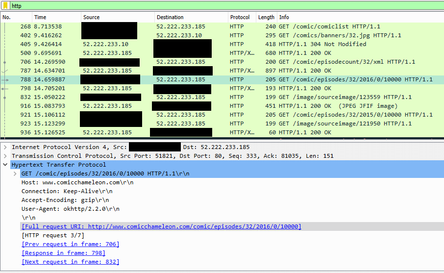
Now I had full web addresses with parameters. Comparing the parameters that appeared when I clicked different comics revealed that each comic in the “full list” was assigned a numeric ID which was used when requesting issues of that comic (along with an intermediate stage where the year of publication is requested).
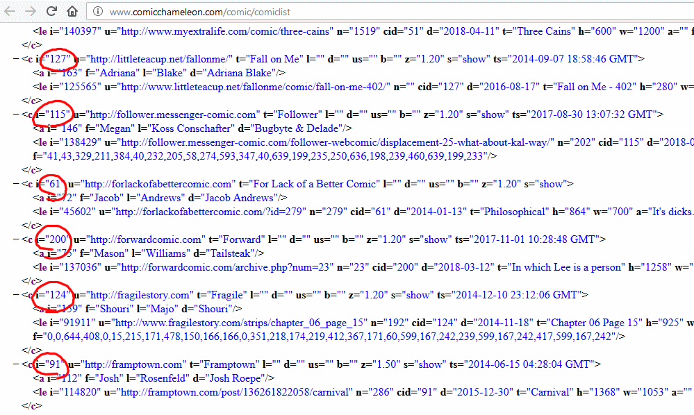
Interestingly, a number of comics were listed with the attribute s="no-show" and did not appear in the app: it looked like comics that weren’t yet being made available via
the app were already being indexed and collected by its web component, and for some reason were being exposed via the XML
API: presumably the developer had never considered that anybody but their app would look at the XML itself, but the thing about the Web is that if you put it on the Web, anybody can see it.
Still: at this point I assumed that I was about to find what I was looking for – some kind of machine-readable source (an RSS feed or something like one) for a webcomic or two. But when I looked at the XML API for one of those webcomics I discovered quite a bit more than I’d bargained on finding:
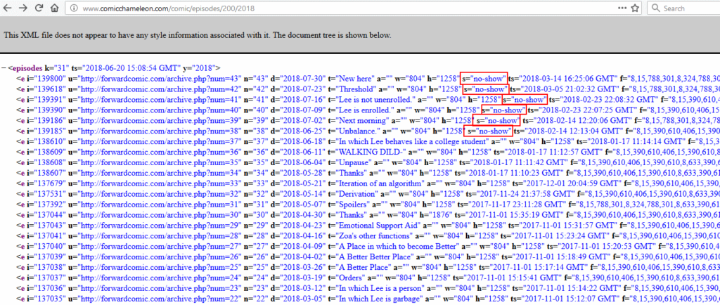
The first webcomic I looked at included the “official” web addresses and titles of each published comic… but also several not yet published ones. The unpublished ones were
marked with s="no-show" to indicate to the app that they weren’t to be shown, but I could now see them. The “official” web addresses didn’t work for me, as I’d expected,
but when I tried Comic Chameleon’s versions of the addresses, I found that I could see entire episodes of comics, up to three and a half months ahead of their expected
publication date.
Whoops.
Naturally, I compiled all of my findings into an email and contacted the app developer with all of the details they’d need to fix it – in hacker terms, I’m one of the “good guys”! – but I wanted to share this particular example with you because (a) it’s not a very dangerous leak of data (a few webcomics a few weeks early and/or a way to evade a few ads isn’t going to kill anybody) and (b) it’s very illustrative of the kinds of mistakes that app developers are making a lot, these days, and it’s important to understand why so that you’re not among them. On to that in a moment.
Responsible disclosure
Because (I’d like to think) I’m one of the “good guys” in the security world, the first thing I did after the research above was to contact the author of the software. They didn’t seem to have a security.txt file, a disclosure policy, nor a profile on any of the major disclosure management sites, so I sent an email. Were the security issue more-severe, I’d have sent a preliminary email suggesting (and agreeing on a mechanism for) encrypted email, but given the low impact of this particular issue, I just explained the entire issue in the initial email: basically what you’ve read above, plus some tips on fixing the issue and an offer to help out.
I subscribe to the doctrine of responsible disclosure, which – in the event of more-significant vulnerabilities – means that after first contacting the developer of an insecure system and giving them time to fix it, it’s acceptable (in fact: in significant cases, it’s socially-responsible) to publish the details of the vulnerability. In this case, though, I think the whole experience makes an interesting learning example about ways in which you might begin to “black box” test an app for data leaks like this and – below – how to think about software development in a way that limits the risk of such vulnerabilities appearing in the first place.
The author of this software hasn’t given any answer to any of the emails I’ve sent over the last couple of weeks, so I’m assuming that they just plan to leave this particular leak in place. I reached out and contacted the author of Forward Comic, though, which turns out (coincidentally) to be probably the most-severely affected publication on the platform, so that he had the option of taking action before I published this blog post.
Lessons to learn
When developing an “app” (whether for the web or a desktop or mobile platform) that connects to an Internet service to collect data, here are the important things you really, really ought to do:
- Don’t publish any data that you don’t want the user to see.
- If the data isn’t for everybody, remember to authenticate the user.
- And for heaven’s sake use SSL, it’s not the 1990s any more.

That first lesson’s the big one of course: if you don’t want something to be on the public Internet, don’t put it on the public Internet! The feeds I found simply shouldn’t have contained the “secret” information that they did, and the unpublished comics shouldn’t have been online at real web addresses. But aside from (or in addition to) not including these unpublished items in the data feeds, what else might our app developer have considered?
- Encryption. There’s no excuse for not using HTTPS these days. This alone wouldn’t have prevented a deliberate effort to read the secret data, but it would help prevent it from happening accidentally (which is a risk right now), e.g. on a proxy server or while debugging something else on the same network link. It also protects the user from exposing their browsing habits (do you want everybody at that coffee shop to know what weird comics you read?) and from having content ‘injected’ (do you want the person at the next table of the coffee shop to be able to choose what you see when you ask for a comic?
- Authentication (app). The app could work harder to prove that it’s genuinely the app when it contacts the website. No mechanism for doing this can ever be perfect, because the user hasa access to the app and can theoretically reverse-engineer it to fish the entire authentication strategy out of it, but some approaches are better than others. Sending a password (e.g. over Basic Authentication) is barely better than just using a complex web address, but using a client-side certiciate or an OTP algorithm would (in conjunction with encryption) foil many attackers.
- Authentication (user). It’s a very-different model to the one currently used by the app, but requiring users to “sign up” to the service would reduce the risks and provide better mechanisms for tracking/blocking misusers, though the relative anonymity of the Internet doesn’t give this much strength and introduces various additional burdens both technical and legal upon the developer.
Fundamentally, of course, there’s nothing that an app developer can do to perfectly protect the data that is published to that app, because the app runs on a device that the user controls! That’s why the first lesson is the most important: if it shouldn’t be on the public Internet (yet), don’t put it on the public Internet.
Hopefully there’s a lesson for you somewhere too: about how to think about app security so that you don’t make a similar mistake, or about some of the ways in which you might test the security of an application (for example, as part of an internal audit), or, if nothing else, that you should go and read Forward, because it’s pretty cool.
Further reading
7 August 2018: I’ve now written a quick explanation about how to intercept HTTPS traffic from Android apps, for those that asked.

