Gutenberg versus Elementor – the beginners challenge

This article is a repost promoting content originally published elsewhere. See more things Dan's reposted.

What happens when you give Gutenberg and Elementor to complete Beginners? In this challenge, Meg and Lily (two of my daughters) are tasked with re-creating a webpage. They’ve never used Elementor or Gutenberg before, and I only gave them 30 minutes each.

Jamie of Pootlepress challenged his daughters – who are presumably both digital natives, but have no WordPress experience – to build a page to a specific design using both Gutenberg and Elementor. In 30 minutes.

Regardless of what you think about the products under test or the competitors in the challenge (Lily + Gutenberg clearly seems to be the fan favourite, which I’d sort-of expect because IMO Gutenberg’s learning curve is much flatter that Elementor’s), this is a fantastic example of “thinking aloud” (“talkalong”) UX testing. And with (only) a £20 prize on offer, it’s possibly the best-value testing of its type I’ve ever seen too! Both the participants do an excellent job of expressing their praise of and frustration with different parts of the interface of their assigned editing platform, and the developers of both – and other systems besides – could learn a lot from watching this video.

Specifically, this video shows how enormous the gulf is between how developers try to express concepts that are essential to web design and how beginner users assume things will work. Concepts like thinking in terms of “blocks” that can resize or reposition dynamically, breakpoints, assets as cross-references rather than strictly embedded within documents, style as an overarching concept by preference to something applied to individual elements, etc… some as second nature once you’re sixteen levels deep into the DOM and you’ve been doing it for years! But they’re rarely intuitive… or, perhaps, not expressed in a way that makes them intuitive… to new users.
Joe’s First Computer Encounter

This article is a repost promoting content originally published elsewhere. See more things Dan's reposted.

(Joe reads the text on IE and clicks on “Suggested Sites”)

Me: “Why did you click on that?”

Joe: “I don’t really know what to do, so I thought this would suggest something to me.”

Finding adults who’ve got basically no computer experience whatsoever is getting increasingly rare (and already was very uncommon back in 2011 when this was written), and so I can see why Jennifer Morrow, when presented with the serendipitous opportunity to perform some user testing with one, made the very most of the occasion.

As well as being a heart-warming story, this post’s a good reminder that we shouldn’t make assumptions about the level of expertise of our users.

Why You Only Need to Test with 5 Users

This article is a repost promoting content originally published elsewhere. See more things Dan's reposted.

Some people think that usability is very costly and complex and that user tests should be reserved for the rare web design project with a huge budget and a lavish time schedule. Not true. Elaborate usability tests are a waste of resources. The best results come from testing no more than 5 users and running as many small tests as you can afford.

In earlier research, Tom Landauer and I showed that the number of usability problems found in a usability test with n users is:

N (1-(1- L ) n )

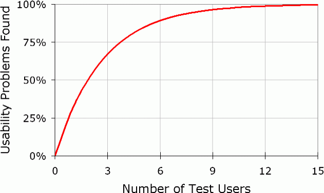
where N is the total number of usability problems in the design and L is the proportion of usability problems discovered while testing a single user. The typical value of L is 31%, averaged across a large number of projects we studied. Plotting the curve for L =31% gives the following result…

Diminishing returns for usability testing, as more and more users are tested. The curve bends around 5 users, which is the recommended number of test participants.