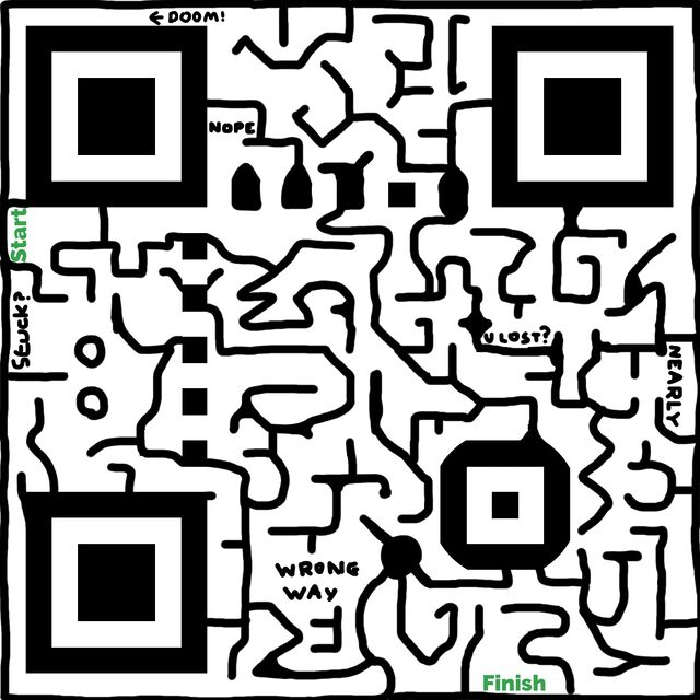
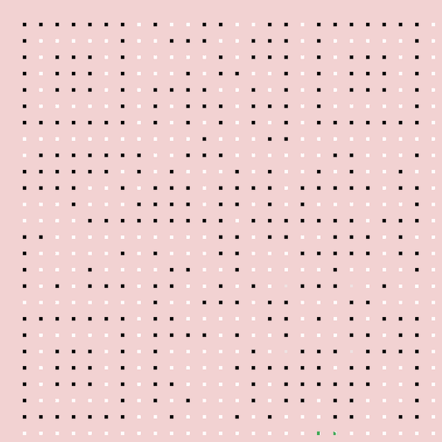
Generated a QR code as usual, minimising its size by making the URL uppercase (allows a smaller character set to be used) and maximising its resilience by ramping up the error
correction to the maximum.
Masked off all but the central 7% of each row and column, leaving just a grid of spots, and then re-adding the three large and one small square and the “zebra crossing” stripes that
connect the large squares, to ensure rapid discovery.
With a pink mask in place to help me see where I was working, drew lines, dots, and whatever else I liked over the black spots but not touching the white ones, to build a maze.
Removed the pink mask, leaving just black and white. Tested a bit.
It’s just about possible to scan this super-minimal QR code, but having the positioning elements in place to help the scanner identify that it is something
scannable makes a huge difference.
Obviously this isn’t a clever idea for real-world scenarios. The point of QR codes’ resilience and error correction is to compensate for suboptimal conditions “in the
field”, like reflections, glare, dust, grime, low light conditions, and so on.
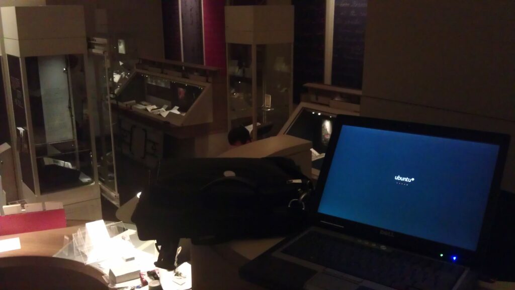
From an elevated position in the exhibition room, I run a few tests of the technical infrastructure whilst other staff set up, below.
In particular, something I’ve been working on are the QR codes. This
experiment – very progressive for a sometimes old-fashioned establishment like the Bodleian – involves small two-dimensional barcodes being placed with the exhibits. The barcodes are
embedded with web addresses for each exhibit’s page on the exhibition website. Visitors who scan them – using a tablet computer, smartphone, or whatever – are directed to a web page
where they can learn more about the item in front of them and can there discuss it with other visitors or can “vote” on it: another exciting new feature in this exhibition is that we’re
trying quite hard to engage academics and the public in debate about the nature of “treasures”: what is a treasure?
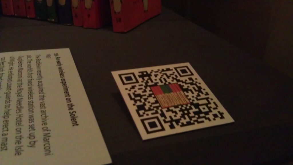
A QR code in place at the Treasures of the Bodleian exhibition.
In order to improve the perceived “connection” between the QR code and the objects, to try to encourage visitors to scan the codes despite perhaps having little or no instruction, we
opted to embed images in the QR codes relating to the objects they related to. By cranking up the error-correction level of a QR code, it’s possible to “damage” them quite significantly and still have them scan perfectly well.
One of my “damaged” QR codes. This one corresponds to The Laxton Map, a 17th Century map of common farming land near Newark on Trent.
We hope that the visual association between each artefact and its QR code will help to make it clear that the code is related to the item (and isn’t, for example, some kind of asset tag
for the display case or something). We’re going to be monitoring usage of the codes, so hopefully we’ll get some meaningful results that could be valuable for future exhibitions: or for
other libraries and museums.
Rolling Your Own
If you’re interested in making your own QR codes with artistic embellishment (and I’m sure a graphic designer could do a far better job than I did!), here’s my approach:
I used Google Infographics (part of Chart Tools) to produce my QR codes. It’s fast, free,
simple, and – crucially – allows control over the level of error correction used in the resulting code. Here’s a sample URL to generate the QR code above:
500×500 is the size of the QR code. I was ultimately producing 5cm codes because our experiments showed that this was about the right size
for our exhibition cabinets, the distance from which people would be scanning them, etc. For laziness, then, I produced codes 500 pixels square at a resolution of 100 pixels per
centimetre.
H specifies that we want to have an error-correction level of 30%, the maximum possible. In theory, at least, this allows us to do the maximum
amount of “damage” to our QR code, by manipulating it, and still have it work; you could try lower levels if you wanted, and possibly get less-complex-looking codes.
0 is the width of the border around the QR code. I didn’t want a border (as I was going to manipulate the code in Photoshop anyway), so I use
a width of 0.
The URL – HTTP://TREASURES.BODLEIAN.OX.AC.UK/T7 – is presented entirely in capitals. This is because capital letters use fewer bits
when encoded as QR codes. “http” and domain names are case-insensitive anyway, and we selected our QR code path names to be in capitals. We also shortened the URL as far as possible:
owing to some complicated technical and political limitations, we weren’t able to lean on URL-shortening services like bit.ly, so we had to roll our own. In
hindsight, it’d have been nice to have set up the subdomain “t.bodleian.ox.ac.uk”, but this wasn’t possible within the time available. Remember: the shorter the web address, the simpler
the code, and simpler codes are easier and faster to read.
Our short URLs redirect to the actual web pages of each exhibit, along with an identifying token that gets picked up by Google Analytics to track how widely the QR codes are being used (and which ones are most-popular amongst visitors).
By now, you’ll have a QR code that looks a little like this.
Load that code up in Photoshop, along with the image you’d like to superimpose into it. Many of the images I’ve had to work with are disturbingly “square”, so I’ve simply taken
them, given them a white or black border (depending on whether they’re dark or light-coloured). With others, though, I’ve been able to cut around some of the more-attractive parts of
the image in order to produce something with a nicer shape to it. In any case, put your image in as a layer on top of your QR code.
Move the image around until you have something that’s aesthetically-appealing. With most of my square images, I’ve just plonked them in the middle and resized them to cover a whole
number of “squares” of the QR code. With the unusually-shaped ones, I’ve positioned them such that they fit in with the pattern of the QR code, somewhat, then I’ve inserted another
layer in-between the two and used it to “white out” the QR codes squares that intersect with my image, giving a jagged, “cut out” feel.
Test! Scan the QR code from your screen, and again later from paper, to make sure that it’s intact and functional. If it’s not, adjust your overlay so that it covers less of the QR
code. Test in a variety of devices. In theory, it should be possible to calculate how much damage you can cause to a QR code before it stops working (and where it’s safe to cause the
damage), but in practice it’s faster to use trial-and-error. After a while, you get a knack for it, and you almost feel as though you can see where you need to put the images so that
they just-barely don’t break the codes. Good luck!
Another of my “damaged” QR codes. I’m reasonably pleased with this one.
Give it a go! Make some QR codes that represent your content (web addresses, text, vCards, or whatever) and embed your own images into them to make them stand out with a style of their
own.