My dear friend Boro raises this curious provocation, which I really enjoyed musing upon this evening. His choice of words are excellent.
Fragmentation is about context-switching. About disfocus. About the scattering of ideas. We think of defragmentation – the “re-ordering” of data – as a necessary good: bringing
management and logic to how our information is arranged. But it’s Boro’s third question that reminds us that that’s not necessarily true.1
2
Anyway: Boro’s post is a reminder that a human brain is not a magnetic drum, and fragmentation is not necessarily something to fear. What’s an extra millisecond or two of psychological
“seek time” as you aim to remember the date of your friend’s birthday… if the mental journey takes you past memories of parties long-ago? How bad, really, is a few moments of seeking
the right word if, on the way, you discover the perfect metaphor for that blog post?3
What Boro accidentally touches on, for me, is the concept of premature optimisation. We talk about this being bad in software engineering circles, but it’s also bad for
us psychologically. Taking shortcuts weakens our ability to think things through “the hard way”. Earlier today, I had a thought about… something inconsequential about
heart rates… and chose to use mental arithmetic, over the course of several minutes, to estimate an answer to my query. My phone – with its built-in calculator app – sat in my pocket
the whole time. I chose the less-efficient route, and I felt better for it. Efficiency is not always the goal.
Or, as folks in my circles are saying a lot lately: inconvenience is counterculture. I quite like that.
Anyway: thanks, Boro, for the thought.
Footnotes
1 Brief side-note #1: if you’re wondering why you haven’t had to “defrag your hard drive”
for the last decade or so: the biggest reason is that SSDs don’t suffer fragmentation in the same kind of way (and, indeed, trying to defragment them probably reduces their
lifespan!). Fragmentation on physical media is a problem only because the magnetic heads need to jump back and forth between “parts” of a file or stream of data, which introduces wear
and slows down seeking. But on solid state media, where data is referenced directly by memory address, fragmentation is no impediment.
2 Brief side-note #2, with the understanding that the side notes are now getting to be
longer than the actual content: one of my favourite features of late-stage HDD defragmentation utilities was that they were smart about what they defragmented where.
Not only could they group individual files “together”, they could also group frequently-used-together files close to one another (minimising head movement) and could even cluster
frequently-accessed files like operating system data very close to the edge of physical media, where the angular rotation of the heads would be smallest (because the track
length was greatest). Mind-boggling how these things, like e.g. screen savers as a mechanism to prevent CRT burn-in, become completely obsolete but still live on in popular
consciousness.
This post advocates minimizing dependencies in web pages that you do not directly control. It conflates dependencies during build time and dependencies in the browser. I maintain
that they are essentially the same thing, that both have the same potential problems, and that the solution is the snappy new acronym HtDTY – Host the Damn Thing Yourself.
…
If your resources are large enough to cause a problem if you Host the Damn Things Yourself then consider finding ways to cut back on their size. Or follow my related advice –
HtDToaSYHaBRW IMCYMbT(P)WDWYD : Host the Damn Thing on a Service You Have A Business Relationship With, It May Cost You Money But They (Probably) Won’t Dick With Your Data.
…
Host the Damn Thing Yourself (HtDTY) is an excellent suggestion; I’ve been a huge fan of the philosophy for ages, but I like this acronym. (I wish it was pronounceable, but you can’t
have everything.)
Andrew’s absolutely right, but I’m not even sure he’s expressed all the ways in which he’s right. Here are my reasons to HtDTY, especially for frontend resources:
Security: As Andrew observes, you can’t protect against supply chain attacks if your supply chain wide open to exploitation. And I’m glad that he points out that
version pinning doesn’t protect you from this (although subsource integrity can).
Privacy: Similarly, Andrew nailed this one. If you host your fonts on Google Fonts, for example, you’re telling one of the biggest data-harvesting companies on the
Internet who’s accessing your website. Don’t do that (in that specific example, google-webfonts-helper is your friend).
Performance: Andrew rightly deconstructs the outdated argument that CDN caching improves your site’s performance. Edge caching might, in some
circumstances, but still has the problems listed above. But this argument can go further than Andrew’s observation that CDNs aren’t that much of a benefit… because sticking to just
one domain name means (a) fewer DNS lookups, (b) fewer TLS handshakes, (c) better compression, if e.g. your JavaScript assets are bundled or at least delivered in the same pipeline,
and (d) all the benefits of HTTP/2 and HTTP/3, like early hints, pipelining, etc. Nowadays, it can often be faster to not-use a CDN (depending on lots of factors), in
addition to all the above benefits.
5. If you use AI, you are the one who is accountable for whatever you produce with it. You have to be certain that whatever you produced was correct. You cannot ask the system
itself to do this. You must either already be expert at the task you are doing so you can recognise good output yourself, or you must check through other, different means the
validity of any output.
…
9. Generative AI produces above average human output, but typically not top human output. If you overuse generative AI you may produce more mediocre output than you are capable of.
…
I was also tempted to include in 9 as a middle sentence “Note that if you are in an elite context, like attending a university, above average for humanity widely could be below
average for your context.”
Point 5 is a reminder that, as I’ve long said, you can’t trust an AI to do anything that you can’t do for yourself. I
sometimes use a GenAI-based programming assistant, and I can tell you this – it’s really good for:
Fancy autocomplete: I start typing a function name, it guesses which variables I’m going to be passing into the function or that I’m going to want to loop through the
output or that I’m going to want to return-early f the result it false. And it’s usually right. This is smart, and it saves me keypresses and reduces the embarrassment of mis-spelling
a variable name1.
Quick reference guide: There was a time when I had all of my PHP DateTimeInterface::format character codes memorised. Now I’d have to look them up. Or I can write a comment (which I should anyway, for the next human) that says something like //
@returns String a date in the form: Mon 7th January 2023 and when I get to my date(...) statement the AI will already have worked out that the format is 'D
jS F Y' for me. I’ll recognise a valid format when I see it, and I’ll be testing it anyway.
Boilerplate: Sometimes I have to work in languages that are… unnecessarily verbose. Rather than writing a stack of setters and getters, or laying out a repetitive
tree of HTML elements, or writing a series of data manipulations that are all subtly-different from one another in ways that are obvious once they’ve been explained to you… I can just
outsource that and then check it2.
Common refactoring practices: “Rewrite this Javascript function so it doesn’t use jQuery any more” is a great example of the kind of request you can throw at an LLM.
It’s already ingested, I guess, everything it could find on StackOverflow and Reddit and wherever else people go to bemoan being stuck with jQuery in their legacy codebase. It’s not
perfect – just like when it’s boilerplating – and will make stupid mistakes3
but when you’re talking about a big function it can provide a great starting point so long as you keep the original code alongside, too, to ensure it’s not removing any
functionality!
Other things… not so much. The other day I experimentally tried to have a GenAI help me to boilerplate some unit tests and it really failed at it. It determined pretty quickly,
as I had, that to test a particular piece of functionality need to mock a function provided by a standard library, but despite nearly a dozen attempts to do so, with copious prompting
assistance, it couldn’t come up with a working solution.
Overall, as a result of that experiment, I was less-effective as a developer while working on that unit test than I would have been had I not tried to get AI assistance: once I
dived deep into the documentation (and eventually the source code) of the underlying library I was able to come up with a mocking solution that worked, and I can see why the AI failed:
it’s quite-possibly never come across anything quite like this particular problem in its training set.
Solving it required a level of creativity and a depth of research that it was simply incapable of, and I’d clearly made a mistake in trying to outsource the problem to it. I was able to
work around it because I can solve that problem.
But I know people who’ve used GenAI to program things that they wouldn’t be able to do for themselves, and that scares me. If you don’t understand the code your tool has
written, how can you know that it does what you intended? Most developers have a blind spot for testing and will happy-path test their code without noticing if they’ve
introduced, say, a security vulnerability owing to their handling of unescaped input or similar… and that’s a problem that gets much, much worse when a “developer” doesn’t even
look at the code they deploy.
Security, accessibility, maintainability and performance – among others, I’ve no doubt – are all hard problems that are not made easier when you use an AI to write code that
you don’t understand.
Footnotes
1 I’ve 100% had an occasion when I’ve called something $theUserID in one
place and then $theUserId in another and not noticed the case difference until I’m debugging and swearing at the computer
2 I’ve described the experience of using an LLM in this way as being a little like having
a very-knowledgeable but very-inexperienced junior developer sat next to me to whom I can pass off the boring tasks, so long as I make sure to check their work because they’re so
eager-to-please that they’ll choose to assume they know more than they do if they think it’ll briefly impress you.
3 e.g. switching a selector from $(...) to
document.querySelector but then failing to switch the trailing .addClass(...) to .classList.add(...)– you know: like an underexperienced but
eager-to-please dev!
In August, I celebrated my blog – with its homepage weighing-in at a total of just 481kb – being admitted to Kev Quirk‘s 512kb club. 512kb club celebrates websites (often personal sites) whose homepage are neither “ultra minimal”
or “link pages” but have a total size, including all assets, of under half a megabyte. It’s about making a commitment to a leaner, more-efficient Web.
My relatively-heavyweight homepage only just slipped in under the line. But, feeling inspired perhaps by some performance enhancements I’ve been planning this week at work, I
decided to try to shave a little more off:
Now, at ~234kb, danq.me just beats the excellent gomakethings.com (it’s all those heavyweight fonts, Chris!).
Here’s what I changed:
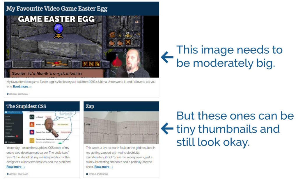
The “recent article” tiles are dynamically sized based on their number, type, and the visitor’s screen resolution. But apart from the top one they’re almost never very large. Using
thumbnail images for the non-first tile shaved off almost 160kb.
You can see the difference, but it’s still acceptable to look at, I think.
Not space-saving, but while I was in there I ensured that the first tile’s image – which almost-certainly comprises part of the Largest
Contentful Paint – is never delivered with loading="lazy".
I was providing a shortcut icon in .ico format (<link rel="shortcut icon" href="https://bcdn.danq.me/_q23t/icons/favicon-16-32-48-64-128.ico" />),
which is pretty redundant nowadays because all modern browsers (and even IE11)
support .png icons. I was already providing.png and .svg versions, but it turns out that some browsers favour the one with the
(harmful?) rel="shortcut icon" over rel="icon" if both are present, and .ico
files are – being based on Windows Bitmaps – horrendously inefficient.
By getting under the 250kb threshold, I’ve jumped up a league from Blue Team to Orange Team, so that’s nice too. I can’t see a meaningful
path from where I’m at to Green Team (under 100kb) though, so this level might have to suffice.
The Internet is full of guides on easily making your WordPress installation run fast. If you’re looking to speed up your WordPress site, you should go read those, not this.
Those guides often boil down to the same old tips:
uninstall unnecessary plugins,
optimise caching (both on the server and, via your headers, on clients/proxies),
resize your images properly and/or ensure WordPress is doing this for you,
This article is for people who aren’t afraid to go tinkering in their WordPress codebase to squeeze a little extra (real world!) performance.
It’s for people whose neverending quest for perfection is already well beyond the point of diminishing returns.
But mostly, it’s for people who want to gawp at me, the freak who actually did this stuff just to make his personal blog a tiny bit nippier without spending an extra penny on
hosting.
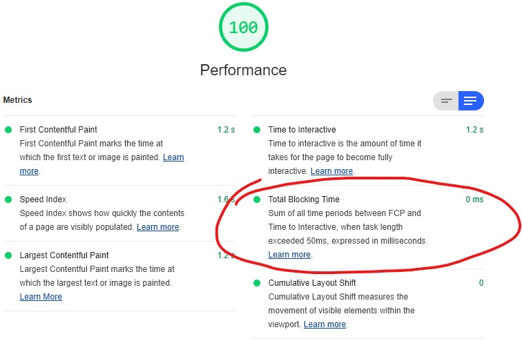
You shouldn’t use Lighthouse as your only measure of your site’s performance. But it’s still reassuring when you get to see those fireworks!
Don’t start with the hard way. Exhaust all the easy solutions – or at least, make a conscious effort which easy solutions to enact or reject – first. Only if you really
want to get into the weeds should you actually try doing the things I propose here. They’re not for most sites, and they’re not the for faint of heart.
Performance is a tradeoff. Every performance improvement costs you something else: time, money, DX, UX, etc. What you choose to trade for performance gains depends on your priority of constituencies, which may differ from mine.4
This is not a recipe book. This won’t tell you what code to change or what commands to run. The right answers for your content will be different than the right answers
for mine. Also: you shouldn’t change what you don’t understand! But I hope these tips will help you think about what questions you need to ask to make your site blazing fast.
Okay, let’s get started…
1. Backstab the plugins you can’t live without
If there are plugins you can’t remove because you depend upon their functionality, and those plugins inject content (especially JavaScript) on the front-end… backstab them to
undermine that functionality.
For example, if you want Jetpack‘s backup and downtime monitoring features, but you don’t want it injecting random <linkrel='stylesheet' id='...-jetpack-css' href='...' media='all' />‘s (an
extra stylesheet to download and parse) into your pages: find the add_filter hook it uses and remove_filter it in your theme5.
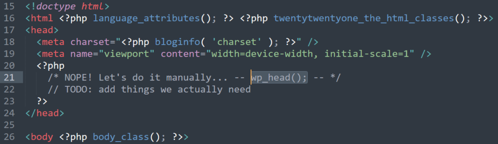
Alternatively, entirely remove the wp_head() and manually reimplement the functionality you actually need. Insert your own joke about “Headless WordPress” here.
Better yet, remove wp_head() from your theme entirely6.
Now, instead of blocking the hooks you don’t want polluting your <head>, you’re specifically allowing only those you want. You’ll want to take care to get
some semi-essential ones like <link rel="canonical" href="...">7.
Now most of your plugins are broken, but in exchange, your theme has reclaimed complete control over what gets sent to the user. You can select what content you actually
want delivered, and deliver no more than that. It’s harder work for you, but your site becomes so much lighter.
Your site is faster now. It doesn’t work, but it’s quick about it!
2. Throw away 100% of your render-blocking JavaScript (and as much as you can of the rest)
The single biggest bottleneck to the user viewing a modern WordPress website is the JavaScript that needs to be downloaded, compiled, and executed before the page can be rendered. Most
of that’s plugins, but even on a nearly-vanilla installation you might find a copy of jQuery (eww!) and some other files.
In step 1 you threw it all away, which is great… but I’m betting you were depending on some of that to make your site work? Let’s put it back, carefully and selectively, while
minimising the impact on load time.
That means scripts should be loaded (a) low-down, and/or (b) marked defer (or, better yet, async), so they don’t block page rendering.
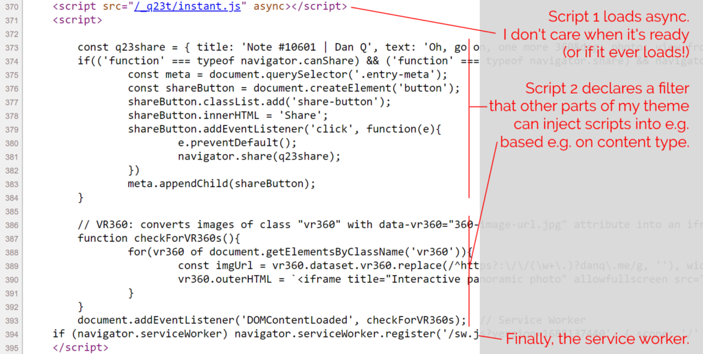
If you haven’t already, you might like to View Source on this page. Count my <script> tags. You’ll probably find just two of them: one external file marked
async, and a second block right at the bottom.
The only third-party script routinely loaded on danq.me is Instant.Page, which specifically exists to improve perceived performance. It preloads
links when you hover over or start-to-touch them.
The inline <script> in my footer.php wraps a single line of PHP: which looks a little like
this: <?php echo implode("\n\n", apply_filters( 'danq_footer_js', [] ) ); ?>. For each item in an initially-empty array, it appends to the script tag. When I render
anything that requires JavaScript, e.g. for 360° photography, I can just add to that
(keyed, to prevent duplicates when viewing an archive page) array. Thus, the relevant script gets added exclusively to the pages where it’s needed, not to the entire site.
The only inline script added to every page loads my service worker, which itself aims to optimise caching as well as providing limited “offline” functionality.
While you’re tweaking your JavaScript anyway, you might like to check that any suitable addEventListeners are set to passive mode. Especially
if you’re doing anything with touch or mousewheel events, you can often increase the perceived performance of these interactions by not letting your custom code block the default
browser behaviour.
I promise you; most of your blog’s front-end JavaScript is either (a) garbage nobody wants, (b) polyfills for platforms nobody uses, or (c) huge libraries you’ve imported so you can
use just one or two functions form them. Trash them.
3. Don’t use a CDN
Wait, what? That’s the opposite of what everybody else recommends. To understand why, you have to think about why people recommend a CDN in the first place. Their reasons are usually threefold:
Proximity
Claim: A CDN delivers content geographically-closer to the user.
Retort: Often true. But in step 4 we’re going to make sure that everything critical comes within the first TCP
sliding window anyway, so there’s little benefit, and there’s a cost to that extra DNS lookup and fresh handshake. Edge
caching your own contentmay have value, but for most sites it’ll have a much smaller impact than almost everything else on this list.
Precaching
Claim: A CDN improves the chance resources are precached in the user’s browser.
Retort: Possibly true, especially with fonts (although see step 6) but less than you’d think with JS libraries because
there are so many different versions/hosts of each. Yours may well be the only site in the user’s circuit that uses a particular one!
Power Claim: A CDN has more resources than you and so can better-withstand spikes of traffic.
Retort: Maybe, but they also introduce an additional single-point-of-failure. CDNs aren’t magically immune
to downtime nor content-blocking, and if you depend on one you’ve just doubled the number of potential failure points that can make your site instantly useless. Furthermore:
in exchange for those resources you’re trading away your users’ privacy and security: if a CDN gets hacked, every site that
uses it gets hacked too.
Consider edge-caching your own content only if you think you need it, but ditch jsDeliver, cdnjs, Google Hosted Libraries etc.
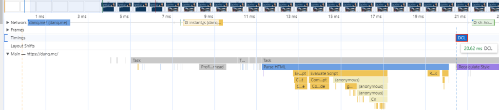
Despite having no edge cache and being hosted in a different country to me, I can open a completely fresh browser and reach DOMContentLoaded on the my homepage in ~20ms. You should learn how to read a
waterfall performance chart just so you can enjoy how “flat” mine is.
Hell: if you can, ditch all JavaScript served from third-parties and slap a Content-Security-Policy: script-src 'self' header on your domain to dramatically reduce
the entire attack surface of your site!8
4. Reduce your HTML and CSS size to <12kb compressed
There’s a magic number you need to know: 12kb. Because of some
complicated but fascinating maths (and depending on how your hosting is configured), it can be significantly faster to initially load a web resource of up to 12kb
than it is to load one of, say, 15kb. Also, for the same reason, loading a web resource of much less than 12kb might not be significantly faster than loading
one only a little less than 12kb.
Inlining as much essential content as possible (CSS, SVGs,
JavaScript etc.) to bring you back up to close-to that magic number again!
$ curl --compressed -so /dev/null -w "%{size_download}\n" https://danq.me/


              10416
Note that this is the compressed, over-the-wire size. Last I checked, my homepage weighed-in at about 10.4kb compressed, which includes the entirety of its HTML and CSS, most of its JS, and a
couple of its SVG images.
Again, this probably flies in the face of everything you were taught about performance. I’m sure you were told that you should <link> to your stylesheets so that they
can be cached across page loads. But it turns out that if you can make your HTML and CSS small enough, the opposite is true and you should inline the stylesheet again: caching styles becomes almost irrelevant if you get all the content in
a single round-trip anyway!
For extra credit, consider optimising your homepage’s CSS so it’s even smaller by excluding directives that only apply to
non-homepage pages, and vice-versa. Assuming you’re using a preprocessor, this shouldn’t be too hard: at simplest, you can have a homepage.css and main.css,
each derived from a set of source files some of which they share (reset/normalisation, typography, colours, whatever) and the rest which is specific only to that part of the site.
Most web pages should fit entirely onto a floppy disk. This one doesn’t, mostly because of all the Simpsons clips, but most should.
Can’t manage to get your HTML and CSS down below the magic
number? Then at least ensure that your HTML alone weighs in at <12kb compressed and you’ll still get some of the
benefits. If you’ve got the headroom, you can selectively include a <style> block containing only the most-crucial CSS, with a particular focus on any that results in layout shifts (e.g. anything that specifies the height: of otherwise dynamically-sized
block elements, or that declares an element position: absolute or position: fixed). These kinds of changes are relatively computationally-expensive because
they cause content to re-flow, so provide hints as soon as possible so that the browser can accommodate for them.
5. Make the first load awesome
We don’t really talk about content being “above the fold” like we used to, because the modern Web has such a diverse array of screen sizes and resolutions that doing so doesn’t make
much sense.
But if loading your full page is still going to take multiple HTTP requests (scripts, images, fonts, whatever),
you should still try to deliver the maximum possible value in the first round-trip. That means:
Making sure all your textual content loads immediately! Unless you’re delivering a huge amount of text, there’s absolutely no excuse for lazy-loading text: it’s
usually tiny, compresses well, and it’s fast to parse. It’s also the most-important content of most pages. Get it delivered to the browser so it can be rendered rightaway.
Reserving space for blocks by sizing images appropriately, e.g. using <img width="..." height="..." ...> or having them load as a background with
background-size: cover or contain in a block sized with CSS delivered in the initial payload. This
reduces layout shift, which mitigates the need for computationally-expensive content reflows.
If possible (see point 4), move vector images that support basic site functionality, like logos, inline. This might also apply to icons, if they’re “as important” as text content.
Marking everything up with standard semantic HTML. There’s a trend for component-driven design to go much too
far, resulting in JavaScript components being used in place of standard elements like links, buttons, and images, resulting in highly-fragile websites: when those scripts fail (or are
very slow to load), the page becomes unusable.
If you want to be sure you’re prioritising your content first and foremost, try disabling all CSS, JavaScript, and external
resources (or just access your site in a browser that ignores those things, like Lynx), and check that it’s still usable. As a bonus, this
helps you check for several accessibility issues.
6. Reduce your dependence on downloaded fonts
Fonts are lovely and can be an important part of your brand identity, but they can also add a lot of weight to your web pages.
If you’re ready and able to drop your webfonts and appreciate the beauty and flexibility of a system font stack (I get it: I’m not there quite
yet!), you can at least make smarter use of your fonts:
Every modern browser supports WOFF2, so you can ditch those chunky old formats you’re clinging onto.
If you’re only using the Latin alphabet, minify your fonts further by dropping the characters you don’t need: tools like Google Webfonts
Helper can help with this, as well as making it easier to selfhost fonts from the most-popular library (is a smart idea for the reasons described under point 3, above!). There are
tools available to further minify fonts if e.g. you only need the capital letters for your title font or something.
Browsers are pretty clever and will work-around it if you make a mistake. Didn’t include an emoji or some obscure mathematical symbol, and then accidentally used them in a
post? Browsers will switch to a system font that can fill in the gap, for you.
Make the most-liberal use of the font-display: CSS directive that you can tolerate!
Don’t use font-display: block, which is functionally the default in most browsers, unless you absolutely have to.
font-display: fallback is good if you’re too cowardly/think your font is too important for you to try font-display: optional.
font-display: optional is an excellent choice for body text: if the browser thinks it’s worthwhile to download the font (it might choose not to if the operating
system indicates that it’s using a metered or low-bandwidth connection, for example), it’ll try to download it, but it won’t let doing so slow things down too much and it’ll
fall-back to whatever backup (system) font you specify.
font-display: swap is also worth considering: this will render any text immediately, even if the right font hasn’t downloaded yet, with no blocking time
whatsoever, and then swap it for the right font when it appears. It’s probably better for headings, because large paragraphs of text can be a little disorienting if they change
font while a user is looking at them!
If writing is for nerds, then typography must be doubly-so. But you’ve read this far, so I’m confident that you qualify…
7. Cache pre-compressed static files
It’s possible that by this point you’re saying “if I had to do this much work, I might as well just use a static site generator”. Well good news: that’s what you’re about to
do!
Obviously you should make sure all your regular caching improvements (appropriate HTTP headers for caching, a
service worker that further improves on that logic based on your content’s update schedule, etc.) first. Again: everything in this guide presupposes that you’ve already done the things
that normal people do.
By aggressively caching pre-compressed copies of all your pages, you’re effectively getting the best of both worlds: a website that, for anonymous visitors, is served directly from
.html.gz files on a hard disk or even straight from RAM in memcached10,
but which still maintains all the necessary server-side interactivity to allow it to be used as a conventional Web-based CMS
(including accepting comments if that’s your jam).
WP Super Cache can do the heavy lifting for you for a filesystem-based solution so long as you put it into “Expert” mode and
amending your webserver configuration. I’m using Nginx, so I needed a try_files directive like this:
I’m sure your favourite performance testing tool has already complained at you about your failure to use the best formats possible when serving images to your users. But how can you fix
it?
There are some great plugins for improving your images automatically and/or in bulk – I use EWWW Image Optimizer – but
to really make the most of them you’ll want to reconfigure your webserver to detect clients that Accept:
image/webp and attempt to dynamically serve them .webp variants, for example. Or if you’re ready to give up on legacy formats and replace all your .pngs
with .webps, that’s probably fine too!
The image you see at https://danq.me/_q23u/2023/11/dynamic.png is probably an image/webp. But if your browser doesn’t support WebP, you’ll get an
image/png instead!
Assuming you’ve got curl and Imagemagick‘s identify, you can see this in action:
curl -s https://danq.me/_q23u/2023/11/dynamic.png -H "Accept: image/webp" | identify -
(Will give you a WebP image)
curl -s https://danq.me/_q23u/2023/11/dynamic.png -H "Accept: image/png" | identify -
(Will give you a PNG image, even though the URL is the same)
9. Simplify, simplify, simplify
The single biggest impact you can have upon the performance of your WordPress pages is to make them less complex.
You don’t have to go as light as Gemtext – like this page on Gemini does – to see
benefits.
Writing my templates and posts so that they’re compatible with CapsulePress helps keep my code necessarily-simple. You don’t have to
do that, though, but you should be asking yourself:
Does my DOM need to cascade so deeply? Could I achieve the same with less?
Am I pre-emptively creating content, e.g. adding a hidden <dialog> directly to the markup in the anticipation that it might be triggered later using
JavaScript, rather than having that JavaScript run document.createElement the element after the page becomes readable?
Have I created unnecessarily-long chains of CSS selectors11
when what I really want is a simple class name, or perhaps even a semantic element name?
10. Add a Service Worker
A service worker isn’t magic. In particular, it can’t help you with those new visitors hitting your site for the first time12.
A service worker lets you do smart things on behalf of the user’s network connection, so that by the time they ask for a resource, you already fetched it for them.
But a suitable service worker can do a few things that can help with performance. In particular, you might consider:
Precaching assets that you anticipate they’re likely to need (e.g. if you use different stylesheets for the homepage and other pages, you can preload both so no matter
where a user lands they’ve already got the CSS they’ll need for the entire site).
Preloading popular pages like the homepage and recent articles, allowing them to load quickly.
Caching a fallback pages – and other resources as-they’re-accessed – to support a full experience for users even if they (or your site!) disconnect from the Internet (or even
embedding “save for offline” functionality!).
Chapters 7 and 8 of Going Offline by Jeremy Keith are
especially good for explaining how this can be achieved, and it’s all much easier than everything else I just described.
Anything else?
Did I miss anything? If you’ve got a tip about ramping up WordPress performance that isn’t one of the “typical seven” – probably because it’s too hard to be worthwhile for most people –
I’d love to hear it!
Footnotes
1 You’ll sometimes see guides that suggest that using a CDN is to be recommended specifically because it splits your assets among multiple domains/subdomains, which mitigates browsers’ limitation on the
number of files they can download simultaneously. This is terrible advice, because such limitations essentially don’t exist any more, but DNS lookups and TLS handshakes still have a bandwidth and computational cost. There are good
things about CDNs, sometimes, but this has not been one of them for some time now.
2 I’m not sure why guides keep stressing the importance of minifying code,
because by the time you’re compressing them too it’s almost pointless. I guess it’s helpful if your compression fails?
3 “Use a faster server” is a “just throw money/the environment at it” solution. I’d like
to think we can do better.
4 For my personal blog, I choose to prioritise user experience, privacy, accessibility,
resilience, and standards compliance above almost everything else.
5 If you prefer to keep your backstab code separate, you can put it in a custom plugin,
but you might find that you have to name it something late in the alphabet – I’ve previously used names like zzz-danq-anti-plugin-hacks – to ensure that they load
after the plugins whose functionality you intend to unhook: broadly-speaking, WordPress loads plugins in alphabetical order.
6 I’ve assumed you’re using a classic, not block, theme. If you’re using a block theme,
you get a whole different set of performance challenges to think about. Don’t get me wrong: I love block themes and think they’re a great way to put more people in control of their
site’s design! But if you’re at the point where you’re comfortable digging this deep into your site’s PHP code,
you probably don’t need that feature anyway, right?
7 WordPress is really good at serving functionally-duplicate content, so search
engines appreciate it if you declare a proper canonical URL.
8 Before you choose to block all third-party JavaScript, you might have to
whitelist Google Analytics if you’re the kind of person who doesn’t mind selling their visitor data to the world’s biggest harvester of personal information in exchange for some
pretty graphs. I’m not that kind of person.
10 I’ve experimented with mounting a ramdisk and storing the WP Super Cache directory
there, but it didn’t make a huge difference, probably because my files are so small that the parse/render time on the browser side dominates the total cascade, and they’re already
being served from an SSD. I imagine in my case memcached would provide similarly-small benefits.
11 I really love the power of CSS preprocessors like Sass, but they do make it deceptively easy to create many more – and longer – selectors
than you intended in your final compiled stylesheet.
12 Tools like Lighthouse usually simulate first-time visitors, which can be a little
unfair to sites with great performance for established visitors. But everybody is a first-time visitor at least once (and probably more times, as caches expire or are
cleared), so they’re still a metric you should consider.
You see what that’s doing? It’s loading the stylesheet for the print medium, but then when the document finishes loading it’s switching the media type from “print” to “all”.
Because it didn’t apply to begin with the stylesheet isn’t render-blocking. You can use this to delay secondary styles so the page essentials can load at full speed.
Reducing blocking times, like I have on this page, is one of many steps in optimising perceived page performance.
I don’t like this approach. I mean: I love the elegance… I just don’t like the implications.
Why I don’t like lazy-loading CSS using Javascript
Using Javascript to load CSS, in order to prevent that CSS
blocking rendering, feels to me like it conceptually breaks the Web. It certainly violates the expectations of progressive enhancement, because it introduces a level of
fault-intolerance that I consider (mostly) unacceptable.
CSS and Javascript are independent of one another. A well-designed progressively-enhanced page should function with
HTML only, HTML-and-CSS only, HTML-and-JS only, or all
three.CSS adds style, and JS adds behvaiour to a page; and when
you insist that the user agent uses Javascript in order to load stylistic elements, you violate the separation of these technologies (I’m looking at you, the majority of heavyweight
front-end frameworks!).
If you’re thinking that the only people affected are nerds like me who browse with Javascript wholly or partially disabled, you’re wrong: gov.uk research shows that around 1% of your visitors have Javascript fail for some reason or another: because it’s disabled
(whether for preference, privacy, compatibility with accessibility technologies, or whaterver), blocked, firewalled, or they’re using a browser that you didn’t expect.
Can we lazy-load CSS in a way that doesn’t depend on Javascript? (spoiler: yes)
Chris’s daily tip got me thinking: could there exist a way to load CSS in a non-render-blocking way but which degraded
gracefully in the event that Javascript was unavailable? I.e. if Javascript is working, lazy-load CSS, otherwise: load
conventionally as a fallback. It turns out, there is!
In principle, it’s this:
Link your stylesheet from within a <noscript> block, thereby only exposing it where Javascript is disabled. Give it a custom attribute to make it easy to find
later, e.g. <noscript lazyload> (if you’re a standards purist, you might prefer to use a data- attribute).
Have your Javascript extract the contents of these <noscript> blocks and reinject them. In modern browsers, this is as simple as e.g.
[...document.querySelectorAll('noscript[lazyload]')].forEach(ns=>ns.outerHTML=ns.innerHTML).
If you need support for Internet Explorer, you need a little more work, because Internet Explorer doesn’t expose<noscript> blocks to the DOM in a helpful way. There are a variety of possible workarounds; I’ve implemented one but not put too much thought into it because I rarely have to
think about Internet Explorer these days.
In any case, I’ve implemented a proof of concept/demonstration if you’d like to see it in action: just take a look and view source (or read the page)
for details. Or view the source alone via this gist.
Lazy-loading CSS using my approach provides most of the benefits of other approaches… but works properly in environments without
Javascript too.
Update: Chris Ferdinandi’s refined this into an even cleaner approach that takes the best of both worlds.
The performance tradeoff isn’t about where the bottleneck is. It’s about who has to carry the burden. It’s one thing for a developer to push the burden onto a
server they control. It’s another thing entirely to expect visitors to carry that load when connectivity and device performance isn’t a constant.
…
This is another great take on the kind of thing I was talking about the other day: some developers who favour heavy frameworks (e.g.
React) argue for the performance benefits, both in development velocity and TTFB. But TTFB alone is not a valid metric of a user’s perception of an application’s performance: if you’re sending a fast payload that then requires extensive
execution and/or additional calls to the server-side, it stands to reason that you’re not solving a performance bottleneck, you’re just moving it.
I, for one, generally disfavour solutions that move a Web application’s bottleneck to the user’s device (unless there are other compelling reasons that it should be there, for example
as part of an Offline First implementation, and even then it should be done with care). Moving the burden of the bottleneck to the user’s device disadvantages those on slower or older
devices and limits your ability to scale performance improvements through carefully-engineered precaching e.g. static compilation. It also produces a tendency towards a thick-client
solution, which is sometimes exactly what you need but more-often just means a larger initial payload and more power consumption on the (probably mobile) user’s device.
Next time you improve performance, ask yourself where the time saved has gone. Some performance gains are genuine; others are just moving the problem around.
The other day, I saw someone on Twitter say (I’m not linking to the original tweet because I don’t want to pile-on the author):
I don’t bother with frameworks, I just use vanilla JS.
Roughly translated:
I’m smarter than the thousands of people who tried to solve the problems I’m about to solve. I’m an expert on security, a11y, browser support, and perf. I don’t care about ROI, I
just want to code.
Here’s the thing: frameworks don’t really help you with this stuff.
Very much this. People who use Javascript frameworks because they think they protect them from common web development pitfalls are simply trading away a set of known, solvable problems
and taking on a different set of unknown, unsolvable ones.
I’m not anti-framework, but I am pro-informed-developer. If security, accessibility, performance, and browser support are things you care about – and they absolutely should be – then
you need to know the impact that the tools you choose have upon those things. It’s easy to learn the impact that vanilla JS has on them, but
it’s harder to understand exactly what impact a framework might have or how that impact might be affected by interactions between it and all of the other frameworks and
libraries you mix-in. And many developers don’t bother to learn.
Use frameworks if they’re the right tool for your job. But you should work towards understanding your tools. Incidentally: in doing so, you’ll probably come to discover that
frameworks are the right tool for fewer jobs than you thought.
We here at unlike kinds decided that we had to implement Google AMP. We have to be in the Top Stories section because otherwise we’re punted down the page and away from potential
readers. We didn’t really want to; our site is already fast because we made it fast, largely with a combination of clever caching and minimal code. But hey, maybe AMP would speed
things up. Maybe Google’s new future is bright.
It isn’t. According to Google’s own Page Speed Insights audit (which Google recommends to check your performance), the AMP version of articles got an average performance score of 87.
The non-AMP versions? 95. (Note: I updated these numbers recently with an average after running the test 6 times per version.)
…
I’ve complained about AMP before plenty – starting here, for example – but it’s even harder to
try to see the alleged “good sides” of the technology when it doesn’t even deliver the one thing it was supposed to. The Internet should be boycotting this shit, not drinking
the Kool-Aid.
Sometimes I feel developers think that performance is a dark art. It is not. In my experience, well performing systems come down to this: fewer and faster. If you are
doing something a lot, do it fewer times. If you are doing something that is slow, make it faster. It really is that simple. The more things you make your system do and the slower
those things are, the worse your performance will be…