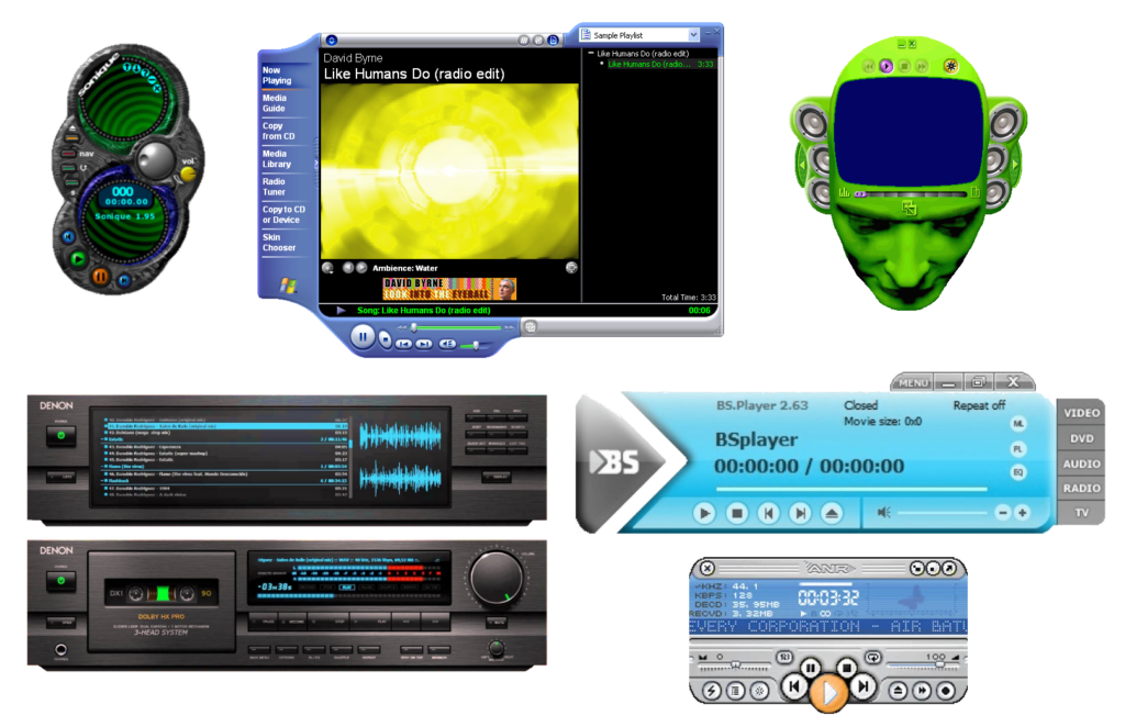
You don’t really see it any more, but: if you downloaded some media player software a couple of decades ago, it’d probably appear in a weird-shaped window, and I’ve never understood why.
 Mostly, these designs are… pretty ugly. And for what? It’s also worth noting that this kind of design can be found in all kinds of applications, in media players that it
was almost ubiquitous.
You might think that they’re an overenthusiastic kind of skeuomorphic design: people trying to make these players look like their physical analogues. But hardware players were still pretty boxy-looking at this point, either because of the limitations of their data storage1. By the time flash memory-based portable MP3 players became commonplace their design was copying software players, not the other way around.
So my best guess is that these players were trying to stand out as highly-visible. Like: they were things you’d want to occupy a disproportionate amount of desktop space. Maybe other people were listening to music differently than me… but for me, back when screen real estate was at such a premium2, a music player’s job was to be small, unintrusive, and out-of-the-way.

It’s a mystery to me why anybody would (or still does) make media player software or skins for them that eat so much screen space, frequently looking ugly while they do so, only to look like a hypothetical hardware device that wouldn’t actually become commonplace until years after this kind of player design premiered!
Maybe other people listened to music on their computer differently from me: putting it front and centre, not using their computer for other tasks at the same time. And maybe for these people the choice of player and skin was an important personalisation feature; a fashion statement or a way to show off their personal identity. But me? I didn’t get it then, and I don’t get it now. I’m glad that this particular trend seems to have died and windows are, for the most part, rounded rectangles once more… even for music player software!
Footnotes
1 A walkman, minidisc player, or hard drive-based digital music device is always going to look somewhat square because of what’s inside.
2 I “only” had 1600 × 1200 (UXGA) pixels on the very biggest monitor I owned before I went widescreen, and I spent a lot of time on monitors at lower resolutions e.g. 1024 × 768 (XGA); on such screens, wasting space on a music player when you’re mostly going to be listening “in the background” while you do something else seemed frivolous.


