I made a graph to show how the number of large hand tools stored in our garage has changed this last year…
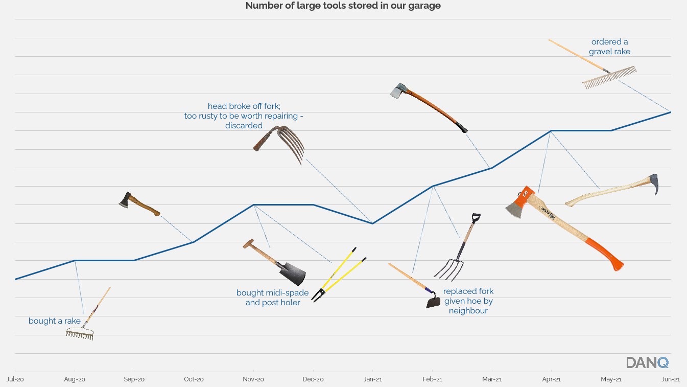
…but I forgot to label the axes.
I made a graph to show how the number of large hand tools stored in our garage has changed this last year…
…but I forgot to label the axes.
This is a repost promoting content originally published elsewhere. See more things Dan's reposted.
…
West Germany’s 1974 World Cup victory happened closer to the first World Cup in 1930 than to today.
The Wonder Years aired from 1988 and 1993 and depicted the years between 1968 and 1973. When I watched the show, it felt like it was set in a time long ago. If a new Wonder Years premiered today, it would cover the years between 2000 and 2005.
Also, remember when Jurassic Park, The Lion King, and Forrest Gump came out in theaters? Closer to the moon landing than today.
…
These things come around now and again, but I’m not sure of the universal validity of observing that a memorable event is now closer to another memorable event than it is to the present day. I don’t think that the relevance of events is as linear as that. Instead, perhaps, it looks something like this:
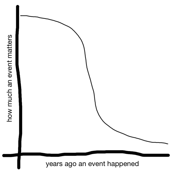
Where the drop-off in relevance occurs is hard to pinpoint and it probably varies a lot by the type of event that’s being remembered: nobody seems to care about what damn terrible thing Trump did last month or the month before when there’s some new terrible thing he did just this morning, for example (I haven’t looked at the news yet this morning, but honestly whenever you read this post he’ll probably have done something awful).
Nonetheless, this post on Wait But Why was a fun distraction, even if it’s been done before. Maybe the last time it happened was so long ago it’s irrelevant now?
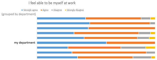
Lots of interesting results from the @bodleianlibs staff survey. Pleased to have my suspicions confirmed about my department’s propensity to be accepting of individuals: it’s the only one where a majority of people strongly agreed with the statement “I feel able to by myself at work” and one of only two where nobody disagreed with it. That feels like an accurate representation of my experience with my team these last 7-8 years!
This is a repost promoting content originally published elsewhere. See more things Dan's reposted.
If you’ve spent any time thinking about complex systems, you surely understand the importance of networks.Networks rule our world. From the chemical reaction pathways inside a cell, to the web of relationships in an ecosystem, to the trade and political networks that shape the course of history.Or consider this very post you’re reading. You probably found it on a social network, downloaded it from a computer network, and are currently deciphering it with your neural network.But as much as I’ve thought about networks over the years, I didn’t appreciate (until very recently) the importance of simple diffusion.This is our topic for today: the way things move and spread, somewhat chaotically, across a network. Some examples to whet the appetite:
- Infectious diseases jumping from host to host within a population
- Memes spreading across a follower graph on social media
- A wildfire breaking out across a landscape
- Ideas and practices diffusing through a culture
- Neutrons cascading through a hunk of enriched uranium
A quick note about form.Unlike all my previous work, this essay is interactive. There will be sliders to pull, buttons to push, and things that dance around on the screen. I’m pretty excited about this, and I hope you are too.So let’s get to it. Our first order of business is to develop a visual vocabulary for diffusion across networks.A simple model
I’m sure you all know the basics of a network, i.e., nodes + edges.To study diffusion, the only thing we need to add is labeling certain nodes as active. Or, as the epidemiologists like to say, infected: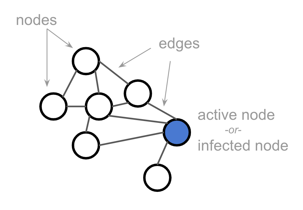 This activation or infection is what will be diffusing across the network. It spreads from node to node according to rules we’ll develop below.Now, real-world networks are typically far bigger than this simple 7-node network. They’re also far messier. But in order to simplify — we’re building a toy model here — we’re going to look at grid or lattice networks throughout this post.(What a grid lacks in realism, it makes up for in being easy to draw ;)Except where otherwise specified, the nodes in our grid will have 4 neighbors, like so:And we should imagine that these grids extend out infinitely in all directions. In other words, we’re not interested in behavior that happens only at the edges of the network, or as a result of small populations.Given that grid networks are so regular, we can simplify by drawing them as pixel grids. These two images represent the same network, for example:
 Alright, let’s get interactive.…
Fabulous (interactive! – click through for the full thing to see for yourself) exploration of network interactions with applications for understanding epidemics, memes, science, fashion, and much more. Plus Kevin’s made the whole thing CC0 so everybody can share and make use of his work. Treat as a longread with some opportunities to play as you go along.
This is a repost promoting content originally published elsewhere. See more things Dan's reposted.
This link was originally posted to /r/MegaMegaMonitor. See more things from Dan's Reddit account.
The original link was: https://i.imgur.com/3aXKsxq.png
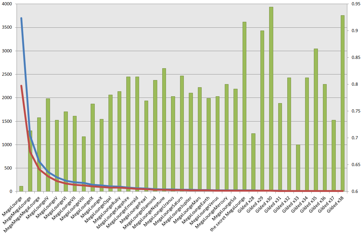
In /u/10_9_‘s recent thread about gilding trends, /u/razerxs made an interesting observation: that the huge ‘drop offs’ in membership of MegaLounges after /r/MegaMegaMegaLounge does not correlate with their expectations, based upon the level of activity in /r/MegaLoungeV. /u/razerxs
observed that e.g. /r/MegaLoungeV is a highly-active sub, which isn’t necessarily what you’d expect if the activity level was based entirely upon the number of people permitted to have access.
I started wondering if there might be a better predictor of engagement levels. I experimented by looking at the ratio of how many people ‘subscribe’ to each MegaLounge to how many people are permitted into there. This isn’t a perfect measure of engagement, of course, but my thinking was that of the people who are invited into a MegaLounge, only some of those will add it to their front page… but that those who add it to their front page are more-likely to actively participate.
The graph shows three things. From the left axis, the blue and red lines show the number of people who are allowed into each MegaLounge and the number of people who are subscribed to each MegaLounge. As you might expect, there’s a gap between the two and the gap narrows in higher lounges, where there are fewer people.
But what I was interested in is whether and where this gap changes proportionally: is the “subscription rate” among eligible people higher in particular lounges, and can this been seen as a predictor of activity levels and engagement rates in each lounge? That’s what the green bars show (against the right-hand axis: note that it doesn’t start at zero). In general, across the MegaLounges up to and including /r/MegaLoungeSol, there does seem to be a slight upward trend: i.e. the higher a lounge you’re in, the more-likely that eligible people are to add that lounge to their front page. Beyond /r/MegaLoungeSol the bars jump around all over the place, probably because of the small number of people ‘up there’, and I suggest that we ignore them: accuracy of this as a predictor would be expected to be better where there were more subscribers: say, up to about /r/MegaLoungeDiamond.
What this would predict would be a “lull” at /r/MegaLoungeVIII. I don’t know if that’s your experience or not. And, interestingly, the ‘subscription ratio’ at /r/MegaLoungeV and /r/MegaLoungeX are also unusually low, bucking the overall trend. What does this mean? I don’t know. But if /r/MegaLoungeV really is to be considered one of the more “active” MegaLounges, then I think that we can safely say that my hypothesis – that we might be able to predict activity hotspots by looking at the subscription rate – is not backed up by the data.
Still: interesting stuff.
This link was originally posted to /r/MegaMegaMonitor. See
more things from Dan's Reddit account.
The original link was: http://i.imgur.com/QdMT6UI.png
This self-post was originally posted to /r/MegaLoungeIndia. See more things from Dan's Reddit account.
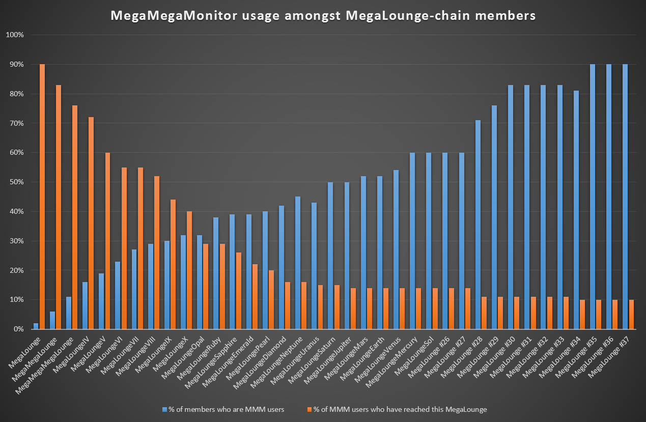
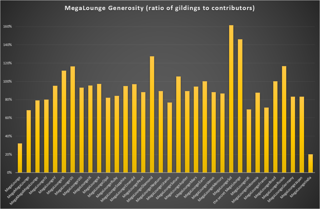
As described over there, I’ve come up with a way to make graphs of the speed of everybody’s ascension through the MegaLounges. But because everybody up here in /r/MegaLoungeIndia is far too important to have to ask for things for themselves, I’ve pre-generated graphs for you all. Here they are:
Hope that provides some amusement and diversion to you all.
This self-post was originally posted to /r/MegaLoungeVII. See more things from Dan's Reddit account.
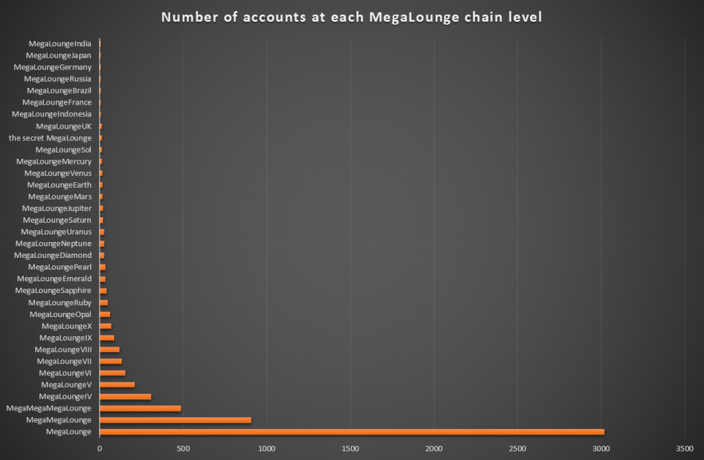
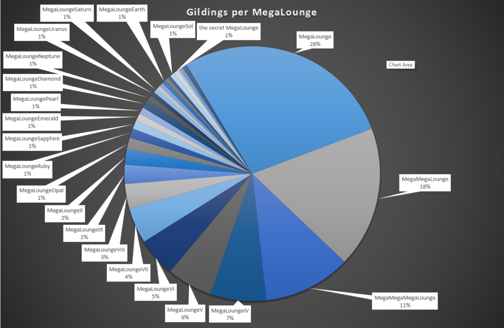
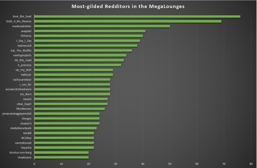
Thanks to the data that /r/MegaMegaMonitor collates, I’ve been able to throw together some fun statistics about the MegaLounge chain. Let me share some graphs with you:
This is all just something fun I threw together while I’ve been off work sick today. If there’s anything else that anybody would like to see extracted from MMM’s data, let me know: it’s all interesting stuff!
This link was originally posted to /r/MegaLoungeSol. See more things from Dan's Reddit account.
The original link was: http://i.imgur.com/xAZINn8.png
This link was originally posted to /r/MegaLoungesArmy. See more things from Dan's Reddit account.
The original link was: https://www.reddit.com/r/MegaMegaMonitor/comments/2vfhze/some_graphs_about_the_megalounge_chain/
This self-post was originally posted to /r/MegaMegaMonitor. See more things from Dan's Reddit account.
Thanks to the data that MegaMegaMonitor collates, I’ve been able to throw together some fun statistics about the MegaLounge chain. Let me share some graphs with you:
This is all just something fun I threw together while I’ve been off work sick today. If there’s anything else that anybody would like to see extracted from MMM’s data, let me know: it’s all interesting stuff!
See:

This is how I like my downloads to look.