I Regret To Say That GMail is Now a Spam Farm, or, Why You Should Really Get That Dedicated Email Address Now

This is a repost promoting content originally published elsewhere. See more things Dan's reposted.

Aside from their predictable subject lines and verbiage, there’s also one other thing that these [recent, AI generated] spam emails have in common: 99.9% come from GMail accounts. Once in a blue moon one will come from yahoo or aol or some other general mail service, but they are a rarity. Almost all of them are GMail. One one hand, congrats to Google, I suppose, for cornering the stand-alone email market so completely that even scammers are impressed with its ease of use. Surely that is some sort of sign of success.

On the other hand, if you are a person who relies on GMail as your primary email, this means that if you are trying to send me mail, you now run a much higher chance of being deposited into my spam folder. So much of the email I get from GMail accounts at this point is spam that an actual Gmail email, from an actual person, is statistically relatively rare. To be fair, if you write that email to me yourself with your own little fingers, your chances of hitting my actual inbox are pretty decent. But if you used GMail’s onboard “AI” to “help” you write that email, you are likely going directly to the spam folder. The GMail spam filter is now trained to recognize “AI” slop sentences, even those written by GMail itself. Yes, there is probably irony there.

GMail’s been going gradually downhill for many years. It’s been a slow decline, compared to many enshittified services, but it’s still very-clearly happening. Aside from the long-established privacy/big data concerns – especially if you use any other Google services, or fail to block their Web trackers – they’ve just devolved into a service that doesn’t “wow” like it did when it was launched. It’s slow, it’s clunky, and it increasingly shovels AI down your throat, whether you want it or not.

If you own a domain name, you should already be using that as the domain of your email address, of course. This detaches your email address from any specific provider, which makes it much easier to change your email provider whenever you like: it puts the power in your hands. You can do this whether you’re using GMail or any other provider.

(If you don’t own a domain name, then perhaps you should.)

But beyond that: if you’re using GMail as your primary personal email service, you should shop around. Don’t let the weight of the inertia of your inbox stop you: there are plenty of ways to back that up, move it around, or just retain it as an archive in-place if you have no other choice.

I switched to Proton about ten or eleven years ago and I haven’t looked back. Are they perfect? No. Are they better than GMail? Absolutely; for me at least. But there are plenty of other options available for those for whom Proton is, perhaps, too-security-conscious. And switching to almost any of them reduces the risk that your messages start going to your recipients’ spam folders, as more and more spammers move to GMail for its AI features, which produce junk mail faster than ever before.

Why aren’t AI companies competing directly with their customers?

If the chatbot can do the job, and if the chatbot costs less than the worker who does the job today, then the chatbot company can profitably sell services more cheaply than anyone who presently employs that worker, because the chatbot company already owns the chatbot. If you were really on a glide path to creating an all-powerful deity and just needed cash to keep the venture going until the cancer-curing word-guesser awoke from its long slumber, then wouldn’t you want as much cash as possible?

An excellent counterpoint for anybody who claims that AI will become profitable eventually, and agrees with the hype assertion that the things that it’s capable of automating always represent better value than human workers doing the same tasks.

Why sell picks and shovels if you’ve already struck gold?

But of course you already know the answer. The big AI companies are currently funded by moving-money-around. They do not have a clear path to profitability, and it’s not certain whether or not they ever will. So selling their service, rather than competing with their customers, allows them to hedge their bets for as long as possible.

Maybe in that time they’ll find a way to bring their costs down. Maybe they won’t. But they’re clearly not confident enough that they will that they’ll bet on their own long-term future.

Recreating a 1990 Book Cover (in HTML + CSS)

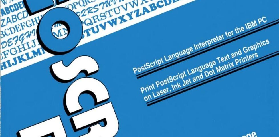
At the weekend, I became briefly obsessed with the cover of the manual for GoScript Plus, a 1990 software tool for converting PostScript output into a format that’s compatible with a wider array of IBM-compatible printers.

I’ve never used this piece of software. I can’t even remember how I found my way to archive.org’s copy of its documentation. Just one of those mysteries.

Anyway: here’s what it looks like:

Computer manual cover printed in blue, black, and white. The title 'GoScript Plus' is askew at one angle, and everything else is askew at a right angle to that.
I can see why, if you were making software like this, you’d want to show off the number of typefaces your tool could support. And look: we can print text at wonky angles! Buy this and you can too!

The design is very much a product of its era. That two-colour print, the strange angles, those smallcaps, the excessive use of title case, and the use of “ink jet” as two words rather than one.

Anyway: I decided I’d attempt to re-create the cover in pure HTML + CSS. No SVGs; no images. Here’s what I came up with:

Somehow mine looks slightly less-dated? But still very “90s”.

I’m not entirely happy with the fonts: in the short while I was working on this, I couldn’t find anything that was quite “right” for the main title, with its stencil-style Rs and Ps, super-rounded Os and Cs, and narrow Ss. In the end I just used Ubuntu Sans almost everywhere.

The white “stripe” with font samples is all just system fonts from your computer! So that’s not accurate either. But my aim was to capture the feel of the manual rather than necessarily make a 100% faithful recreation of it, so I guess it’s okay.

I was quite pleased with the LaserGo logo in the top left. The main “striped circle with one corner a different color” was implemented like this:

/* The <address> element contains the text "LaserGo, Inc" */
address {
  /* Before AND after it are two virtual elements: */
  &:before,
  &:after {
    content: '';
    display: block;
    position: absolute;
    /* Both are offset to where I want the "circle" to be. */
    /* (note use of container query units for responsive sizing!) */
    top: -8cqw;
    left: 3cqw;
    width: 8cqw;
    height: 8cqw;
    /* Make it circular: */
    border-radius: 50%;
    /* The background is striped, with a color specified in --logo-color: */
    background: repeating-linear-gradient(var(--logo-color) 0cqw, transparent 0.2cqw, transparent 0.3cqw);
    /* Then that gets masked; two variables control which part is shown: */
    mask-image: conic-gradient(var(--logo-corner-mask) 0deg, var(--logo-corner-mask) 90deg, var(--logo-remainder-mask) 90deg, var(--logo-remainder-mask) 360deg);
  }

  &:before {
    /* The "before" circle uses white stripes: */
    --logo-color: var(--white);
    /* And masks so that three-quarters of the circle is shown: */
    --logo-corner-mask: transparent;
    --logo-remainder-mask: black;
  }

  &:after {
    /* The "after" circle uses black stripes: */
    --logo-color: var(--black);
    /* And masks so that one-quarter of the circle is shown: */
    --logo-corner-mask: black;
    --logo-remainder-mask: transparent;
  }
}
I was pleased to be able to share 90% of the CSS code between the white-striped three-quarters-circle and the black-striped one-quarter-circle. All that remained after this was to “bite” a corner out of it with a background-coloured overlay.

Anyway; there’s probably nothing more to say about this, apart from a reminder than HTML + CSS is absolutely a an art medium. Take a look at the source code of my fake book cover, if you like (or inspect its DOM, if you prefer): it’s all self-contained and should be reasonably readable.

×