I’ve written before about the trend in web development to take what the web gives you for free, throw it away, and then rebuild it in Javascript. The rebuilt version is invariably worse in many ways – less-accessible, higher-bandwidth, reduced features, more fragile, etc. – but it’s more convenient for developers. Personally, I try not to value developer convenience at the expense of user experience, but that’s an unpopular opinion lately.

In the site shown in the screenshot above, the developer took something the web gave them for free (a hyperlink), threw it away (by making it a link-to-nowhere), and rebuilt its functionality with Javascript (without thinking about the fact that you can do more with hyperlinks than click them: you can click-and-drag them, you can bookmark them, you can share them, you can open them in new tabs etc.). Ugh.
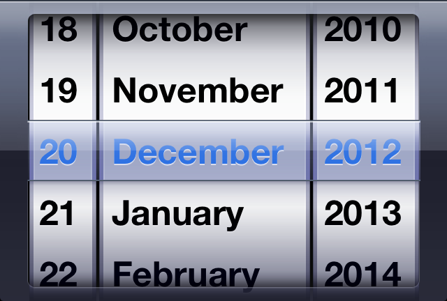
Date pickers
Particularly egregious are the date pickers. Entering your date of birth on a web form ought to be pretty simple: gov.uk pretty much solved it based on user testing they did in 2013.
Here’s the short of it:
- Something you can clearly type a numeric day, month and year into is best.
- Three dropdowns are slightly worse, but at least if you use native HTML
<select>elements keyboard users can still “type” to filter. - Everything else – including things that look like
<select>s but are really funky React<div>s, is pretty terrible.

My fellow Automattician Enfys recently tweeted:
People designing webforms that require me to enter my birthdate:
I am begging you: just let me type it in.
Typing it in is 6-8 quick keystrokes. Trying to navigate a little calendar or spinny wheels back to the 1970s is time-consuming, frustrating and unnecessary.
They’re right. Those little spinny wheels are a pain in the arse if you’ve got to use one to go back 40+ years.

Can we do worse?
If there’s one thing we learned from making the worst volume control in the world, the other year, it’s that you can always find a worse UI metaphor. So here’s my attempt at making a date of birth field that’s somehow even worse than “date spinners”:
My datepicker implements a game of “higher/lower”. Starting from bounds specified in the HTML code and a random guess, it narrows-down its guess as to what your date of birth is as you click the up or down buttons. If you make a mistake you can start over with the restart button.
Amazingly, this isn’t actually the worst datepicker into which I’ve entered my date of birth! It’s cognitively challenging compared to most, but it’s relatively fast at narrowing down the options from any starting point. Plus, I accidentally implemented some good features that make it better than plenty of the datepickers out there:
- It’s progressively enhanced – if the Javascript doesn’t load, you can still enter your date of birth in a sensible way.
- Because it leans on a
<input type="date">control, your browser takes responsibility for localising, so if you’re from one of those weird countries that prefers mm-dd-yyyy then that’s what you should see. - It’s moderately accessible, all things considered, and it could easily be improved further.
It turns out that even when you try to make something terrible, so long as you’re building on top of the solid principles the web gives you for free, you can accidentally end up with something not-so-bad. Who knew?