As I’ve previously mentioned (sadly), Microsoft Edge is to drop its own rendering engine EdgeHTML and replace it with Blink, Google’s one (more of my and others related sadness here, here, here, and here). Earlier this month, Microsoft made available the first prerelease versions of the browser, and I gave it a go.

All of the Chrome-like features you’d expect are there, including support for Chrome plugins, but Microsoft have also clearly worked to try to integrate as much as possible of the important features that they felt were distinct to Edge in there, too. For example, Edge Blink supports SmartScreen filtering and uses Microsoft accounts for sync, and Incognito is of course rebranded InPrivate.
But what really interested me was the approach that Edge Dev has taken with Progressive Web Apps.

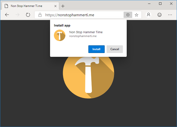
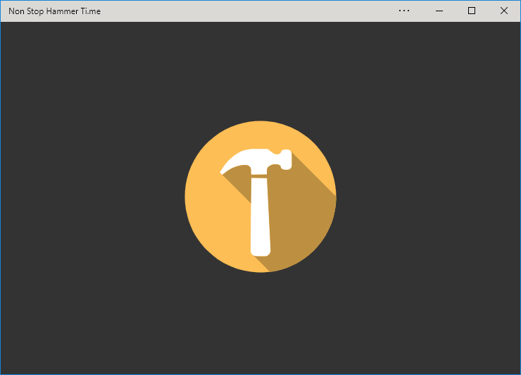
Edge Dev may go further than any other mainstream browser in its efforts to make Progressive Web Apps visible to the user, putting a plus sign (and sometimes an extended install prompt) right in the address bar, rather than burying it deep in a menu. Once installed, Edge PWAs “just work” in exactly the way that PWAs ought to, providing a simple and powerful user experience. Unlike some browsers, which make installing PWAs on mobile devices far easier than on desktops, presumably in a misguided belief in the importance of mobile “app culture”, it doesn’t discriminate against desktop users. It’s a slick and simple user experience all over.

Feature support is stronger than it is for Progressive Web Apps delivered as standalone apps via the Windows Store, too, with the engine not falling over at the first sign of a modal dialog for example. Hopefully (as I support one of these hybrid apps!) these too will begin to be handled properly when Edge Dev eventually achieves mainstream availability.

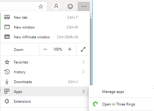
But perhaps most-impressive is Edge Dev’s respect for the importance of URLs. If, having installed the progressive “app” version of a site you subsequently revisit any address within its scope, you can switch to the app version via a link in the menu. I’d rather have seen a nudge in the address bar, where the user might expect to see such things (based on that being where the original install icon was), but this is still a great feature… especially given that cookies and other state maintainers are shared between the browser, meaning that performing such a switch in a properly-made application will result in the user carrying on from almost exactly where they left off.

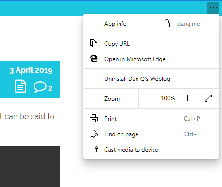
Similarly, and also uncommonly forward-thinking, Progressive Web Apps installed as standalone applications from Edge Dev enjoy a “copy URL” option in their menu, even if the app runs without an address bar (e.g. as a result of a "display": "standalone" directive
in the manifest.json). This is a huge boost to sharability and is enormously (and unusually) respectful of the fact that addresses are the
Web’s killer feature! Furthermore, it respects the users’ choice to operate their “apps” in whatever way suits them best: in a browser (even a competing browser!), on their
mobile device, or wherever. Well done, Microsoft!
I’m still very sad overall that Edge is becoming part of the Chromium family of browsers. But if the silver lining is that we get a pioneering and powerful new Progressive Web App engine then it can’t be all bad, can it?


