I copied the code, dropped it into a post of mine, created a static image of an animated GIF, and
turned on the “reduce motion” preference (System Preferences > Accessibility > Display).
And then BOOM. Just worked. In real time!
…
I added reduced-motion support to DanQ.me earlier this year, but I only bothered to pay attention to the animated parts of the layout
and design itself (the “bounce” on the menus and the cutesy motion of the logo, for example) and considered the (few) GIF animations and the like that I’ve added to be out-of-scope. But
this approach is really quite simple and elegant, and I’ll bear it in mind if I ever have need of such a thing!
When I write a blog post, it generally becomes a static thing: its content always
usually stays the same for the rest of its life (which is, in my case, pretty much forever). But sometimes, I go back and make an
amendment. When I make minor changes that don’t affect the overall meaning of the work, like fixing spelling mistakes and repointing broken links, I just edit the page, but for
more-significant changes I try to make it clear what’s changed and how.
This blog post from 2007, for example, was amended after its publication with the insertion of content at the top and the deletion
of content within.
Historically, I’d usually marked up deletions with the HTML <strike>/<s> elements (or
other visually-similar approaches) and insertions by clearly stating that a change had been made (usually accompanied by the date and/or time of the change), but this isn’t a good
example of semantic code. It also introduces an ambiguity when it clashes with the times I use <s> for comedic effect in the Web equivalent of the old caret-notation joke:
Be nice to this fool^H^H^H^Hgentleman, he's visiting from corporate HQ.
Better, then, to use the <ins> and <del> elements, which were designed for exactly this purpose and even accept attributes to specify the date/time
of the modification and to cite a resource that explains the change, e.g. <ins datetime="2019-05-03T09:00:00+00:00"
cite="https://alices-blog.example.com/2019/05/03/speaking.html">The last speaker slot has now been filled; thanks Alice</ins>. I’ve worked to retroactively add such
semantic markup to my historical posts where possible, but it’ll be an easier task going forwards.
Of course, no browser I’m aware of supports these attributes, which is a pity because the metadata they hold may well have value to a reader. In order to expose them I’ve added a little
bit of CSS that looks a little like this, which makes their details (where available) visible as a sort-of tooltip when hovering
over or tapping on an affected area. Give it a go with the edits at the top of this post!
ins[datetime],del[datetime]{position:relative;}ins[datetime]::before,del[datetime]::before{position:absolute;top:-24px;font-size:12px;color:#fff;border-radius:4px;padding:2px6px;opacity:0;transition:opacity0.25s;
hyphens:none;/* suppresses sitewide line break hyphenation rules */white-space:nowrap;/* suppresses extraneous line breaks in Chrome */}ins[datetime]:hover::before,del[datetime]:hover::before{opacity:0.75;}ins[datetime]::before{content:'inserted 'attr(datetime)''attr(cite);background:#050;/* insertions are white-on-green */}del[datetime]::before{content:'deleted 'attr(datetime)''attr(cite);background:#500;/* deletions are white-on-red */}
CSS facilitating the display of <ins>/<del> datetimes and citations on hover or touch.
I’m aware that the intended use-case of <ins>/<del> is change management, and that the expectation is that the “final” version of a
document wouldn’t be expected to show all of the changes that had been made to it. Such a thing could be simulated, I suppose, by appropriately hiding and styling the
<ins>/<del> blocks on the client-side, and that’s something I might look into in future, but in practice my edits are typically small and rare
enough that nobody would feel inconvenienced by their inclusion/highlighting: after all, nobody’s complained so far and I’ve been doing exactly that, albeit in a non-semantic way, for
many years!
I’m also slightly conscious that my approach to the “tooltip” might cause it to obstruct interactivity with something directly above an insertion or deletion: e.g. making a hyperlink
inaccessible. I’ve tested with a variety of browsers and devices and it doesn’t seem to happen (my line height works in my favour) but it’s something I’ll need to be mindful of if I
change my typographic design significantly in the future.
A final observation: I love the CSS attr() function, and I’ve been using it (and counter()) for all
kinds of interesting things lately, but it annoys me that I can only use it in a content: statement. It’d be amazingly valuable to be able to treat integer-like attribute
values as integers and combine it with a calc() in order to facilitate more-dynamic styling of arbitrary sets of HTML elements. Maybe one day…
For the time being, I’m happy enough with my new insertion/deletion markers. If you’d like to see them in use in their natural environment, see the final paragraph of my 2012 review of The Signal and The Noise.
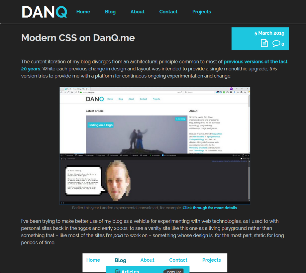
The current iteration of my blog diverges from an architectural principle common to most of previous versions of the last 20 years. While
each previous change in design and layout was intended to provide a single monolithic upgrade, this version tries to provide me with a platform for continuous ongoing
experimentation and change.
I’ve been trying to make better use of my blog as a vehicle for experimenting with web technologies, as I used to with personal sites back in the 1990s and early 2000s; to see a vanity
site like this one as a living playground rather than something that – like most of the sites I’m paid to work on – something whose design is, for the most part, static for
long periods of time.
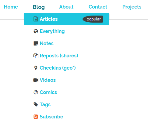
The “popular” flag and associated background colour in the “Blog” top-level menu became permanent after a period of A/B testing. Thanks, unwitting testers!
I’m not entirely happy with the design of these boxes, but that’s a job for another day.
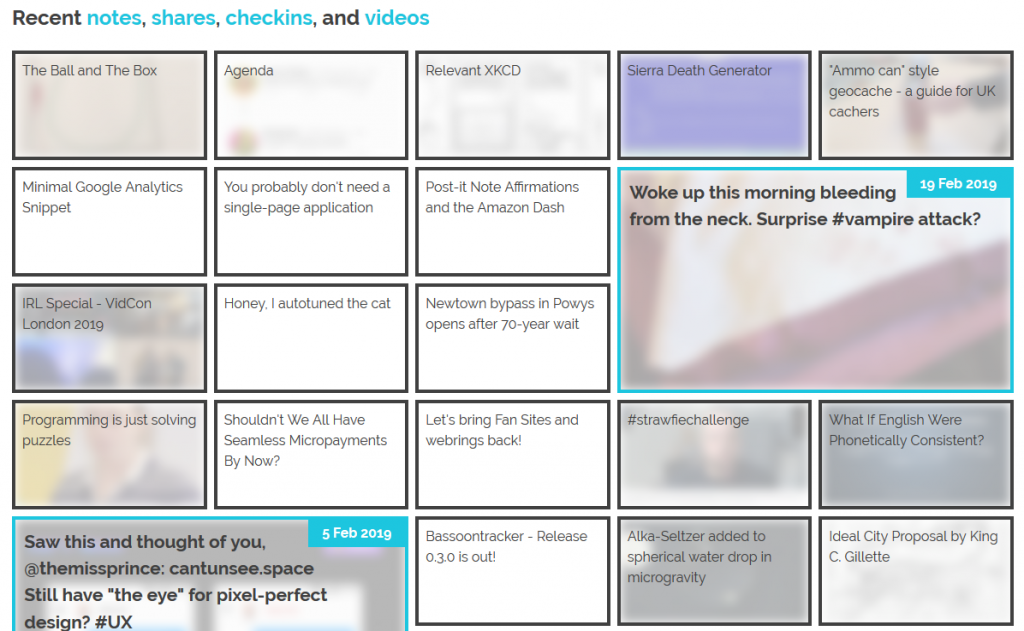
The grid of recent notes, shares, checkins and videos on my
homepage is powered by the display: grid; CSS directive. The number of columns varies by screen width from six
on the widest screens down to three or just one on increasingly small screens. Crucially, grid-auto-flow: dense; is used to ensure an even left-to-right filling of the
available space even if one of the “larger” blocks (with grid-column: span 2; grid-row: span 2;) is forced for space reasons to run onto the next line. This means that
content might occasionally be displayed in a different order from that in which it is written in the HTML (which is reverse
order of publication), but in exchange the items are flush with both sides.
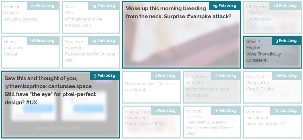
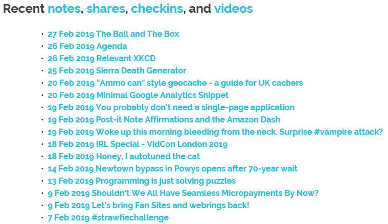
The large “5 Feb” item in this illustration should, reverse-chronologically, appear before the “3 Feb” item, but there isn’t room for it on the previous line. grid-auto-flow:
dense; means that the “3 Feb” item is allowed to bubble-up and fill the gap, appearing out-of-order but flush with the edge.
Not all web browsers support display: grid; and while that’s often only one of design and not of readability because these browsers will fall back to usually-very-safe
default display modes like block and inline, as appropriate, sometimes there are bigger problems. In Internet Explorer 11, for example, I found (with thanks to
@_ignatg) a problem with my directives specifying the size of these cells (which are actually <li> elements because, well,
semantics matter). Because it understood the directives that ought to impact the sizing of the list items but not
the one that redeclared its display type, IE made… a bit of a mess of things…
Thanks, Internet Explorer. That’s totally what I was looking for.
Do websites need to look the same in every browser? No. But the content should be readable
regardless, and here my CSS was rendering my content unreadable. Given that Internet Explorer users represent a little
under 0.1% of visitors to my site I don’t feel the need to hack it to have the same look-and-feel: I just need it to have the same content readability. CSS Feature Queries to the rescue!
CSS Feature Queries – the @supports selector – make it possible to apply parts of your stylesheet if and only if
the browser supports specific CSS features, for example grids. Better yet, using it in a positive manner (i.e. “apply these
rules only if the browser supports this feature”) is progressive enhancement, because browsers that don’t understand the @supports selector act in
the same way as those that understand it but don’t support the specified feature. Fencing off the relevant parts of my stylesheet in a @supports (display: grid) { ... }
block instructed IE to fall back to displaying that content as a boring old list: exactly what I needed.
It isn’t pretty, but it’s pretty usable!
Reduced-motion support
I like to put a few “fun” features into each design for my blog, and while it’s nowhere near as quirky as having my head play peek-a-boo when you
hover your cursor over it, the current header’s animations are in the same ballpark: hover over or click on some of the items in the header menu to see for yourself..
I’m most-pleased with the playful “bounce” of the letter Q when you hover over my name.
These kinds of animations are fun, but they can also be problematic. People with inner ear disorders (as well as people who’re just trying to maximise the battery life on their portable
devices!) might prefer not to see them, and web designers ought to respect that choice where possible. Luckily, there’s an emerging standard to acknowledge that: prefers-reduced-motion. Alongside its cousins inverted-colors, prefers-reduced-transparency, prefers-contrast and
prefers-color-scheme (see below for that last one!), these new CSS tools allow developers to optimise based on the accessibility
features activated by the user within their operating system.
In Windows you turn off animations while in MacOS you turn on not-having animations, but the principle’s the same.
If you’ve tweaked your accessibility settings to reduce the amount of animation your operating system shows you, this website will respect that choice as well by not animating the
contents of the title, menu, or the homepage “tiles” any more than is absolutely necessary… so long as you’re using a supported browser, which right now means Safari or Firefox (or the
“next” version of Chrome). Making the change itself is pretty simple: I just added a @media screen and (prefers-reduced-motion: reduce) { ... } block to disable or
otherwise cut-down on the relevant animations.
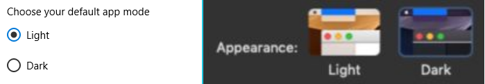
Dark-mode support
…
Similarly, operating systems are beginning to
support “dark mode”, designed for people trying to avoid eyestrain when using their computer at night. It’s possible for your browser to respect this and try to “fix” web pages for
you, of course, but it’s better still if the developer of those pages has anticipated your need and designed them to acknowledge your choice for you. It’s only supported in Firefox and
Safari so far and only on recent versions of Windows and MacOS, but it’s a start and a helpful touch for those nocturnal websurfers out there.
Come to the dark side, Luke. Or just get f.lux, I suppose.
It’s pretty simple to implement. In my case, I just stacked some overrides into a @media (prefers-color-scheme: dark) { ... } block, inverting the background and primary
foreground colours, softening the contrast, removing a few “bright” borders, and darkening rather than lightening background images used on homepage tiles. And again, it’s an example of
progressive enhancement: the (majority!) of users whose operating systems and/or browsers don’t yet support this feature won’t be impacted by its inclusion in my stylesheet, but those
who can make use of it can appreciate its benefits.
This isn’t the end of the story of CSS experimentation on my blog, but it’s a part of the it that I hope you’ve enjoyed.
Last week, I attended W3C TPAC as well as the CSS Working Group meeting there. Various changes were made to specifications, and discussions had which I feel are of interest to web
designers and developers. In this article, I’ll explain a little bit about what happens at TPAC, and show some examples and demos of the things we discussed at TPAC for CSS in
particular.
…
This article describes proposals for the future of CSS, some of which are really interesting. It includes mention of:
CSS scrollbars – defining the look and feel of scrollbars. If that sounds familiar, it’s because it’s not actually new: Internet Explorer 5.5 (and
contemporaneous version of Opera) supported a proprietary CSS extension that did the same thing back in 2000!
Aspect ratio units – this long-needed feature would make it possible to e.g. state that a box is square
(or 4:3, or whatever), which has huge value for CSS grid layouts: I’m excited by this one.
:where() – although I’ll be steering clear until they decide whether the related :matches() becomes :is(), I can see a million uses for this (and its widespread
existence would dramatically reduce the amount that I feel the need to use a preprocessor!).
TL/DR: When you use eight values specifying border-radius in CSS, you can create organic looking shapes. WOW. No time to read it all ?— we made a visual tool for you.
Find it here.
“The Image is set round just by using the well-supported border-radius. Don’t forget that old CSS still exists and is useful. You don’t need to use something fancy for every
effect.” — Rachel Andrew
Shortly after I heard this talk, I thought that you certainly could create more than just circles and started to dig deeper into what can be done using border-radius.
…
That’s really cool. I had a quick play and made this gold ‘shield’ award:
Although there’s a lot of heated discussion around diversity, I feel many of us ignore the elephant in the web development diversity room. We tend to forget about users of older or
non-standard devices and browsers, instead focusing on people with modern browsers, which nowadays means the latest versions of Chrome and Safari.
This is nothing new — see “works only in IE” ten years ago, or “works only in Chrome” right now — but as long as we’re addressing other diversity issues in web development we should
address this one as well.
Ignoring users of older browsers springs from the same causes as ignoring women, or non-whites, or any other disadvantaged group. Average web developer does not know any non-whites,
so he ignores them. Average web developer doesn’t know any people with older devices, so he ignores them. Not ignoring them would be more work, and we’re on a tight deadline with a
tight budget, the boss didn’t say we have to pay attention to them, etc. etc. The usual excuses.
I am increasingly of the opinion that the general software engineering adage “Don’t Repeat Yourself” does not always apply to web development. Also, I found that web development
classes in CS academia are not very realistic. These two problems turn out to have the same root cause: a lack of appreciation of what browsers do…
As I indicated in my last blog post, my new blog theme has a “pop up” Dan in the
upper-left corner. Assuming that you’re not using Internet Explorer, then when you move your mouse cursor over it, my head will “duck” back behind the bar below it.
My head "pops up" in the top-left hand corner of the site, and hides when you hover your mouse cursor over it.
This is all done without any Javascript whatsoever: it’s pure CSS. Here’s how it’s done:
<divclass="sixteen columns"> <divid="dans-creepy-head"></div> <h1id="site-title"class="graphic">
<ahref="/"title="Scatmania">Scatmania</a>
</h1> <spanclass="site-desc graphic">
The adventures and thoughts of "Scatman" Dan Q
</span> </div>
The HTML for the header itself is pretty simple: there’s a container (the big blue bar) which contains, among other things, a <div> with the id
"dans-creepy-head". That’s what we’ll be working with. Here’s the main CSS:
The CSS sets a size, position, and background image to the <div>, in what is probably a familiar way. A :hover selector changes the style to increase the
distance from the top of the container (from -24px to 100px) and to decrease the height, cropping the image (from 133px to 60px – this was necessary
in this case to prevent the bottom of the image from escaping out from underneath the masking bar that it’s supposed to be “hiding behind”). With just that code, you’d have a perfectly
workable “duck”, but with a jerky, one-step animation.
The transition directive (and browser-specific prefix versions -o-transition, -webkit-transition, and -moz-transition, for compatability) are what
makes the magic happen. This element specifies that any ("all") style is changed on this element (whether via CSS directives, as in this case, or by a change of class or
properties by a Javascript function), that a transition effect will be applied to those changes. My use of "all" is a lazy catch-all – I could have specified the
individual properties ( top and height) that I was interested in changing, and even put different periods on each, but I’ll leave it to you to learn about CSS3 transition options for yourself. The 800ms is the
duration of the transition: in my case, 0.8 seconds.
I apply some CSS to prevent the :hover effect from taking place in Internet Explorer, which doesn’t support transitions. The "ie" class is applied to the
<html> tag using Paul Irish’s technique, so it’s easy to detect and handle IE users without
loading separate stylesheet files for them. And finally, in order to fit with my newly-responsive design, I make the pop-up head disappear when the window is under 780px wide (at which
point there’d be a risk of it colliding with the title).
That’s all there is to it! A few lines of CSS, and you’ve got an animation that degrades gracefully. You could equally-well apply transformations to links (how about making them fade in
or out, or change the position of their background image?) or, with a little Javascript, to your tabstrips and drop-down menus.
[this post was lost during a server failure on Sunday 11th July 2004; it was partially recovered on 21st March 2012]
If you’re going to spend (at an absolute minimum – and probably closer to four times the amount) $350 on a series of banner advertisements promoting your service, to be displayed inside
a popular ad-sponsored piece of software, you’ll check your spelling, right? Right? Look at this:
[this image has been lost]
Sometimes I really do feel that Christians should be banned from the internet. They should certainly be disallowed from writing web pages – other than the Christians, I’ve never seen a
group of people who have – within their own group – broken every single rule of good web site design. Well… except if you consider GeoCities-users a group of their own.
As if this page, which scrolls on and on, haslarge numbers of images linked from other sites, and using a (badly) tiled
background image, isn’t bad enough, I’ve seen:
This GeoCities monstrosity, with a stupid amount of animated GIFs, annoying applets, and platform-dependent code
(including an embedded… [the rest of this post has been lost]