What this now does is instead of saying “add margin to the left”, it says “regardless of direction, put margin on the starting side”. If the language of the document was
right to left, like Arabic, that margin would be on the right hand side.
…
This is clever. If you use e.g. margin-left on every list element after the first to put space “between” them, the spacing isn’t quite right when the order of the elements
is reversed, for example because your page has been automatically translated into a language that reads in the opposite direction (e.g. right-to-left, rather than left-to-right). When
you use margin-left in this way you’re imposing a language-direction-centric bias on your content, and there’s no need: margin-inline-start and its friends
are widely-supported and says what you mean: “place a margin before this element”. I’ll be trying to remember to
use this where it’s appropriate from now on.
I’m reminded of an old joke (best read aloud), which I’ll repeat for your amusement:
The European Union commissioners have announced that agreement has been reached to adopt English as the preferred language for European communications, rather than German, which was
the other possibility. As part of the negotiations, Her Majesty’s Government conceded that English spelling had some room for improvement and has accepted a five-year phased plan for
what will be known as EuroEnglish (Euro for short).
In the first year, “s” will be used instead of the soft “c.” Sertainly, sivil servants will resieve this news with joy. Also, the hard “c” will be replaced with “k”. Not only will
this klear up konfusion, but typewriters kan have one less letter.
There will be growing publik enthusiasm in the sekond year, when the troublesome “ph” will be replaced by “f”. This will make words like “fotograf” 20 persent shorter.
In the third year, publik akseptanse of the new spelling kan be expekted to reach the stage where more komplikated changes are possible. Governments will enkorage the removal of
double letters, which have always ben a deterent to akurate speling. Also, al wil agre that the horible mes of silent “e”s in the languag is disgrasful, and they would go.
By the fourth year, peopl wil be reseptiv to steps such as replasing “th” by “z” and “w” by ” v”.
During ze fifz year, ze unesesary “o” kan be dropd from vords kontaining “ou”, and similar changes vud of kors be aplid to ozer kombinations of leters.
After zis fifz yer, ve vil hav a reli sensibl riten styl. Zer vil be no mor trubls or difikultis and evrivun vil find it ezi tu understand ech ozer.
Blissymbolics was conceived by Austro-Hungarian expatriate Charles K. Bliss (1897–1985), born Karl Kasiel Blitz to a Jewish family in the town of Czernowitz (now Chernivtsi in
modern-day Ukraine). He was introduced to signs and symbols at an early age in the form of circuit diagrams – his father’s many occupations included mechanic and electrician – which
he understood immediately as a “logical language”. Bliss (then Blitz) attended the Vienna University of Technology for chemical engineering and went on to become chief of the patent
department at the German TV and radio company Telefunken, a career that was cut short in early 1938 when the Third Reich annexed Austria.
Bliss was sent to Dachau concentration camp, and then to Buchenwald, before escaping to England in 1939. The eight-month German bombing offensive against Britain known as The Blitz
began only months later, prompting him to change his surname “from the war-like Blitz to the peaceful Bliss”, as he recalled in a taped interview. Bliss fled to Shanghai by way of Canada and Japan, where he was reunited with his wife. Claire, a
German Catholic, had used her connections to get Bliss out of Buchenwald, but her relatively privileged status was not enough to spare her a fraught journey to safety across Europe
and Asia. Even in Shanghai, the couple was forced into the Hongkew ghetto following the Japanese occupation.
Bliss became enraptured with written Chinese, which he mistook initially for ideograms. (Chinese characters are, in fact, logograms.) Nevertheless, certain Chinese characters have
pictographic qualities, and it was the symbol for “man”, that sparked Bliss’s epiphany. As he learned enough to read Chinese newspaper headlines and shop signage, he soon
realized that he was reading the symbols not in Chinese, but in his native German. At the age of 45, Bliss was inspired to develop a non-alphabetic writing system that could be
mastered in a short period of time and read by anyone regardless of their spoken language. This work remained the focus of his life, even after he and Claire emigrated to Australia in
1946 and despite the general apathy and indifference with which it was met.
…
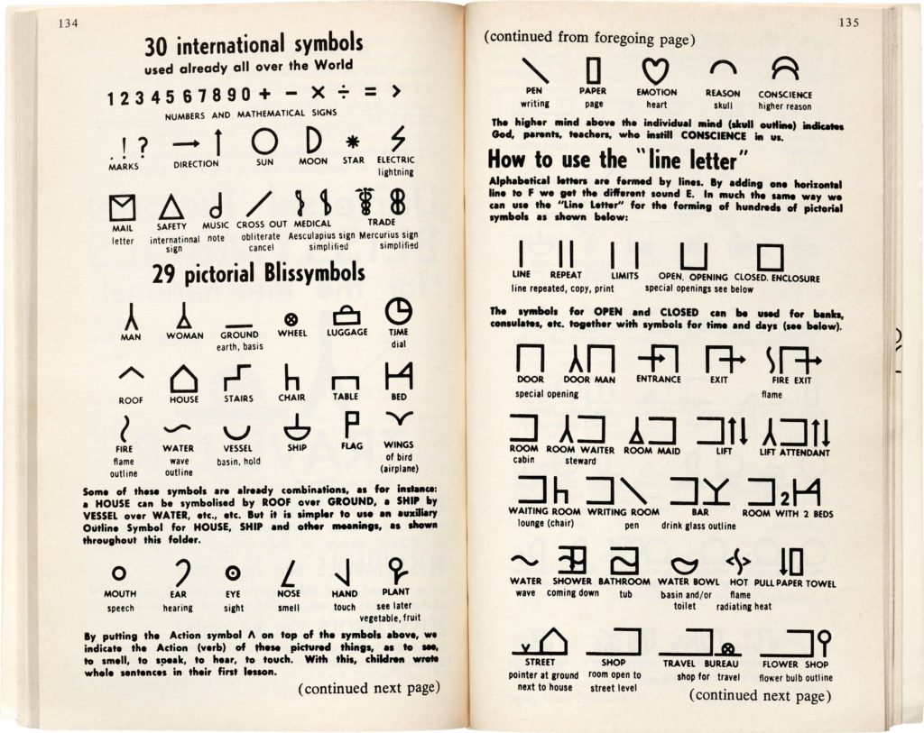
Fascinating article about the little-known “language” of Blissymbolics: coming from a similar era and background to Esperanto,
Blissymbolics failed even more to gain widespread traction but encompasses some really interesting ideas (about graphic notation and design, about linguistic concepts, about
communication theory) that we can still learn from. Read the full article…
Let me try that again: which came first, the colour or the fruit?
Still not quite right – one more try: which came first, orange, the English name of the colour, or orange, the English name of the fruit? What I really want
to know is: is the fruit named after the colour or the colour after the fruit? (I find it hard to believe that the two share a name and colour simply by coincidence)
It turns out that the fruit came first. Prior to the introduction of oranges to Western Europe in around the 16th or 17th century by Portugese merchants, English-speaking
countries referred to the colour by the name ġeolurēad. Say that Old English word out loud and you’ll hear its roots: it’s a combination of the historical versions of the
words “yellow” and “red”. Alternatively, people substituted words like “gold” or “amber”: also both words for naturally-occurring substances whose identity is confirmed by
their colouration.
There wasn’t much need for a dedicated word in English to describe the colour, before the introduction of the fruit, because there wasn’t much around of that colour. The
colour orange isn’t common in nature: a few fruits, copper-rich soils and rocks, a small number of tropical fish, a handful of flowers… and of course autumn leaves during that brief
period before they go brown and are washed away by Britain’s encroaching winter weather.
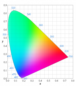
Brent Berlin and Paul Kay theorise that the evolution of a language tends towards the
introduction of words for particular colours in a strict order: so words to distinguish between green and blue (famously absent in Japanese,
Vietnamese, and Thai) are introduced before brown is added, which in term appears before the distinction of pink, orange, and grey. At a basic level, this seems to fit: looking at a
variety of languages and their words for different
colours, you’ll note that the ‘orange’ column is filled far less-often than the ‘brown’ column, which in turn is filled less-often than the ‘green’ column.
This is a rather crude analogy, of course, because some languages go further than others in their refinement of a particular area of the spectrum. Greek, for example, breaks down what
we would call “blue” into τυρκουάζ (turquoise) and κυανό (azure), and arguably βιολέ (violet), although a Greek-speaker would probably put the
latter down as a shade of purple, rather than of blue. It makes sense, I suppose, that languages are expected to develop a name for the colour “red” no later than they do for other
colours (other than to differentiate between darkness and lightness) – a lot of important distinctions in biology, food, and safety depend on our ability to communicate about red
things! But it seems to me that we’ve still got a way to go, working on our linguistic models of colour.
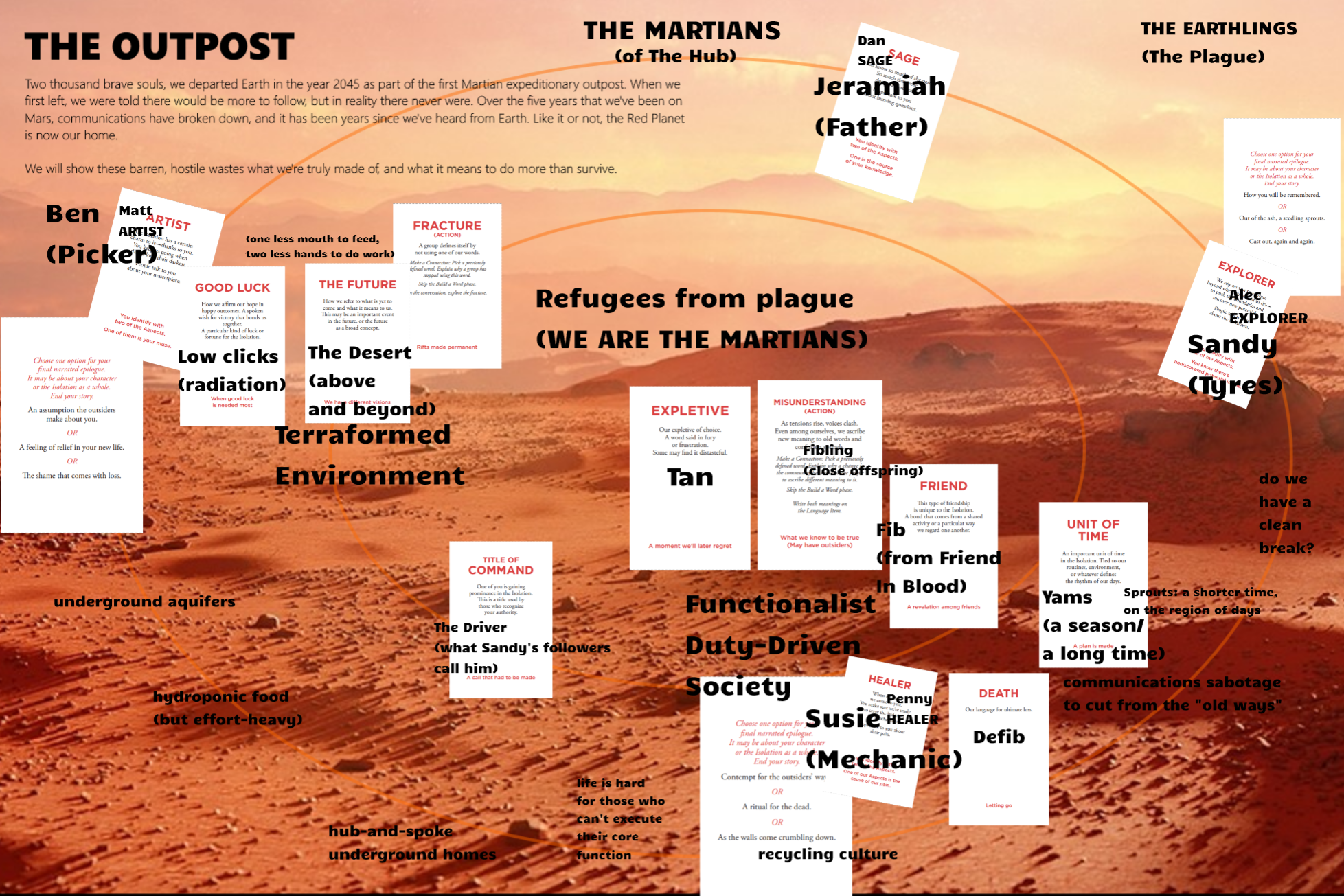
If we’d evolved on Mars (and were still a sighted, communicative, pack creature, but – for some reason – still had a comparable range and resolution of colour vision), our languages
would probably contain an enormous variety of words for colours in the 650-750 nanometre wavelengths (the colours that English speakers universally call “red”). Being able to navigate
the red planet based on the different ratios of hematites in the rocks, plains, soils and dusts would doubtless mean that the ability to linguistically distinguish between a dark-red
feature and a medium-red feature could be of great value!
The names we have for colours represent a part of our history, and our environment. From an anthropological and linguistic perspective, that’s incredibly interesting.
If it weren’t for the ubiquity of, say, violets and lavender in the Northern hemisphere, perhaps the English language wouldn’t have been for a word for that particular colour, and the
rainbow would have six colours instead of seven. And if I’d say, “Richard Of York Gave Battle In…”, nobody would know how to finish the sentence.
In other news, I recently switched phone network, and I’m now on Orange (after many years on Vodafone). There is no connection between this fact and this blog post; I just thought I’d share.
Door Anguish languish moose beer month a moth faux net tickley verses tile ant flecks a bill languishes spur ken honours. Wither ladle procters, eaters easer two ewes whirrs inn quiet
weedy queue louse weighs.
Dizzy woo nose a tin naan teen fitter sex, ah gentile moon aimed Hough Ardle Chase deed eggs ark lead art? Hear oat uh buck kern tame in severer furry tells, nosier rams, fey mouse
tells, ant thongs, end duke cane henge joy atoll own lion. Half pun
wit tit!
Par hips eye shut starred rye teen owl may blocks boats lark these?
“Thanks to these changes,” I said, “The Bodleian Libraries websites CMS can now support the use of Unicode
characters. That means that the editors can now write web content in Arabic, Japanese, Russian… or even Ancient Egyptian!”
It sounded like a good soundbite for the internal newsletter, although of course I meant that last suggestion as a joke. While I’m aware of libraries within the Bodleian who’d benefit
from being able to provide some of their content in non-Latin characters – and Arabic, Japanese, and Russian were obvious candidate languages – I didn’t actually anticipate that
mentioning Ancient Egyptian would attract much attention. Everybody knows that’s meant as a joke, right?
“Is that just Demotic symbols, then? Or can we use all hieroglyphics?” came back the reply. My heart stopped. Somebody actually wanted to use a four thousand plus year old
alphabet to write their web pages?
It turns out that there’s only one font in existence that supports the parts of the Unicode font set corresponding to Egyptian hieroglyphics: Aegyptus. So you need to ensure that your readers have that installed or they’ll
just see lots of boxes. And you’ll need to be able to type the characters in the first place – if you don’t have an Ancient Egyptian Keyboard (and who does, these days), you’re going to
spend a lot of time clicking on characters from a table or memorising five-digit hex-codes.
But yes, it’s doable. With a properly set-up web server, database, CMS, and templates, and sufficient motivation, it’s possible to type in Ancient Egyptian. And now, thanks to me, the
Bodleian has all of those things.
Well: except perhaps the motivation. The chap who asked about Ancient Egyptian was, in fact, having a laugh. In the strange academic environment of Oxford University, it’s hard to be
certain, sometimes.
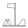
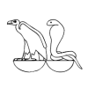
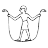
I do find myself wondering what scribes of the Old Kingdom would have made of this whole exercise. To a scribe, for example, it will have been clear that to express his meaning he
needed to draw a flock of three herons facing left. Millenia later, we treat “three herons facing left” as a distinct separate glyph from “one heron facing left”, perhaps in a similar
way to the way that we treat the Æ ligature as being separate from the letters A and E from which it is derived. He couldn’t draw just one heron, because… well, that just wouldn’t make
any sense, would it? So this symbol – no: more importantly, it’s meaning – is encoded as U+13163, the 78,180th character in an attempted “univeral alphabet”.
To what purpose? So that we can continue to pass messages around in Ancient Egyptian in a form that will continue to be human and machine-readable for as long as is possible. But
why? That’s what I imagine our scribe would say. We’re talking about a dead language here: one whose continued study is only justified by an attempt to understand ancient texts
that we keep digging up. And he’d be right.
All existing texts written in Ancient Egyptian aren’t encoded in Unicode. They’re penned on rotting papyrus and carved into decaying sandstone walls. Sure, we could
transcribe them, but we’d get exactly the same amount of data by transliterating them or using an encoding format for that specific purpose (which I’m sure must exist), and even more
data by photographing them. There’s no need to create more documents in this ancient language: just to preserve the existing ones for at least as long as it takes to
translate and interpret them. So why the effort to make an encoding system – and an associated font! – to display them?
Don’t get me wrong: I approve. I think Unicode is awesome, and I think that UTF-16 and UTF-8 are fantastic (if slightly hacky) ways to make use of the breadth of Unicode
without doubling or quadrupling the amount of memory consumed by current 8-bit documents. I just don’t know how to justify it. All of those bits, just to store information in a language
in which we’re producing no new information.
What I’m saying is: I think it’s wonderful that we can now put Egyptian hieroglyphics on the Bodleian Libraries websites. I just don’t know how I’d explain why it’s cool to a
time-traveling Egyptian scribe. Y’know; in case I come across one.
Antaŭ pluraj semajnoj, mi havis sonĝo. Mi sonĝis de mi parolas Esperanton. Neniu rajtas diri mi ne postiras mia sonĝoj, ĉar mi komencis lerni la lingvo!
(sed mi bezonis vortaron por skribis jenon)
Translation of my very rough-and-ready multilingual work, above: Several weeks ago, I had a dream. I dreamt that I spoke Esperanto. Nobody may say I don’t follow my
dreams, because I’ve begun learning the language. (although I required a dictionary to write this)
That’s the short and long of it, really. Thanks to Lernu!‘s online “audiobook”-like tutorials and Project Gutenberg and a half-dozen other sites, I’ve now got a basic grasp of Esperanto. I can say who I am and how I am and ask the same
of you, tell you what I do for a living, conjugate a variety of verbs (actually, any verb – the structure of the language is so thoughtfully put-together that the rules for using it are
logical and exception-free).
Why am I learning a language that I know no other speakers of? Well, it gives me something new to think about on my lunch breaks, but I’m afraid the best reason is the one detailed
(bilingually) above: I dreamt I could, so I wanted to find out if I was able to. I’ve always been particularly bad at picking up human languages (programming languages, by comparison,
I’m tend to learn very fast), and as I’m not quite mad enough yet to
learn Lojban, I guess Esperanto‘s the next-best thing.
Statto‘s not the only one to get pissed off at some of the ways people abuse
and misuse their language. I’m not perfect myself (contrary to my bedpartners’ claims), but there’s one form of linguistic butchery that really gets my goat.
The thing that really gets to me is the persistent and habitual misuse by some people of the word literally… to describe something which is not literally the case and is, in
some cases, even a metaphor – quite the opposite of a literal. What these people mean to say, of course, is probably really (which has a double
meaning – being real, which is virtually the same as literally – and as a term of exaggeration). Occasionally they mean particularly, in order
to differentiate between other metaphor-inducing events. But usually, their needs would be serviced with a simple exclamation mark. Now it’s not to say that I haven’t made this mistake
– I have – but somehow other people’s mental self-torture over their mistake never seems to atone for their sin.
Now comes a new torment, fresh from the habits of a co-worker of mine. He shall remain nameless, but how he infuriates me shall be known to all – having finally learnt what the word
literally literally means (see what I did there?), he’s instead substituted it in his sentences with physically.
Sometimes, this would be okay – after all, sometimes he’s talking about things which are physical events and trying to exaggerate them. But he and I work together as software engineers,
and so we spend a lot of time talking about virtual concepts such as variables and program code. Have you any idea how annoying it is to be stuck into a debugging session and be
interrupted by a guy saying “I know I can use dot-clone, but can I physically copy an object structure in memory?”
April Fools Day has always been an oppertunity for me to get back at the ineffective dickheads that are the management of Penbryn Hall at the University of Wales, Aberystwyth. This year
was no exception. Building upon the success of my last big prank, Penbryn-Hall.co.uk, a spoof ‘official’ site which almost got me expelled
from the hall, this year I worked with Kit, Bryn and Claire in order to cause yet more chaos.
We had a plan in mind already, but when Penbryn sent out the following message on the internal e-mail system, we couldn’t help but pounce on an oppertunity:
On Tuesday 1st and Wednesday 2nd April, Mark and I will be doing a maintenance inspection in student rooms.
This will involve checking for repairs and lights which are not working.
We will be starting in Block 1 at 10.30 am
If you have any problems e.g. desk lamp not working and would like a new bulb, please call at Reception.
Margaret Woodliff
Deputy Manager
A few things immediatley stand out in this e-mail. One is that the name at the bottom is not the same name as the person it appears to come from. A second is that it is not provided in
Welsh, and is therefore in contravention of the University’s billingual policy…
…the third, and stupidest of the lot, is that they arranged to do room inspections on the first of April.
So, we thought… all we have to do is spread some more convincing (not difficult, considering) counter-publicity, stating that this e-mail was actually a student prank, and that
there will not be any room inspections after all. We could even go so far as to state that we suspect that this e-mail may be the prelude to an attempt to gain unauthorised access to
student’s study bedrooms. Mayhem in the making.
We came up with a poster that expressed pretty much this, and stuck copies up all over the hall. And it worked! People were absolutely convinced that our posters were real and
the real e-mail was the hoax. In the end, the management had to spend their Sunday walking round from room-to-room knocking on student’s doors and assuring them that the e-mail
was the genuine article. Oh; how I laughed.
The poster is available to download as an Adobe Acrobat file, below.
Download The Poster
Adobe Acrobat (PDF); 22KB.
The actual poster which was put up around Penbryn Hall for April Fools Day 2003.