Progressive enhancement is a great philosophy for Web application development. Deliver all the essential basic functionality using the simplest standards available; use advanced technologies to add bonus value and convenience features for users whose platform supports them. Win.

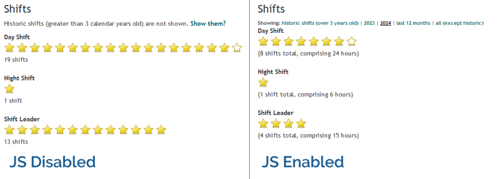
In Three Rings, for example, volunteers can see a “starchart” of the volunteering shifts they’ve done recently, at-a-glance, on their profile page1. In the most basic case, this is usable in its HTML-only form: even with no JavaScript, no CSS, no images even, it still functions. But if JavaScript is enabled, the volunteer can dynamically “filter” the year(s) of volunteering they’re viewing. Basic progressive enhancement.
If a feature requires JavaScript, my usual approach is to use JavaScript to add the relevant user interface to the page in the first place. Those starchart filters in Three Rings don’t appear at all if JavaScript is disabled. A downside to this approach is that the JavaScript necessarily modifies the DOM on page load, which introduces a delay to the page being interactive as well as potentially resulting in layout shift.
That’s not always the best approach. I was reminded of this today by the website of 7-year-old Shiro (produced with, one assumes, at least a little help from Saneef H. Ansari). Take a look at this progressively-enhanced theme switcher:
The HTML that’s delivered over-the-wire provides a disabled <select> element, which gains the CSS directive cursor: not-allowed;, to make it clear to the used that this dropdown doesn’t do anything. The whole thing’s wrapped
in a custom element.
When that custom element is defined by the JavaScript, it enhances the dropdown with an event listener that implements the theme changes, then enables the disabled
<select>.
<color-schemer>
  <form>
    <label>
      Theme
      <select disabled>
        <option value="">System</option>
        <option value="dark">Dark</option>
        <option value="light" selected>Light</option>
      </select>
    </label>
  </form>
</color-schemer>
<label>
probably should use a for="..." rather than wrapping the <select>, but otherwise this code is absolutely gorgeous.
It’s probably no inconvenience to the minority of JS-less users to see a theme switcher than, when they go to use it, turns out to be disabled. But it saves time for virtually everybody not to have to wait for JavaScript to manipulate the DOM, or else to risk shifting the layout by revealing a previously-hidden element.
Altogether, this is a really clever approach, and I was pleased today to be reminded – by a 7-year-old! – of the elegance of this approach. Nice one Shiro (and Saneef!).
Footnotes
1 Assuming that administrators at the organisation where they volunteer enable this feature for them, of course: Three Rings‘ permission model is robust and highly-customisable. Okay, that’s enough sales pitch.