I’ve been changing my relationship to being online.
Some of it is keeping in touch with friends who are fascinated by the same sorts of hybrid creations I am. Friends who build things. Friends in different professional communities.
Paying attention when they mention some new discovery or avenue of interest.
Some of it is using an RSS reader to change the cadence and depth of my consumption—pulling away from the quick-hit likes of social media in favor of a space where I can run my
thoughts to their logical conclusion (and then sit on them long enough to consider whether or not they’re true).
…
I wish I could get more people to see the value in the “slow Web”. The participatory Web. The creative Web. The personalised Web.
When you use an app to browse a “stream” in most social media, you’re seeing a list of posts curated to keep you watching, keep you seeing adverts, keep you on the app so that as much
personal data as possible can be leeched from your behaviour. If it feels satisfying and especially if it feels addictive, the social network has done its job, but don’t be fooled: its
job is not to improve social connections – it’s job is to keep you from doing anything else.
You don’t have to use the Web this way. You can subscribe to the content creators and topics that actually interest you. You can get that content on basically any device or medium you
like, or across a mixture: want notifications by email? Slack? IRC? Discord? In a browser? In an app? As-it-happens or digests? You
can filter for what interests you most at any given moment, save content for later, and resharing is supported thanks to an old-school invention called a “URL“. And you’ll see fewer ads and experience less misuse of your behavioural data.
Sure, there’s a learning curve. But it’s worth it. I wish I could get more people to see that.
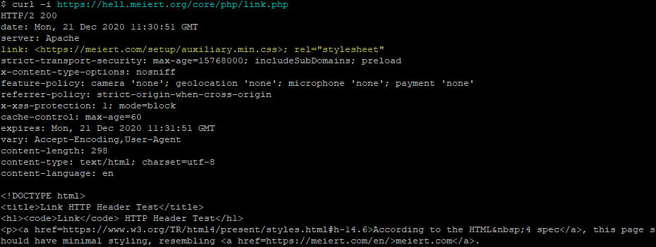
While talking about external CSS, he hinted at what I consider to be a distinct fourth way with its own unique use
cases:; using the Link: HTTP header. I’d like to share with you how it works and why I think it needs to be
kept in people’s minds, even if it’s not suitable for widespread deployment today.
Injecting CSS using the Link: HTTP Header
Every one of Jeremy’s suggestions involve adding markup to the HTML document itself. Which makes sense; you almost always
want to associate styles with a document regardless of the location it’s stored or the medium over which it’s transmitted. The most popular approach to adding CSS to a page uses the <link> HTML element, but did you know… the <link> element has a semantically-equivalent HTTP header,Link:.
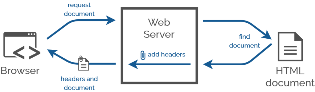
A webserver adds headers when it serves a document anyway. Adding one more is no big deal.
Why is this important?
This isn’t something you should put on your website right now. This (21-year-old!) standard is still only really supported in Firefox and pre-Blink Opera, so you lose perhaps 95% of the
Web (it could be argued that because CSSought to be considered progressive enhancement, it’s tolerable so long as your
HTML is properly-written).
If it were widely-supported, though, that would be a really good thing: HTTP headers beat meta/link tags for configurability, performance management, and separation of concerns. Need some specific examples? Sure:
here’s what you could use HTTP stylesheet linking for:
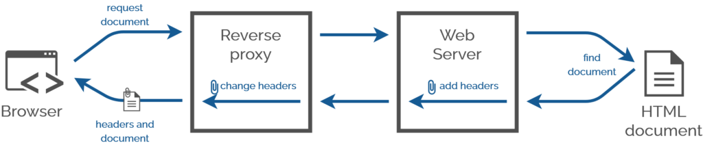
You have no idea how many times in my career I’d have injected CSS Link: headers using a reverse proxy server the
standard was universally-implemented. This technique would have made one of my final projects at the Bodleian so much easier…
Performance improvement using aggressively preloaded “top” stylesheets before the DOM parser even fires up.
Stylesheet injection by edge caches to provide regionalised/localised changes to brand identity.
Strong separation of content and design by hosting content and design elements in different systems.
Branding your staff intranet differently when it’s accessed from outside the network than inside it.
Rebranding proprietary services on your LAN without deep inspection, using reverse proxies.
Less-destructive user stylesheet injection by plugins etc. that doesn’t risk breaking icky on-page Javascript (e.g. theme switchers).
Browser detection? 😂 You could use this technique today to detect Firefox. But you absolutely
shouldn’t; if you think you need browser detection in CSS, use this instead.
Unfortunately right now though, stylesheet Link: headers remain consigned to the bin of “cool stylesheet standards that we could probably use if it weren’t for fucking Google”; see also
alternate stylesheets.
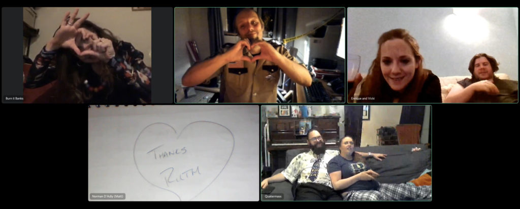
This weekend I announced and then hosted Homa Night II, an effort to use
technology to help bridge the chasms that’ve formed between my diaspora of friends as a result mostly of COVID. To a lesser extent
we’ve been made to feel distant from one another for a while as a result of our very diverse locations and lifestyles, but the resulting isolation was certainly compounded by lockdowns
and quarantines.
Long gone are the days when I could put up a blog post to say “Troma Night tonight?” and expect half a dozen friends to turn up at my house.
Back in the day we used to have a regular weekly film night called Troma Night, named after the studio
who dominated our early events and whose… genre… influenced many of our choices thereafter. We had over 300 such film
nights, by my count, before I eventually left our shared hometown of Aberystwyth ten years ago. I wasn’t the last one of the Troma Night
regulars to leave town, but more left before me than after.
Observant readers will spot a previous effort I made this year at hosting a party online.
Earlier this year I hosted Sour Grapes, a murder mystery party (an irregular highlight of our Aberystwyth social calendar,
with thanks to Ruth) run entirely online using a mixture of video chat and “second screen”
technologies. In some ways that could be seen as the predecessor to Homa Night, although I’d come up with most of the underlying technology to make Homa Night possible on a
whim much earlier in the year!
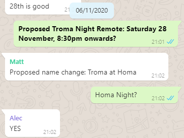
The idea spun out of a few conversations on WhatsApp but the final name – Homa Night – wasn’t agreed until early in November.
How best to make such a thing happen? When I first started thinking about it, during the first of the UK’s lockdowns, I considered a few options:
Streaming video over a telemeeting service (Zoom, Google Meet, etc.)
Very simple to set up, but the quality – as anybody who’s tried this before will attest – is appalling. Being optimised for speech rather than music and sound effects gives the audio
a flat, scratchy sound, video compression artefacts that are tolerable when you’re chatting to your boss are really annoying when they stop you reading a crucial subtitle, audio and
video often get desynchronised in a way that’s frankly infuriating, and everybody’s download speed is limited by the upload speed of the host, among other issues. The major benefit of
these platforms – full-duplex audio – is destroyed by feedback so everybody needs to stay muted while watching anyway. No thanks!
Teleparty or a similar tool Teleparty (formerly Netflix Party, but it now supports more services) is a pretty clever way to get almost exactly what I want:
synchronised video streaming plus chat alongside. But it only works on Chrome (and some related browsers) and doesn’t work on tablets, web-enabled TVs, etc., which would exclude some
of my friends. Everybody requires an account on the service you’re streaming from, potentially further limiting usability, and that also means you’re strictly limited to the media
available on those platforms (and further limited again if your party spans multiple geographic distribution regions for that service). There’s definitely things I can learn from
Teleparty, but it’s not the right tool for Homa Night.
“Press play… now!”
The relatively low-tech solution might have been to distribute video files in advance, have people download them, and get everybody to press “play” at the same time! That’s at least
slightly less-convenient because people can’t just “turn up”, they have to plan their attendance and set up in advance, but it would certainly have worked and I seriously
considered it. There are other downsides, though: if anybody has a technical issue and needs to e.g. restart their player then they’re basically doomed in any attempt to get back
in-sync again. We can do better…
A custom-made synchronised streaming service…?
A custom solution that leveraged existing infrastructure for the “hard bits” proved to be the right answer.
So obviously I ended up implementing my own streaming service. It wasn’t even that hard. In case you want to try your own, here’s how I did it:
Media preparation
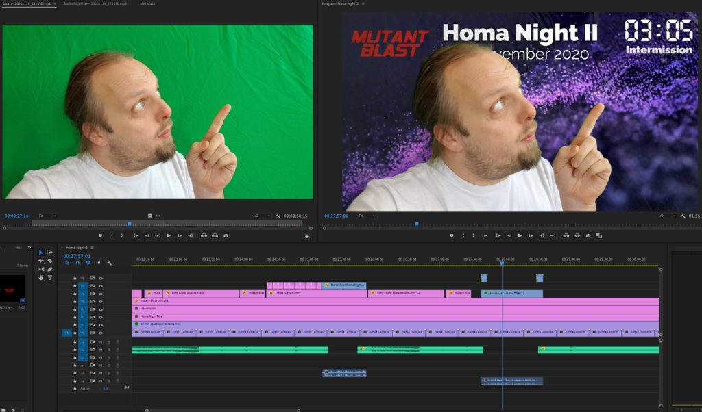
First, I used Adobe Premiere to create a video file containing both of the night’s films, bookended and separated by “filler” content to provide an introduction/lobby, an intermission,
and a closing “you should have stopped watching by now” message. I made sure that the “intro” was a nice round duration (90s) and suitable for looping because I planned to hold people
there until we were all ready to start the film. Thanks to Boris & Oliver for the background
music!
Honestly, the intermission was just an excuse to keep my chroma key gear out following its most-recent use.
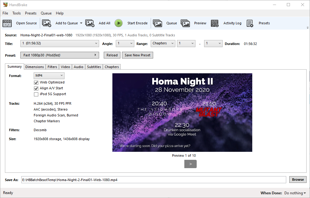
Next, I ran the output through Handbrake to produce “web optimized” versions in 1080p and 720p output sizes. “Web optimized” in this case means that
metadata gets added to the start of the file to allow it to start playing without downloading the entire file (streaming) and to allow the calculation of what-part-of-the-file
corresponds to what-part-of-the-timeline: the latter, when coupled with a suitable webserver, allows browsers to “skip” to any point in the video without having to watch the intervening
part. Naturally I’m encoding with H.264 for the widest possible compatibility.
Even using my multi-GPU computer for the transcoding I had time to get up and walk around a bit.
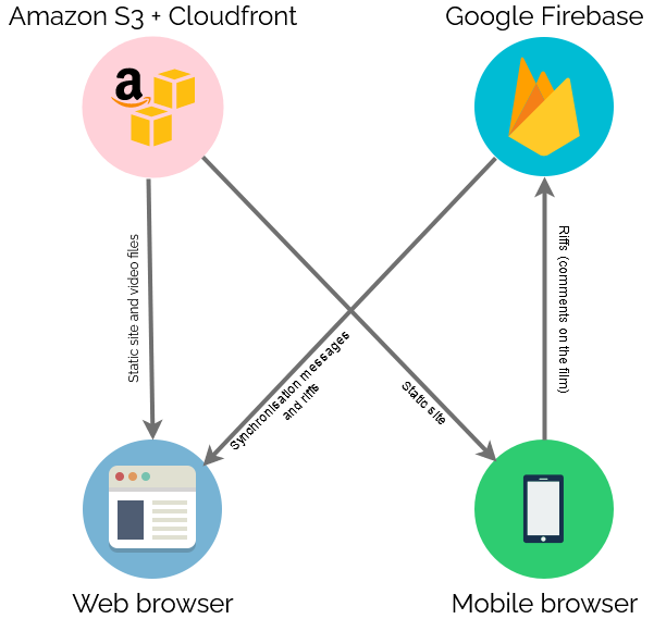
Real-Time Synchronisation
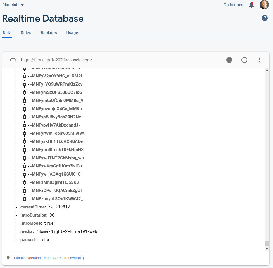
To keep everybody’s viewing experience in-sync, I set up a Firebase account for the application: Firebase provides an easy-to-use Websockets
platform with built-in data synchronisation. Ignoring the authentication and chat features, there wasn’t much
shared here: just the currentTime of the video in seconds, whether or not introMode was engaged (i.e. everybody should loop the first 90 seconds, for now), and
whether or not the video was paused:
Firebase makes schemaless real-time databases pretty easy.
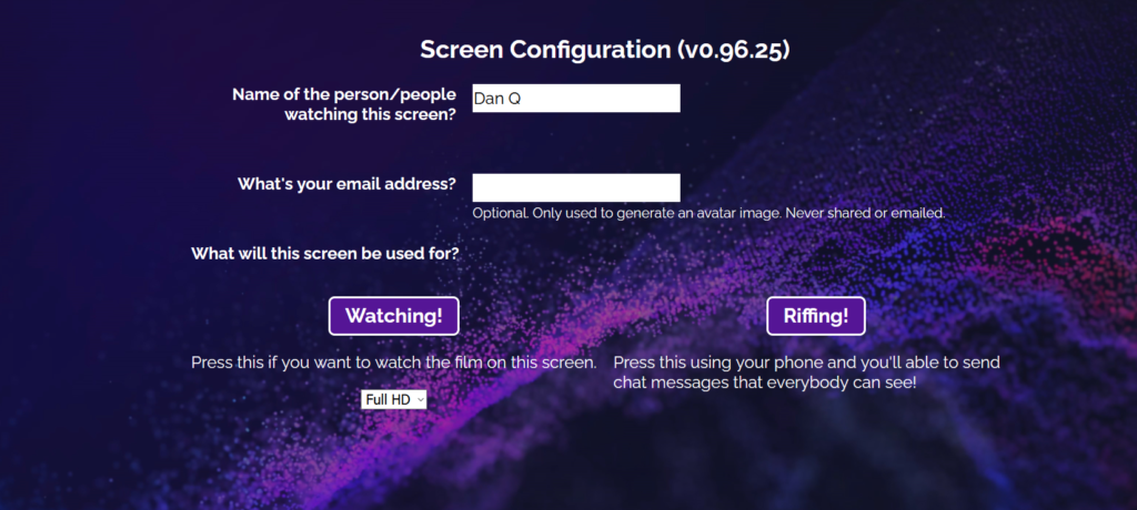
To reduce development effort, I never got around to implementing an administrative front-end; I just manually went into the Firebase database and acknowledged “my” computer as being an
administrator, after I’d connected to it, and then ran a little Javascript in my browser’s debugger to tell it to start pushing my video’s currentTime to the server every
few seconds. Anything else I needed to edit I just edited directly from the Firebase interface.
Other web clients’ had Javascript to instruct them to monitor these variables from the Firebase database and, if they were desynchronised by more than 5 seconds, “jump” to the correct
point in the video file. The hard part of the code… wasn’t really that hard:
// Rewind if we're passed the end of the intro loopfunction introModeLoopCheck() {
if (!introMode) return;
if (video.currentTime > introDuration) video.currentTime =0;
}
function fixPlayStatus() {
// Handle "intro loop" modeif (remotelyControlled && introMode) {
if (video.paused) video.play(); // always play
introModeLoopCheck();
return; // don't look at the rest
}
// Fix current timeconst desync =Math.abs(lastCurrentTime - video.currentTime);
if (
(video.paused && desync > DESYNC_TOLERANCE_WHEN_PAUSED) ||
(!video.paused && desync > DESYNC_TOLERANCE_WHEN_PLAYING)
) {
video.currentTime = lastCurrentTime;
}
// Fix play statusif (remotelyControlled) {
if (lastPaused &&!video.paused) {
video.pause();
} elseif (!lastPaused && video.paused) {
video.play();
}
}
// Show/hide paused notification
updatePausedNotification();
}
Web front-end
Finally, there needed to be a web page everybody could go to to get access to this. As I was hosting the video on S3+CloudFront anyway, I put the HTML/CSS/JS there too.
I decided to carry the background theme of the video through to the web interface too.
I tested in Firefox, Edge, Chrome, and Safari on desktop, and (slightly less) on Firefox, Chrome and Safari on mobile. There were a few quirks to work around, mostly to do with browsers
not letting videos make sound until the page has been interacted with after the video element has been rendered, which I carefully worked-around by putting a popup “over” the
video to “enable sync”, but mostly it “just worked”.
Delivery
On the night I shared the web address and we kicked off! There were a few hiccups as some people’s browsers got disconnected early on and tried to start playing the film before it was
time, and one of these even when fixed ran about a minute behind the others, leading to minor spoilers leaking via the rest of us riffing about them! But on the whole, it worked. I’ve
had lots of useful feedback to improve on it for the next version, and I might even try to tidy up my code a bit and open-source the results if this kind of thing might be useful to
anybody else.
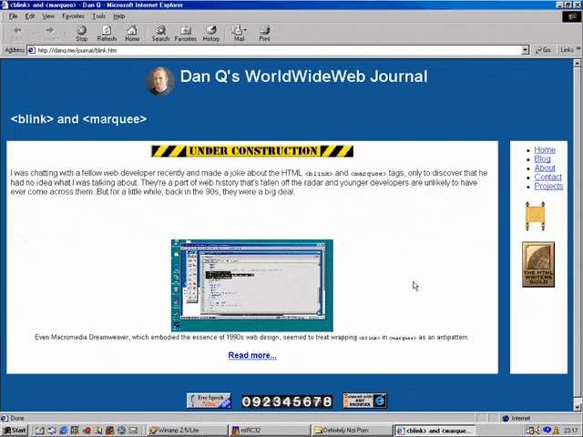
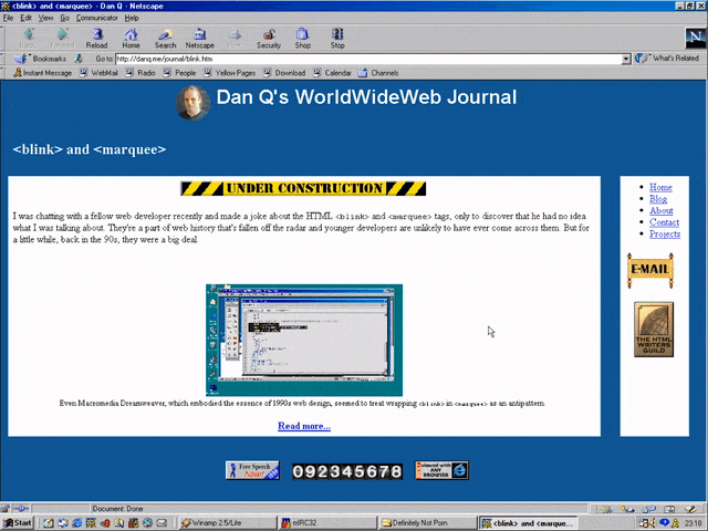
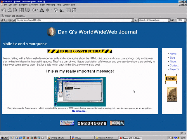
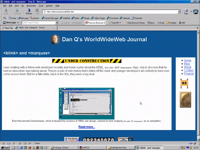
I was chatting with a fellow web developer recently and made a joke about the HTML <blink> and
<marquee> tags, only to discover that he had no idea what I was talking about. They’re a part of web history that’s fallen off the radar and younger developers are
unlikely to have ever come across them. But for a little while, back in the 90s, they were a big deal.
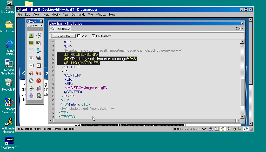
Even Macromedia Dreamweaver, which embodied the essence of 1990s web design, seemed to treat wrapping
<blink> in <marquee> as an antipattern.
Invention of the <blink> element is often credited to Lou Montulli, who wrote pioneering web browser Lynx before being joining Netscape in 1994. He insists that he didn’t write any
of the code that eventually became the first implementation of <blink>. Instead, he claims: while out at a bar (on the evening he’d first meet his wife!), he
pointed out that many of the fancy new stylistic elements the other Netscape engineers were proposing wouldn’t work in Lynx, which is a text-only browser. The fanciest conceivable
effect that would work across both browsers would be making the text flash on and off, he joked. Then another engineer – who he doesn’t identify – pulled a late night hack session and
added it.
And so it was that when Netscape Navigator 2.0 was released in 1995 it added support for
the <blink> tag. Also animated GIFs and the first inklings of JavaScript, which collectively
would go on to define the “personal website” experience for years to come. Here’s how you’d use it:
<BLINK>This is my blinking text!</BLINK>
With no attributes, it was clear from the outset that this tag was supposed to be a joke. By the time HTML4 was
published as a a recommendation two years later, it was documented as being a joke. But the Web of the late 1990s
saw it used a lot. If you wanted somebody to notice the “latest updates” section on your personal home page, you’d wrap a <blink> tag around the title (or,
if you were a sadist, the entire block).
If you missed this particular chapter of the Web’s history, you can simulate it at Cameron’s World.
In the same year as Netscape Navigator 2.0 was released, Microsoft released Internet Explorer
2.0. At this point, Internet Explorer was still very-much playing catch-up with the features the Netscape team had implemented, but clearly some senior Microsoft engineer took a
look at the <blink> tag, refused to play along with the joke, but had an innovation of their own: the <marquee> tag! It had a whole suite of attributes to control the scroll direction, speed, and whether it looped or bounced backwards and forwards. While
<blink> encouraged disgusting and inaccessible design as a joke, <marquee> did it on purpose.
<MARQUEE>Oh my god this still works in most modern browsers!</MARQUEE>
But here’s the interesting bit: for a while in the late 1990s, it became a somewhat common practice to wrap content that you wanted to emphasise with animation in both a
<blink> and a <marquee> tag. That way, the Netscape users would see it flash, the IE users
would see it scroll or bounce. Like this:
<MARQUEE><BLINK>This is my really important message!</BLINK></MARQUEE>
Wrap a <blink> inside a <marquee> and IE users will see the marquee. Delightful.
The web has always been built on Postel’s Law: a web browser should assume that it won’t understand everything it reads,
but it should provide a best-effort rendering for the benefit of its user anyway. Ever wondered why the modern <video> element is a block rather than a self-closing
tag? It’s so you can embed within it code that an earlier browser – one that doesn’t understand <video> – can read (a browser’s default state when seeing a
new element it doesn’t understand is to ignore it and carry on). So embedding a <blink> in a <marquee> gave you the best of both worlds, right?
(welll…)
Wrap a <blink> inside a <marquee> and Netscape users will see the blink. Joy.
Better yet, you were safe in the knowledge that anybody using a browser that didn’t understand either of these tags could still read your content. Used properly, the
web is about progressive enhancement. Implement for everybody, enhance for those who support the shiny features. JavaScript and CSS can be applied with the same rules, and doing so pays dividends in maintainability and accessibility (though, sadly, that doesn’t stop people writing
sites that needlessly require these technologies).
Personally, I was a (paying! – back when people used to pay for web browsers!) Opera user so I mostly saw neither <blink> nor <marquee> elements.
I don’t feel like I missed out.
I remember, though, the first time I tried Netscape 7, in 2002. Netscape 7 and its close descendent are, as far as I can tell, the only web browsers to support both<blink> and <marquee>. Even then, it was picky about the order in which they were presented and the elements wrapped-within them. But support was
good enough that some people’s personal web pages suddenly began to exhibit the most ugly effect imaginable: the combination of both scrolling and flashing text.
If Netscape 7’s UI didn’t already make your eyes bleed (I’ve toned it down here by installing the “classic skin”), its simultaneous
rendering of <blink> and <marquee> would.
The <blink> tag is very-definitely dead (hurrah!), but you can bring it back with pure CSS if you must.
<marquee>, amazingly, still survives, not only in polyfills but natively, as you might be able to see above. However, if you’re in any doubt as to whether or not
you should use it: you shouldn’t. If you’re looking for digital nostalgia, there’s a whole
rabbit hole to dive down, but you don’t need to inflict <marquee> on the rest of us.
Watched the pilot of Webbed Briefs by @heydonworks (of Every Layout fame). It’s a sarcastic independent vlog
about web technologies, so I immediately fell in love and subscribed to the feed…
You see what that’s doing? It’s loading the stylesheet for the print medium, but then when the document finishes loading it’s switching the media type from “print” to “all”.
Because it didn’t apply to begin with the stylesheet isn’t render-blocking. You can use this to delay secondary styles so the page essentials can load at full speed.
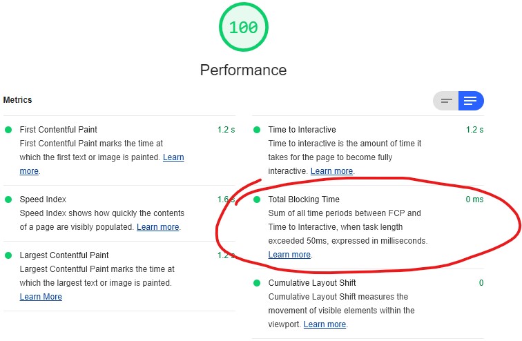
Reducing blocking times, like I have on this page, is one of many steps in optimising perceived page performance.
I don’t like this approach. I mean: I love the elegance… I just don’t like the implications.
Why I don’t like lazy-loading CSS using Javascript
Using Javascript to load CSS, in order to prevent that CSS
blocking rendering, feels to me like it conceptually breaks the Web. It certainly violates the expectations of progressive enhancement, because it introduces a level of
fault-intolerance that I consider (mostly) unacceptable.
CSS and Javascript are independent of one another. A well-designed progressively-enhanced page should function with
HTML only, HTML-and-CSS only, HTML-and-JS only, or all
three.CSS adds style, and JS adds behvaiour to a page; and when
you insist that the user agent uses Javascript in order to load stylistic elements, you violate the separation of these technologies (I’m looking at you, the majority of heavyweight
front-end frameworks!).
If you’re thinking that the only people affected are nerds like me who browse with Javascript wholly or partially disabled, you’re wrong: gov.uk research shows that around 1% of your visitors have Javascript fail for some reason or another: because it’s disabled
(whether for preference, privacy, compatibility with accessibility technologies, or whaterver), blocked, firewalled, or they’re using a browser that you didn’t expect.
Can we lazy-load CSS in a way that doesn’t depend on Javascript? (spoiler: yes)
Chris’s daily tip got me thinking: could there exist a way to load CSS in a non-render-blocking way but which degraded
gracefully in the event that Javascript was unavailable? I.e. if Javascript is working, lazy-load CSS, otherwise: load
conventionally as a fallback. It turns out, there is!
In principle, it’s this:
Link your stylesheet from within a <noscript> block, thereby only exposing it where Javascript is disabled. Give it a custom attribute to make it easy to find
later, e.g. <noscript lazyload> (if you’re a standards purist, you might prefer to use a data- attribute).
Have your Javascript extract the contents of these <noscript> blocks and reinject them. In modern browsers, this is as simple as e.g.
[...document.querySelectorAll('noscript[lazyload]')].forEach(ns=>ns.outerHTML=ns.innerHTML).
If you need support for Internet Explorer, you need a little more work, because Internet Explorer doesn’t expose<noscript> blocks to the DOM in a helpful way. There are a variety of possible workarounds; I’ve implemented one but not put too much thought into it because I rarely have to
think about Internet Explorer these days.
In any case, I’ve implemented a proof of concept/demonstration if you’d like to see it in action: just take a look and view source (or read the page)
for details. Or view the source alone via this gist.
Lazy-loading CSS using my approach provides most of the benefits of other approaches… but works properly in environments without
Javascript too.
Update: Chris Ferdinandi’s refined this into an even cleaner approach that takes the best of both worlds.
Our sources report that the underlying reason behind the impressive tech demo for Unreal Engine 5 by Epic Games is to ridicule web developers.
According to the Washington Post, the tech demo includes a new dynamic lighting system and a rendering approach with a much higher geometric detail for both shapes and textures. For
example, a single statue in the demo can be rendered with 33 million triangles, giving it a truly unprecedented level of detail and visual density.
Turns out that the level of computational optimization and sheer power of this incredible technology is meant to make fun of web developers, who struggle to maintain 15fps while
scrolling a single-page application on a $2000 MacBook Pro, while enjoying 800ms delays typing the corresponding code into their Electron-based text editors.
…
Funny but sadly true. However, the Web can be fast. What makes it slow is bloated, kitchen-sink-and-all frontend frameworks, pushing computational effort to the browser with
overcomplicated DOM trees and unnecessarily rich CSS rules, developer
privilege, and blindness to the lower-powered devices that make up most of the browsing world. Oh, and of course embedding a million third-party scripts to get you all the analytics,
advertising, etc. you think you need doesn’t help, either.
The Web will never be as fast as native, for obvious reasons. But it can be fast; blazingly so. It just requires a little thought and consideration. I’ve talked about this recently.
As we’ve mentioned in previous blog posts, the $FAMOUS_COMPANY backend has historically been developed in $UNREMARKABLE_LANGUAGE and architected on top of
$PRACTICAL_OPEN_SOURCE_FRAMEWORK. To suit our unique needs, we designed and open-sourced $AN_ENGINEER_TOOK_A_MYTHOLOGY_CLASS, a highly-available, just-in-time compiler for
$UNREMARKABLE_LANGUAGE.
…
Saagar Jha tells the now-familiar story of how a bunch of techbros solved their scaling problems by reinventing the wheel. And then, when that didn’t work out, moved the goalposts of
success. It’s a story as old as time; or at least as old as the modern Web.
(Should’a strangled the code. Or better yet, just refactored what they had.)
The performance tradeoff isn’t about where the bottleneck is. It’s about who has to carry the burden. It’s one thing for a developer to push the burden onto a
server they control. It’s another thing entirely to expect visitors to carry that load when connectivity and device performance isn’t a constant.
…
This is another great take on the kind of thing I was talking about the other day: some developers who favour heavy frameworks (e.g.
React) argue for the performance benefits, both in development velocity and TTFB. But TTFB alone is not a valid metric of a user’s perception of an application’s performance: if you’re sending a fast payload that then requires extensive
execution and/or additional calls to the server-side, it stands to reason that you’re not solving a performance bottleneck, you’re just moving it.
I, for one, generally disfavour solutions that move a Web application’s bottleneck to the user’s device (unless there are other compelling reasons that it should be there, for example
as part of an Offline First implementation, and even then it should be done with care). Moving the burden of the bottleneck to the user’s device disadvantages those on slower or older
devices and limits your ability to scale performance improvements through carefully-engineered precaching e.g. static compilation. It also produces a tendency towards a thick-client
solution, which is sometimes exactly what you need but more-often just means a larger initial payload and more power consumption on the (probably mobile) user’s device.
Next time you improve performance, ask yourself where the time saved has gone. Some performance gains are genuine; others are just moving the problem around.
Normally this kind of thing would go into the ballooning dump of “things I’ve enjoyed on the Internet” that is my reposts archive. But sometimes something is
so perfect that you have to try to help it see the widest audience it can, right? And today, that thing is: Mackerelmedia
Fish.
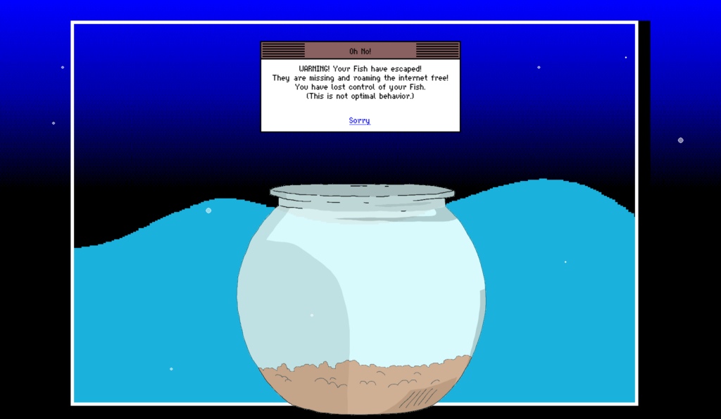
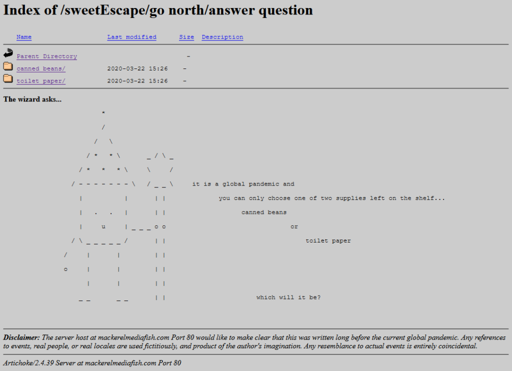
Historical fact: escaped fish was one of the primary reasons for websites failing in 1996.
What is Mackerelmedia Fish? I’ve had a thorough and pretty complete experience of it, now, and I’m still not sure. It’s one or more (or none)
of these, for sure, maybe:
A point-and-click, text-based, or hypertext adventure?
A statement about the fragility of proprietary technologies on the Internet?
An ARG set in a parallel universe in which the 1990s never ended?
A series of surrealist art pieces connected by a loose narrative?
Rock Paper Shotgun’s article about it opens with “I
don’t know where to begin with this—literally, figuratively, existentially?” That sounds about right.
This isn’t the reward for “winning” the “game”. But I was proud of it anyway.
What I can tell you with confident is what playing feels like. And what it feels like is the moment when you’ve gotten bored waiting for page 20 of Argon Zark to finish appear so you decide to reread your already-downloaded copy of the 1997 a.r.k bestof book, and for a moment you think to yourself: “Whoah; this must be what living in the future
feels like!”
Because back then you didn’t yet have any concept that “living in the future” will involve scavenging for toilet paper while complaining that you can’t stream your favourite shows in 4K on your pocket-sized
supercomputer until the weekend.
I was always more of a Bouncing Blocks than a Hamster Dance guy, anyway.
Mackerelmedia Fish is a mess of half-baked puns, retro graphics, outdated browsing paradigms and broken links. And that’s just part of what makes it great.
It’s also “a short story that’s about the loss of digital history”, its creator Nathalie Lawhead
says. If that was her goal, I think she managed it admirably.
Everything about this, right down to the server signature (Artichoke), is perfect.
If I wasn’t already in love with the game already I would have been when I got to the bit where you navigate through the directory indexes of a series of deepening folders,
choose-your-own-adventure style. Nathalie writes, of it:
One thing that I think is also unique about it is using an open directory as a choose your own adventure. The directories are branching. You explore them, and there’s text at the
bottom (an htaccess header) that describes the folder you’re in, treating each directory as a landscape. You interact with the files that are in each of these folders, and uncover the
story that way.
Back in the naughties I experimented with making choose-your-own-adventure games in exactly this way. I was experimenting with different media by which this kind of
branching-choice game could be presented. I envisaged a project in which I’d showcase the same (or a set of related) stories through different approaches. One was “print” (or at least
“printable”): came up with a Twee1-to-PDF
converter to make “printable” gamebooks. A second was Web hypertext. A third – and this is the one which was most-similar to what Nathalie has now so expertly made real – was
FTP! My thinking was that this would be an adventure game that could be played in a browser or even from the command line on any
(then-contemporary: FTP clients aren’t so commonplace nowadays) computer. And then, like so many of my projects, the half-made
version got put aside “for later” and forgotten about. My solution involved abusing the FTP protocol terribly, but it
worked.
(I also looked into ways to make Gopher-powered hypertext fiction and toyed with the idea of using YouTube
annotations to make an interactive story web [subsequently done amazingly by Wheezy Waiter, though the death of YouTube
annotations in 2017 killed it]. And I’ve still got a prototype I’d like to get back to, someday, of a text-based adventure played entirely through your web browser’s debug
console…! But time is not my friend… Maybe I ought to collaborate with somebody else to keep me on-course.)
My first batch of pet frogs died quite quickly, but these ones did okay.
In any case: Mackerelmedia Fish is fun, weird, nostalgic, inspiring, and surreal, and you should give it a go. You’ll need to be on a Windows
or OS X computer to get everything you can out of it, but there’s nothing to stop you starting out on your mobile, I imagine.
Sso long as you’re capable of at least 800 × 600 at 256 colours and have 4MB of RAM,
if you know what I mean.
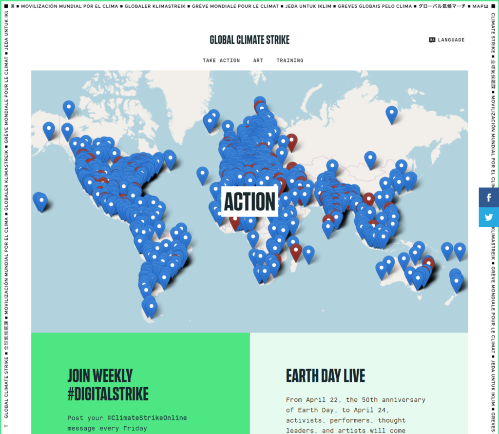
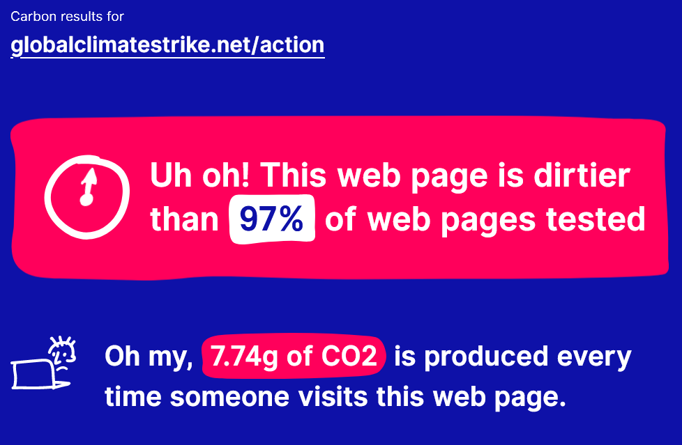
Save your bandwidth: just look at this screenshot of the site instead of visiting.
Going to that page results in about 14 Mb of data being transmitted from their server to your device (which you’ll pay for
if you’re on a metered connection). For comparison, reading my recent post about pronouns results in about 356 Kb of data. In other words, their page is forty times more bandwidth-consuming, despite the fact that my page has about four times the word count. The page
you’re reading right now, thanks to its images, weighs in at about 650 Kb: you could still download it more than twenty times while
you were waiting for theirs.
Well that’s got to be pretty embarassing.
Worse still, the most-heavyweight of the content they deliver is stuff that’s arguably strictly optional and doesn’t add to the message:
Eight different font files are served from three different domains (the fonts alone consume about 140 Kb) – seven more are
queued but not used.
Among the biggest JavaScript files they serve is that of Hotjar analytics: I understand the importance of measuring your impact, but making
your visitors – and the planet – pay for it is a little ironic.
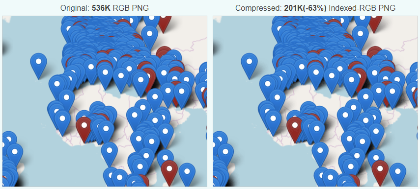
The biggest JavaScript file seems to be for Mapbox, which as far as I can see is never actually used: that map on the page is a static
image which, incidentally, I was able to reduce from 0.5 Mb to 0.2 Mb just by running it through
a free online image compressor.
This took me literally seconds to do but would save about a twelfth of a second for every single typical 4G user to their site. And it’s not even the worst culprit.
And because the site sets virtually no caching headers, even if you’ve visited the website before you’re likely to have to download the whole thing again. Every single
time.
It’s not just about bandwidth: all of those fonts, that JavaScript, their 60 Kb of CSS (this page sent you 13 Kb) all has to be parsed and interpreted by your device. If you’re on a mobile device or a laptop, that means you’re burning through lithium (a non-renewable resource whose extraction and disposal is highly polluting) and
regardless of your device you’re using you’re using more electricity to visit their site than you need to. Coding antipatterns like document.write() and active event
listeners that execute every time you scroll the page keep your processor working hard, turning electricity into waste heat. It took me over 12 seconds on a high-end smartphone and a
good 4G connection to load this page to the point of usability. That’s 12 seconds of a bright screen, a processor running full tilt,a data connection working its hardest, and a
battery ticking away. And I assume I’m not the only person visiting the website today.
This isn’t really about this particular website, of course (and I certainly don’t want to discourage anybody from the important cause of saving the planet!). It’s about the
bigger picture: there’s a widespread and long-standing trend in web development towards bigger, heavier, more power-hungry websites, built on top of heavyweight frameworks that push the
hard work onto the user’s device and which favour developer happiness over user experience. This is pretty terrible: it makes the Web slow, and brittle, and it increases the digital
divide as people on slower connections and older devices get left behind.
Back in 2011, some folks cross-compiled Doom (the original, not the reboot, obviously) to JavaScript, leveraging the capabilities of the then-relatively-young
<canvas> element and APIs. I was really impressed to see that JavaScript had come so far and that
performance on desktop devices was so slick. Sure, this was an 18-year-old video game, but it was playable in a browser, which was a long way from the environment for which it
was originally developed.
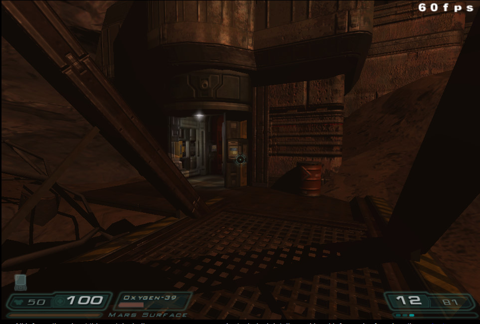
Now Doom 3‘s playable in a browser, and my mind’s blown all over again. This follows almost the same curve – Doom 3’s 16 years old – but it still goes to show that there’s
little limit to the power of client-side browser programming. They’ve done this magic with WebAssembly; while WebAssembly goes
slightly against my ideas about the open-source nature of the Web, I still respect the power it commands to do heavyweight crunching tasks like this one.
How long until AAA developers start developing with the Web as an additional platform?
Don’t understand why Web accessibility is important? Need a quick and easily-digestible guide to the top things you should be looking into in order to make your web applications
screenreader ready? Try this fun, video-game-themed 5 minute video from Microsoft.
There’s a lot more to accessibility than is covered here, and it’s perhaps a little over-focussed on screenreaders, but it’s still a pretty awesome introduction.
A new email-based extortion scheme apparently is making the rounds, targeting Web site owners serving banner ads through Google’s AdSense program. In this scam, the
fraudsters demand bitcoin in exchange for a promise not to flood the publisher’s ads with so much bot and junk traffic that Google’s automated anti-fraud systems suspend the user’s
AdSense account for suspicious traffic.
…
The shape of our digital world grows increasingly strange. As anti-DoS techniques grow better and more and more uptime-critical
websites hide behind edge caches, zombie network operators remain one step ahead and find new and imaginative ways to extort money from their victims. In this new attack, the criminal
demands payment (in cryptocurrency) under threat that, if it’s not delivered, they’ll unleash an army of bots to act like the victim trying to scam their advertising network,
thereby getting the victim’s site demonetised.
I first got into web design/development in the late 90s, and only as I type this sentence do I realize how long ago that was.
And boy, it was horrendous. I mean, being able to make stuff and put it online where other people could see it was pretty slick, but we did not have very much to work with.
I’ve been taking for granted that most folks doing web stuff still remember those days, or at least the decade that followed, but I think that assumption might be a wee bit
out of date. Some time ago I encountered a tweet marvelling at what we had to do without
border-radius. I still remember waiting with bated breath for it to be unprefixed!
But then, I suspect I also know a number of folks who only tried web design in the old days, and assume nothing about it has changed since.
I’m here to tell all of you to get off my lawn. Here’s a history of CSS and web design, as I remember it.
(Please bear in mind that this post is a fine blend of memory and research, so I can’t guarantee any of it is actually correct, especially the bits about causality. You may
want to try the W3C’s history of CSS, which is considerably shorter,
has a better chance of matching reality, and contains significantly less swearing.)
(Also, this would benefit greatly from more diagrams, but it took long enough just to write.)
…
I too remember the bad-old days of the pre-CSS and early-CSS Web. Back
then, when we were developing for it, we thought that it was magical. We tolerated issues like having to copy-paste our navigation around a stack of static pages, manually change our
design all over the place etc…. but man… I wouldn’t want to go back to working that way!
This is an excellent long-read for an up-close-and-personal look at how CSS has changed over the decades. Well worth a look if
you’ve any interest in the topic.