The current iteration of my blog diverges from an architectural principle common to most of previous versions of the last 20 years. While each previous change in design and layout was intended to provide a single monolithic upgrade, this version tries to provide me with a platform for continuous ongoing experimentation and change.
Earlier this year I added experimental console art, for example. Click through for more details.I’ve been trying to make better use of my blog as a vehicle for experimenting with web technologies, as I used to with personal sites back in the 1990s and early 2000s; to see a vanity site like this one as a living playground rather than something that – like most of the sites I’m paid to work on – something whose design is, for the most part, static for long periods of time.
The “popular” flag and associated background colour in the “Blog” top-level menu became permanent after a period of A/B testing. Thanks, unwitting testers!Among the things I’ve added prior to the initial launch of this version of the design are gracefully-degrading grids, reduced-motion support, and dark-mode support – three CSS features of increasing levels of “cutting edge”-ness but each of which is capable of being implemented in a way that does not break the site’s compatibility. This site’s pages are readable using (simulations of) ancient rendering engines or even in completely text-based browsers, and that’s just great.
Here’s how I’ve implemented those three features:
Gracefully-degrading grids
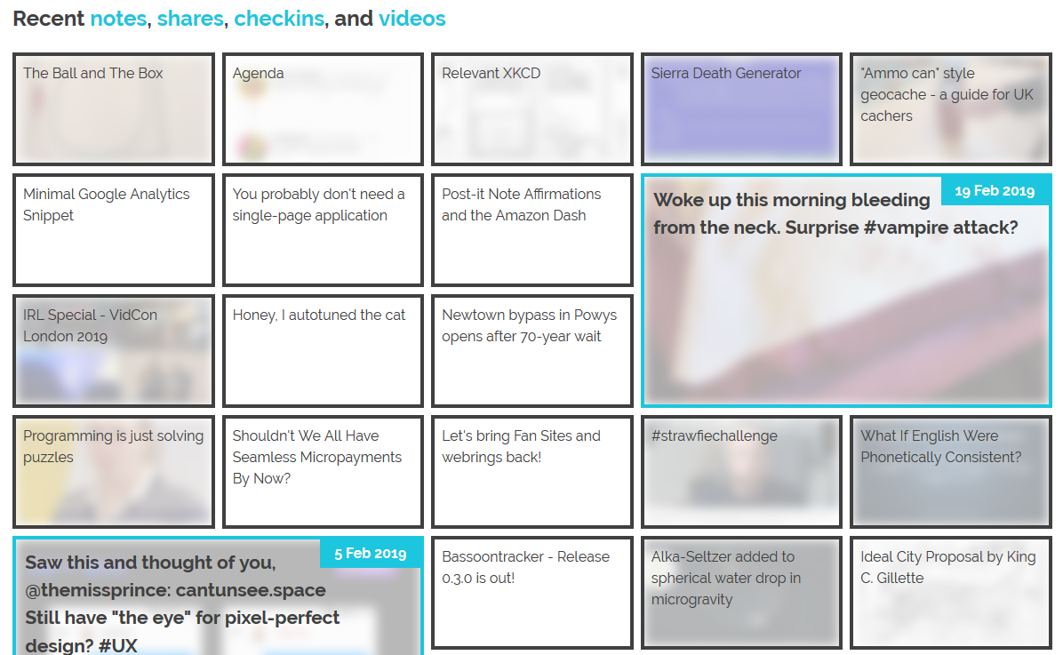
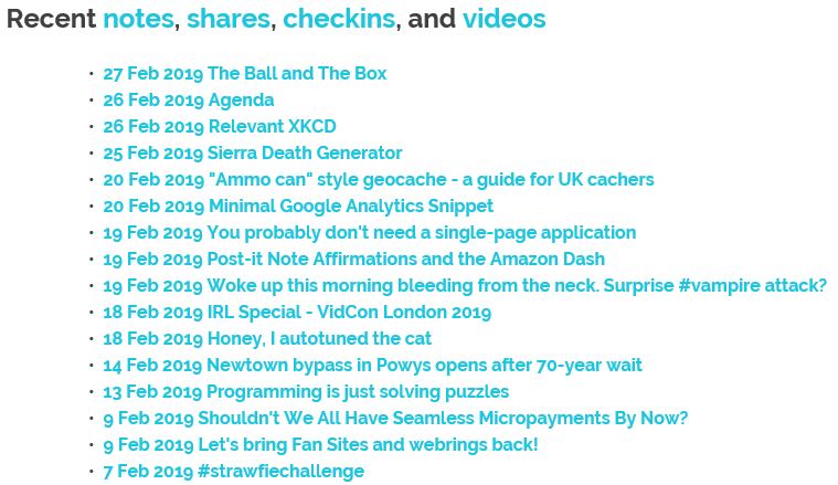
I’m not entirely happy with the design of these boxes, but that’s a job for another day.The grid of recent notes, shares, checkins and videos on my homepage is powered by the display: grid; CSS directive. The number of columns varies by screen width from six on the widest screens down to three or just one on increasingly small screens. Crucially, grid-auto-flow: dense; is used to ensure an even left-to-right filling of the available space even if one of the “larger” blocks (with grid-column: span 2; grid-row: span 2;) is forced for space reasons to run onto the next line. This means that content might occasionally be displayed in a different order from that in which it is written in the HTML (which is reverse order of publication), but in exchange the items are flush with both sides.
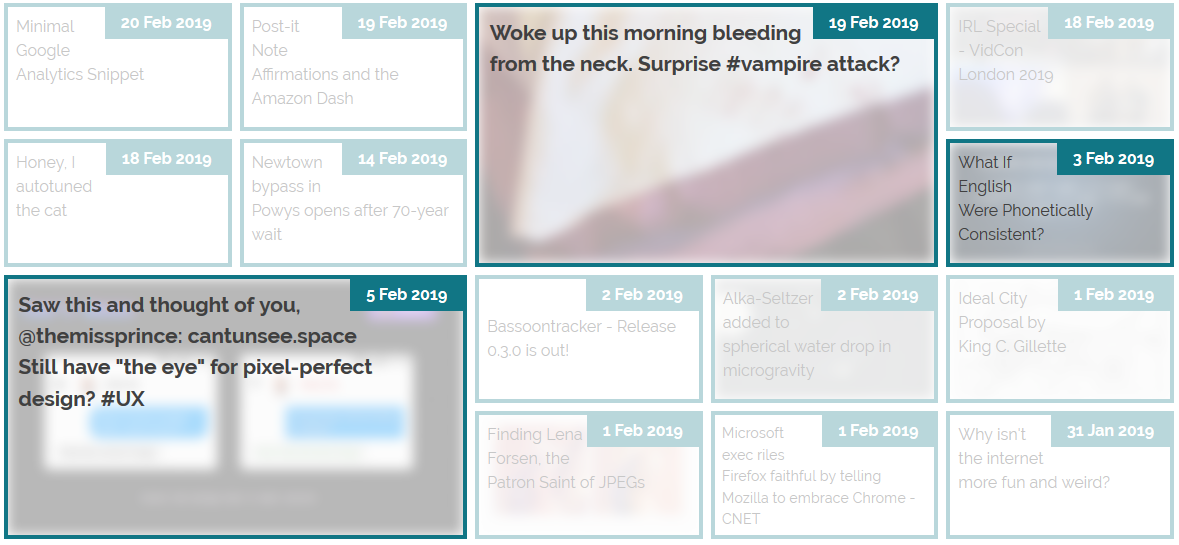
The large “5 Feb” item in this illustration should, reverse-chronologically, appear before the “3 Feb” item, but there isn’t room for it on the previous line. grid-auto-flow: dense; means that the “3 Feb” item is allowed to bubble-up and fill the gap, appearing out-of-order but flush with the edge.Not all web browsers support display: grid; and while that’s often only one of design and not of readability because these browsers will fall back to usually-very-safe default display modes like block and inline, as appropriate, sometimes there are bigger problems. In Internet Explorer 11, for example, I found (with thanks to @_ignatg) a problem with my directives specifying the size of these cells (which are actually <li> elements because, well, semantics matter). Because it understood the directives that ought to impact the sizing of the list items but not the one that redeclared its display type, IE made… a bit of a mess of things…
Thanks, Internet Explorer. That’s totally what I was looking for.Do websites need to look the same in every browser? No. But the content should be readable regardless, and here my CSS was rendering my content unreadable. Given that Internet Explorer users represent a little under 0.1% of visitors to my site I don’t feel the need to hack it to have the same look-and-feel: I just need it to have the same content readability. CSS Feature Queries to the rescue!
CSS Feature Queries – the @supports selector – make it possible to apply parts of your stylesheet if and only if the browser supports specific CSS features, for example grids. Better yet, using it in a positive manner (i.e. “apply these rules only if the browser supports this feature”) is progressive enhancement, because browsers that don’t understand the @supports selector act in the same way as those that understand it but don’t support the specified feature. Fencing off the relevant parts of my stylesheet in a @supports (display: grid) { ... } block instructed IE to fall back to displaying that content as a boring old list: exactly what I needed.
It isn’t pretty, but it’s pretty usable!Reduced-motion support
I like to put a few “fun” features into each design for my blog, and while it’s nowhere near as quirky as having my head play peek-a-boo when you hover your cursor over it, the current header’s animations are in the same ballpark: hover over or click on some of the items in the header menu to see for yourself..
I’m most-pleased with the playful “bounce” of the letter Q when you hover over my name.These kinds of animations are fun, but they can also be problematic. People with inner ear disorders (as well as people who’re just trying to maximise the battery life on their portable devices!) might prefer not to see them, and web designers ought to respect that choice where possible. Luckily, there’s an emerging standard to acknowledge that: prefers-reduced-motion. Alongside its cousins inverted-colors, prefers-reduced-transparency, prefers-contrast and prefers-color-scheme (see below for that last one!), these new CSS tools allow developers to optimise based on the accessibility features activated by the user within their operating system.
In Windows you turn off animations while in MacOS you turn on not-having animations, but the principle’s the same.If you’ve tweaked your accessibility settings to reduce the amount of animation your operating system shows you, this website will respect that choice as well by not animating the contents of the title, menu, or the homepage “tiles” any more than is absolutely necessary… so long as you’re using a supported browser, which right now means Safari or Firefox (or the “next” version of Chrome). Making the change itself is pretty simple: I just added a @media screen and (prefers-reduced-motion: reduce) { ... } block to disable or otherwise cut-down on the relevant animations.
Dark-mode support
…Similarly, operating systems are beginning to support “dark mode”, designed for people trying to avoid eyestrain when using their computer at night. It’s possible for your browser to respect this and try to “fix” web pages for you, of course, but it’s better still if the developer of those pages has anticipated your need and designed them to acknowledge your choice for you. It’s only supported in Firefox and Safari so far and only on recent versions of Windows and MacOS, but it’s a start and a helpful touch for those nocturnal websurfers out there.
Come to the dark side, Luke. Or just get f.lux, I suppose.It’s pretty simple to implement. In my case, I just stacked some overrides into a @media (prefers-color-scheme: dark) { ... } block, inverting the background and primary foreground colours, softening the contrast, removing a few “bright” borders, and darkening rather than lightening background images used on homepage tiles. And again, it’s an example of progressive enhancement: the (majority!) of users whose operating systems and/or browsers don’t yet support this feature won’t be impacted by its inclusion in my stylesheet, but those who can make use of it can appreciate its benefits.
This isn’t the end of the story of CSS experimentation on my blog, but it’s a part of the it that I hope you’ve enjoyed.