The first “full” day of WordCamp Europe 2023 (which kicked-off at Contributor Day) was busy and intense, but I loved it.
This post is basically a live-blog of everything I got up to, and it’s mostly for my own benefit/notetaking. If you don’t read it, nobody will blame you.
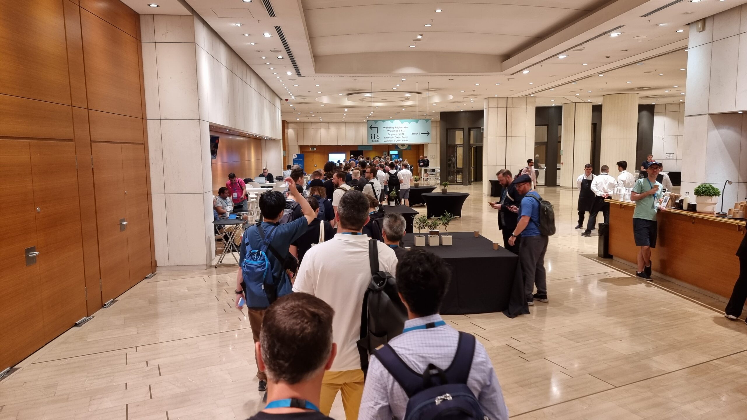
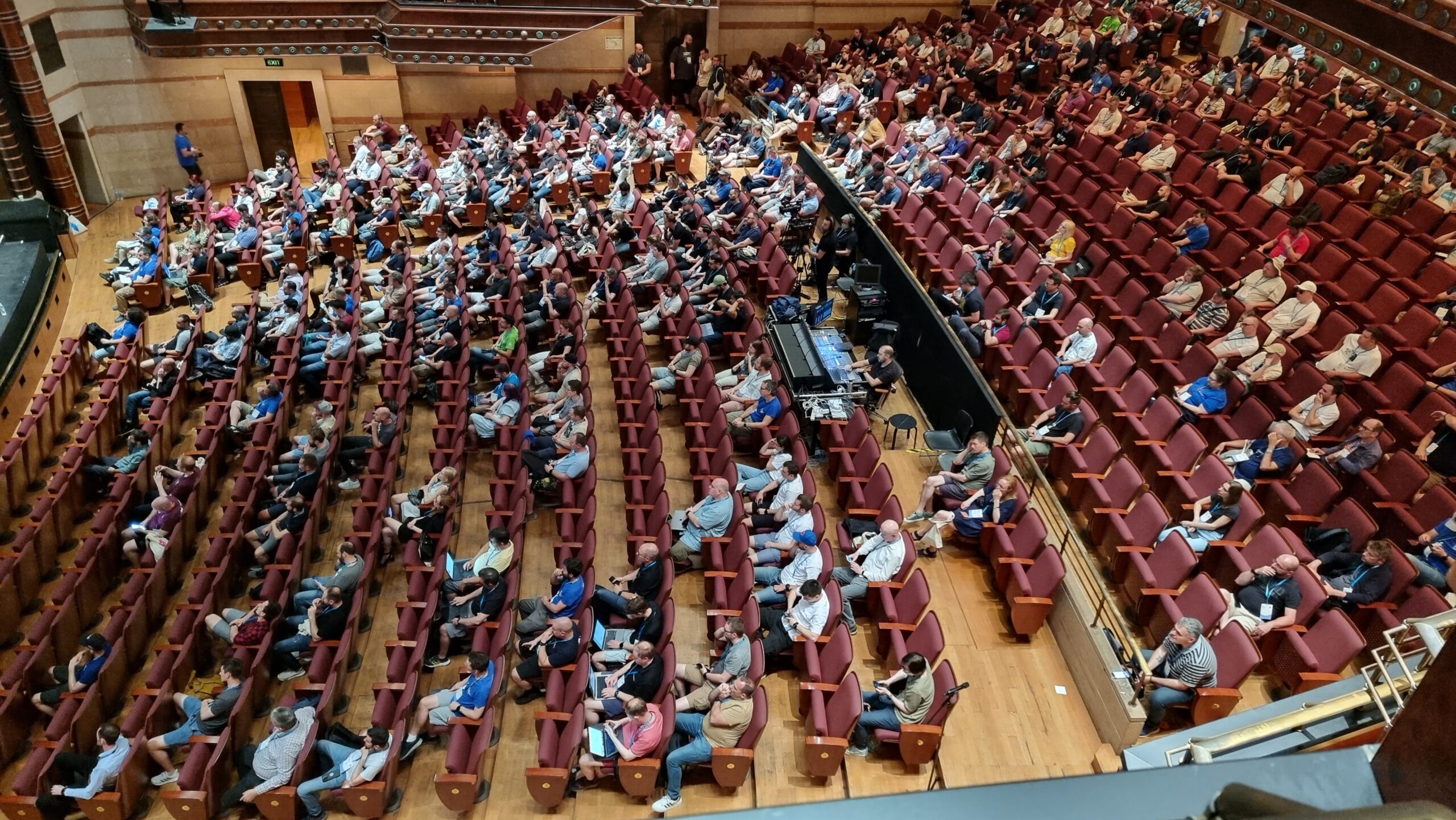
Six minutes after workshop registration opened its queue snaked throughout an entire floor of the conference centre.
Here’s what I got up to:
10 things that all WordPress plugin developers should avoid
David Artiss took the courageous step of installing 36 popular plugins onto a fresh WordPress site and was, unsurprisingly, immediately bombarded by a billion banners on his dashboard. Some were merely unhelpful (“don’t forget to add your API key”), others were annoying (“thanks for installing our plugin”), and plenty more were commercial advertisements (“get the premium version”) despite the fact that WordPress.org guidelines recommend against this. It’s no surprise that this kind of “aggressive promotion” is the single biggest annoyance that people reported when David asked around on social media.
Similarly, plugins which attempt to break the standard WordPress look-and-feel by e.g. hoisting themselves to the top of the menu, showing admin popovers, putting settings sections in places other than the settings submenu, and so on are a huge annoyance to everybody. I get sufficiently frustrated by these common antifeatures of plugins I use that I actually maintain a plugin for my own use that “fixes” the ones that aggrivate me the most!
David raised lots of other common gripes with WordPress plugins, too: data validation failures, leaving content behind after uninstallation (and “deactivation surveys”, ugh!), and a failure to account for accessibility.
David’s promised to put his slides online, plus to write articles about everything that came up in his Q&A.
I’m unconvinced that we can rely on plugin developers to independently fix the kinds of problems that come high on David’s list. I wonder if there’s mileage in WordPress Core reimplementing the way that the main navigation menu works such that all items in it can be (easily) re-arranged by users to their own preference? This would undermine the perceived value to plugin developers of “hoisting” their own to the top by allowing users to counteract it, and would provide a valuable feature to allow site admins to streamline their workflow: use WooCommerce but only in a way that’s secondary to your blog? Move “Products” below “Posts”! Etc.
Why yes, I’m liveblogging this. And yes, I’m not using Gutenberg yet (that’s a whole other story…)
Where did we come from?
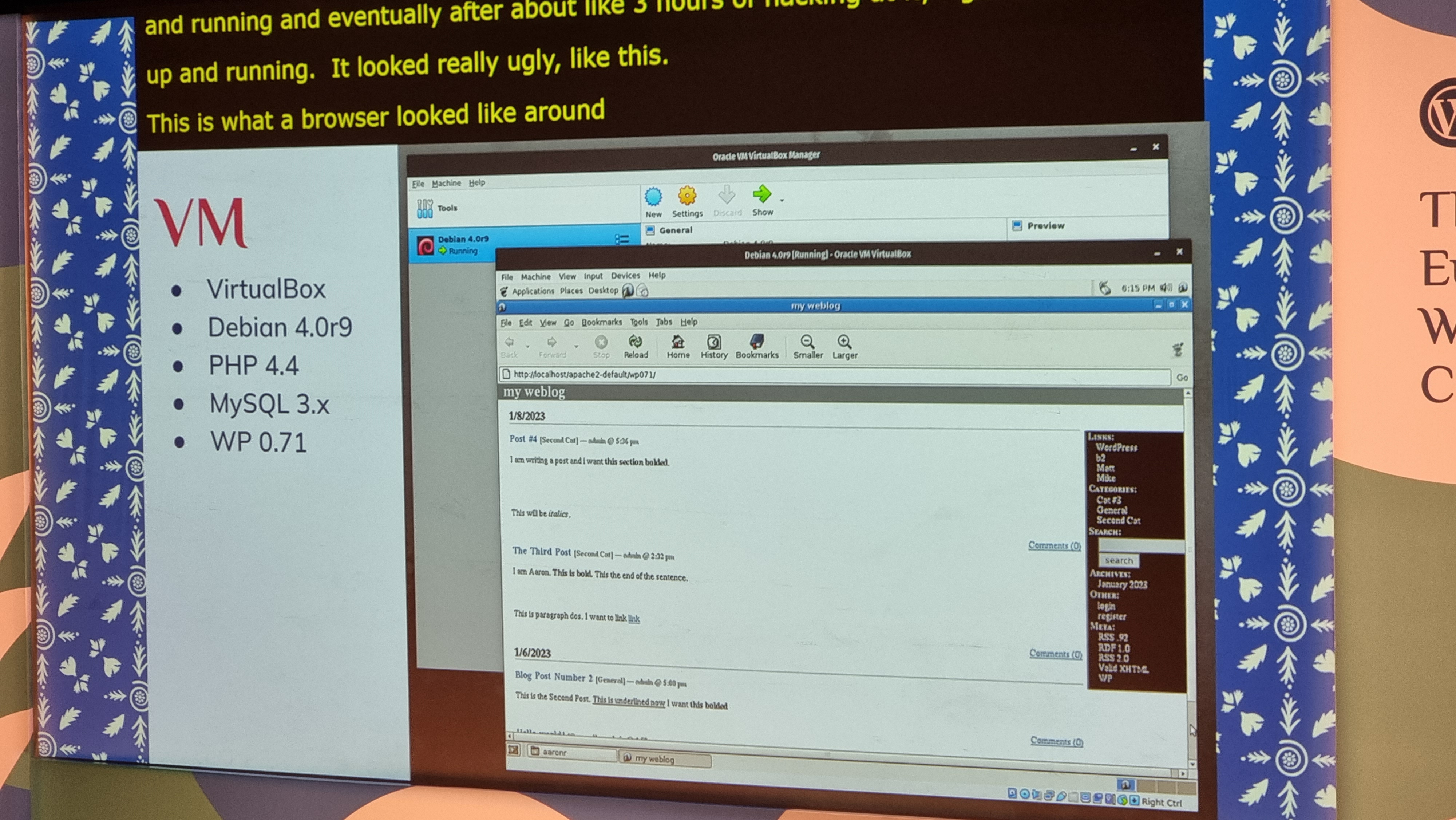
Aaron Reimann from ClockworkWP gave us a tour of how WordPress has changed over the course of its 20-year history, starting even slightly before I started using WordPress; my blog (previously powered by some hacky PHP, previouslier powered by some hackier Perl, previousliest written in static HTML) switched to WordPress in 2004, when it hit version 1.2, so it was fun to get the opportunity to see some even older versions illustrated.
A WordPress site from 2004 would, of course, still be perfectly usable today. How many JS-heavy/API-driven websites of today do you reckon will still function in 20 years time?
It was great to be reminded how far the Core code has come over that time. Early versions of WordPress – as was common among PHP applications at the time! – had very few files and each could reliably be expected to be a stack of SQL, wrapped in a stack of code, wrapped in what’s otherwise a HTML file: no modularity!
Aaron’s passion for this kind of digital archaeology really shows. I dig it.
There were very few surprises for me in this talk, as you might expect for such an “old hand”, but I really enjoyed the nostalgia of exploring WordPress history through his eyes.
I enjoyed putting him on the spot with a “spicy” question at the end of his talk, by asking him if, alongside everything we’ve gained over the years, whether there’s anything we lost along the way. He answered well, pointing out that the somewhat bloated stack of plugins that are commonplace on big sites nowadays and the ease with which admins can just “click and install” more of them. I agree with him, although personally I miss built-in XFN support…
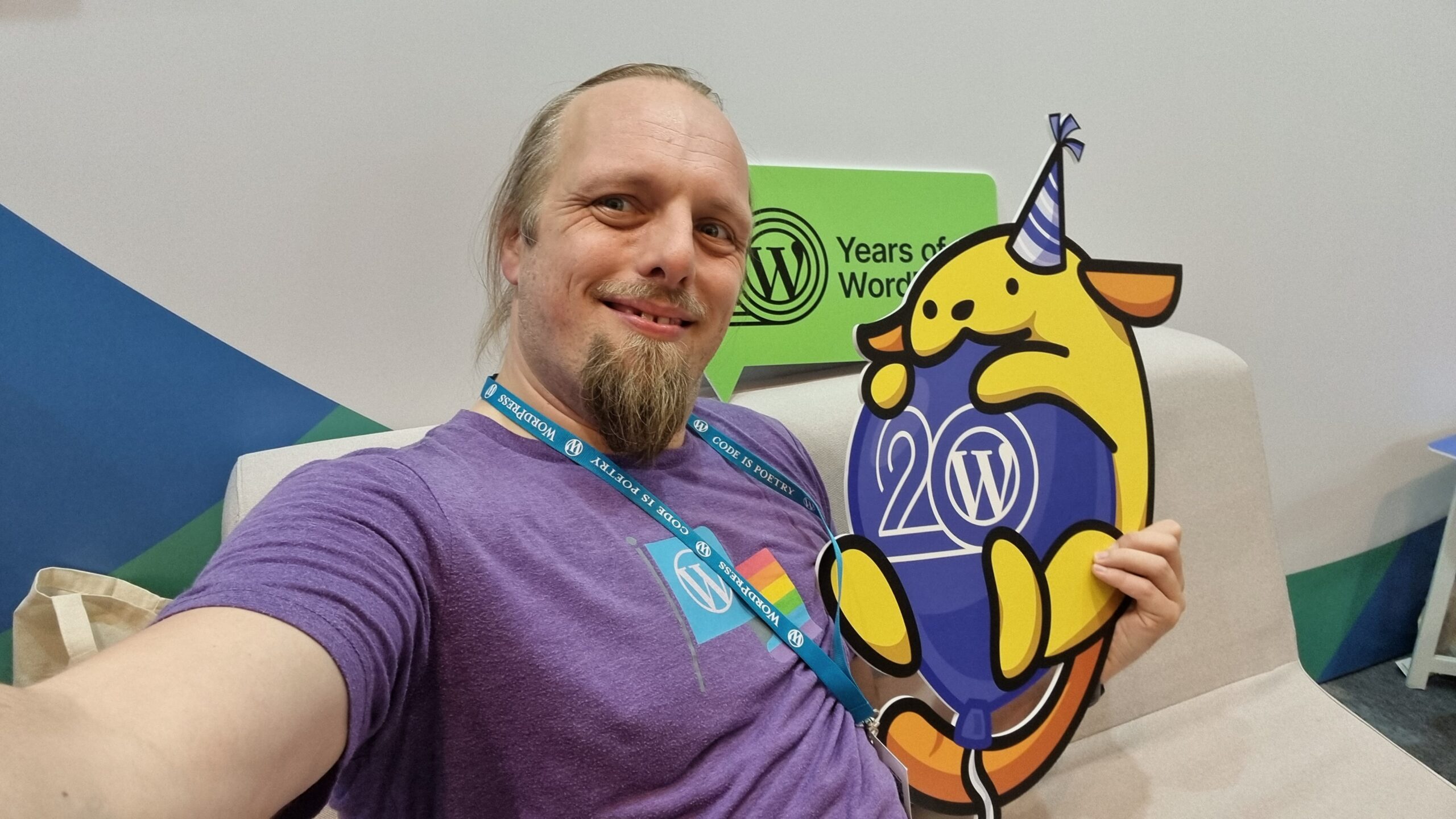
If you’d have told me in advance that hugging a Wapuu would have been a highlight of the day… yeah, that wouldn’t have been a surprise!
Networking And All That
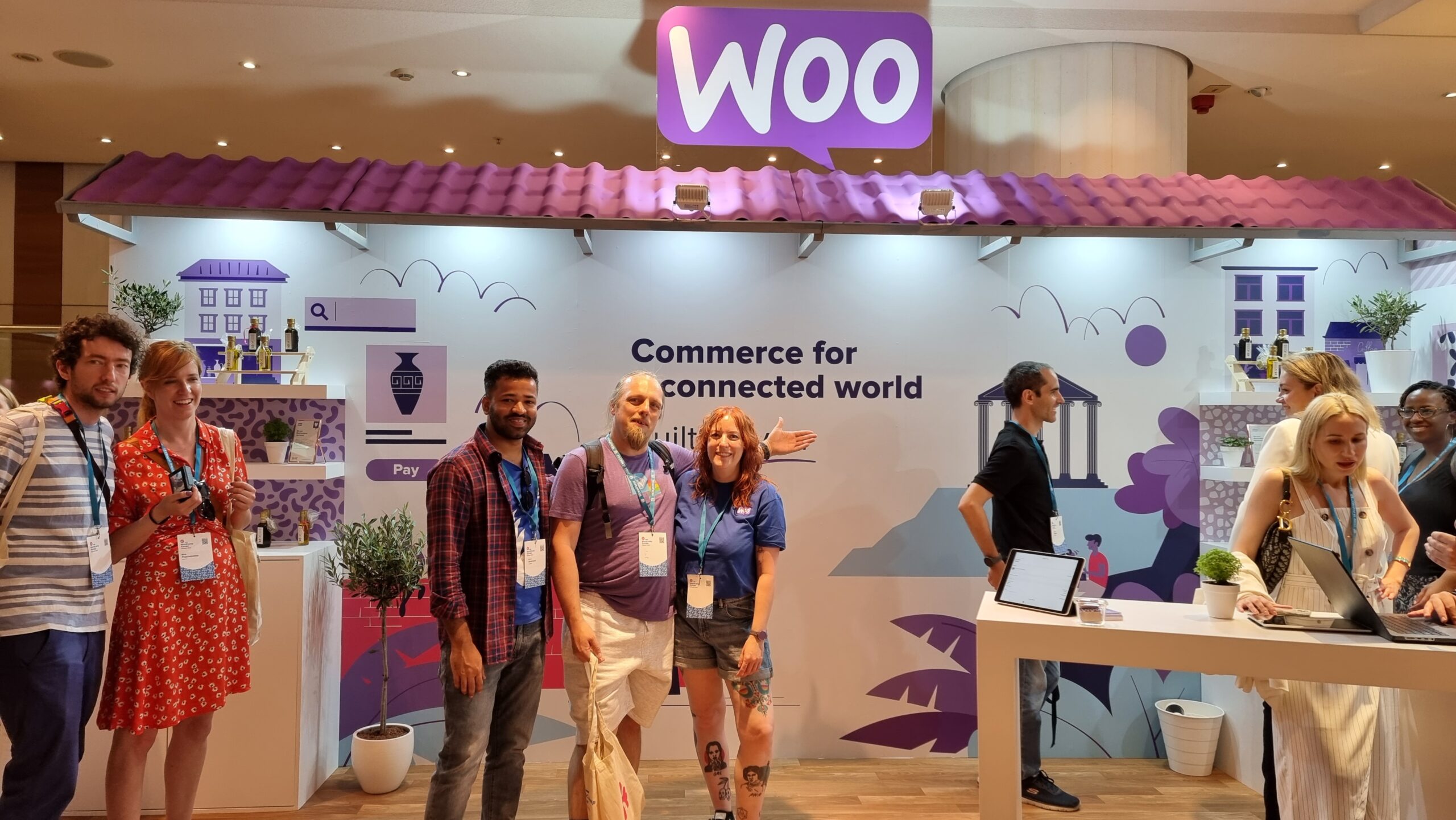
There’s a lot of exhibitors with stands, but I tried to do a circuit or so and pay attention at least to those whose owners I’ve come into contact with in a professional capacity. Many developers who make extensions for WooCommerce, of course, sell those extensions through WooCommerce.com, which means they come into routine direct contact with my code (and it can mean that when their extension’s been initially rejected by our security scanners or linters, it’s me their developers first want to curse!).
After a while, to spare some of that awkward exchange where somebody tries to sell me their product before I explain that I already sell their product for them, I slapped a “Woo” sticker on my lanyard.
It’s been great to connect with people using WordPress to power the Web in a whole variety of different contexts, but it somehow still feels strange to me that WordPress has such a commercial following! Even speaking as somebody who’s made their living at least partially out of WordPress for the last decade plus, it still feels to me like its greatest value comes from its use for personal publishing.
The feel of a WordCamp with its big shiny sponsors is enormously different from, say, the intimacy and individuality of a Homebrew Website Club meeting, and I think that’s something I still need to come to terms with. WordPress’s success story comes from many different causes, but perhaps chief among them is the fact that it’s versatile enough to power the website of a government, multinational, or household-name brand… but also to run the smallest personal indie blog. I struggle to comprehend that, even with my background.
(Side note, Sophie Koonin says that building a personal website is a radical act in 2023, and I absolutely agree.)
My division of Automattic had a presence, of course.
I was proud of my colleagues for the “gimmick” they were using to attract people to the Woo stand: you could pick up a “credit card” and use it to make a purchase (of Greek olive oil) using a website, see your order appear on the app at the backend in real-time, and then receive your purchase as a giveaway. The “credit card” doubles as a business card from the stand, the olive oil is a real product from a real, local producer (who really uses WooCommerce to sell online!), and when you provide an email address at the checkout you can opt-in to being contacted by the team afterwards. That’s some good joined-up thinking by my buddies in marketing!
WordPress extended: build unique websites on top of WP
Petya Petkova observed that it’s commonplace to take the easy approach and make a website look like… well, every other website. “Web deja-vu” is a real thing, and it’s fed not only by the ebbs and flows of trends in web design but by the proliferation of indistinct themes that people just install-and-use.
How can we break free from web deja-vu, asks Petya. It almost makes me sad that her slides had been coalesced into the conference’s slidedeck design rather than being her own… although on second though maybe that just helps enhance the point!
Choice of colours and typography can be used to tell a story, to instil a feeling, to encourage engagement. Scrolling can be used as a metaphor for storytelling (“scrolly-telling”, Petya calls it). Animation flow can be used to direct a user’s attention and drive focus and encourage interaction.
A lot of the technical concepts she demonstrated – parts of a page that scroll at different speeds, typography that shifts or changes, videos used in a subtle way to accentuate other content, etc. – can be implemented in the frontend with WebGL, Three.js and the like. Petya observes that moving this kind of content interactivity into the frontend can produce an illusion of a performance improvement, which is an argument I’ve heard before, but personally I think it’s only valuable if it’s built as a progressive enhancement: otherwise, you’re always at risk that your site won’t look like you’d hope.
I note, for example, that Petya’s agency’s site shows only an “endless spinner” when viewed in my browser (which blocks the code.jQuery CDN by default, unless allowlisted for specific sites). All of the content is there, on the page, if you View Source, but it’s completely invisible if an external JavaScript fails to load. That doesn’t just happen when weirdos like me disable JavaScript in their browsers: it can happen if the browser interacts badly with the script, or if the user’s Internet connection is ropey, or a malware scanner misfires, or if government censorship blocks the CDN, or in any number of other conditions.
While I agree with Petya about the value of animation and interactivity to make sites awesome, I don’t think it can take second-place to ensuring the most-widespread access and accessibility for your audience. Otherwise we’d still be making Flash sites, right?
So yeah: uniqueness and creativity are great, and I like what she’s proposing, but not the way she goes about it. The first person to ask a question wisely brought up accessibility, and Petya answered well that accessibility technologies can bridge the gap, but I’d counter that it’s preferable to build accessible in the first instance: if you have to use an aria- attribute it’s a good sign that you probably already did something wrong (not always, but it’s certainly a pointer that you ought to take a step back and check!).
Several other good questions and great answers followed: about how to showcase a preliminary design when they design is dependent upon animation and interactivity (which I’ve witnessed before!), on the value of server-side rendering of components, and about how to optimise for smaller screens. Petya clearly knows her stuff in all of these areas and had confident responses.
State of WordPress security – insights from 2022
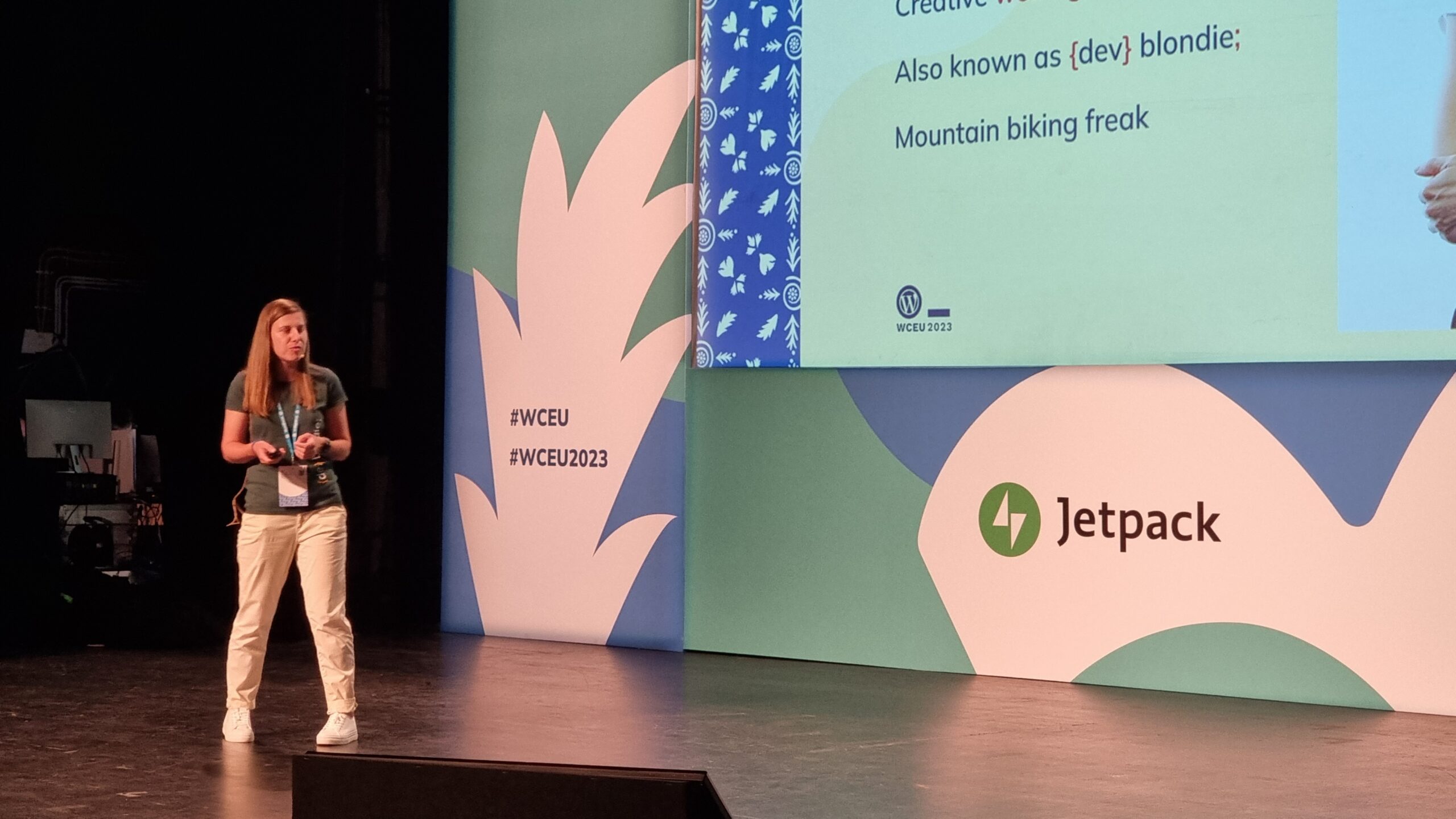
Oliver Sild is the kind of self-taught hacker, security nerd, and community builder that I love, so I wasn’t going to miss his talk.
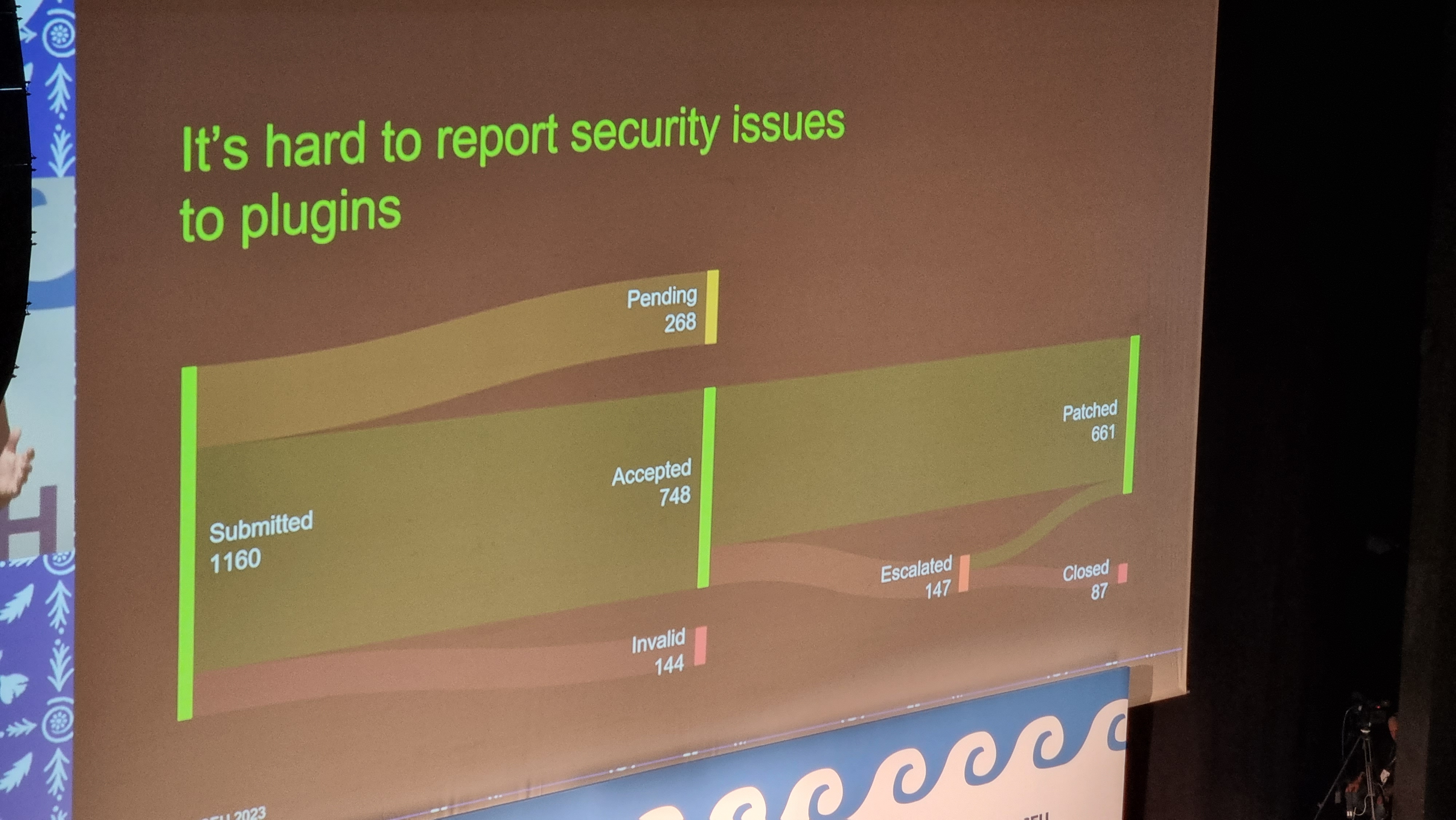
The number of security vulnerability reports in the WordPress ecosystem is up +328%, Oliver opened. But the bugs being reported are increasingly old, so we’re not talking about new issues being created. And only 0.3% of bugs were in WordPress Core (and were patched before they were exploitable).
It’s good news in general in WordPress Security-land… but CSRF is on the up-and-up (overtaking XSS) in the plugin space. That, and all the broken access control we see in the admin area, are things I’ll be keeping in mind next time I’m arguing with a vendor about the importance of using nonces and security checks in their extension (I have this battle from time to time!).
But an interesting development is the growth of the supply chains in the WordPress plugin ecosystem. Nowadays a plugin might depend upon another plugin which might depend upon a library… and a patch applied to the latter of those might take time to be propagated through the chain, providing attackers with a growing window of opportunity.
I love a good Sankey chart. Even when it says scary things.
A worrying thought is that while plugin directory administrators will pull and remove plugins that have longstanding unactioned security issues. But that doesn’t help the sites that already have that plugin installed and are still using it! There’s a proposal to allow WordPress to notify admins if a plugin used on a site has been dropped for security reasons, but it was opened 9 years ago and hasn’t seen any real movement, soo…
I like that Oliver plugged for security researchers being acknowledged as equal contributors to developers on your software. But then, I would say that, as somebody who breaks into things once in a while and then tells the affected parties how to fix the problem that allowed me to do so! He also provided a whole wealth of tips for site owners and agencies to try to keep their sites safe, but little that I wasn’t aware of already.
Still, good to see this talk get as good an audience as it did, given the importance of the topic!
It was about this point in the day, glancing at my schedule and realising that at any given time there were up to four other sessions running simultaneously, that I really got a feel for the scale of this conference. Awesome. Meanwhile, Oliver was fielding the question that I’m sure everybody was thinking: with Gutenberg blocks powered by JavaScript that are often backed by a supply-chain of the usual billion-or-so files you find in your .node_modules directory, isn’t the risk of supply chain attacks increasing?
Spoiler: yes. Did you notice earlier in this post I mentioned that I don’t use Gutenberg on this site yet?
When the Jetpack team told me that they’ve been improving their cloud offering, this wasn’t what I expected.
Typographic readability in theme design & development
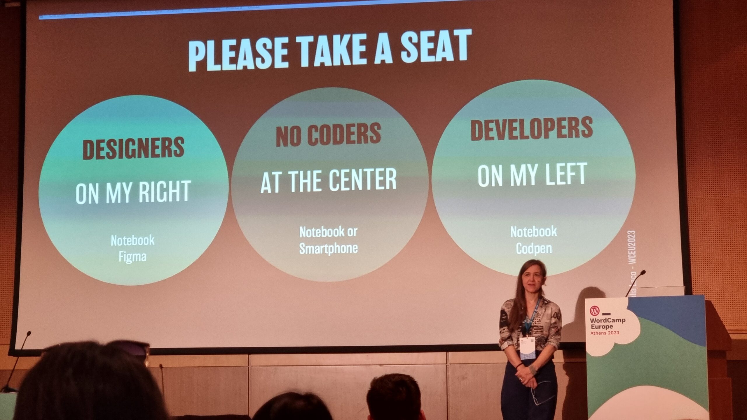
My first “workshop” was run by Giulia Laco, on the topic of readable content and design.
Designers to the left of me, coders to the right: here I am, stuck in the middle with you.
Giulia began by reminding us how short the attention span of Web readers is, and how important the right typographic choices are in ensuring that people actually read your content. I fully get this – I think that very few people will have the attention span to read this part of this very blog post, for example! – but I loved that she hammered the point home by presenting every slide of her presentation twice (or more), “improving” the typographic choices as she went along: an excellent and memorable quirk.
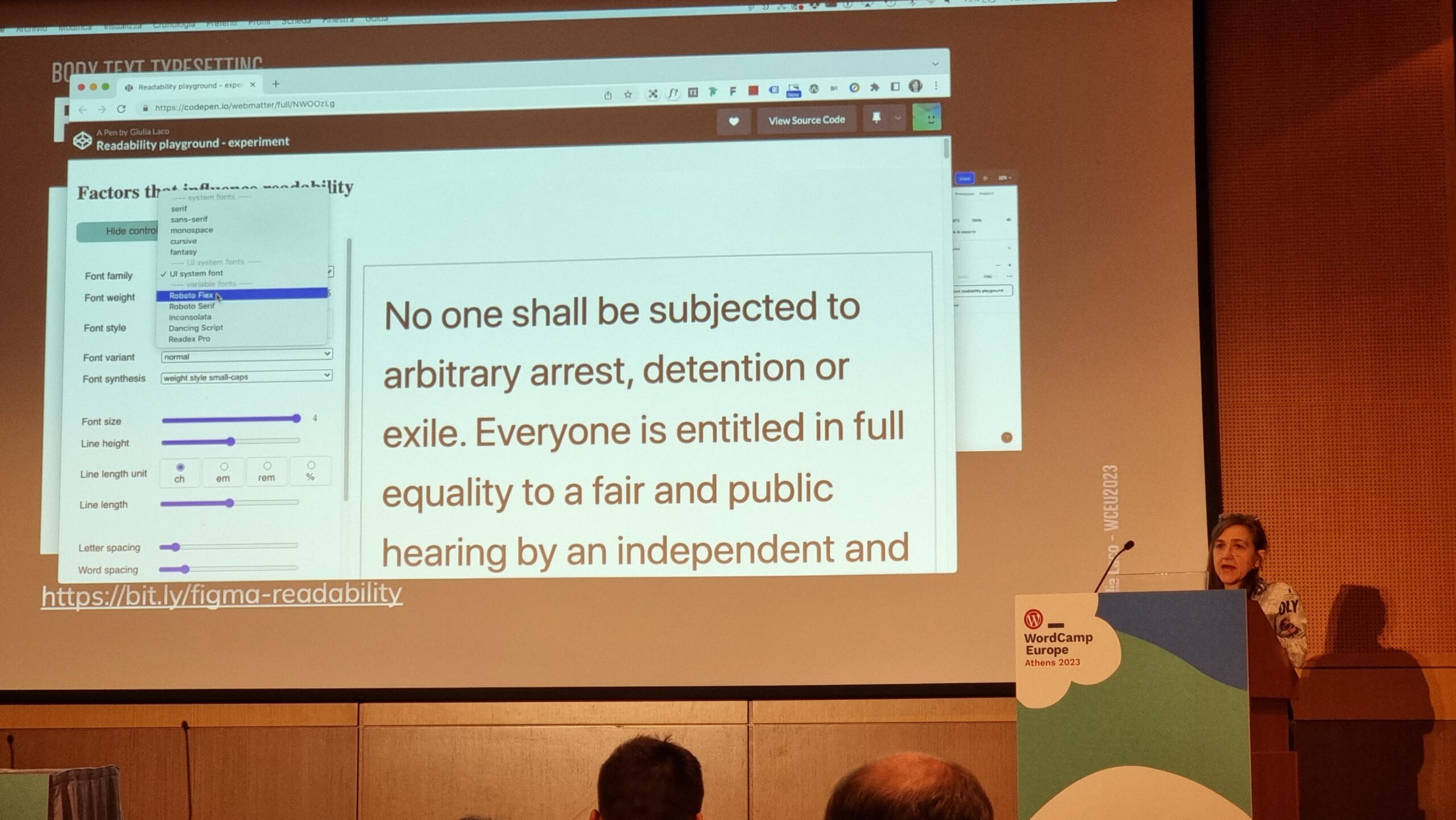
Our capacity to read and comprehend a text is affected by a combination of common (distance, lighting, environment, concentration, mood, etc.), personal (age, proficiency, motiviation, accessibility requirements, etc.), and typographic (face, style, size, line length and spacing, contrast, width, rhythm etc.) factors. To explore the impact of the typographic factors, the group dived into a pre-prepared Codepen and a shared Figma diagram. (I immediately had a TIL moment over the font-synthesis: CSS property!)
I appreciated that Giulia stressed the importance of a fallback font. Just like the CDN issues I described above while talking about JavaScript dependencies, not specifying a fallback font puts your design at the mercy of the browser’s defaults. We don’t like to think about what happens when websites partially fail, but they do, and we should.
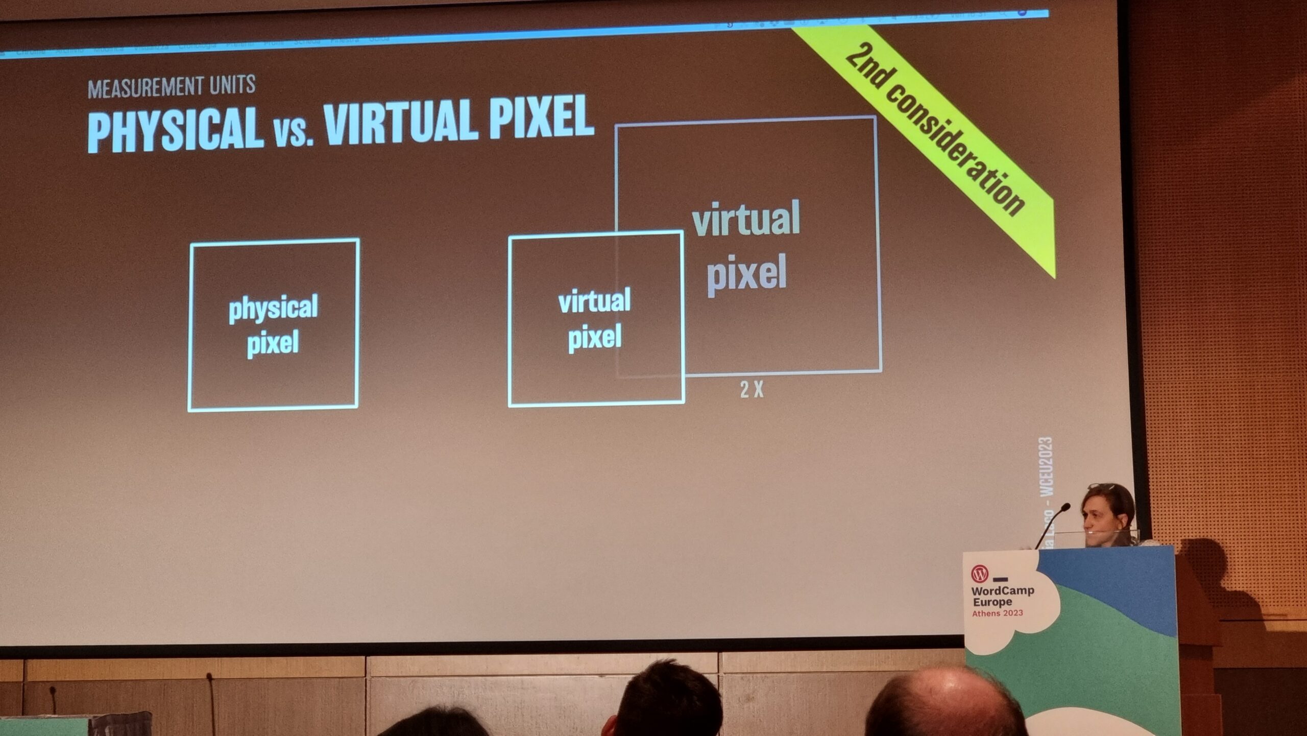
Things get interesting at the intersection of readability and accessibility. For example, WCAG accessibility requirements demand that you don’t use images of text (we used to do this a lot back before we could reliably use fonts on the web, and before we could easily have background images on e.g. buttons for navigation). But this accessibility requirement also aids screen readability when accounting for e.g. “retina” screens with virtual pixel ratios.
Do you remember when a pixel was the size of a pixel? Those days are long gone. True story.
Giulia provided a great explanation of why we may well think in pixels (as developers or digital designers) but we’re unlikely to use them everywhere: I’d internalised this lesson long ago but I appreciated a well-explained justification. The short of it is: screen zoom (that fancy zoom feature you use in your browser all the time, especially on mobile) and text zoom (the one you probably don’t use, or don’t use so much) are different things, and setting a pixel-based font size in the root node wrecks the latter, forcing some people with accessibility needs to use the former, which is likely to result in vertical scrolling. Boo!
I also enjoyed seeing this demo of how the different hyphenation-points in different languages (because of syllable stress) can impact on your wrapping points/line lengths when content is translated. This can affect any website, of course, because any website can be the target of automatic translation.
Plus, Giulia’s thoughts on the value of serifed fonts (even on digital displays) for improving typographic readability of the letters d, b, p and q which are often mirror- or rotationally-symmetric to one another in sans-serif fonts. It’s amazing to have something – in this case, a psychological letter transposition – pointed out that I’ve experienced but never pinned down the reason for, before. Neat!
It was a shame that this workshop took place late in the day, because many of the participants (including me) seemed to have flagging energy levels!
Altogether a great (but intense) day. Boggles my mind that there’s another one like it tomorrow.