It’s that time of year again when I comparison-shop for car insurance, and every time I come across a new set of reasons to hate the developers at Confused.com. How do you confuse me? Let me count the ways.
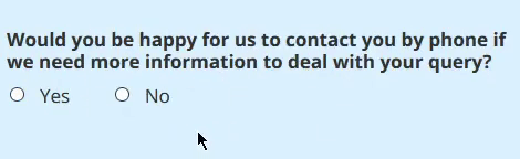
No means yes
I was planning to enumerate my concerns to them directly, via their contact form, but when I went to do so I spotted this bit of genius, which clinched it and made me write a blog post instead:
Clicking the word “Yes” means “Yes”. Clicking the word “No” means “Yes” as well.Turns out that there’s a bit of the old sloppy-paste going on there:
<input type=”radio” value=”Yes” id=”ContactByPhoneYes” name=”contactByPhone” />
<label for=”ContactByPhoneYes” class=”label”>Yes</label>
<input type=”radio” value=”No” id=”ContactByPhoneNo” name=”contactByPhone” />
<label for=”ContactByPhoneYes” class=”label”>No</label>
I guess nobody had the “consent talk” with Confused.com?
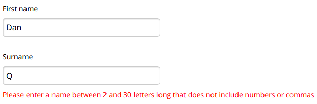
That’s not my name!
Somebody needs to brush up on their falsehoods programmers believe about names.Honestly, I’m used to my unusual name causing trouble by now and I know how to work around it in the way that breaks the fewest systems (I can even usually get airline tickets without too much difficulty nowadays). But these kinds of (arbitrary) restrictions must frustrate folks like Janice Keihanaikukauakahihulihe’ekahaunaele.
I guess their developers didn’t realise that this blog post was parody?
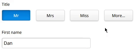
Also, that’s not my title!
This one, though, pisses me off:
As everybody knows, there are only six titles, and two of them are “Dr”.This is a perfect example of why your forms should ask for what you actually want to know, not for what you think people want to tell you. Just ask!
If you want to know my gender, ask for my gender! (I’m a man, by the way.)
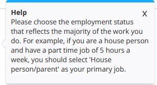
I don’t understand why you want to know – after all, it’s been illegal since 2012 to risk-assess/price car insurance differently on the grounds of gender – but maybe you’ve got a valid reason. Which hopefully you’ll tell me in a tooltip. Like you’re using it as a (terrible checksum) when you check my driving license details, that’s fine!
If you want to know my title, ask for my title! (I prefer not to use one, but if you must use one I’d prefer Mx.)
This ought to be an optional field, of course, and ideally you want a free text input or else you’ll always have missed somebody (Lord, Reverend, Prince, Wing Commander…). It’s in your interests because I’m totally going to pick at random otherwise. Today I’m a Ms.
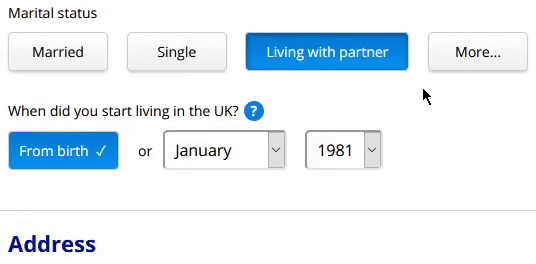
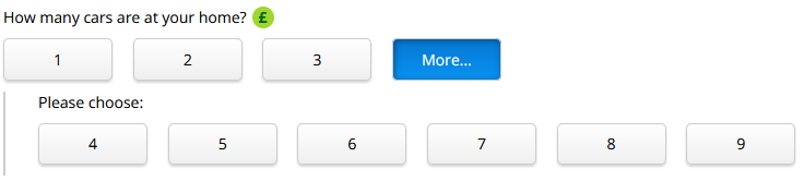
Consistency? Never heard of it.
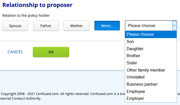
It’s not a big thing, but if you come up with a user interface paradigm like “clicking More… shows more buttons”, you ought to stick to it.
Maybe their internal style guide says “a More… button with three additional options should use buttons, but four additional options should be a drop-down”. But it seems more-likely that they just don’t have one.Again, I’m not sure exactly what all of this data is used for, nor why there’s a need to differentiate between married couples and civil partnerships, but let’s just assume this is all necessary and legitimate and just ask ourselves: why are we using drop-downs now for “More…”? We were using buttons just a second ago!
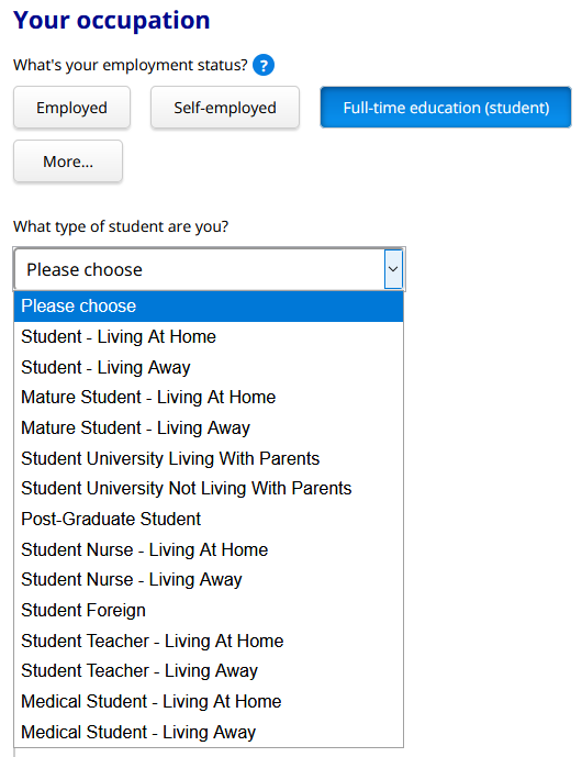
This was just crying out for a type-in field. But I guess the same developer who did the “Title” question did this one too, and wanted to show off the fancy “more buttons” control they’d written. (Imaginary style guide be damned!)What’s my occupation again?
There’s so much to unpack in the “occupation” part of the form that I’m not even sure where to begin. Let’s just pick out a few things:
I never answered a question this hard even in the exams I did when I was a student. Why do we care where students live… except if they’re postgrads? If I’m a mature student studying a postgraduate course in medicine while living at home with my parents… which of the five possible options should I pick? And, again: what difference could it conceivably make?The student thing is just the beginning, though. You can declare up to two jobs, but if the first one is “house person/parent” you can’t have a second one. If you’re self-employed, that has to be your first job even though the guidance says that the one you spend most time on must be the first one (this kind of thing infuriated me when I used to spend 60% of my work time employed, 20% self-employed, and 20% studying).
I’m not saying it’s easy to make a form like this. I know from experience that it’s not. I am saying that Confused.com make it look a lot harder than it is.
Well that clears everything up. Also, I think you mean “houseperson”, unless you’re referring to somebody who is half-house/half-person, like some kind of architectural werewolf.What do you mean, you live with your partner?
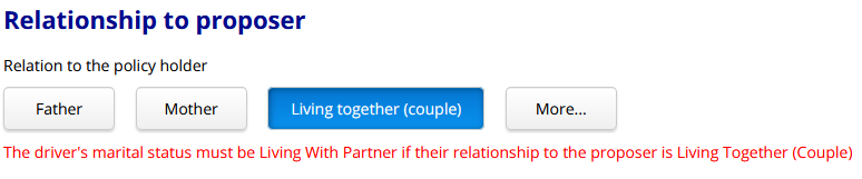
At a glance, this sounds like a “poly world problem”, but hear me out:
What you’re seeing here is a reference-identity error. I can’t possibly be living together with somebody as a couple if their marital status isn’t “Living With Partner”.I put Ruth‘s martial status as married, because she’s married to JTA. But then when it asked how she was related to me, it wouldn’t accept “Living together (couple)”.
If I put Ruth as the primary policyholder (proposer) though, I don’t even get the option of “living together (couple)” to describe her relationship with me. ‘Cos it’s physically impossible to have a partner and be married, right?Even if you don’t think it’s odd that they hide “living with partner” button as an option to describe a married person’s relationship to somebody other than their spouse… you’ve still got to agree that it’s a little bit odd that they don’t hide the “spouse” button. In other words, this user interface is more-okay with you having multiple spouses than it is with you having a spouse and an unmarried partner!
And of course this isn’t just about polyamorous folks: there are perfectly “normal” reasons that a person might end up confused by this interface, too. For example a separated (but not yet divorced) couple, one of whom has a new partner (it’s not even inconceivable that such a pair might share custody of a car). Also interesting is the fact that the form doesn’t care about the gender of your spouse (it doesn’t ask for “husband” or “wife”) but does care about the gender of your parent, child, or sibling. What gives?
Half a dozen easy fixes. Go for it, Confused.com.
Given that their entire marketing plan for most of the last two decades has been that they reduce customer confusion, Confused.com’s user interface leaves a lot to be desired. As I’ve mentioned before – and speaking as a web developer that’s been in the game for longer than their company has – it’s not necessarily easy to get this kind of thing right. But you can improve a form like this, a little at a time. And every little win counts for something: a more-satisfied returning customer, perhaps, or a new word-of-mouth recommendation.
Or you can just let it languish and continue to have the kind of form that people mock on the public Internet.
It’ll be a year until I expect to comparison-shop for car insurance again: let’s see how they get on, shall we?
Update (21 January 2021): Confused.com Respond!
I didn’t expect to receive any response to this post: most organisations don’t when I call-out the problems with their websites (not least because I’m more than a little bit sarcastic about it!). I never heard back from the Digital Climate Strike folks, for example, when I pointed out that their website was a great example of exactly the kind of problem they were protesting. But Confused.com passed on my thoughts to Product Manager Gareth who took a look at them and gave me a £20 Amazon gift card by way of thanks. Nice one, Confused.com!