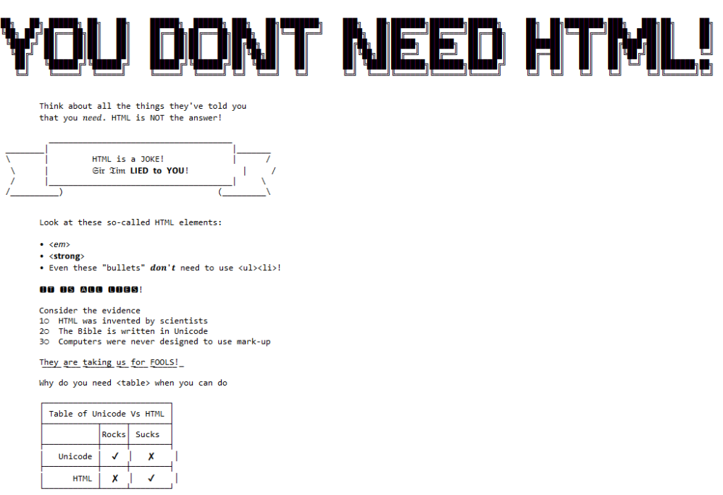
It all started when I saw no-ht.ml, Terence Eden‘s hilarious response to Salma
Alam-Naylor‘s excellent HTML is all you need to make a website. The latter is an
argument against both the silly amount of JavaScript with which websites routinely burden their users, but also even against depending on CSS. As a fan of CSS Naked Day and a firm
believer in using JS only for progressive enhancement, I’m obviously in favour.
Obviously no-ht.ml is to be taken as tongue-in-cheek, but as you’re about to see: it caught my interest and got me thinking: how could I go even further.
Terence’s site works by delivering a document with a
claimed MIME type of text/html, but which contains only the (invalid) “HTML” code
<!doctype UNICODE><meta charset="UTF-8"><plaintext> (to work around browsers’ wish to treat the page as HTML). This is followed by a block of UTF-8 plain text making use of spacing
and emoji to illustrate and decorate the content. It’s frankly very silly, and I love it.1
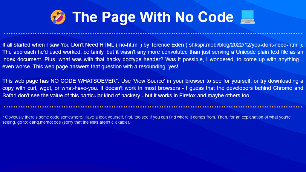
I think it’s possible to go one step further, though, and create a web page with no code whatsoever. That is, one that you can read as if it were a regular web page, but where
using View Source or e.g. downloading the page with curl will show you… nothing.
I present: The Page With No Code! (It’ll probably only work if you’re using Firefox, for reasons that will become apparent later.)
I’d encourage you to visit The Page With No Code, use View Source to confirm for yourself that it truly has no code, and see if you can work out for yourself how it manages
this feat… before coming back here for an explanation. Again: probably Firefox-only.
Once you’ve had a look for yourself and had a chance to form an opinion, here’s an explanation of the black magic that makes this atrocity possible:
The page is blank. It’s delivered with Content-Type: text/html. Your browser interprets a completely-blank page as faulty and corrects it to a functionally-blank
minimal HTML page: <html><head></head><body></body></html>.
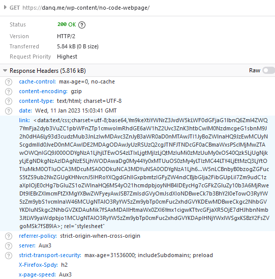
<body> and <html> elements can be styled with CSS; this includes the ability to add
content:::before and ::after each
element. If only we could load a stylesheet then content injection is possible.
We use the fourth way to inject
CSS – a Link: HTTP header – to deliver a CSS payload (this, unfortunately, only works in Firefox). To further obfuscate what’s happening and remove the need for a round-trip, this is encoded
as a data: URI.
The stylesheet – and all the page content – is right there in the Link: header if you just care to decode it! Observe that while 5.84kB of
data are transferred, the browser rightly states that the page is zero bytes in size.
My server-side implementation of this broke in 2023 after I upgraded Nginx; my new version doesn’t support the super-long Link: header needed
to make this hack work, so I’ve updated the page to use the Link: to reference the CSS file rather than embed it via a data URI. It’s not as cool, but it at least means you can
still see the page. Thanks to Thomas Bradshaw for pointing out the problem.
Footnotes
1 My first reaction was “why not just deliver something with Content-Type:
text/plain; charset=utf-8 and dispense with the invalid code, but perhaps that’s just me overthinking the non-existent problem.
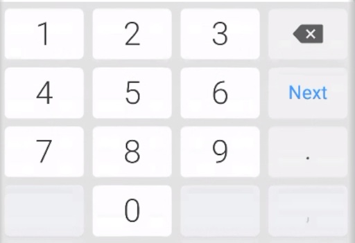
Using <input type="text" inputmode="numeric" pattern="[0-9]*"> allows for a degree of separation between how the user enters data (“input mode”), what the browser
expects the user input to contain (type equals number), and potentially how it tries to validate it.
…
I’ve sung the praises of the GDS research team before, and it’s for things like this that I respect them the most: they’re
knowing for taking a deep-dive user-centric approach to understanding usability issues, and they deliver valuable actionable answers off the back of it.
If you’ve got Web forms that ask people for numbers, this is how you should be doing it. If you’re doing so specifically for 2FA purposes, see that post I shared last month on a similar topic.
As part of the preparing to leave the Bodleian I’ve been revisiting a lot of the documentation I’ve written over the last eight
years. It occurred to me that I’ve never written publicly about how the Bodleian’s digital signage/interactives actually work; there are possible lessons to learn.
The Bodleian‘s digital signage is perhaps more-diverse, both in terms of technology and audience, than that of most organisations. We’ve got
signs in areas that are exclusively reader-facing to help students and academics find what they’re looking for, signs in publicly accessible rooms that advertise and educate, and signs
in gallery spaces upon which we try to present engaging and often-interactive content to support exhibitions.
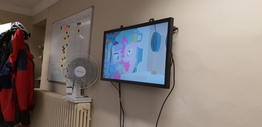
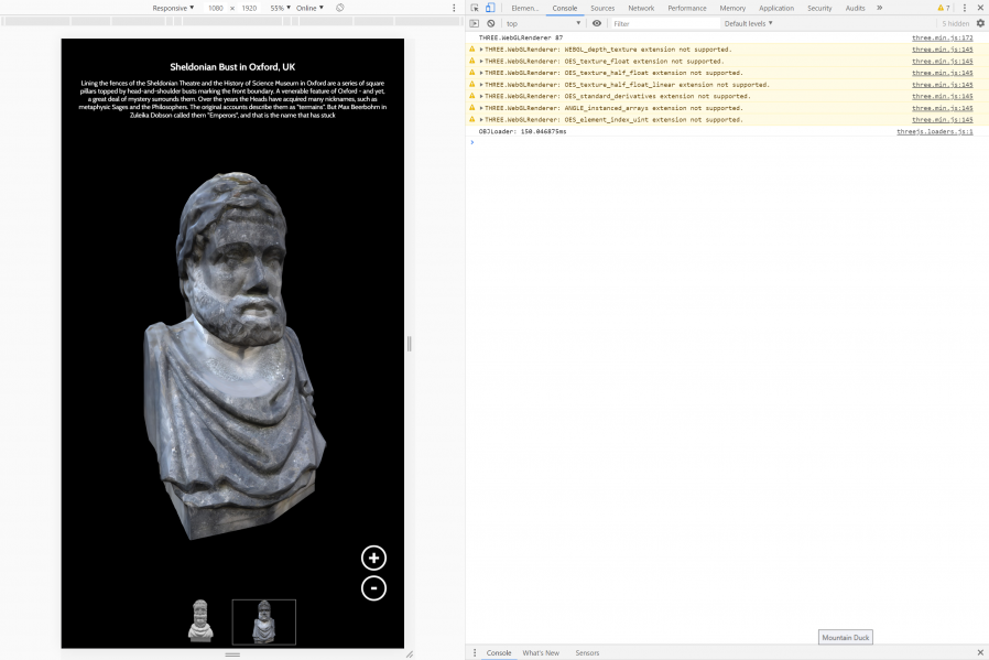
Getting an extra touchscreen for the office for prototyping/user testing purposes was great, even when it wasn’t showing MLP: FiM.
Throughout those three spheres, we’ve routinely delivered a diversity of content (let’s just ignore the countdown clock, for now…). Traditional
directional signage, advertisements, games, digital exhibitions, interpretation, feedback surveys…
In the vast majority of cases – and this is where the Bodleian’s been unusual (though certainly not unique) among cultural sector institutions – we’ve created
those in-house rather than outsourcing them.
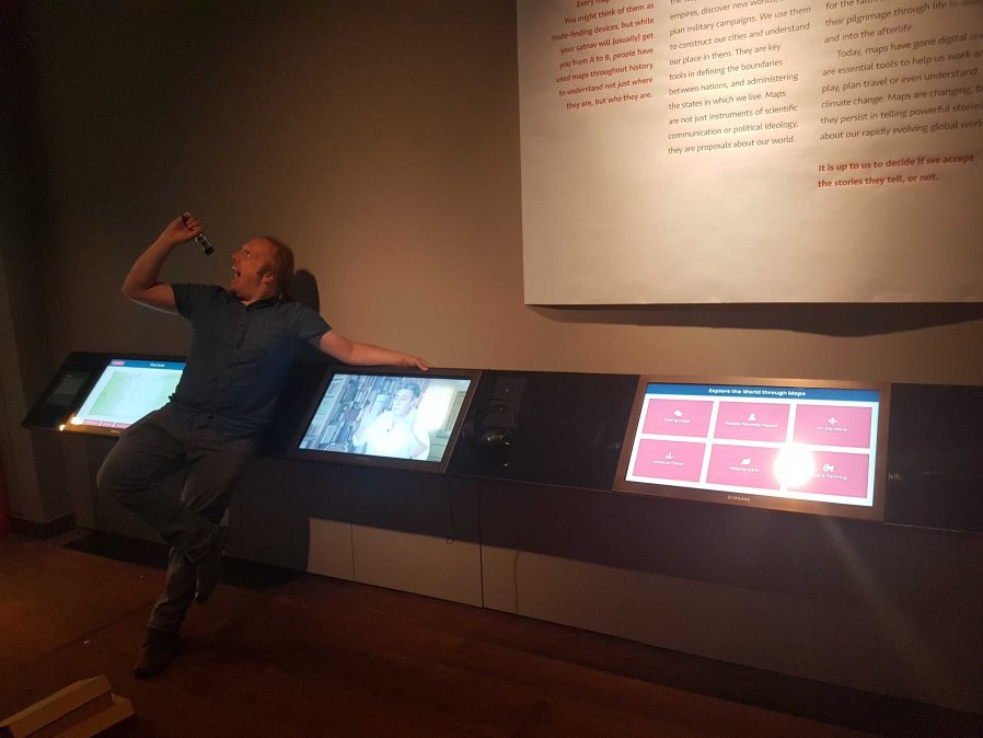
Using off-the-shelf technology also allows the Bodleian to in-house much of their hardware maintenance, as a secondary part of other job roles. Singing into your screwdriver remains
optional, though.
To do this economically – the volume of work on interactive signage is inconsistent throughout the year – we needed to align the skills required with skills used elsewhere in the
organisation. To do this, we use the web as our medium! Collectively, the Bodleian’s Digital Communications team already had at least some experience in programming, web design, graphic
design, research, user testing, copyediting etc.: the essential toolkit for web application development.
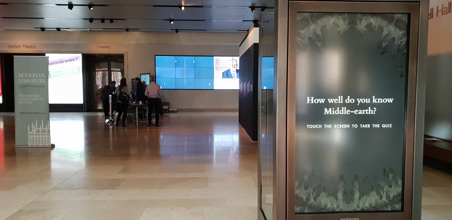
Whether you were playing Pong on the video wall at the back or testing your Middle-earth knowledge on the touchscreen at the front… behind the
scenes you were interacting with a web page I wrote.
By shifting our digital signage platform to lean heavily on web technologies, we were able to leverage talented people we already had to produce things that we might otherwise
have had to outsource. This, in turn, meant that more exhibitions and displays get digital enhancement, on a shorter turnaround.
It also means that there’s a tighter integration between exhibition content and content for web and social media: it’s easier for us to re-use content across multiple platforms.
Sometimes we’ve even made our digital interactives, or adapted version of them, available directly online, allowing our exhibitions to reach people that can’t get to our physical spaces
at all.
Because we’re able to produce our own content on-demand, even our smaller, shorter-duration displays can have hands-on digital interactives associated with them.
On to the technology! We’re using a real mixture of tech: when it’s donated or reclaimed from previous projects (and when the bidding and acquisition processes are, well… as you’d
expect at the University of Oxford), you learn not to say no to freebies. Our fleet includes:
Samsung Android tablets with freestanding kiosk frames. We run the excellent-value Kiosk Browser Lockdown app on
these, which loads on boot and prevents access to anything but a specified website.
OnelanNTBs connected to a mixture of
touch and non-touch screens, wall-mounted or in kiosk frames. We use Onelan’s standard digital signage features as well as – for interactive content – their built-in touch-capable web
browser.
Dell PCs of the standard variety supplied by University IT services, connected to wall-mounted touch screens, running Google Chrome in Kiosk Mode. More on this below.
The browsers’ responsive simulators are invaluable when we’re targeting signage at five (!) different resolutions.
When you’re developing content for a very small number of browsers and a limited set of screen sizes, you quickly learn to throw a lot of “best practice” web development out of the
window. You’ll never come across a text browser or screen reader, so alt-text doesn’t matter. You’ll never have to rescale responsively, so you might as well absolutely-position almost
everything. The devices are all your own, so you never need to ask permission to store cookies. And because you control the platform, you can get away with making configuration tweaks
to e.g. allow autoplaying videos with audio. Coming from a conventional web developer background to producing digital signage content makes feels incredibly lazy.
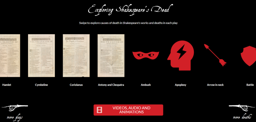
Helping your users see your interactive as “app-like” rather than “web-like” encourages them to feel comfortable engaging with it in ways uncharacteristic of web pages. In our Shakespeare’s Dead interactive, for example, we started the experience in the middle of a long horizontally-scrolling “page”, which might
feel very unusual in a conventional browser.
Using Chrome to run digital signage requires, in the Bodleian’s case, a couple of configuration tweaks and the right command-line switches. We use:
chrome://flags/#overscroll-history-navigation – disabling this prevents users from triggering “back”/”forward” by swiping with two fingers
chrome://flags/#pull-to-refresh – disabling this prevents the user from triggering a “refresh” by scrolling up beyond the top of the page (this only happens on some
kinds of devices)
chrome://flags/#system-keyboard-lock – we don’t use attached keyboards, but if you do, you might want to set this flag so you can use the keyboard.lock()
API to intercept e.g. ALT+F4 so users can’t escape the application
running on startup with e.g. chrome --kiosk --noerrdialogs --allow-file-access-from-files --disable-touch-drag-drop --incognito https://example.com/some/url
Kisok mode makes the browser run fullscreen and prevents e.g. opening additional tabs, giving an instant “app-like” experience. As we don’t have keyboards attached to our
digital signage, this also prevents visitors from closing Chrome.
Turning off error dialogs reduces the risk that an error will result in an unslightly message to the user.
Enabling “file access from files” allows content hosted at file:// addresses to access content at other file:// addresses, which makes it possible to write “offline” sites
(sometimes useful where we’re serving large videos or on previous occasions when WiFi has been shaky) that can still take advantage of features like the Fetch API.
Unless you need drag-and-drop, it’s simpler to disable it; this prevents a user long-press-and-dragging an image around the screen.
Incognito mode ensures that the browser doesn’t remember what site was showing last time it ran; our computers often end up switched off at the wall at the end of the day, and
without this the browser will offer to load the site it had open last time, when it runs.
We usually host our interactives directly on the web, at “secret” addresses, and this is generally preferable to us as we can more-easily make on-the-fly adjustments to
content (plus it makes it easier to hook up analytic tools).
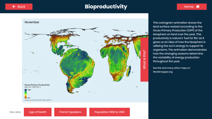
Be sure to test the capabilities of your hardware! Our Onelan NTBs, unlike your desktop PCs, can’t handle multitouch input, which
affects the design of our user interfaces for these devices.
Meanwhile, in the application’s CSS code, we set * { user-select: none; } to prevent the user from highlighting
text by selecting it with their finger. We also make heavy use of absolutely-sized/positioned, overflow: hidden blocks to ensure that scrollbars never appear, and
CSS animations to make content feel dynamic and to draw attention to particular elements.
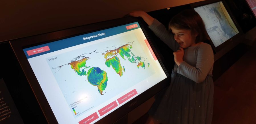
There’s no substitute for good testing. And there’s no stress-testing quite like letting a 5 year-old loose on your work.
Altogether, this approach gives the Bodleian the capability to produce engaging interactive content at low cost and using the existing skills of their digital and exhibitions teams.
It’s not an approach that would work for every cultural institution: in particular, some of the Bodleian’s sister institutions already
outsource the technical parts of their web work, and so don’t have the expertise in-house to share with a web-powered digital signage solution.
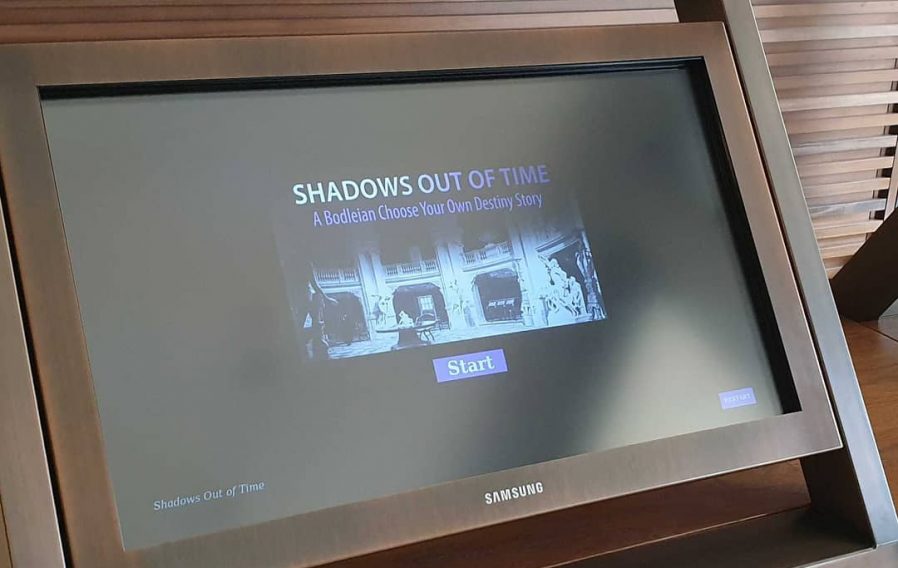
A few minor CSS tweaks to make the buttons finger-friendly and our Halloween game Shadows Out Of
Time, which I’d already made web-friendly, was touchscreen-ready too. I wonder if they’ll get this one out again, this
Halloween?
But for those museums that can fit into this model – or can adapt to do so in future – using the web to produce interactive digital content and digital signage is a highly
cost-effective way to engage with visitors, even (or especially!) when dealing with short-lived and/or rotating displays.
It’s also been among my favourite parts of my job at the Bod these last 8½ years, and I’m sure I’ll miss it!
When I write a blog post, it generally becomes a static thing: its content always
usually stays the same for the rest of its life (which is, in my case, pretty much forever). But sometimes, I go back and make an
amendment. When I make minor changes that don’t affect the overall meaning of the work, like fixing spelling mistakes and repointing broken links, I just edit the page, but for
more-significant changes I try to make it clear what’s changed and how.
This blog post from 2007, for example, was amended after its publication with the insertion of content at the top and the deletion
of content within.
Historically, I’d usually marked up deletions with the HTML <strike>/<s> elements (or
other visually-similar approaches) and insertions by clearly stating that a change had been made (usually accompanied by the date and/or time of the change), but this isn’t a good
example of semantic code. It also introduces an ambiguity when it clashes with the times I use <s> for comedic effect in the Web equivalent of the old caret-notation joke:
Be nice to this fool^H^H^H^Hgentleman, he's visiting from corporate HQ.
Better, then, to use the <ins> and <del> elements, which were designed for exactly this purpose and even accept attributes to specify the date/time
of the modification and to cite a resource that explains the change, e.g. <ins datetime="2019-05-03T09:00:00+00:00"
cite="https://alices-blog.example.com/2019/05/03/speaking.html">The last speaker slot has now been filled; thanks Alice</ins>. I’ve worked to retroactively add such
semantic markup to my historical posts where possible, but it’ll be an easier task going forwards.
Of course, no browser I’m aware of supports these attributes, which is a pity because the metadata they hold may well have value to a reader. In order to expose them I’ve added a little
bit of CSS that looks a little like this, which makes their details (where available) visible as a sort-of tooltip when hovering
over or tapping on an affected area. Give it a go with the edits at the top of this post!
ins[datetime],del[datetime]{position:relative;}ins[datetime]::before,del[datetime]::before{position:absolute;top:-24px;font-size:12px;color:#fff;border-radius:4px;padding:2px6px;opacity:0;transition:opacity0.25s;
hyphens:none;/* suppresses sitewide line break hyphenation rules */white-space:nowrap;/* suppresses extraneous line breaks in Chrome */}ins[datetime]:hover::before,del[datetime]:hover::before{opacity:0.75;}ins[datetime]::before{content:'inserted 'attr(datetime)''attr(cite);background:#050;/* insertions are white-on-green */}del[datetime]::before{content:'deleted 'attr(datetime)''attr(cite);background:#500;/* deletions are white-on-red */}
CSS facilitating the display of <ins>/<del> datetimes and citations on hover or touch.
I’m aware that the intended use-case of <ins>/<del> is change management, and that the expectation is that the “final” version of a
document wouldn’t be expected to show all of the changes that had been made to it. Such a thing could be simulated, I suppose, by appropriately hiding and styling the
<ins>/<del> blocks on the client-side, and that’s something I might look into in future, but in practice my edits are typically small and rare
enough that nobody would feel inconvenienced by their inclusion/highlighting: after all, nobody’s complained so far and I’ve been doing exactly that, albeit in a non-semantic way, for
many years!
I’m also slightly conscious that my approach to the “tooltip” might cause it to obstruct interactivity with something directly above an insertion or deletion: e.g. making a hyperlink
inaccessible. I’ve tested with a variety of browsers and devices and it doesn’t seem to happen (my line height works in my favour) but it’s something I’ll need to be mindful of if I
change my typographic design significantly in the future.
A final observation: I love the CSS attr() function, and I’ve been using it (and counter()) for all
kinds of interesting things lately, but it annoys me that I can only use it in a content: statement. It’d be amazingly valuable to be able to treat integer-like attribute
values as integers and combine it with a calc() in order to facilitate more-dynamic styling of arbitrary sets of HTML elements. Maybe one day…
For the time being, I’m happy enough with my new insertion/deletion markers. If you’d like to see them in use in their natural environment, see the final paragraph of my 2012 review of The Signal and The Noise.
As I indicated in my last blog post, my new blog theme has a “pop up” Dan in the
upper-left corner. Assuming that you’re not using Internet Explorer, then when you move your mouse cursor over it, my head will “duck” back behind the bar below it.
My head "pops up" in the top-left hand corner of the site, and hides when you hover your mouse cursor over it.
This is all done without any Javascript whatsoever: it’s pure CSS. Here’s how it’s done:
<divclass="sixteen columns"> <divid="dans-creepy-head"></div> <h1id="site-title"class="graphic">
<ahref="/"title="Scatmania">Scatmania</a>
</h1> <spanclass="site-desc graphic">
The adventures and thoughts of "Scatman" Dan Q
</span> </div>
The HTML for the header itself is pretty simple: there’s a container (the big blue bar) which contains, among other things, a <div> with the id
"dans-creepy-head". That’s what we’ll be working with. Here’s the main CSS:
The CSS sets a size, position, and background image to the <div>, in what is probably a familiar way. A :hover selector changes the style to increase the
distance from the top of the container (from -24px to 100px) and to decrease the height, cropping the image (from 133px to 60px – this was necessary
in this case to prevent the bottom of the image from escaping out from underneath the masking bar that it’s supposed to be “hiding behind”). With just that code, you’d have a perfectly
workable “duck”, but with a jerky, one-step animation.
The transition directive (and browser-specific prefix versions -o-transition, -webkit-transition, and -moz-transition, for compatability) are what
makes the magic happen. This element specifies that any ("all") style is changed on this element (whether via CSS directives, as in this case, or by a change of class or
properties by a Javascript function), that a transition effect will be applied to those changes. My use of "all" is a lazy catch-all – I could have specified the
individual properties ( top and height) that I was interested in changing, and even put different periods on each, but I’ll leave it to you to learn about CSS3 transition options for yourself. The 800ms is the
duration of the transition: in my case, 0.8 seconds.
I apply some CSS to prevent the :hover effect from taking place in Internet Explorer, which doesn’t support transitions. The "ie" class is applied to the
<html> tag using Paul Irish’s technique, so it’s easy to detect and handle IE users without loading separate
stylesheet files for them. And finally, in order to fit with my newly-responsive design, I make the pop-up head disappear when the window is under 780px wide (at which point there’d be
a risk of it colliding with the title).
That’s all there is to it! A few lines of CSS, and you’ve got an animation that degrades gracefully. You could equally-well apply transformations to links (how about making them fade in
or out, or change the position of their background image?) or, with a little Javascript, to your tabstrips and drop-down menus.
Oh yeah: I changed the look-and-feel of scatmania.org the other week, in case you hadn’t noticed. It’s become a
sort-of-traditional January activity for me, these years, to redesign the theme of my blog at this point in the year.
This year’s colours are black, white, greys, and red, and you’ll note also that serifed fonts are centre-stage again, appearing pretty-much-universally throughout the site for the first
time since 2004. Yes, I know that it’s heavier and darker than previous versions of the site: but it’s been getting fluffier and lighter year on year for ages, now, and I thought it was
time to take a turn. You know: like the economy did.
This new design has elements in common with the theme before last: a big blue header, an off-white background, and sans-serif faces.
Aside from other cosmetic changes, it’s also now written using several of the new technologies of HTML5 (I may put the shiny new logo on it, at some point). So apologies to those of you running archaic and non-standards-compliant browsers (I’m looking at you, Internet
Explorer 6 users) if it doesn’t look quite right, but really: when your browser is more than half as old as the web itself, it’s time to upgrade.
I’ve also got my site running over IPv6 – the next generation Internet protocol – for those of you who care about those sorts of things. If you don’t know why IPv6 is important and “a
big thing”, then here’s a simple explanation.
Right now you’re probably viewing the IPv4 version: but if you’re using an IPv6-capable Internet connection, you might be viewing the IPv6 version. You’re not missing out, either way:
the site looks identical: but this is just my tiny contribution towards building the Internet of tomorrow.
(if you really want to, you can go to ipv6.scatmania.org to see the IPv6 version – but it’ll only work if your Internet Service Provider is on the ball and has set you up with an IPv6
address!)