My Geo*ing Limits

I thought it might be fun to try to map the limits of my geocaching/geohashing. That is, to draw the smallest possible convex polygon that surrounds all of the geocaches I’ve found and geohashpoints I’ve successfully visited.

World map showing the outer extent of the areas in which Dan has geocached/geohashed. A shaded polygon covers the UK (except the far North of Scotland), parts of California, Cape Town, and parts of Italy and Austria.

Mathematically, such a shape is a convex hull – the smallest polygon encircling a set of points without concavity. Here’s how I made it:

1. Extract all the longitude/latitude pairs for every successful geocaching find and geohashpoint expedition. I keep them in my blog database, so I was able to use some SQL to fetch them:

SELECT DISTINCT coord_lon.meta_value lon, coord_lat.meta_value lat
FROM wp_posts
LEFT JOIN wp_postmeta expedition_result ON wp_posts.ID = expedition_result.post_id AND expedition_result.meta_key = 'checkin_type'
LEFT JOIN wp_postmeta coord_lat ON wp_posts.ID = coord_lat.post_id AND coord_lat.meta_key = 'checkin_latitude'
LEFT JOIN wp_postmeta coord_lon ON wp_posts.ID = coord_lon.post_id AND coord_lon.meta_key = 'checkin_longitude'
LEFT JOIN wp_term_relationships ON wp_posts.ID = wp_term_relationships.object_id
LEFT JOIN wp_term_taxonomy ON wp_term_relationships.term_taxonomy_id = wp_term_taxonomy.term_taxonomy_id
LEFT JOIN wp_terms ON wp_term_taxonomy.term_id = wp_terms.term_id
WHERE wp_posts.post_type = 'post' AND wp_posts.post_status = 'publish'
AND wp_term_taxonomy.taxonomy = 'kind'
AND wp_terms.slug = 'checkin'
AND expedition_result.meta_value IN ('Found it', 'found', 'coordinates reached', 'Attended');

2. Next, I determine the convex hull of these points. There are an interesting variety of algorithms for this so I adapted the Monotone Chain approach (there are convenient implementations in many languages). The algorithm seems pretty efficient, although that doesn’t matter much to me because I’m caching the results for a fortnight.

Animation showing an algorithm draw lines from point to point, selecting each point by avoiding counter-clockwise turns.
I watched way too many animations of different convex hull algorithms before selecting this one… pretty-much arbitrarily.

3. Finally, I push the hull coordinates into Geoapify, who provide mapping services to me. My full source code is available.

An up-to-date (well, no-more than two weeks outdated) version of the map appears on my geo* stats page. I don’t often get to go caching/hashing outside the bounds already-depicted, but I’m excited to try to find opportunities to push the boundaries outwards as I continue to explore the world!

(I could, I suppose, try to draw a second larger area of places I’ve visited: the difference between the smaller and larger areas would represent all of the opportunities I’d missed to find a hashpoint!)

Animation showing an algorithm draw lines from point to point, selecting each point by avoiding counter-clockwise turns.× World map showing the outer extent of the areas in which Dan has geocached/geohashed. A shaded polygon covers the UK (except the far North of Scotland), parts of California, Cape Town, and parts of Italy and Austria.×

Local Expert

At school, our 9-year-old is currently studying the hsitory of human civilization from the late stone age through to the bronze age. The other week, the class was split into three groups, each of which was tasked with researching a different piece of megalithic architecture:

  • One group researched Stonehenge, because it’s a pretty obvious iconic choice
  • Another group researched the nearby Rollright Stones, which we’ve made a family tradition of visiting on New Year’s Day and have dragged other people along to sometimes
  • The final group took the least-famous monument, our very own local village henge The Devil’s Quoits
Dan, wearing a black t-shirt with the words "Let's make the web a better place" on, sits with his back to a standing stone. Four more standing stones can be seen stretching away into the bakground, atop a flowery meadow and beneath a slightly cloudy but bright sky.
Love me some ancient monuments, even those that are perhaps less authentically-ancient than others.

And so it was that one of our eldest’s classmates was searching on the Web for information about The Devil’s Quoits when they found… my vlog on the subject! One of them recognised me and said, “Hey, isn’t that your Uncle Dan?”1

On the school run later in the day, the teacher grabbed me and asked if I’d be willing to join their school trip to the henge, seeing as I was a “local expert”. Naturally, I said yes, went along, and told a bunch of kids what I knew!

A group of schoolchildren in a mixture of white and blue shirts, and with most wearing sunhats, sit on a pile of rocks alongside a ring ditch and listen intently to Dan.
I’ve presented to much-larger audiences before on a whole variety of subjects, but this one still might have been the most terrifying.

I was slightly intimidated because the class teacher, Miss Hutchins, is really good! Coupled with the fact that I don’t feel like a “local expert”2, this became a kick-off topic for my most-recent coaching session (I’ve mentioned how awesome my coach is before).

A young girl, her hair wild, sits at a kitchen table with a laptop and a homework book, writing.
I originally thought I might talk to the kids about the Bell Beaker culture people who are believed to have constructed the monument. But when I pitched the idea to our girl she turned out to know about as much about them as I did, so I changed tack.

I eventually talked to the class mostly about the human geography aspects of the site’s story. The area around the Devil’s Quoits has changed so much over the millenia, and it’s a fascinating storied history in which it’s been:

  • A prehistoric henge and a circle of 28 to 36 stones (plus at least one wooden building, at some point).
  • Medieval farms, from which most of the stones were taken (or broken up) and repurposed.
  • A brief (and, it turns out, incomplete) archeological survey on the remains of the henge and the handful of stones still-present.
  • A second world war airfield (a history I’ve also commemorated with a geocache).
  • Quarrying operations leaving a series of hollowed-out gravel pits.
  • More-thorough archeological excavation, backed by an understanding of the cropmarks visible from aircraft that indicate that many prehistoric people lived around this area.
  • Landfill use, filling in the former gravel pits (except for one, which is now a large lake).
  • Reconstruction of the site to a henge and stone circle again.3
Ultrawide panoramic picture showing a full circle of standing stones under a clear sky. The dry grass has been cut back, and the remains of a campfire can be seen.
It doesn’t matter to me that this henge is more a modern reconstruction than a preserved piece of prehistory. It’s still a great excuse to stop and learn about how our ancestors might have lived.

It turns out that to be a good enough to pass as a “local expert”, you merely have to know enough. Enough to be able to uplift and inspire others, and the humility to know when to say “I don’t know”.4

That’s a lesson I should take to heart. I (too) often step back from the opportunity to help others learn something new because I don’t feel like I’m that experienced at whatever the subject is myself. But even if you’re still learning something, you can share what you’ve learned so far and help those behind you to follow the same path. I’m forever learning new things, and I should try to be more-open to sharing “as I learn”. And to admit where I’ve still got a long way to go.

Footnotes

1 Of course, I only made the vlog because I was doing a videography course at the time and needed subject matter, and I’d recently been reading a lot about the Quoits because I was planning on “hiding” a virtual geocache at the site, and then I got carried away. Self-nerdsniped again!

2 What is a local expert? I don’t know, but what I feel like is just a guy who read a couple of books because he got distracted while hiding a geocache!

3 I’ve no idea what future archeologists will make of this place when they finda reconstructed stone circle and then, when they dig nearby, an enormous quantity of non-biodegradable waste. What was this strange stone circle for, they’ll ask themselves? Was it a shrine to their potato-based gods, to whom they left crisp packets as a sacrifice?

4 When we’re talking about people from the neolithic, saying “I don’t know” is pretty easy, because what we don’t know is quite a lot, it turns out!

Dan, wearing a black t-shirt with the words "Let's make the web a better place" on, sits with his back to a standing stone. Four more standing stones can be seen stretching away into the bakground, atop a flowery meadow and beneath a slightly cloudy but bright sky.× A group of schoolchildren in a mixture of white and blue shirts, and with most wearing sunhats, sit on a pile of rocks alongside a ring ditch and listen intently to Dan.× A young girl, her hair wild, sits at a kitchen table with a laptop and a homework book, writing.× Ultrawide panoramic picture showing a full circle of standing stones under a clear sky. The dry grass has been cut back, and the remains of a campfire can be seen.×

Automattic International

(This is yet another post about Automattic. Seee more posts about my experience of working at Automattic.)

Off the back of my recent post about privileges I enjoy as a result of my location and first language, even at my highly-multinational employer, and inspired by my colleague Atanas‘ data-mining into where Automatticians are located, I decided to do another treemap, this time about which countries Automatticians call home:

Where are the Automatticians?

Treemap showing countries of Automatticians. North America and specifically the USA dominates, the UK has the most in Europe, etc.
If raw data’s your thing (or if you’re just struggling to make out the names of the countries with fewer Automatticians), here’s a CSV file for you.

To get a better picture of that, let’s plot a couple of cartograms. This animation cycles between showing countries at (a) their actual (landmass) size and (b) approximately proportional to the number of Automatticians based in each country:

Animation showing countries "actual size" changing to proportional-to-Automattician-presence.
This animation alternates between showing countries at “actual size” and proportional to the number of Automatticians based there. North America and Europe dominate the map, but there are other quirks too: look at e.g. how South Africa, New Zealand and India balloon.

Another way to consider the data would be be comparing (a) the population of each country to (b) the number of Automatticians there. Let’s try that:

Animation showing countries proportional to population changing to proportional-to-Automattician-presence.
Here we see countries proportional to their relative population change shape to show number of Automatticians, as seen before. Notice how countries with larger populations like China shrink away to nothing while those with comparatively lower population density like Australia blow up.

There’s definitely something to learn from these maps about the cultural impact of our employee diversity, but I can’t say more about that right now… primarily because I’m not smart enough, but also at least in part because I’ve watched the map animations for too long and made myself seasick.

A note on methodology

A few quick notes on methodology, for the nerds out there who’ll want to argue with me:

  1. Country data was extracted directly from Automattic’s internal staff directory today and is based on self-declaration by employees (this is relevant because we employ a relatively high number of “digital nomads”, some of whom might not consider any one country their home).
  2. Countries were mapped to continents using this dataset.
  3. Maps are scaled using Robinson projection. Take your arguments about this over here.
  4. The treemaps were made using Excel. The cartographs were produced based on work by Gastner MT, Seguy V, More P. [Fast flow-based algorithm for creating density-equalizing map projections. Proc Natl Acad Sci USA 115(10):E2156–E2164 (2018)].
  5. Some countries have multiple names or varied name spellings and I tried to detect these and line-up the data right but apologies if I made a mess of it and missed yours.
Treemap showing countries of Automatticians. North America and specifically the USA dominates, the UK has the most in Europe, etc.× Animation showing countries "actual size" changing to proportional-to-Automattician-presence.× Animation showing countries proportional to population changing to proportional-to-Automattician-presence.×

Automattic Privilege

I’ve been thinking recently about three kinds of geographic privilege I enjoy in my work at Automattic. (See more posts about my experience of working at Automattic.)

1. Timezone Privilege

Take a look at the map below. I’m the pink pin here in Oxfordshire. The green pins are my immediate team – the people I work with on a day-to-day basis – and the blue pins are people outside of my immediate team but in its parent team (Automattic’s org chart is a bit like a fractal).

World map showing the locations of Dan, his immediate team, and its parent team. There's a cluster of nine pins Europe, a few pins further East in Russia and Indonesia, one in Cape Town, two in North America, and one in Central America.
I’m the pink pin; my immediate team are the green pins. People elsewhere in our parent team are the blue pins. Some pins represent multiple people.

Thinking about timezones, there are two big benefits to being where I am:

  1. I’m in the median timezone, which makes times that are suitable-for-everybody pretty convenient for me (I have a lot of lunchtime/early-afternoon meetings where I get to watch the sun rise and set, simultaneously, through my teammates’ windows).
  2. I’m West of the mean timezone, which means that most of my immediate coworkers start their day before me so I’m unlikely to start my day blocked by anything I’m waiting on.

(Of course, this privilege is in itself a side-effect of living close to the meridian, whose arbitrary location owes a lot to British naval and political clout in the 19th century: had France and Latin American countries gotten their way the prime median would have probably cut through the Atlantic or Pacific oceans.)

2. Language Privilege

English is Automattic’s first language (followed perhaps by PHP and Javascript!), not one of the 120 other languages spoken by Automatticians. That’s somewhat a consequence of the first language of its founders and the language in which the keywords of most programming languages occur.

It’s also a side-effect of how widely English is spoken, which in comes from (a) British colonialism and (b) the USA using Hollywood etc. to try to score a cultural victory.

Treemap showing languages spoken by Automatticians: English dominates, followed by Spanish, French, German, Italian, Hindi, Portugese, Mandarin, Russian, Japanese, Polish, Afrikaans, Dutch, Green, Catalan, Cantonese, Romanian, and many others.
Languages self-reportedly spoken by Automatticians, sized proportional to the number of speakers. No interpretation/filtering has been done, so you’ll see multiple dialects of the same root language.

I’ve long been a fan of the concept of an international axillary language but I appreciate that’s an idealistic dream whose war has probably already been lost.

For now, then, I benefit from being able to think, speak, and write in my first language all day, every day, and not have the experience of e.g. my two Indonesian colleagues who routinely speak English to one another rather than their shared tongue, just for the benefit of the rest of us in the room!

3. Passport Privilege

Despite the efforts of my government these last few years to isolate us from the world stage, a British passport holds an incredible amount of power, ranking fifth or sixth in the world depending on whose passport index you follow. Compared to many of my colleagues, I can enjoy visa-free and/or low-effort travel to a wider diversity of destinations.

Normally I might show you a map here, but everything’s a bit screwed by COVID-19, which still bars me from travelling to many places around the globe, but as restrictions start to lift my team have begun talking about our next in-person meetup, something we haven’t done since I first started when I met up with my colleagues in Cape Town and got assaulted by a penguin.

But even looking back to that trip, I recall the difficulties faced by colleagues who e.g. had to travel to a different country in order tom find an embassy just to apply for the visa they’d eventually need to travel to the meetup destination. If you’re not a holder of a privileged passport, international travel can be a lot harder, and I’ve definitely taken that for granted in the past.

I’m going to try to be more conscious of these privileges in my industry.

World map showing the locations of Dan, his immediate team, and its parent team. There's a cluster of nine pins Europe, a few pins further East in Russia and Indonesia, one in Cape Town, two in North America, and one in Central America.× Treemap showing languages spoken by Automatticians: English dominates, followed by Spanish, French, German, Italian, Hindi, Portugese, Mandarin, Russian, Japanese, Polish, Afrikaans, Dutch, Green, Catalan, Cantonese, Romanian, and many others.×

What’s wrong with what3words?

This article is a repost promoting content originally published elsewhere. See more things Dan's reposted.

In his latest video, Andrew provides a highly-accessible and slick explanation of all of the arguments against what3words that I’ve been making for years, plus a couple more besides.

Arguments that he makes that closely parallel my own include that what3words addresses are (a) often semantically-ambiguous, (b) potentially offensive, (c) untranslatable (and their English words, used by non-English speakers, exaggerates problem (a)), and (d) based on an aggressively-guarded proprietary algorithm. We’re of the same mind, there. I’ll absolutely be using this video to concisely explain my stance in future.

Andrew goes on to point out two further faults with the system, which don’t often appear among my arguments against it:

The first is that its lack of a vertical component and of a mechanism for narrowing-down location more-specifically makes it unsuitable for one of its stated purposes of improving addressing in parts of the developing world. While I do agree that what3words is a bad choice for use as this kind of addressing system, my reasoning is different, and I don’t entirely agree with his. I don’t believe that what3words are actually arguing that their system should be used alone to address a letter. Even in those cases where a given 3m × 3m square can be used to point to a single building’s entryway, a single building rarely contains one person! At a minimum, a “what3words”-powered postal address is likely to specify the name of the addressee who’s expected to be found there. It also may require additional data impossible to encode in any standardisable format, and adding a vertical component doesn’t solve this either: e.g. care-of addresses, numbered letterboxes, unconventional floor numbers (e.g. in tunnels or skybridges), door colours, or even maps drawn from memory onto envelopes have been used in addressed mail in some parts of the world and at some times. I’m not sure it’s fair to claim that what3words fails here because every other attempt at a universal system would too.

Similarly, I don’t think it’s necessarily relevant for him to make his observation that geological movements result in impermanence in what3words addresses. Not only is this a limitation of global positioning in general, it’s also a fundamentally unsolvable problem: any addressable “thing” is capable or movement both with and independent of the part of the Earth to which it’s considered attached. If a building is extended in one direction and the other end demolished, or remodelling moves its front door, or a shipwreck is split into two by erosion against the seafloor, or two office buildings become joined by a central new lobby between them, these all result in changes to the positional “address” of that thing! Even systems designed specifically to improve the addressability of these kinds of items fail us: e.g. conventional postal addresses change as streets are renamed, properties renamed or renumbered, or the boundaries of settlements and postcode areas shift. So again: while changes to the world underlying an addressing model are a problem… they’re not a problem unique to what3words, nor one that they claim to solve.

One of what3words’ claimed strengths is that it’s unambiguous because sequential geographic areas do not use sequential words, so ///happy.adults.hand is nowhere near ///happy.adults.face. That kind of feature is theoretically great for rescue operations because it means that you’re likely to spot if I’m giving you a location that’s in 
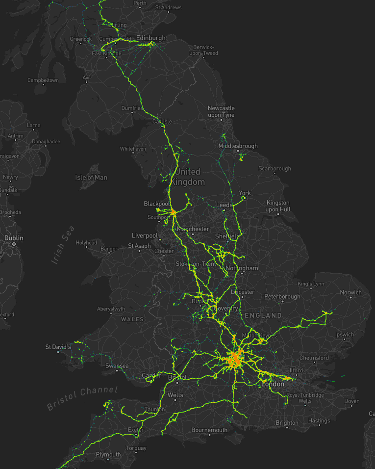
completely the wrong country, whereas the difference between 51.385, -1.6745 and 51.335, -1.6745, which could easily result from a transcription error, are an awkward 4 miles away. Unfortunately, as Andrew demonstrates, what3words introduces a different kind of ambiguity instead, so it doesn’t really do a great job of solving the problem.

And sequential or at least localised areas are actually good for some things, such as e.g. addressing mail! If I’ve just delivered mail to 123 East Street and my next stop is 256 East Street then (depending on a variety of factors) I probably know which direction to go in, approximately how far, and possibly even what side of the road it’ll be on!

That’s one of the reasons I’m far more of a fan of the Open Location Code, popularised by Google as Plus Codes. It’s got many great features, including variable resolution (you can give a short code, or just the beginning of a code, to specify a larger area, or increase the length of the code to specify any arbitrary level of two-dimensional precision), sequential locality (similar-looking codes are geographically-closer), and it’s based on an open standard so it’s at lower risk of abuse and exploitation and likely has greater longevity than what3words. That’s probably why it’s in use for addresses in Kolkata, India and rural Utah. Because they don’t use English-language words, Open Location Codes are dramatically more-accessible to people all over the world.

If you want to reduce ambiguity in Open Location Codes (to meet the needs of rescue services, for example), it’d be simple to extend the standard with a check digit. Open Location Codes use a base-20 alphabet selected to reduce written ambiguity (e.g. there’s no letter O nor number 0), so if you really wanted to add this feature you could just use a base-20 modification of the Luhn algorithm (now unencumbered by patents) to add a check digit, after a predetermined character at the end of the code (e.g. a slash). Check digits are a well-established way to ensure that an identifier was correctly received e.g. over a bad telephone connection, which is exactly why we use them for things like credit card numbers already.

Basically: anything but what3words would be great.

Heatmapping my Movements

As I mentioned last year, for several years I’ve collected pretty complete historic location data from GPSr devices I carry with me everywhere, which I collate in a personal μlogger server.

Going back further, I’ve got somewhat-spotty data going back a decade, thanks mostly to the fact that I didn’t get around to opting-out of Google’s location tracking until only a few years ago (this data is now also housed in μlogger). More-recently, I now also get tracklogs from my smartwatch, so I’m managing to collate more personal location data than ever before.

Inspired perhaps at least a little by Aaron Parecki, I thought I’d try to do something cool with it.

Heatmapping my movements

The last year

Heatmap showing Dan's movements around Oxford since moving house in 2020. There's a strong cluster around Stanton Harcourt with heavy tendrils around Witney and Eynsham and along the A40 to Summertown, and lighter tendrils around North and Central Oxford.
My movements over the last year have been relatively local, but there are some interesting hotspots and common routes.

What you’re looking at is a heatmap showing my location over the last year or so since I moved to The Green. Between the pandemic and switching a few months prior to a job that I do almost-entirely at home there’s not a lot of travel showing, but there’s some. Points of interest include:

  • The blob around my house, plus some of the most common routes I take to e.g. walk or cycle the children to school.
  • A handful of my favourite local walking and cycling routes, some of which stand out very well: e.g. the “loop” just below the big blob represents a walk around the lake at Dix Pit; the blob on its right is the Devils Quoits, a stone circle and henge that I thought were sufficiently interesting that I made a virtual geocache out of them.
  • The most common highways I spend time on: two roads into Witney, the road into and around Eynsham, and routes to places in Woodstock and North Oxford where the kids have often had classes/activities.
  • I’ve unsurprisingly spent very little time in Oxford City Centre, but when I have it’s most often been at the Westgate Shopping Centre, on the roof of which is one of the kids’ favourite restaurants (and which we’ve been able to go to again as Covid restrictions have lifted, not least thanks to their outdoor seating!).

One to eight years ago

Let’s go back to the 7 years prior, when I lived in Kidlington. This paints a different picture:

Heatmap showing Dan's movements around Kidlington, including a lot of time in the village and in Oxford City Centre, as well as hotspots at the hospital, parks, swimming pools, and places that Dan used to volunteer. Individual expeditions can also be identified.
For the seven years I lived in Kidlington I moved around a lot more than I have since: each hotspot tells a story, and some tell a few.

This heatmap highlights some of the ways in which my life was quite different. For example:

  • Most of my time was spent in my village, but it was a lot larger than the hamlet I live in now and this shows in the size of my local “blob”. It’s also possible to pick out common destinations like the kids’ nursery and (later) school, the parks, and the routes to e.g. ballet classes, music classes, and other kid-focussed hotspots.
  • I worked at the Bodleian from early 2011 until late in 2019, and so I spent a lot of time in Oxford City Centre and cycling up and down the roads connecting my home to my workplace: Banbury Road glows the brightest, but I spent some time on Woodstock Road too.
  • For some of this period I still volunteered with Samaritans in Oxford, and their branch – among other volunteering hotspots – show up among my movements. Even without zooming in it’s also possible to make out individual venues I visited: pubs, a cinema, woodland and riverside walks, swimming pools etc.
  • Less-happily, it’s also obvious from the map that I spent a significant amount of time at the John Radcliffe Hospital, an unpleasant reminder of some challenging times from that chapter of our lives.
  • The data’s visibly “spottier” here, mostly because I built the heatmap only out of the spatial data over the time period, and not over the full tracklogs (i.e. the map it doesn’t concern itself with the movement between two sampled points, even where that movement is very-guessable), and some of the data comes from less-frequently-sampled sources like Google.

Eight to ten years ago

Let’s go back further:

Heatmap showing Dan's movements around Oxford during the period he lived in Kennington. Again, it's dominated by time at home, in the city centre, and commuting between the two.
Back when I lived in Kennington I moved around a lot less than I would come to later on (although again, the spottiness of the data makes that look more-significant than it is).

Before 2011, and before we bought our first house, I spent a couple of years living in Kennington, to the South of Oxford. Looking at this heatmap, you’ll see:

  • I travelled a lot less. At the time, I didn’t have easy access to a car and – not having started my counselling qualification yet – I didn’t even rent one to drive around very often. You can see my commute up the cyclepath through Hinksey into the City Centre, and you can even make out the outline of Oxford’s Covered Market (where I’d often take my lunch) and a building in Osney Mead where I’d often deliver training courses.
  • Sometimes I’d commute along Abingdon Road, for a change; it’s a thinner line.
  • My volunteering at Samaritans stands out more-clearly, as do specific venues inside Oxford: bars, theatres, and cinemas – it’s the kind of heatmap that screams “this person doesn’t have kids; they can do whatever they like!”

Every map tells a story

I really love maps, and I love the fact that these heatmaps are capable of painting a picture of me and what my life was like in each of these three distinct chapters of my life over the last decade. I also really love that I’m able to collect and use all of the personal data that makes this possible, because it’s also proven useful in answering questions like “How many times did I visit Preston in 2012?”, “Where was this photo taken?”, or “What was the name of that place we had lunch when we got lost during our holiday in Devon?”.

There’s so much value in personal geodata (that’s why unscrupulous companies will try so hard to steal it from you!), but sometimes all you want to do is use it to draw pretty heatmaps. And that’s cool, too.

Heatmap showing Dan's movements around Great Britain for the last 10 years: with a focus on Oxford, tendrils stretch to hotspots in South Wales, London, Cambridge, York, Birmingham, Preston, Glasgow, Edinburgh, and beyond.

How these maps were generated

I have a μlogger instance with the relevant positional data in. I’ve automated my process, but the essence of it if you’d like to try it yourself is as follows:

First, write some SQL to extract all of the position data you need. I round off the latitude and longitude to 5 decimal places to help “cluster” dots for frequency-summing, and I raise the frequency to the power of 3 to help make a clear gradient in my heatmap by making hotspots exponentially-brighter the more popular they are:

SELECT ROUND(latitude, 5) lat, ROUND(longitude, 5) lng, POWER(COUNT(*), 3) `count`
FROM positions
WHERE `time` BETWEEN '2020-06-22' AND '2021-08-22'
GROUP BY ROUND(latitude, 5), ROUND(longitude, 5)

This data needs converting to JSON. I was using Ruby’s mysql2 gem to fetch the data, so I only needed a .to_json call to do the conversion – like this:

db = Mysql2::Client.new(host: ENV['DB_HOST'], username: ENV['DB_USERNAME'], password: ENV['DB_PASSWORD'], database: ENV['DB_DATABASE'])
db.query(sql).to_a.to_json

Approximately following this guide and leveraging my Mapbox subscription for the base map, I then just needed to include leaflet.js, heatmap.js, and leaflet-heatmap.js before writing some JavaScript code like this:

body.innerHTML = '<div id="map"></div>';
let map = L.map('map').setView([51.76, -1.40], 10);
// add the base layer to the map
L.tileLayer('https://api.mapbox.com/styles/v1/{id}/tiles/{z}/{x}/{y}?access_token={accessToken}', {
  maxZoom: 18,
  id: 'itsdanq/ckslkmiid8q7j17ocziio7t46', // this is the style I defined for my map, using Mapbox
  tileSize: 512,
  zoomOffset: -1,
  accessToken: '...' // put your access token here if you need one!
}).addTo(map);
// fetch the heatmap JSON and render the heatmap
fetch('heat.json').then(r=>r.json()).then(json=>{
  let heatmapLayer = new HeatmapOverlay({
    "radius": parseFloat(document.querySelector('#radius').value),
    "scaleRadius": true,
    "useLocalExtrema": true,
  });
  heatmapLayer.setData({ data: json });
  heatmapLayer.addTo(map);
});

That’s basically all there is to it!

Heatmap showing Dan's movements around Oxford since moving house in 2020. There's a strong cluster around Stanton Harcourt with heavy tendrils around Witney and Eynsham and along the A40 to Summertown, and lighter tendrils around North and Central Oxford.× Heatmap showing Dan's movements around Kidlington, including a lot of time in the village and in Oxford City Centre, as well as hotspots at the hospital, parks, swimming pools, and places that Dan used to volunteer. Individual expeditions can also be identified.× Heatmap showing Dan's movements around Oxford during the period he lived in Kennington. Again, it's dominated by time at home, in the city centre, and commuting between the two.× Heatmap showing Dan's movements around Great Britain for the last 10 years: with a focus on Oxford, tendrils stretch to hotspots in South Wales, London, Cambridge, York, Birmingham, Preston, Glasgow, Edinburgh, and beyond.×

The Coolest Thing About GPS

I’m currently doing a course, through work, delivered by BetterOn Video. The aim of the course is to improve my video presentation skills, in particular my engagement with the camera and the audience.

I made this video based on the week 2 prompt “make a video 60-90 seconds long about something you’re an expert on”. The idea came from a talk I used to give at the University of Oxford.

The Race to Win Staten Island

This article is a repost promoting content originally published elsewhere. See more things Dan's reposted.

Possibly CGP Grey‘s best video yet: starting with the usual lighthearted and slightly silly look into an interesting piece of history, it quickly diverges from a straightforward path through the Forest of All Knowledge (remember No Flag Northern Ireland?) and becomes an epic adventure into fact-checking, healthy scepticism, and demonstrable information literacy. Speaking admittedly as somebody who genuinely loved the Summer of Grey Tesla Road Trip series of vlogs, this more-human-than-average Grey adventure is well-worth watching to the end.

The Search for England’s Forgotten Footpaths

This article is a repost promoting content originally published elsewhere. See more things Dan's reposted.

Nineteen years ago, the British government passed one of its periodic laws to manage how people move through the countryside. The Countryside and Rights of Way Act created a new “right to roam” on common land, opening up three million acres of mountains and moor, heath and down, to cyclists, climbers, and dog walkers. It also set an ambitious goal: to record every public path crisscrossing England and Wales by January 1, 2026. The British Isles have been walked for a long time. They have been mapped, and mapped again, for centuries. But that does not mean that everything adds up, or makes sense. Between them, England and Wales have around a hundred and forty thousand miles of footpaths, of which around ten per cent are impassable at any time, with another ten thousand miles that are thought to have dropped off maps or otherwise misplaced. Finding them all again is like reconstructing the roots of a tree. In 2004, a government project, named Discovering Lost Ways, was given a fifteen-million-pound budget to solve the problem. It ended four years later, overwhelmed. “Lost Footpaths to Stay Lost,” the Daily Telegraph reported. Since then, despite the apparent impossibility of the task, the 2026 cutoff has remained on the statute books, leaving the job of finding and logging the nation’s forgotten paths to walkers, horse people, and other obsessives who can’t abide the muddled situation.

A couple of days into the New Year, with the deadline now only seven years off, I met Bob Fraser, a retired highway engineer, in a parking lot a few miles outside Truro, in Cornwall, in the far west of England. Fraser grew up in Cornwall and returned about thirty years ago, which is when he noticed that many footpaths were inaccessible or ended for no reason. “I suppose that got me interested in trying to get the problem sorted out,” he said. Since he retired, seven years ago, Fraser has been researching and walking more or less full time; in the past three years, he has applied to reinstate sixteen lost paths.

If Doggerland Had Not Drowned

This article is a repost promoting content originally published elsewhere. See more things Dan's reposted.

by Lee Rimmer

Doggerland

As well additional land around our familiar coastlines, the lower sea level reveals a low lying 9,000 square mile landmass called Doggerland – named after Dogger Bank, the large sandbank which currently sits in a shallow area of the North Sea off the east coast of England (dogger being an old Dutch word for fishing boat).

Doggerland had a rich landscape of hills, rivers and lakes and a coastline comprising lagoons, marshes and beaches.  It had woodlands of oak, elm, birch, willow, alder, hazel and pine.  It was home to horses, aurochs, deer, elks and wild pigs.  Waterfowl, otters and beavers abounded in wetland areas and the seas, lakes and rivers teemed with fish.  It was probably the richest hunting and fishing ground in Europe at the time and had an important influence on the course of prehistory in northwestern Europe as maritime and river-based societies adapted to this environment.

I love a bit of alternative history fiction, and this is a big one, going all the way back to prehistoric times. What if the period of global warming that took place thousands of years ago, “sinking” Doggerland and separating the formerly-connected British Isles from one another and from the European mainland? The potential impact is massive, affecting geography, history, and politics indefinitely, and it’s fun to think – and read – about.

@RespectableLaw on North Sentinel Island

This article is a repost promoting content originally published elsewhere. See more things Dan's reposted.

There’s been a lot of talk about the missionary killed by the natives of North Sentinel Island. They’re probably so aggressive because of this weirdo, Maurice Vidal Portman. So here’s a big thread about this creep and some facts from my decade-long obsession with the island.
The Sentinelese are often described as “uncontacted,” but this not strictly true. They had a very significant contact in 1880 with Commander Portman.
Portman, the black sheep third son of some minor noble, was assigned by the English Royal Navy to administer and pacify the Andaman Islands, a job he pursued from 1880-1900 with the full measure of his own perversity.
Portman was erotically obsessed with the Andamanese, and he indulged his passion for photography by kidnapping members of various tribes and posing them in mock-Greek homoerotic compositions.
During his 20 years in a sexualized heart of darkness, Portman measured and cataloged every inch of his prisoner’s bodies, with an obsessive focus on genitals.
Just imagine being a Neolithic person spending a few weeks in this guy’s rotating menagerie.
Portman spent most of his time in the greater Andaman Islands, but in 1880, he landed on North Sentinel. The natives fled, and his party ventured inland to find a settlement which had been abandoned in haste.
But they located an elderly couple and a few children they were able to abduct. The couple quickly died, likely from ailments to which they had no immunity.
The children spent a few weeks with Portman doing god knows what, after which he returned them to the island. Portman returned on a couple occasions, but the Sentinelese hid from him each time.
The story related by the children was certainly passed down among the 100 or so inhabitants of the island, and even today, Portman’s fatal kidnapping is just beyond a human lifetime.
So when the Indian government attempted contact with anthropologists in the 1960s and 70s, the Sentinelese were understandably hostile to outsiders. The Indian government soon gave up.
In 1981, a cargo ship named The Primrose ran aground on the coral reef surrounding North Sentinel. The crew radioed for assistance and settled in for a long wait. But in the morning they saw 50 men with bows on the beach, building makeshift boats.
The crew called for an emergency airlift and were evacuated, and not a moment too soon. Rough waves had thwarted the Sentinelese in their attempts to board, but the weather was clearing.
The ship and its cargo were left at the island, awaiting discovery by Neolithic eyes. Today you can still see the gutted remains on The Primrose on Google Earth.
Imagine climbing on board that ship. A completely alien vessel filled with alien things. Imagine seeing simple machines for the first time. A hinge. A latch. A wheel. Things that would instantly make sense in a satisfying way. Others would be so incomprehensible to avoid notice.
I have never been able to find out what cargo was on The Primrose in all my years of reading. There was about 100 tons of some sort of consumer product on board, and I’m curious what it was. But even absent the cargo, think about all the things that must have been on that ship.
In the 1990s, when anthropologists returned to the island to make new attempts at contact, they were met with a different attitude. Not friendly, exactly. But they were willing to accept gifts. Many would wade into the water with smiles to accept coconuts.

Here is a video of one of those encounters:

And in those videos, you can see that these pre-iron age people now had metal weapons, like the knife carried by this man. They had scavenged metal from the Primrose and cold-forged it into tools.
After collecting gifts for a few minutes, a few members of the tribe would approach and make menacing gestures, signaling that it was time for the outsiders to leave. They have never lost their desire for isolation, despite the gifts.
And they remained consistent in their intolerance against intruders. In 2006, two fishermen were killed after drifting into the island when their anchor detached while they were sleeping.
The Sentinelese are lucky they were so effective at preventing contact. The neighboring Jawara weren’t so fortunate. The tribe went from 9,000 to a couple hundred from lack of genetic immunity and only forestalled annihilation due to aggressive segregation. Their future is bleak.
Yet on North Sentinel, they’ve maintained a small community for 60,000 years which is by all indications happy. There is no way to integrate them into the modern world without wiping out nearly every member of their tribe.
And their aggressiveness is not the mark of savagery. It just that their conception of outsiders is mostly framed by some foot-faced English pervert who murdered some old people and did weird things to their kids. So let’s do them a favor and leave them alone.

The peculiar history of the Ordnance Survey

This article is a repost promoting content originally published elsewhere. See more things Dan's reposted.

The history of the organisation known as OS is not merely that of a group of earnest blokes with a penchant for triangulation and an ever-present soundtrack of rustling cagoules.

From its roots in military strategy to its current incarnation as producer of the rambler’s navigational aid, the government-owned company has been checking and rechecking all 243,241 sq km (93,916 sq miles) of Great Britain for 227 years. Here are some of the more peculiar elements in the past of the famous map-makers.