There is a distinct lack of coloration in today’s automobiles, with the majority seemingly finished in a shade that could be found on a greyscale chart. Things are no better in the
interior; nearly always black, beige or grey, colours that architectural and couture designers refer to as neutrals. To make matters worse, these shades are all too often matched to
the exterior pigment (i.e. black with black, silver with grey) to create insidious and mind-numbing monochrome vehicles that appear to have simply been dipped whole into a large vat
of colourant.
1937 Delahaye 135, ivory and navy blue with dark red leather
Things were not always this gloomy. From the dawn of motoring through the 1920s, cars were painted in a full spectrum of colours, often in vivid combinations. The world’s first motor
vehicle, the 1886 Benz Patent-Motorwagen was green, with its fully-exposed engine finished in bright red. At the Villa d’Este or Pebble Beach Concours d’Elegance one sees a veritable
riot of colour that would likely be a bit shocking to today’s consumers: black with orange, yellow with orange, dark and light blue, dark and light green, red with blue, maroon with
red; the palette was limitless.
…
I’m not even remotely “into” cars but I loved this article… and I do think that it’s a bit of a shame that cars don’t exhibit the variety of colour that they used to, any longer. As a
kid, I remember that the old chap who lived on the other side of our street kept a remarkably old-fashioned but regal looking car (I’ve no idea what it was: I was only very young) in
racing green with maroon trim and leather, and chrome window frames. I used to think how cool it was that he got to have a car that was so distinctive and unusual, because it was
already rare to see things that didn’t just fit into the same boxy, bland palettes. Since then, things have only gotten worse: I can’t remember the time that my daily commute took me
past a car that wasn’t painted in an all-encompassing single-colour coat of metallic black, white, silver, red, or blue and with interior plastic entirely in one of two shades of dark
grey.
Hopefully it’s just a phase that we, as a society, are going through.
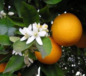
Let me try that again: which came first, the colour or the fruit?
Oranges
Still not quite right – one more try: which came first, orange, the English name of the colour, or orange, the English name of the fruit? What I really want
to know is: is the fruit named after the colour or the colour after the fruit? (I find it hard to believe that the two share a name and colour simply by coincidence)
Oranges
It turns out that the fruit came first. Prior to the introduction of oranges to Western Europe in around the 16th or 17th century by Portugese merchants, English-speaking
countries referred to the colour by the name ġeolurēad. Say that Old English word out loud and you’ll hear its roots: it’s a combination of the historical versions of the
words “yellow” and “red”. Alternatively, people substituted words like “gold” or “amber”: also both words for naturally-occurring substances whose identity is confirmed by
their colouration.
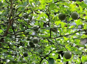
Green oranges. These oranges are what are now known as ‘bitter oranges’, the only variety to grow naturally: the ‘sweet oranges’ you’re used to eating are entirely a domesticated
species.
There wasn’t much need for a dedicated word in English to describe the colour, before the introduction of the fruit, because there wasn’t much around of that colour. The
colour orange isn’t common in nature: a few fruits, copper-rich soils and rocks, a small number of tropical fish, a handful of flowers… and of course autumn leaves during that brief
period before they go brown and are washed away by Britain’s encroaching winter weather.
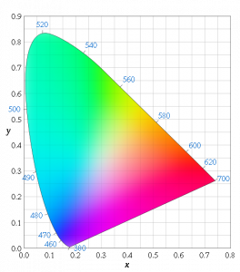
The names for the parts of the visible spectrum are reasonably arbitrary, but primary colours tend to cover a broader “space” than secondary ones; presumably because its easier for
humans to distinguish between colours that trigger multiple types of receptors in the eye.
Brent Berlin and Paul Kay theorise that the evolution of a language tends towards the
introduction of words for particular colours in a strict order: so words to distinguish between green and blue (famously absent in Japanese,
Vietnamese, and Thai) are introduced before brown is added, which in term appears before the distinction of pink, orange, and grey. At a basic level, this seems to fit: looking at a
variety of languages and their words for different
colours, you’ll note that the ‘orange’ column is filled far less-often than the ‘brown’ column, which in turn is filled less-often than the ‘green’ column.
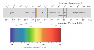
Of course, from a non-anthropocentric perspective, the “visible spectrum” is just a tiny part of the range of frequencies of electromagnetic radiation that we, and other animals, make
use of.
This is a rather crude analogy, of course, because some languages go further than others in their refinement of a particular area of the spectrum. Greek, for example, breaks down what
we would call “blue” into τυρκουάζ (turquoise) and κυανό (azure), and arguably βιολέ (violet), although a Greek-speaker would probably put the
latter down as a shade of purple, rather than of blue. It makes sense, I suppose, that languages are expected to develop a name for the colour “red” no later than they do for other
colours (other than to differentiate between darkness and lightness) – a lot of important distinctions in biology, food, and safety depend on our ability to communicate about red
things! But it seems to me that we’ve still got a way to go, working on our linguistic models of colour.
Factor in the ability of the human eye to distinguish between different colours, and you get a far more-complex picture that a simple linear spectrum.
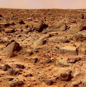
If we’d evolved on Mars (and were still a sighted, communicative, pack creature, but – for some reason – still had a comparable range and resolution of colour vision), our languages
would probably contain an enormous variety of words for colours in the 650-750 nanometre wavelengths (the colours that English speakers universally call “red”). Being able to navigate
the red planet based on the different ratios of hematites in the rocks, plains, soils and dusts would doubtless mean that the ability to linguistically distinguish between a dark-red
feature and a medium-red feature could be of great value!
Mars. It’s pretty damn red.
The names we have for colours represent a part of our history, and our environment. From an anthropological and linguistic perspective, that’s incredibly interesting.
All six colours of the rainbow. No, wait… nine? Three? A hundred? It’s all about how you name them.
If it weren’t for the ubiquity of, say, violets and lavender in the Northern hemisphere, perhaps the English language wouldn’t have been for a word for that particular colour, and the
rainbow would have six colours instead of seven. And if I’d say, “Richard Of York Gave Battle In…”, nobody would know how to finish the sentence.
In other news, I recently switched phone network, and I’m now on Orange (after many years on Vodafone). There is no connection between this fact and this blog post; I just thought I’d share.
Well, it’s been over a year since I last updated
the look-and-feel of my blog, so it felt like it was time for a redesign. The last theme was made during a period that I was just recovering from a gloomy
patch, and that was reflected the design: full of heavy, dark reds, blacks, and greys, and it’s well-overdue a new look!
The old Scatmania design: very serious-looking, and with dark, moody colours.
I was also keen to update the site to in line with the ideas and technologies that are becoming more commonplace in web design, nowadays… as well as using it as a playground for some of
the more-interesting CSS3 features!
This new design has elements in common with the theme before last: a big blue header, an off-white background, and sans-serif faces.
Key features of the new look include:
A theme that uses strong colours in the footer and header, to “frame” the rest of the page content.
A responsive design that rescales dynamically all the way from a mobile phone screen through tablets, small 4:3 monitors, and widescreen ratios (try
resizing your browser window!).
CSS transitions to produce Javascript-less dynamic effects: hover your cursor over the picture of me in the header to make me “hide”.
CSS “spriting” to reduce the number of concurrent downloads your browser has to make in order to see the content. All of the social media icons, for
example, are one file, split back up again using background positioning. They’re like image maps, but a million times less 1990s.
Front page “feature” blocks to direct people to particular (tagged) areas of the site, dynamically-generated (from pre-made templates) based on what’s
popular at any given time.
A re-arrangement of the controls and sections based on the most-popular use-cases of the site, according to visitor usage trends. For example, search
has been made more-prominent, especially on the front page, the “next post”/”previous post” controls have been removed, and the “AddToAny” sharing tool has been tucked away at the
very bottom.
[spb_message color=”alert-warning” width=”1/1″ el_position=”first last”]Note that some of these features will only work in modern browsers, so Internet Explorer users might be out of
luck![/spb_message]
As always, I’m keen to hear your feedback (yes, even from those of you who subscribe by
RSS). So let me know what you think!
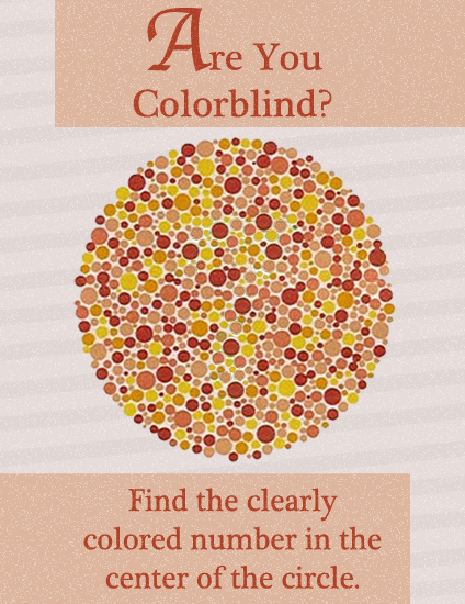
I’m not colourblind, and I’m not really a mobile developer, so maybe there’s something I’ve missed, but I’ve got an idea for an app and I thought I’d run it by you guys to
see if there’s something I’ve missed.
Mobile processing power is getting better and better, and we’re probably getting close to the point where we can do live video image manipulation at acceptable framerates (even 10
frames/sec would be something). So why can’t we make an app that shifts colours as seen by the camera to a particular different part of the spectrum (depending on the user’s
preferences).
For example, a deuteranomat (green weak, difficulty differentiating through the red/orange/yellow/green spectrum) might configure the software to shift yellows and greens to instead
be presented as purples and blues. The picture would be false, of course, but it would help distinguish between colours in order to make, for example, colour-coded maps readable.
I was thinking about how video cameras can often “see” infa-red (try pointing a remote control at a video camera and pressing the button), and present it to the viewer as white or
red, when I saw a documentary with some footage of “how bees see the world”. Bees have vision of a similar breadth of spectrum to humans, but shifted well into the infa-red range (and
away from the blue end of the spectrum). In the documentary, they’d filmed some flowers using a highly infa-red sensitive camera, and then they’d “shifted” the colours around the
spectrum in order to make it visible to normal humans: the high-infa-reds became yellows, the low-infa-reds became blues, and the reds they left as reds. Obviously this isn’t what
bees actually experience, but it’s an approximation that allows us to appreciate the variety in their spectrum.
Can we make this conversion happen “live” on mobile technology? And why haven’t we done so!
Oh yeah: I changed the look-and-feel of scatmania.org the other week, in case you hadn’t noticed. It’s become a
sort-of-traditional January activity for me, these years, to redesign the theme of my blog at this point in the year.
This year’s colours are black, white, greys, and red, and you’ll note also that serifed fonts are centre-stage again, appearing pretty-much-universally throughout the site for the first
time since 2004. Yes, I know that it’s heavier and darker than previous versions of the site: but it’s been getting fluffier and lighter year on year for ages, now, and I thought it was
time to take a turn. You know: like the economy did.
This new design has elements in common with the theme before last: a big blue header, an off-white background, and sans-serif faces.
Aside from other cosmetic changes, it’s also now written using several of the new technologies of HTML5 (I may put the shiny new logo on it, at some point). So apologies to those of you running archaic and non-standards-compliant browsers (I’m looking at you, Internet
Explorer 6 users) if it doesn’t look quite right, but really: when your browser is more than half as old as the web itself, it’s time to upgrade.
I’ve also got my site running over IPv6 – the next generation Internet protocol – for those of you who care about those sorts of things. If you don’t know why IPv6 is important and “a
big thing”, then here’s a simple explanation.
Right now you’re probably viewing the IPv4 version: but if you’re using an IPv6-capable Internet connection, you might be viewing the IPv6 version. You’re not missing out, either way:
the site looks identical: but this is just my tiny contribution towards building the Internet of tomorrow.
(if you really want to, you can go to ipv6.scatmania.org to see the IPv6 version – but it’ll only work if your Internet Service Provider is on the ball and has set you up with an IPv6
address!)